Photos: See how this remodel perfectly captures California’s indoor-outdoor living
It all started with a preschool social gathering at a Studio City home, a serendipitous encounter that led, eventually, to Nina Lederman moving into her dream house in 2003.
“I loved the house instantly,” says Lederman, a TV executive. “I told the homeowner that if she ever wanted to sell the house, I’d buy it.”
Stunning photos, celebrity homes: Get the free weekly Hot Property newsletter >>
A year later, she learned in quintessential working-mom fashion that it was for sale.
“I found out in the carpool line at school,” Lederman says with a smile. “I came right over and bought the house.”
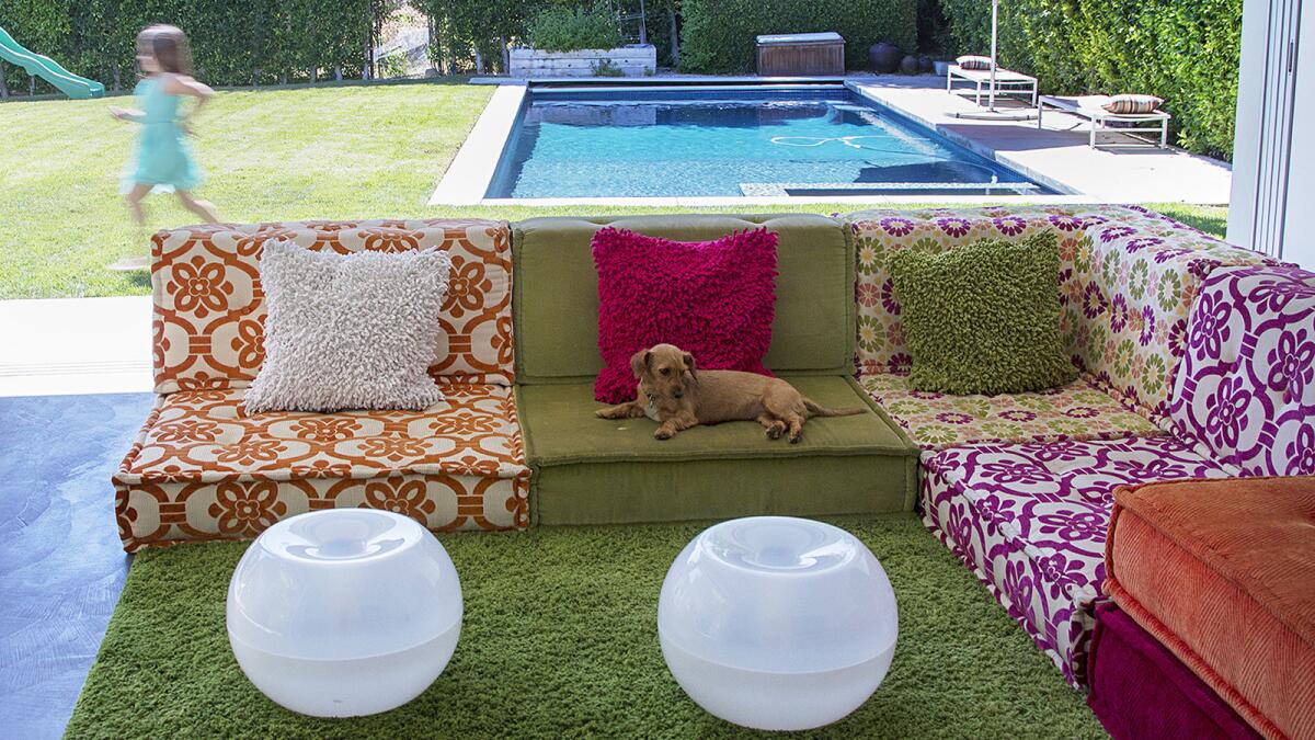
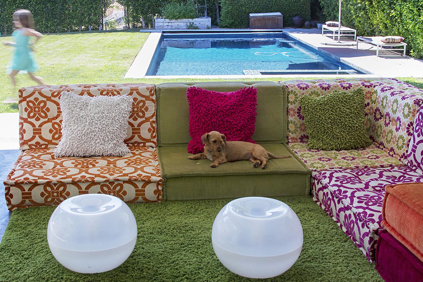
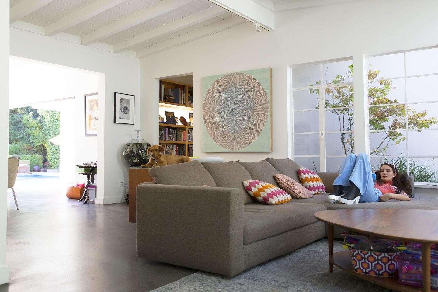
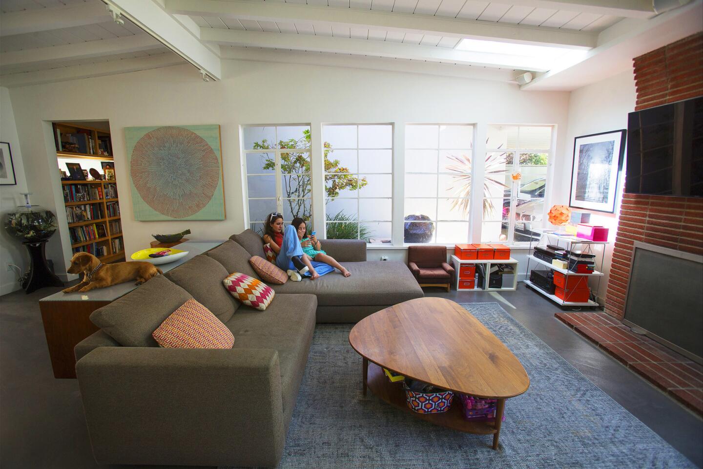
The family room was originally a covered patio that the architect enclosed. The family room couch -- a clever knock-off of the Roche Boboise Mah Jong modular section -- is made with inexpensive fabric from Diamond Foam and Fabric and can accommodate sleepovers.
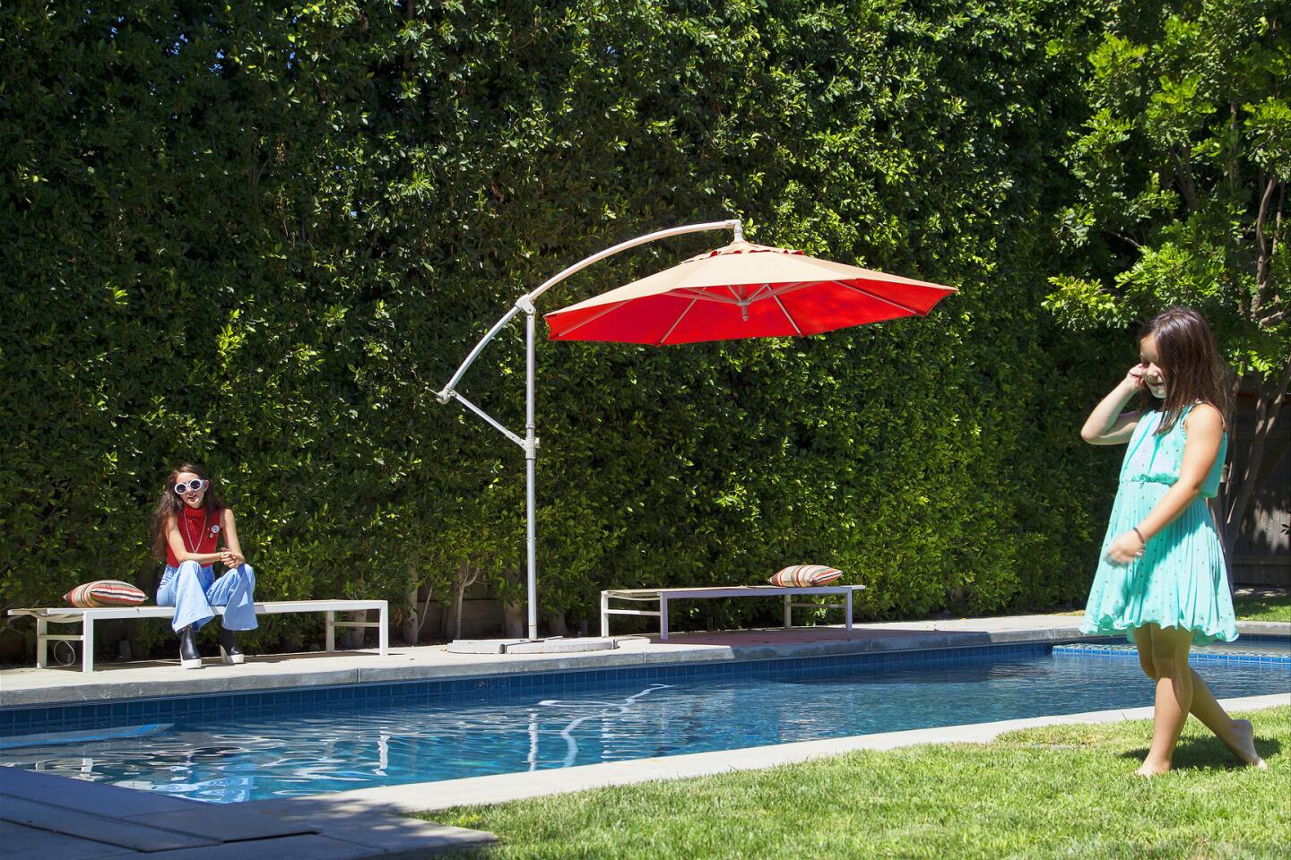
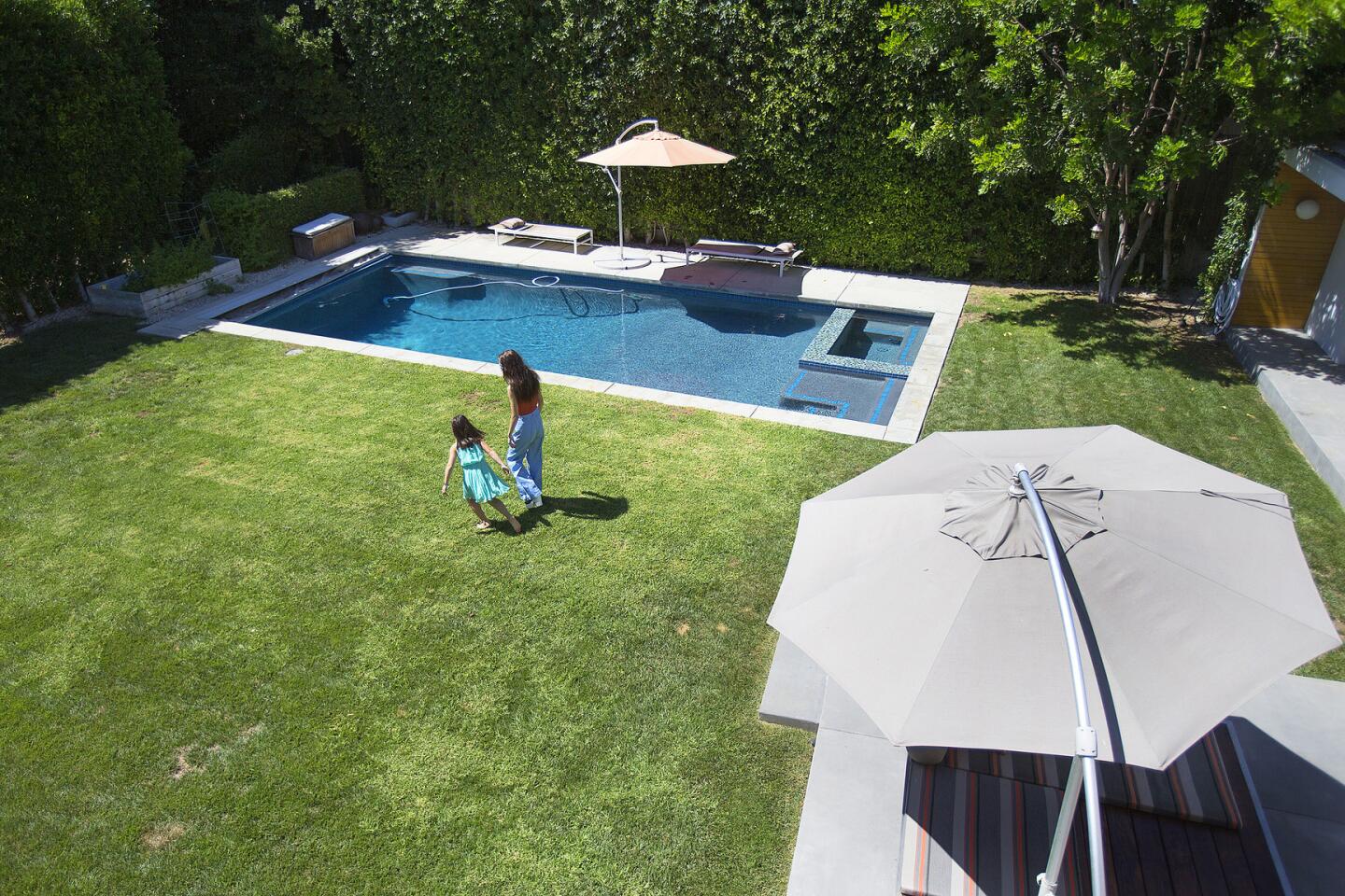
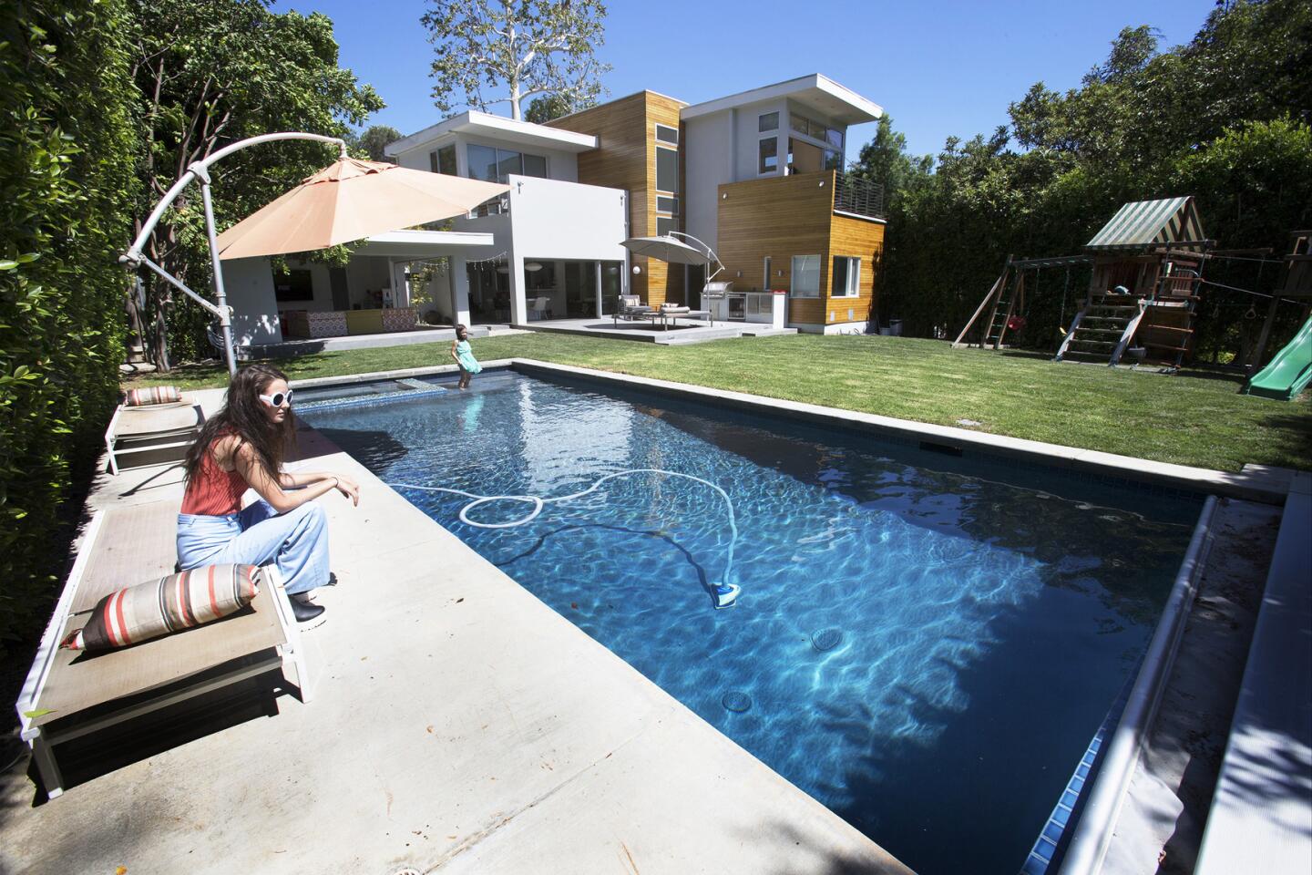
Lederman’s passion for the midcentury home is understandable. It’s open and breezy and sits on a private 9,900-square-foot lot surrounded by trees. With its sunlit interiors that connect to the outdoors, the 1948 post and beam is an endorsement for California indoor-outdoor living. Indeed, stand inside the dining room, with all of the Fleetwood sliding doors pushed to the side, and you’ll find yourself lured outdoors to the pool.

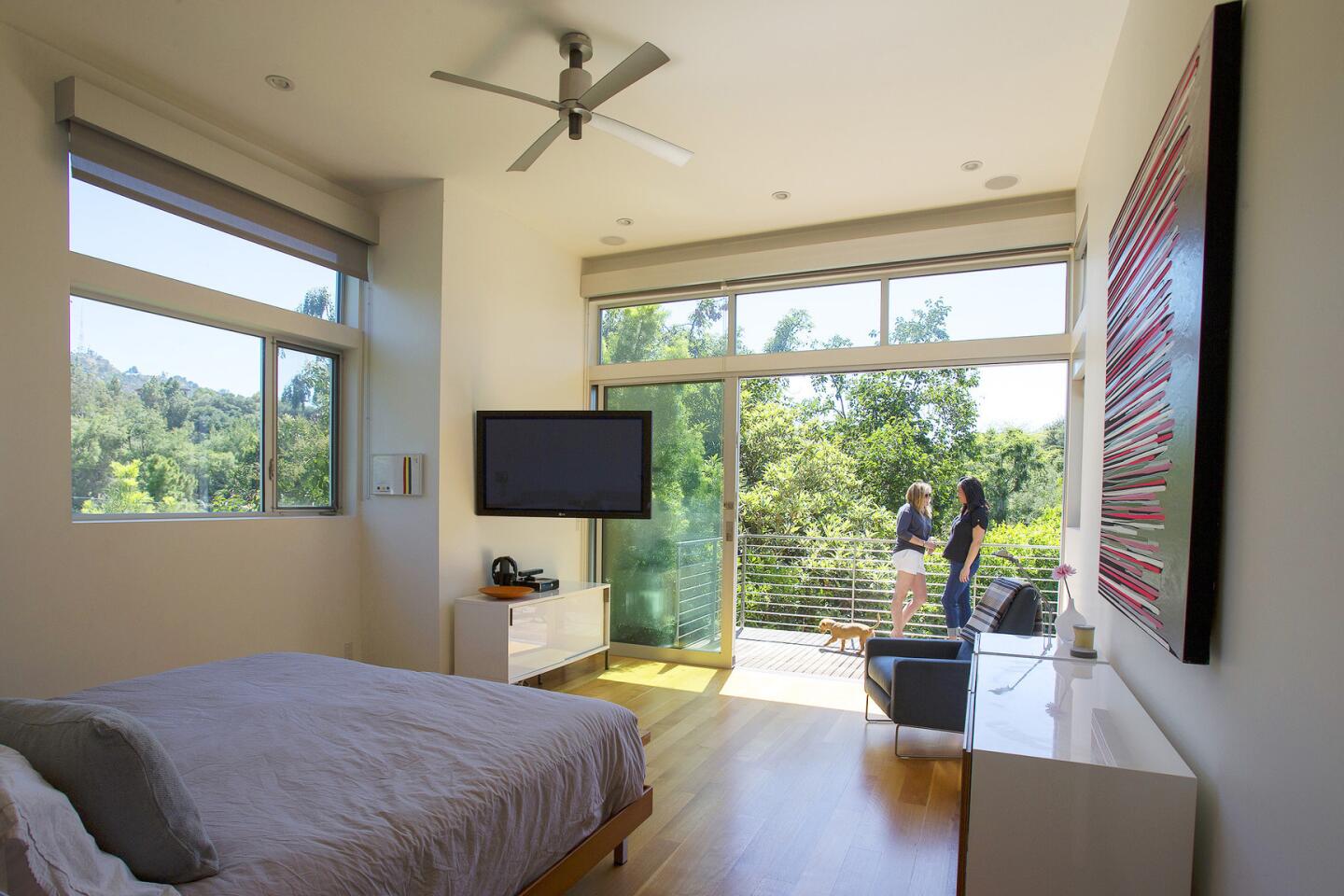
The remodel created privacy for the blended family by adding a second floor that includes two master bedroom suites with attached decks that overlook the backyard, shown here.
The original ranch home featured three bedrooms in about 2,000 square feet of space. But in 2009 Lederman and her partner, Rowena Arguelles, an agent at Creative Artists Agency, expanded their family — which already included Lederman’s two teenage children from a previous relationship — with the birth of their daughter, Grey. It was time for more space and privacy, and the couple enlisted architect Elissa Scrafano to re-imagine the house.
For Scrafano, the expansion was a multilayered undertaking.
Home tours: A peek inside the houses of Los Angeles >>
“It was about how to incorporate new relationships, kids, flexible space and needs for privacy,” she says. It was also about taking advantage of the home’s landscape. “I wanted to open up the house to nature and create seamless access to the backyard.”
The architect added a second floor that includes two bedroom suites with attached decks that overlook the backyard, a walk-in closet adjoining the master bath and a gym-office space that faces the front courtyard.
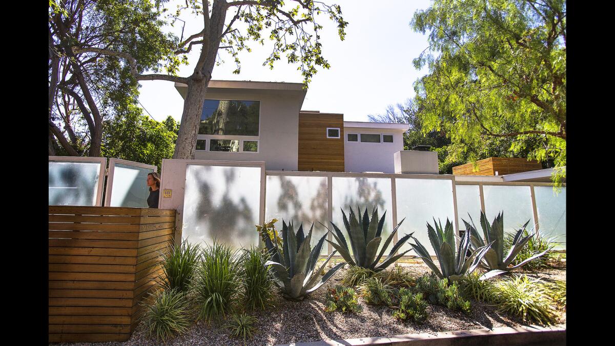
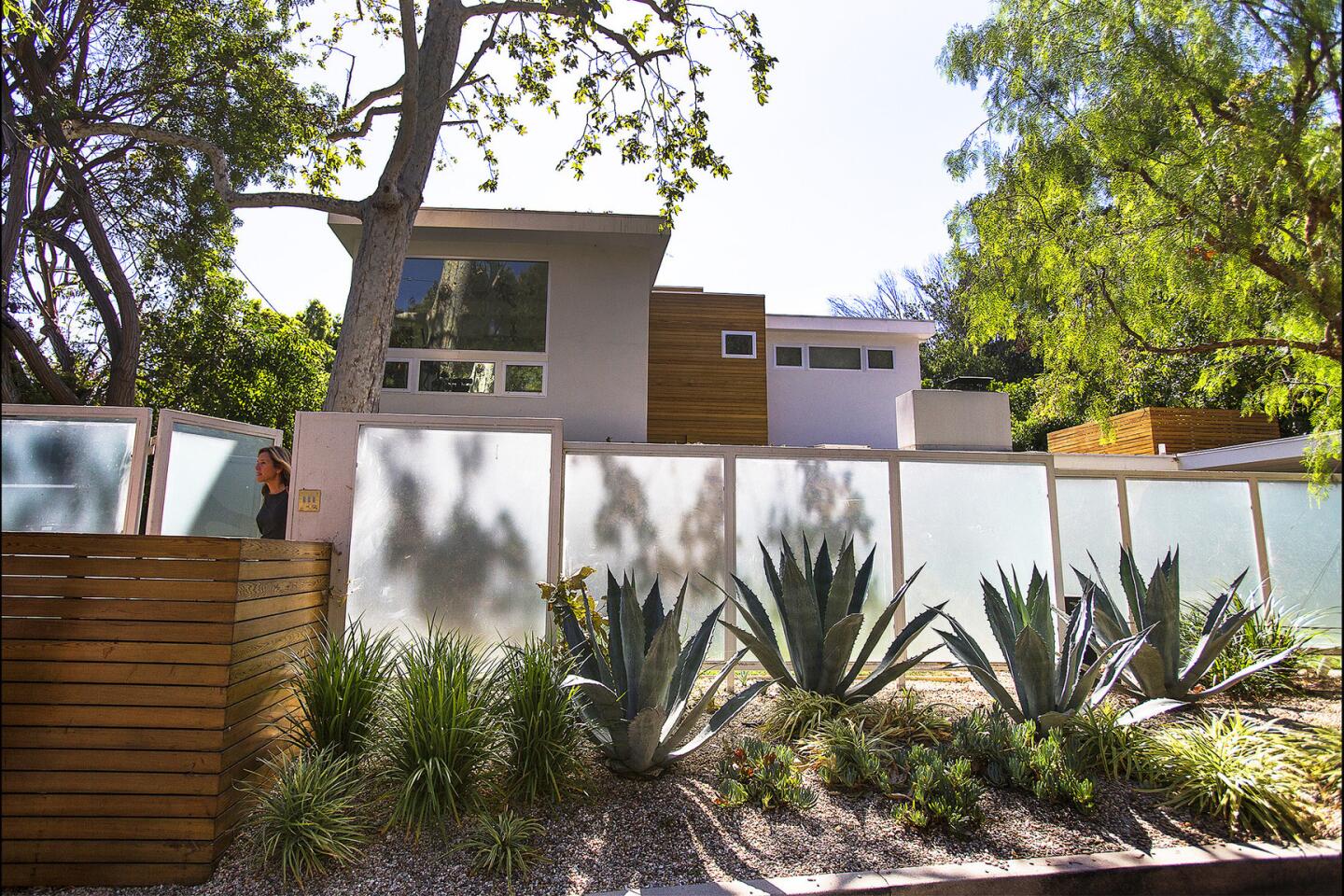
From the street, the house has a modern sensibility with a surplus of glass, vertical lines and cedar siding. The opaque fence creates a nice backdrop for the front courtyard.
From the street, the house has a modern air with a surplus of glass, vertical lines and cedar siding. The look is clean and contemporary, but inside, the home retains its warm midcentury mood. This derives in part from the home’s many original details, such as the red brick fireplace, hand-crank iron windows and midcentury tongue and groove ceilings that the couple chose to keep.
“It was supposed to feel like it wasn’t really an addition,” Scrafano says of the second floor.
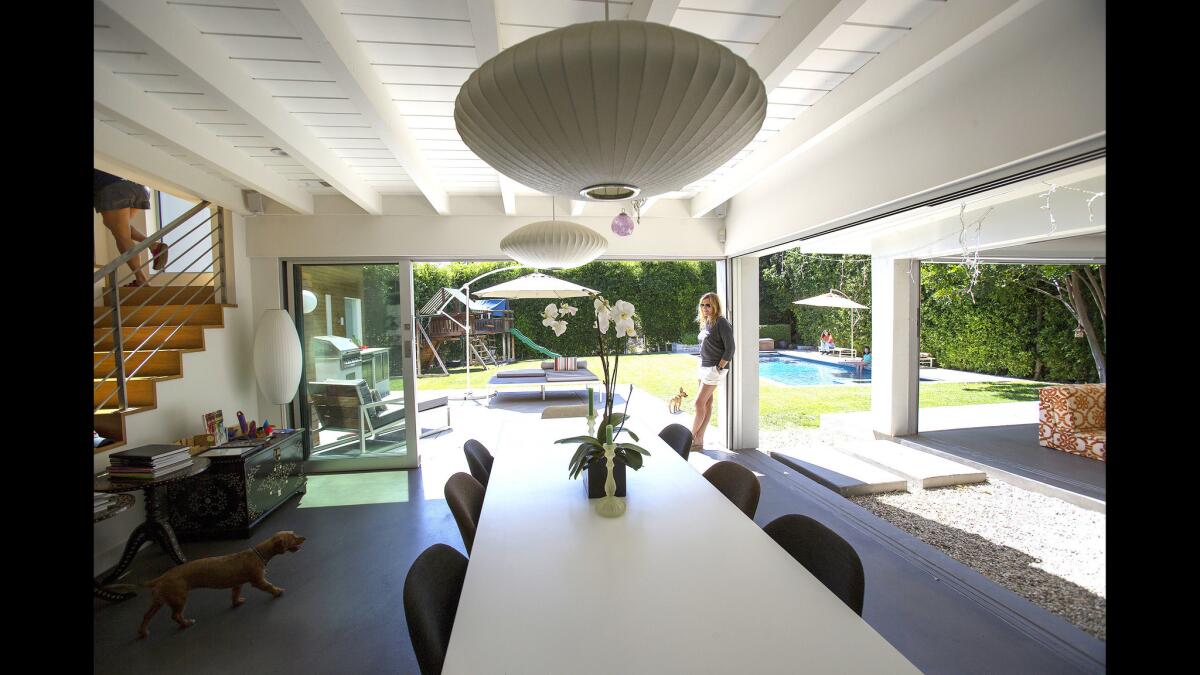
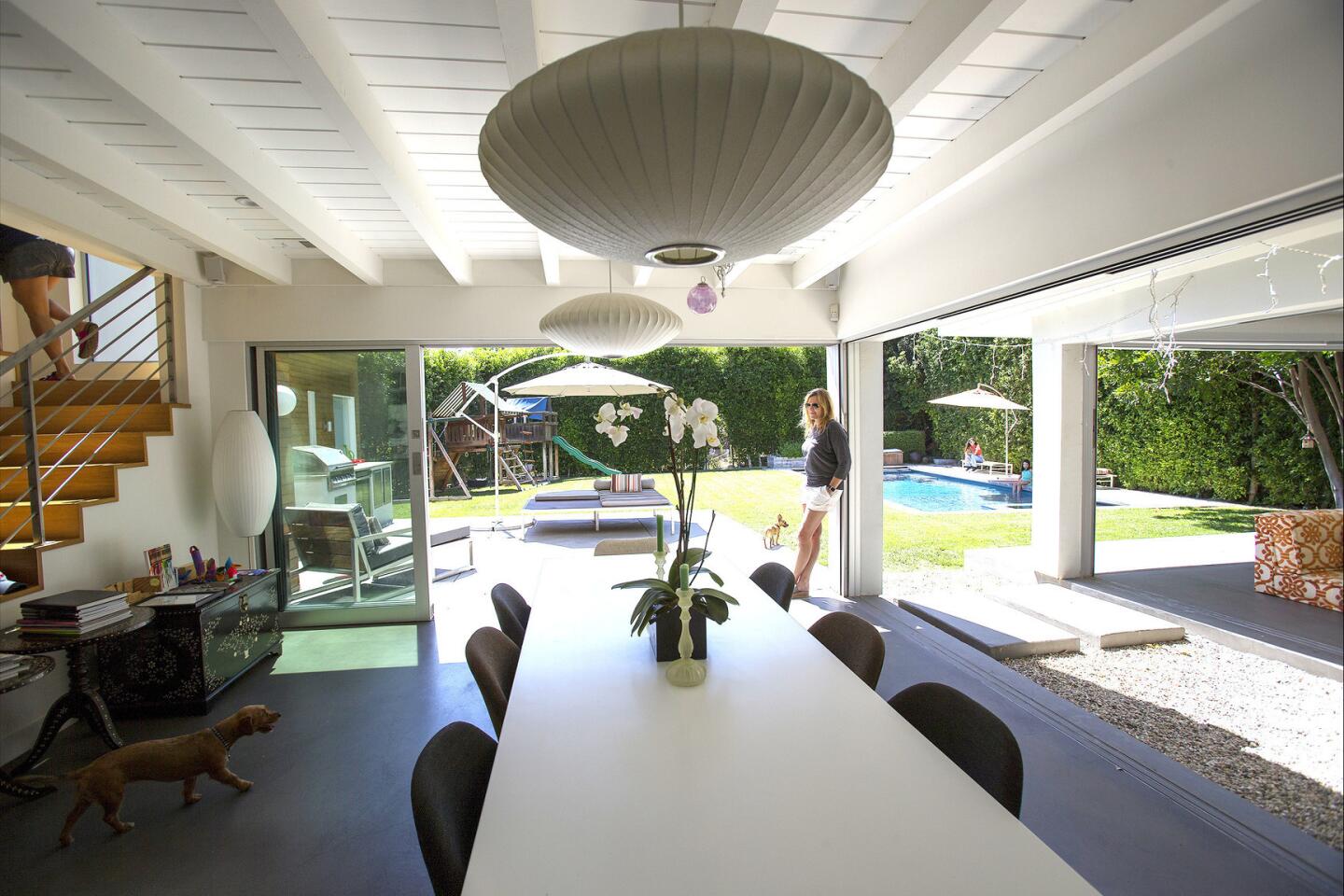
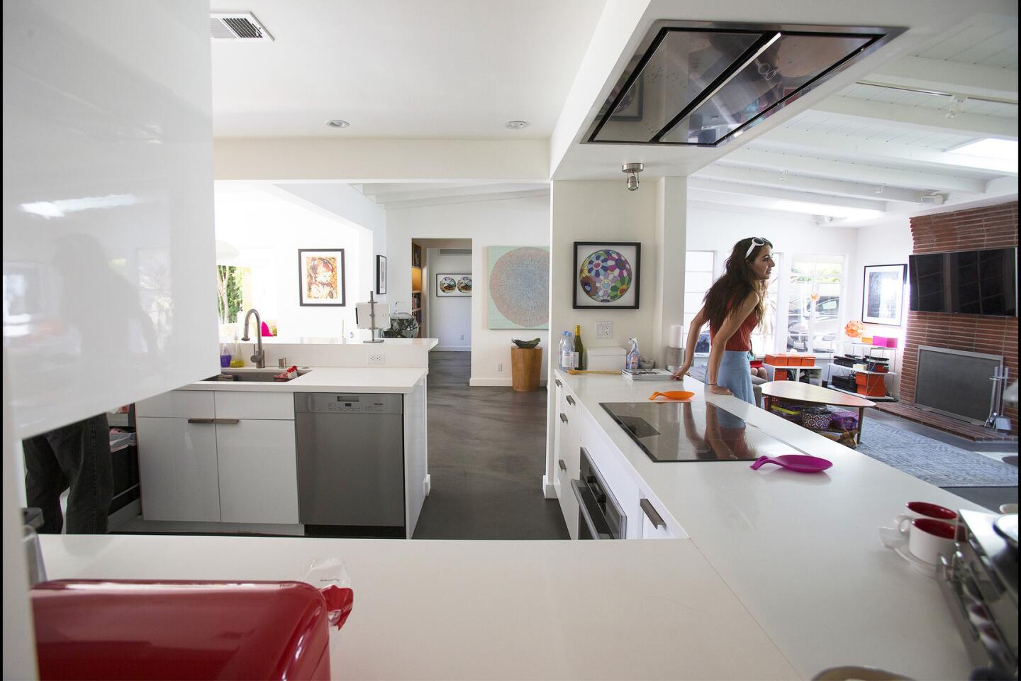
Nina Lederman, right, relaxes in the dining room of the Studio City home she shares with Rowena Arguelles. The grown-up dining room has clear sight lines to the new family room, at right, where their kids like to hang out. “We can have separate areas and see the kids at the same time,” Lederman says.
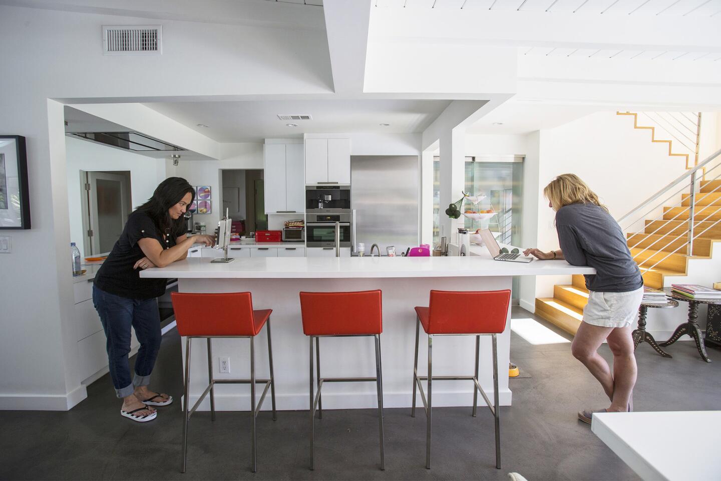
Careful thought was also put into creating a family-friendly environment. Although the dining room is a grown-up space with classic midcentury furnishings, it has clear sight lines to the open family room, designed by Scrafano, where the kids and their friends hang out. The two rooms are separated by about 5 feet of empty space, prompting Scrafano to joke that you have to “step on two concrete lily pads” to get from one room to another.
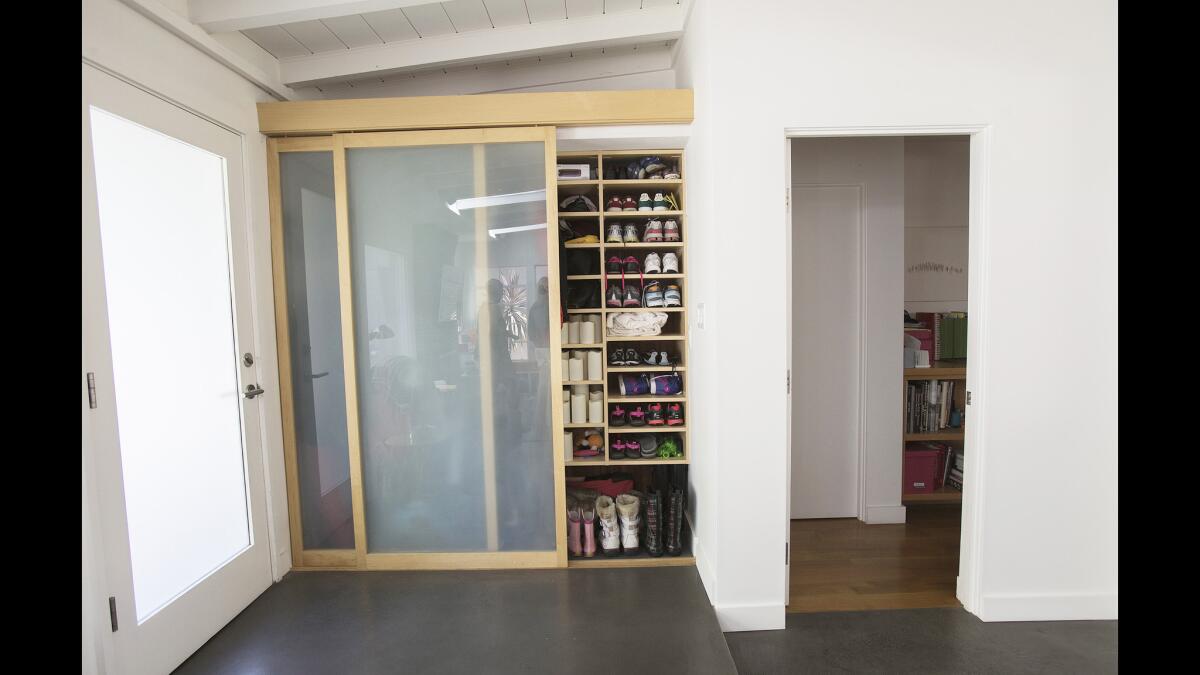
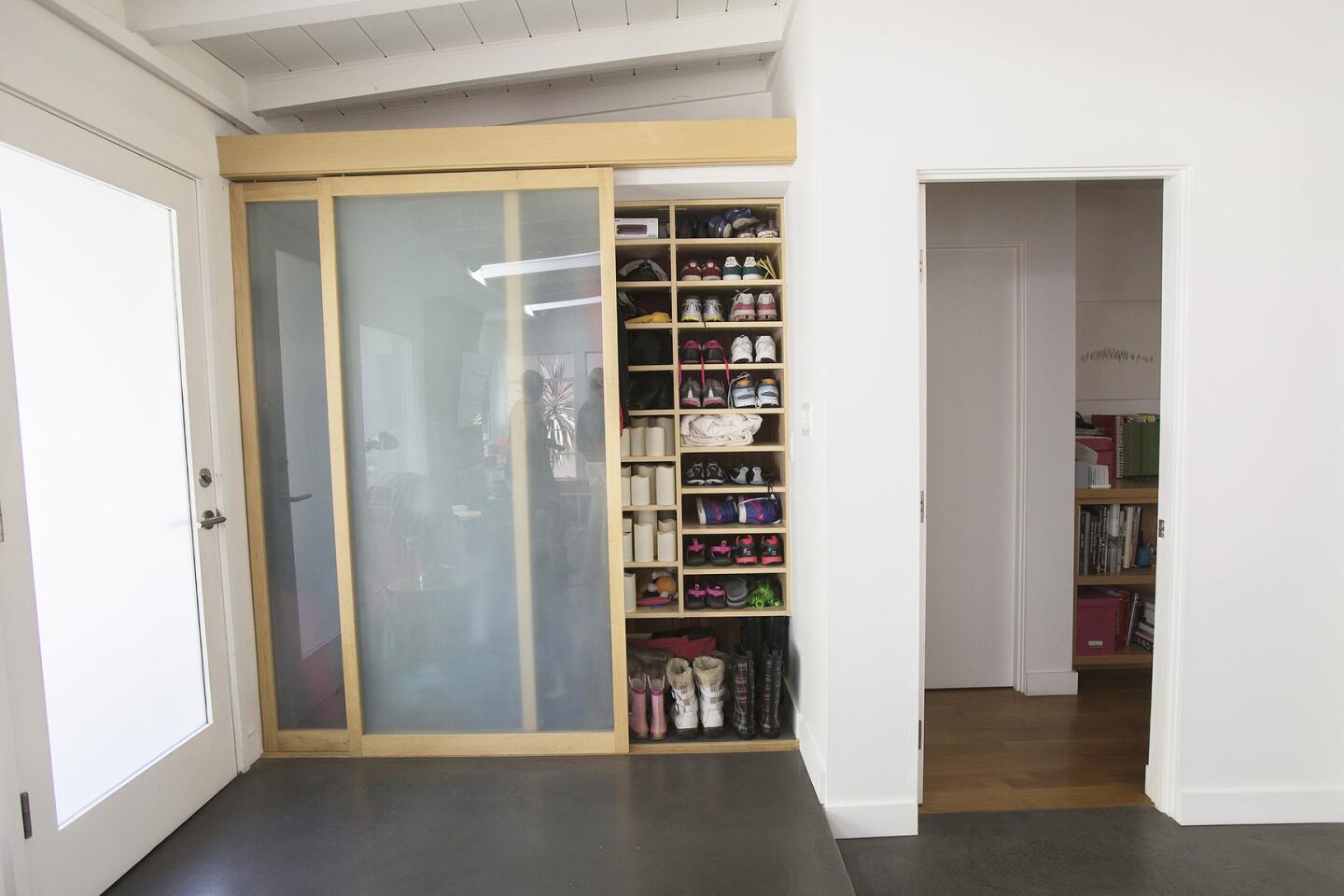
In the foyer, a closet serves as a mud room for shoes, jackets and backpacks. “We want to be able to put stuff away and have the interiors still look beautiful,” Lederman says. The couple also installed highly organized Elfa shelving systems from the Container Store in the kitchen and family room.
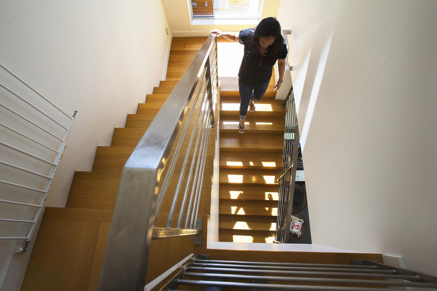
Due to their hectic family and work lives, the couple strove to eliminate clutter. “We want to be able to put stuff away and have the interiors still look beautiful,” Lederman says while offering a peek inside a pantry that is cleverly hidden underneath the stair tower. They also installed highly organized Elfa shelving systems from the Container Store in the kitchen and family room. Another closet in the entryway serves as a mud room for shoes, backpacks and jackets.
The home, the couple agree, has provided them with an ideal compound to accommodate their blended family. And while Lederman’s oldest daughter prepares to go off to college this month, the house remains a constant.
“I have always loved this house,” Lederman says. “Then. And now. I feel lucky to be here.”
Twitter: lisaboone19
MORE HOME TOURS:
They found a Fickett house, bought into the neighborhood
In Palm Springs, a renovation to meld midcentury, modern, light and art
Architect’s homework: When you can’t build it on, build it over
More to Read
Inside the business of entertainment
The Wide Shot brings you news, analysis and insights on everything from streaming wars to production — and what it all means for the future.
You may occasionally receive promotional content from the Los Angeles Times.
