In the second season of “Arrested Development,” various members of the Bluth clan come together to build a model home for a new development in Newport Beach, a project intended to revive the fortunes of their perpetually failing family company. Short on money, they don hard hats and build it themselves. “It doesn’t have to be good,” says Michael (Jason Bateman). “It just has to look good.”
In Orange County, life frequently imitates “Arrested Development,” the cult comedy set in Orange County — and it appears that the Orange County Museum of Art is no exception.
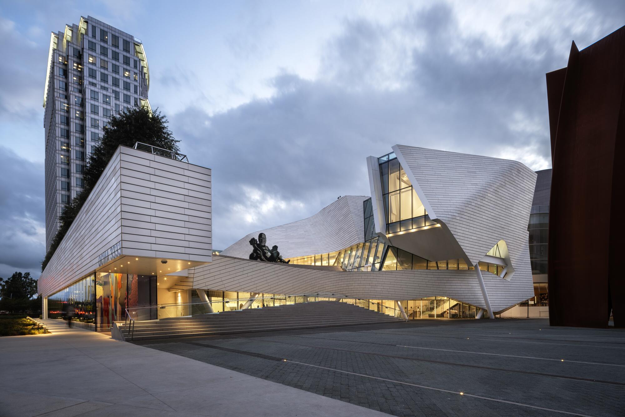
In October, the museum opened the doors to its highly anticipated new home: a swooping 53,000 square-foot structure designed by Morphosis at the eastern edge of the Segerstrom Center for the Arts in Costa Mesa. Heralding the building’s arrival were a torrent of email newsletters, a ribbon-cutting, a 24-hour party and a splashy gala.
One small thing: The building wasn’t done.
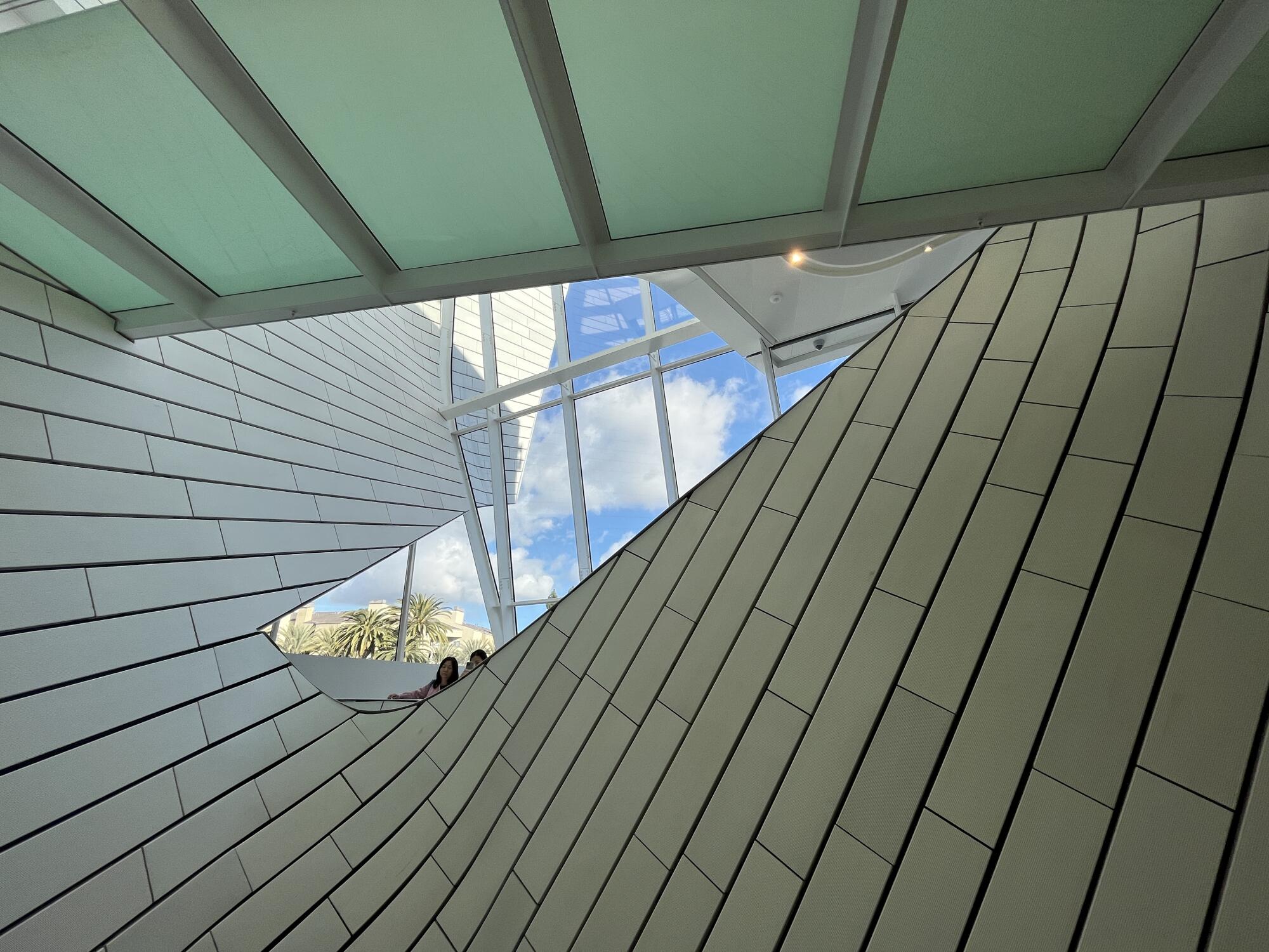
Like that Bluth model home, OCMA’s space-age structure looked OK from afar. But once you moved in close, the details didn’t hold up. When I attended a press preview in late September, portions of the atrium were lined in foam core and held together by tape. Trims sat unfinished or didn’t line up. Some of the white terracotta tiles that cover the building’s facade were haphazardly installed, wrecking the precise geometries of a design that ripples and torques.
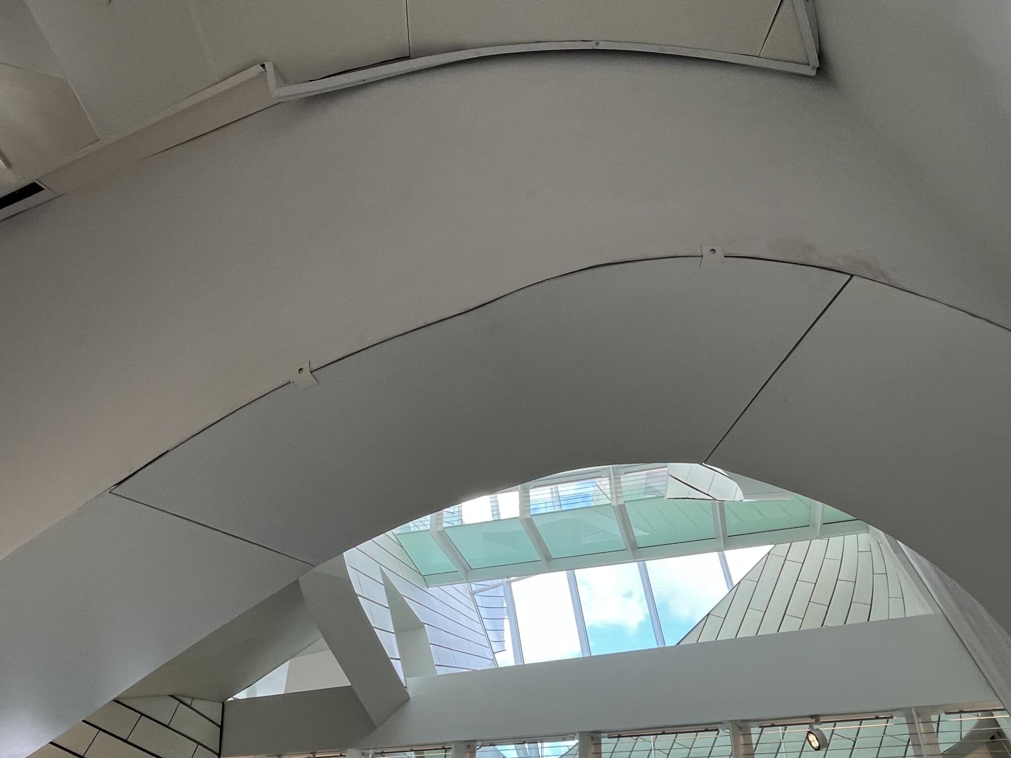
The bungled details were the subject of some mockery on architecture Twitter. An anonymous architect who goes by the handle @SpiderThan tweeted a series of images that compared the dazzling public relations photos of the building (presumably Photoshopped) with the grim reality of tape and clamps. It was captioned, “When you order it online vs when it arrives.”
Last month, Guardian architecture critic Oliver Wainwright published a scathing review of the building, describing it as a “shop of horrors.” The story features some mystifying quotes from museum director Heidi Zuckerman, claiming she was OK with imperfection. “I believe in wabi-sabi,” she told him. “Sometimes you can only appreciate a finished thing by experiencing it unfinished.”
I too appreciate imperfection. But when it comes to a structure with a $94-million price tag, it’d be nice if it vaguely resembled the glossy images that are being distributed to the press.
I paid a visit to OCMA over the Christmas holiday and encountered shoddily installed trims and ill-fitting boards in lieu of steel. In addition, some of the perforated aluminum panels that protect the ceiling bear the contractor’s handwritten notations. Look up as you ascend the steps and you may catch a glimpse of sky — or a hastily scrawled “#19.”
Several factors have contributed to these problems. For starters, there is Morphosis’ complicated design: a ruptured box with a spiraling atrium clad in custom tiles that had to be extruded in dozens of dimensions to accommodate all the twisting. There were supply chain issues induced by the pandemic. And there was the museum’s insistence on sticking to its opening date of Oct. 8.
Since then, contractors have been at work on OCMA’s off days, but progress has been slow — unsurprisingly, given the number of fixes required. Which is why the museum plans on shutting down for a few weeks after the current exhibitions conclude at the end of January.
“Before opening, we understood that we needed to find time to put the finishing touches on the building, and the changeover in the exhibition program is the right moment to do it,” a spokesperson for OCMA said via email. “The museum will be closed from January 23-February 13, 2023 to do the remaining work.”
My advice: Take the time to get it done right, because this is messy.
It took 35 years, but the Orange County Museum of Art has a new home.
The new OCMA has been a long time coming.
Previously, the museum had inhabited a nondescript building in Newport Beach. The obscure location — tucked between some dull apartment buildings and a fire station on the outskirts of Fashion Island — along with the tight quarters inspired leadership to mull expansion plans for decades (among them an ill-fated concept by Renzo Piano in the ‘80s). Fourteen years ago, the Segerstrom family donated land to the museum for a new building on the arts center’s complex in Costa Mesa; the L.A.-based firm Morphosis, founded by Pritzker Prize winner Thom Mayne, came on board as architects.
This brought a studio known for aggressive form-making to an arts complex laden with plenty of forms: Charles E. Lawrence’s Segerstrom Hall, with its massive arch of red granite, a separate concert hall by Pelli Clarke Pelli with an undulating glass facade and, in between them, a small, spiral-shaped cafe designed by Michael Maltzan Architecture. (It’s a lot of dude.)
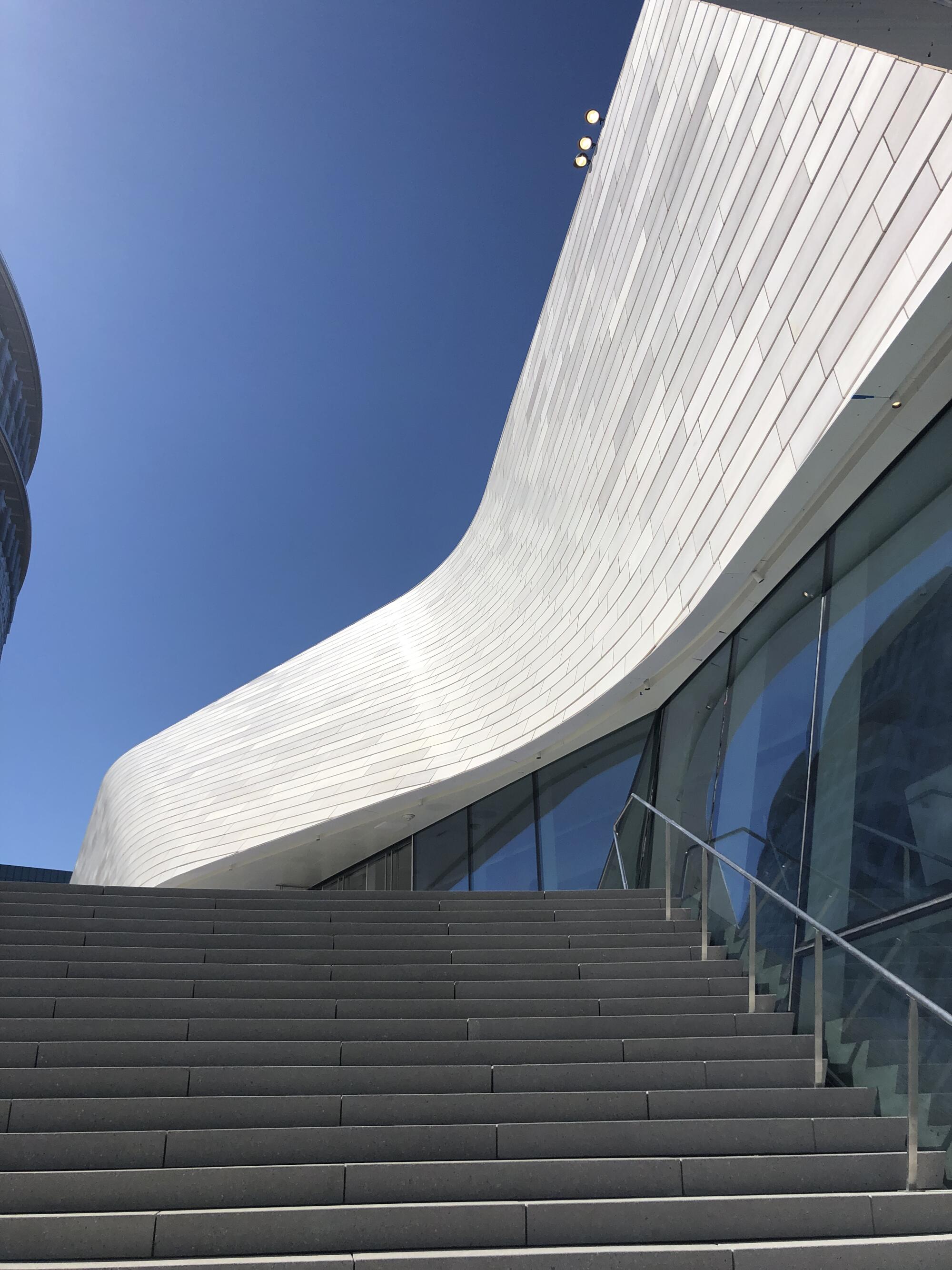
Morphosis, led by partner-in-charge Brandon Welling, added a structure that — in keeping with his firm’s output — feels seismic.
The building takes the form of a rectangular box whose northern facade appears to erupt before “Connector,” a 65-foot steel sculpture by Richard Serra. It is here that most of the building’s pyrotechnics can be found — along with its construction woes.
The first floor of the museum contains the principal exhibition spaces, the second harbors a pair of smaller galleries and the third floor features a cafe abutting a landscaped roof terrace that easily exceeds 10,000 square feet. The pleasing, water-conscious landscape design, by the Office of James Burnett, features palo brea trees dotting the terrace. These should offer a remarkable sight in the spring when they burst into yellow blooms.
Saturday’s Orange County Museum of Art gala marked the debut of the institution’s new $94 million building, which opens to the public Oct. 8.
The new building has given OCMA more space to showcase its art — 25,000 square feet of exhibition areas versus the 13,000-plus in the old building. But I’m not yet convinced it’s better space. Some of this may have to do with how the museum is using it. Hasty construction, it seems, has translated to an equally hasty move-in.
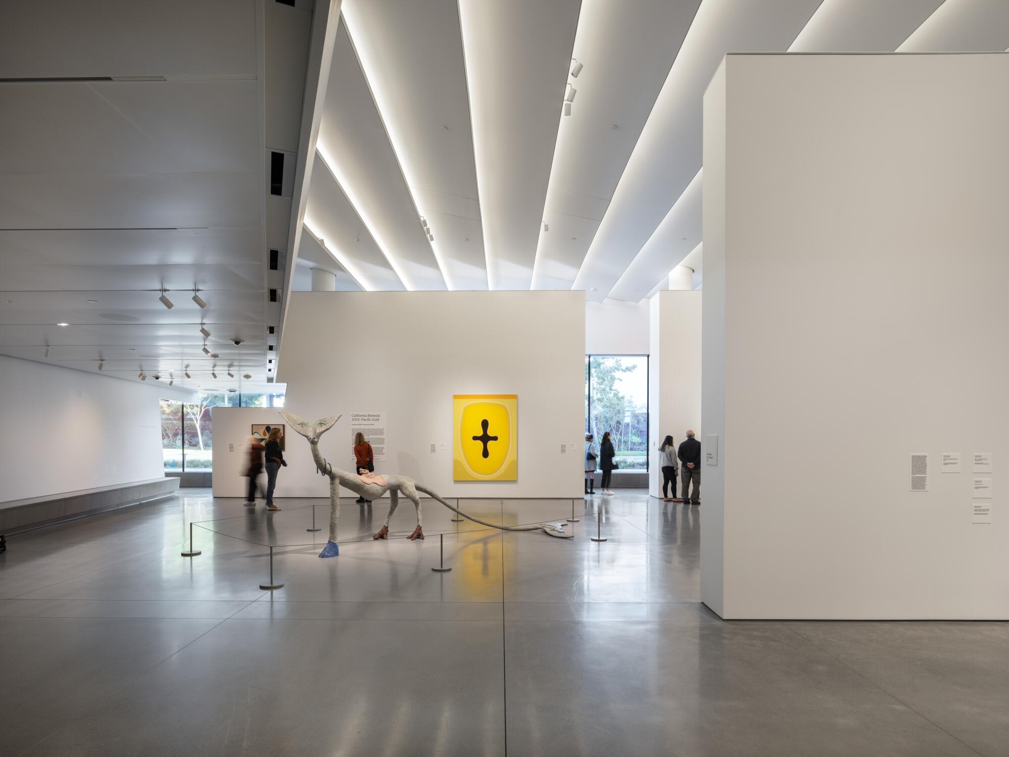
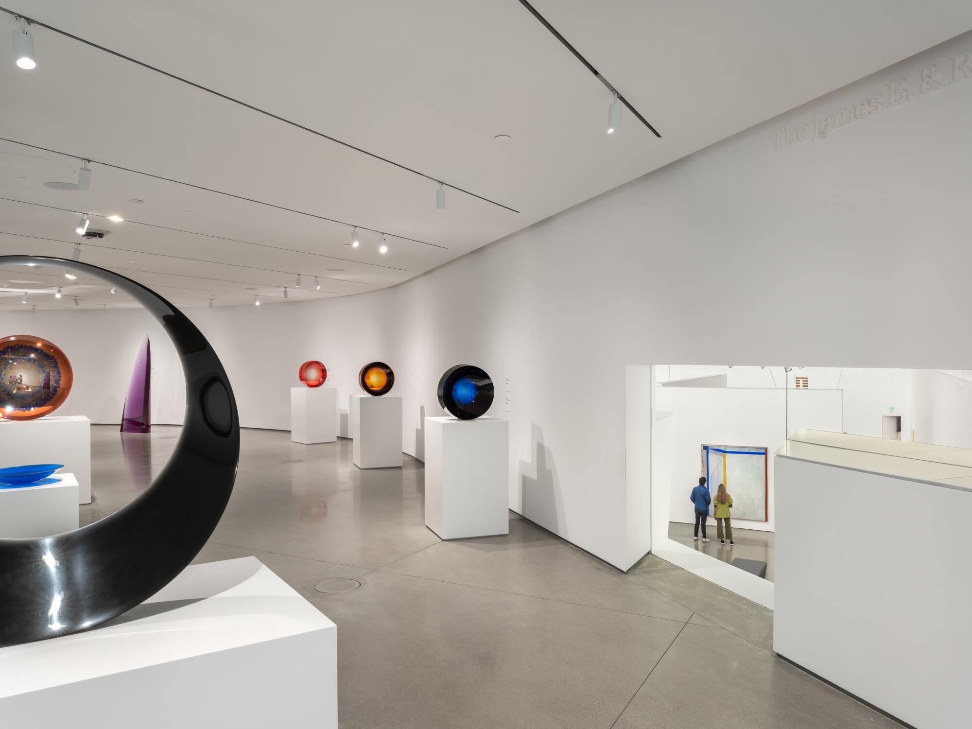
The ground floor galleries consist of a large, flexible space dressed in the art-world uniform of white walls and polished concrete. A smartly designed fabric ceiling dampens the acoustics and conceals overhead light fixtures. And a glass wall on the eastern side of the building allows passersby on Avenue of the Arts to get a peek at street-level displays.
On the macro level, the spaces acquit themselves well. But the current installation design feels a bit muddled. At the moment, the ground floor contains two adjacent shows: one for the permanent collection, the other for the temporary California Biennial. The paths into each one aren’t well delineated. I watched a number of people descend the ramp that leads to the galleries and then wonder where exactly to go next. The galleries also bleed one into another, making it unclear where one exhibition begins and another ends. It’s museum as endless scroll; the burden will be on exhibition designers to set some boundaries.
Upstairs, a boomerang-shaped mezzanine gallery, a protected space ideal for light-sensitive art, features some interesting cut-outs that provide views into the main galleries below. More puzzling is the so-called Visionaries Gallery, which isn’t really a gallery but a passageway leading out of the atrium’s stairs. Currently, it features an installation of diagrams and models by landscape architect Peter Walker, who designed one of the landscapes in the Segerstrom complex. On a busy day, good luck trying to view the work while dodging all the human traffic.
One of the most prominent features at the new OCMA is a rooftop sculpture by the L.A.-born artist, whose work riffs on history, myth and vintage quilts.
There are still many — many — kinks to be worked out at OCMA, but the museum’s location is a vast improvement over Newport Beach. Costa Mesa sits at the intersection of the 405 and 55 freeways and is more easily accessed from other parts of the county. Over the holidays it was packed, more packed than I’ve ever seen it on a non-event day. And a significant number of the visitors were people of color — whole families with kids in tow. (Free admission helps.)
The building also breathes life into the arts center, which used to only see activity in advance of a performance. OCMA’s roof terrace has proved a popular place to linger, as are the cafe tables the museum has arranged near the lobby coffee bar. On my last trip, I heard a group of kids singing inside the Serra.
For OCMA, it’s been a turbulent debut. But there’s time to get the house in order. After decades of dreaming about expansion, the museum should have a building that feels a little more like capital “A” architecture — and a lot less Bluth.
More to Read
The biggest entertainment stories
Get our big stories about Hollywood, film, television, music, arts, culture and more right in your inbox as soon as they publish.
You may occasionally receive promotional content from the Los Angeles Times.
