Review: Thom Mayne frames Emerson College with towering sense of self
A frame, an arch, a studio stage set, a proscenium: The first question about Emerson College’s hulking new Hollywood campus on Sunset Boulevard, designed by Thom Mayne and the Culver City firm Morphosis, is simply what to call the architectural box in which it comes packaged.
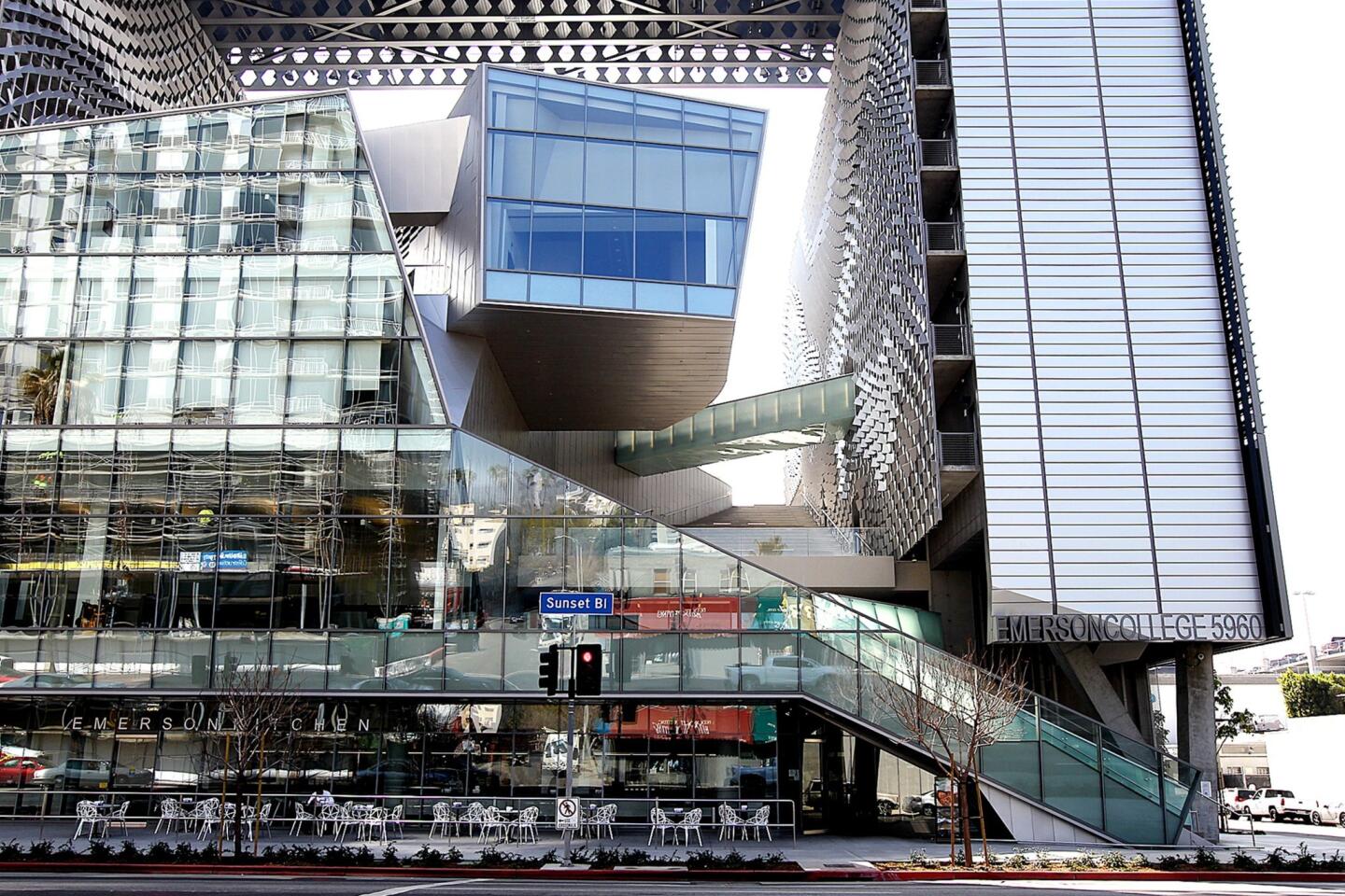
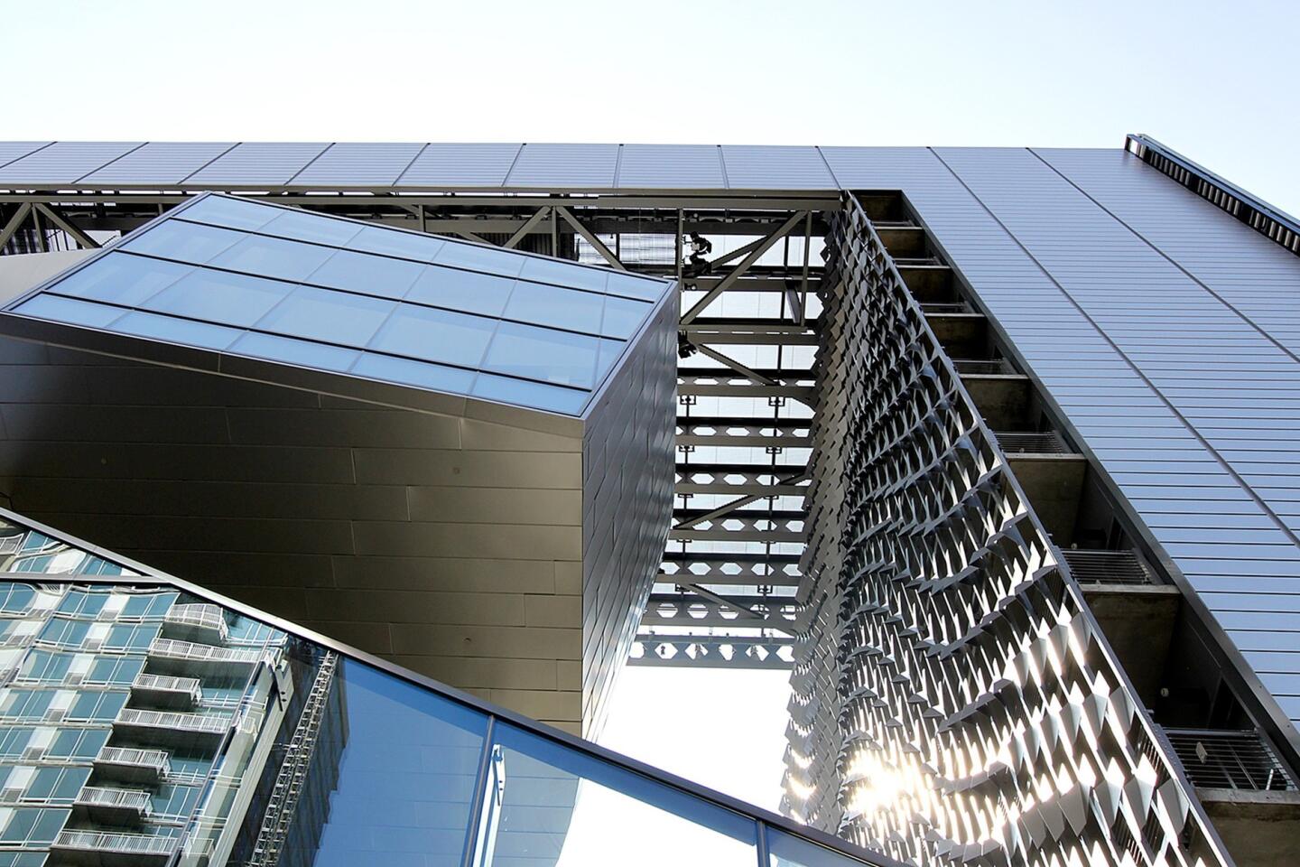
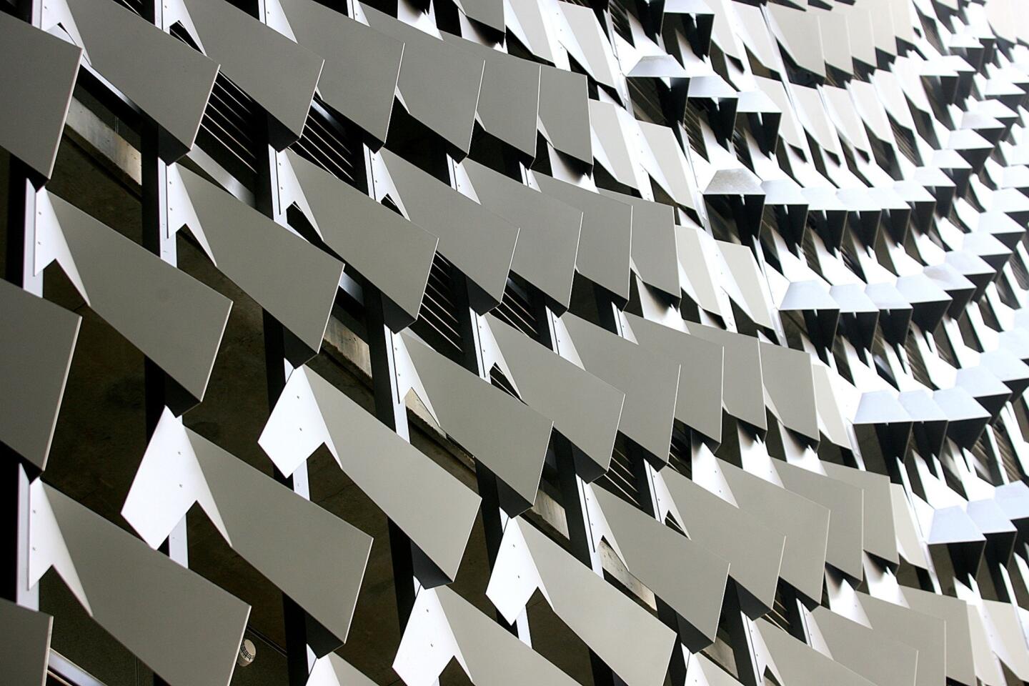
As you approach it heading east or west on Sunset, the $110-million building — one of the first really ambitious pieces of architecture to be finished in Los Angeles since the recession — looks to be an unadorned 10-story cube wrapped in metal panels and a gridded pattern of sunshades. It is and executed in the typical Morphosis palette, which runs from silver to gray.
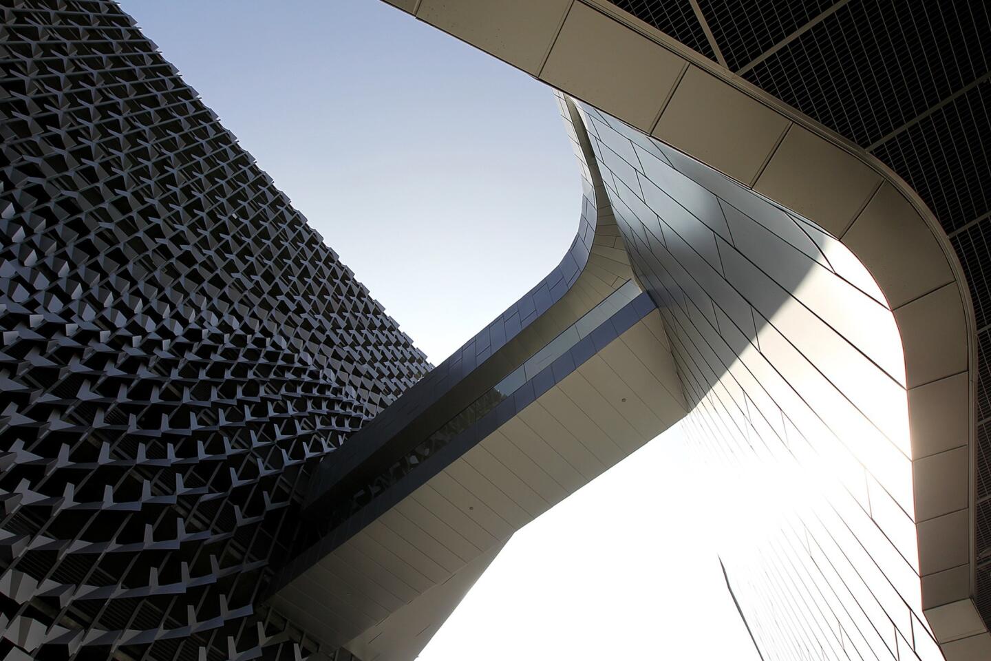
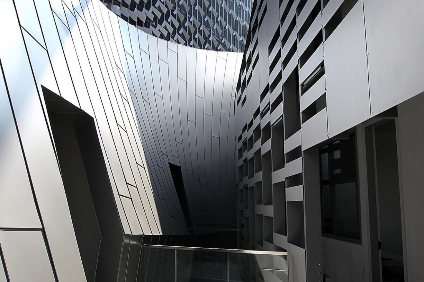
But as you come around front, you notice the cube is largely hollow in the center, leaving room for a writhing collection of forms, faced in glass, that hold classroom space for students who leave Emerson’s Boston campus to spend a year in Los Angeles, many of them taking advantage of Hollywood internships.
PHOTOS: Best architecture moments 2013 | Christopher Hawthorne
Seeing the bulbous academic building emerging from that simple frame, you think of an airplane or a rocket leaving a giant rectangular hangar. You think of the alien popping out of Sigourney Weaver’s stomach.
Looking at the frame itself, remembering that Mayne has been working on a skyscraper in Paris, you think of the 1989 Grande Arche in La Defense, on the edge of the French capital, by the architects Johann Otto von Spreckelsen and Paul Andreu.
This extreme contrast between basic (even banal) and virtuosic forms is one Mayne has used before, in projects like his decade-old Caltrans District 7 Headquarters in downtown Los Angeles. It’s also a common strategy in the work of Frank Gehry, whose winning New World Symphony building in Miami tucks an entire village of mismatched shapes inside a simple white stucco box.
Here the effect is impressive, monumental and supremely self-conscious all at once. Mayne and his Morphosis collaborators on the project (led by Kim Groves, Aaron Ragan, Chandler Ahrens and Shanna Yates) have essentially created an interlocking collection of sculptural forms, pointed their glass ends toward the Hollywood sign, suspended them above Sunset Boulevard and then used the rest of the building to frame them.
And this is where the design departs radically from the Gehry example — or for that matter from the Grande Arche, which mostly frames empty space. The goal of the Emerson shape is not to recall in Abstract Modernist terms a monument like the Arc de Triomphe, which Von Spreckelsen and Andreu were clearly interested in doing, as much as to focus our attention on the unorthodox center of the building.
INTERACTIVE: Tour Los Angeles’ boulevards
In this way, the architectural expression and the idea of how to frame that expression become inseparable; or, to borrow an idea from the theater, the proscenium is designed together with the action onstage.
Of course the shape of the building solves some practical and functional problems as well. The architects began with a pair of slender 10-story towers, holding dormitories for as many as 200 or so Emerson students.
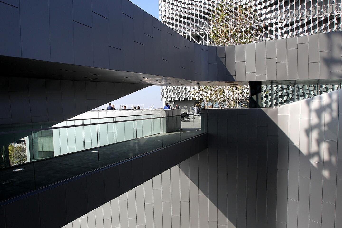
They pushed these to the periphery of the site, along its eastern and western edges. That opened up space in between not only for the curving form of the academic building but also for sizable south-facing terraces protected from the street.
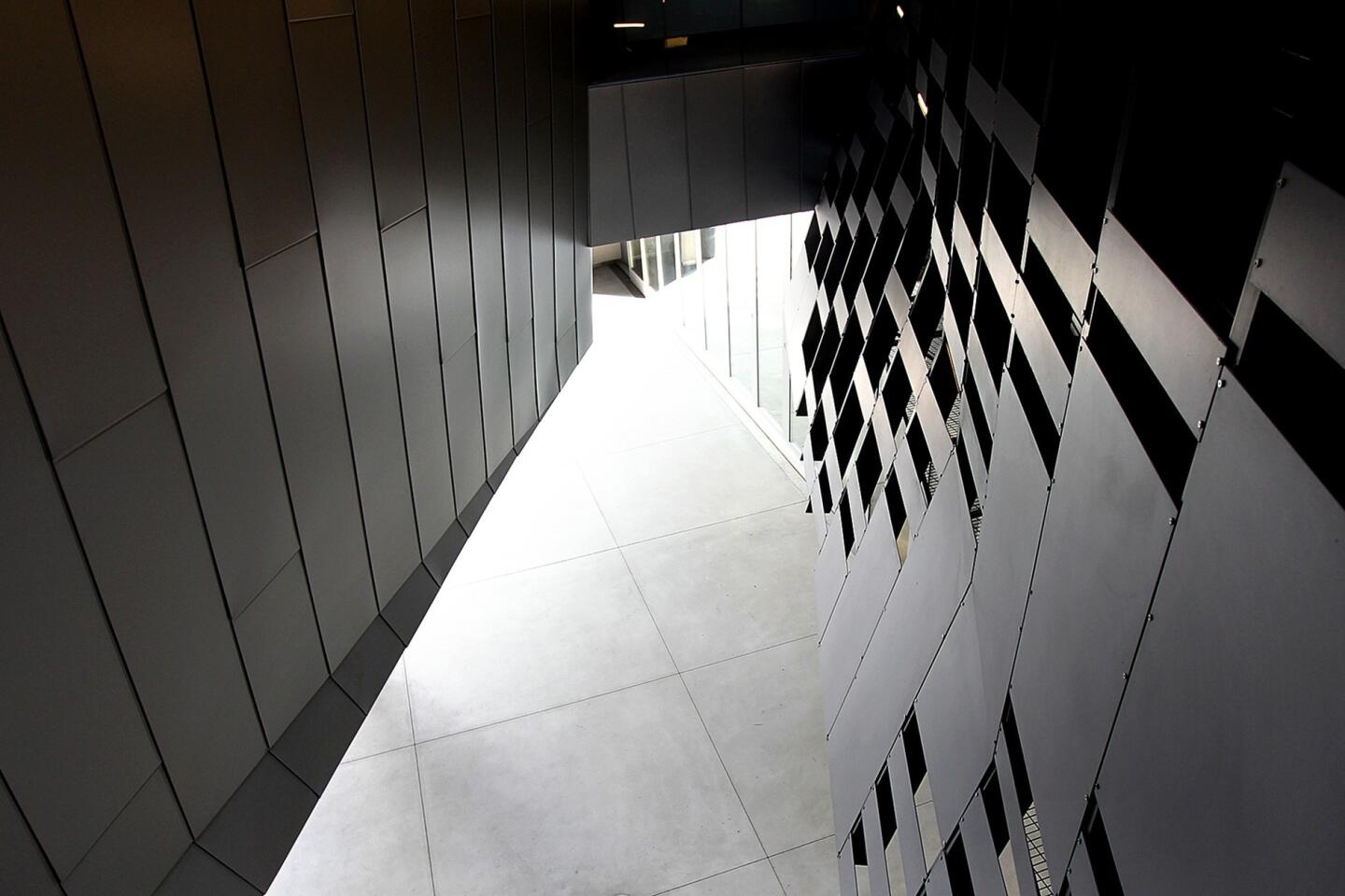
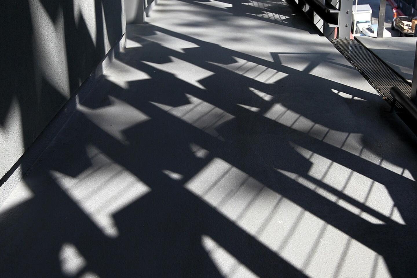
Then they lined the interior of the two towers, overlooking the terraces, with a metal scrim created with parametric computer modeling. It acts as both fixed sunshade and as shimmering, elaborate decorative touch.
Mayne is often reluctant to allow his buildings to pursue a conventional kind of beauty. But he’s made an exception here, with this dramatic and photogenic scrim, just as he made an exception in the silhouette of the Paris tower.
Making a connection
Then came the simple gesture that helped the Emerson building’s towering sense of self-regard snap into place. In part to make room for a helipad required by the Los Angeles Fire Department, the architects connected the two slender residential wings with a long span across the top of the building along Sunset.
Voilá: What had been a pair of dormitory towers with classrooms piled between them suddenly had a different architectural personality altogether. Now there was a clear connection between the architecture of the new building and the design of the Hollywood studios themselves, those boxy and efficient containers for fantastical stage sets of all kinds.
Linking the two towers with that span also has the effect of turning the Emerson complex into a closed loop, a self-contained academic village. The goal is to take the typically horizontal and spread-out form of a college campus and collect it inside a denser, vertical and more urban space — and, as Morphosis puts it in a description of the building, to evoke “the concentrated energy of East Coast metropolitan centers in an iconic Los Angeles setting.”
With the frame itself capable of holding equipment for lighting and sound, the whole building can operate as a stage set for the students working on film and TV projects.
‘HER’: Spike Jonze’s refreshing take on a future L.A.
Mayne’s buildings, especially the Caltrans headquarters, have often served as the backdrop for commercials and shown up in films. Now the Emerson students have one of those backdrops all to themselves.
The building’s resemblance to a stage set also connects it to the peculiar urban history of Hollywood architecture. It was just two miles east on Sunset, at Virgil Place, that a giant set for part of D.W. Griffith’s silent epic “Intolerance” was built in 1916.
The set, representing the Great Wall of Babylon, was bigger by far than any of the surrounding buildings. And after filming was done it stayed there for three years, a glorious relic slowly decaying, until the same fire department that now requires most buildings higher than 75 feet to include helipads decided it was a hazard and needed to be torn down.
Ultimately some of its ornamental forms, including giant elephants, showed up in the design of the Hollywood & Highland complex, whose Dolby Theatre holds the Oscar ceremony every year. But Mayne’s Emerson building, with its energetic scale and enthusiastic disregard for what surrounds it, may be the more fitting tribute to Griffith and Hollywood flamboyance.
PHOTOS: Designs of Pritzker Architecture Prize 2014 winner Shigeru Ban
In a different kind of city, on a different kind of site, Mayne’s goal might have been different too: to make connections to the neighborhood around the new building. But this part of Sunset Boulevard, three blocks from the 101 Freeway, is mostly a collection of fast-food joints and studio complexes that turn their backs on the street.
The Cinerama Dome, four blocks to the west, is not quite close enough to qualify as part of the new building’s architectural context. And though a residential tower is going up across the street, the neighborhood is mostly low-rise; the closest neighbor to the south is a single-story bungalow.
For an architect like Mayne, interested primarily in creating singular acts of architectural drama, this sort of setting is a rare opportunity, a blank slate.
The nearby buildings won’t give you much to work with or against. What’s required, if it’s maximum punch you’re looking for, is a kind of grandiose and explicit self-sufficiency, a willingness to create a collection of unorthodox architectural forms and, while you’re at it, the giant flat-screen, the huge digital billboard, on which to broadcast them to the world.
A welcome change
The Emerson project signals a refreshing and long-awaited change of direction from Morphosis, an indication that the firm is finally done pursuing what had become a signature line of torqued and tortured boxes. That architectural approach, evident in a building at Caltech and another for Cooper Union in New York, had over time hardened into cliché. It reached a definitive dead end last year in the Perot Museum of Nature and Science in Dallas, which somehow managed to be boorish and toothless at the same time.
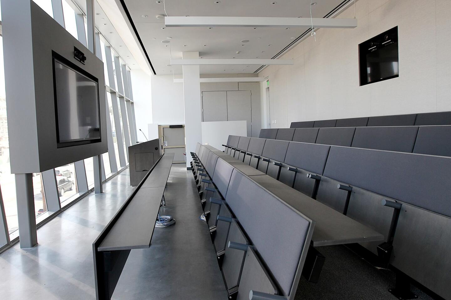
The new building suffers from familiar Morphosis mannerisms, especially the sense that the design is preening for the cameras more than it’s taking time to shape effective interior space. This gap between affect and product is especially notable in the charmless, efficiently Spartan concrete dorm rooms.
Still, the sheer striking presence of the building on Sunset gives me at least a modest amount of hope for future architectural experiments in Los Angeles — especially ones that will replace the brooding quality of Mayne’s buildings with something less aggressively downcast and more productively humane. Given the beating that the profession took in the recession and that the city is an increasingly regulated, risk-averse and expensive place to build, it has been easy to despair for our ability to produce important new architecture.
But think how many stretches of L.A. boulevards are just like the one surrounding the Emerson building — wide, flat sections of what Reyner Banham called the “Plains of Id,” where even a 10-story building can have an outsized, monumental impact.
More to Read
The biggest entertainment stories
Get our big stories about Hollywood, film, television, music, arts, culture and more right in your inbox as soon as they publish.
You may occasionally receive promotional content from the Los Angeles Times.
