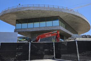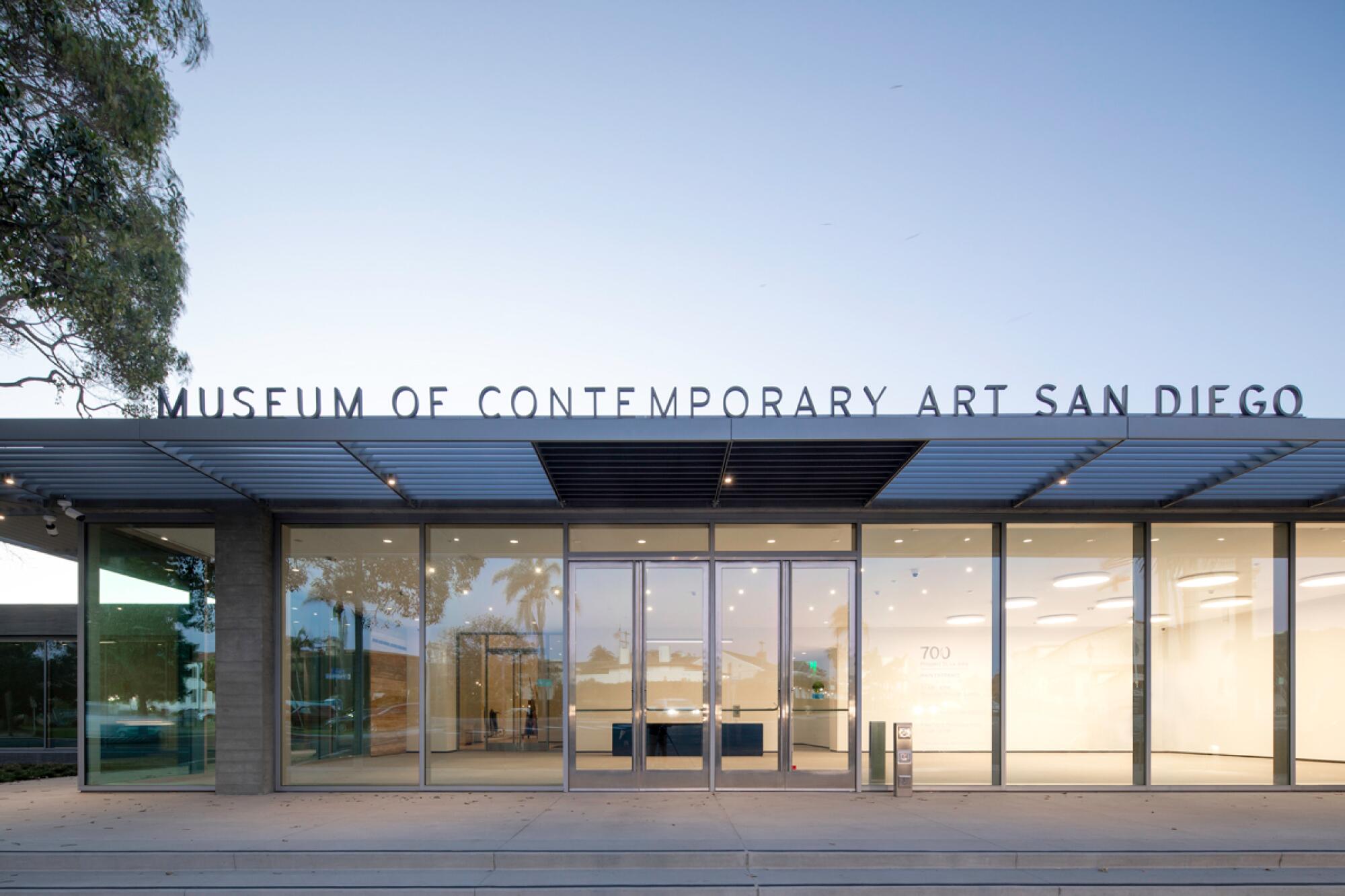
SAN DIEGO — In 2018, dozens of critics and scholars signed an open letter to the Museum of Contemporary Art San Diego condemning a proposed renovation and expansion of its La Jolla building by New York-based Selldorf Architects, describing it as “a tremendous mistake.” Four years out, that renovation and expansion is complete.
The short of it: The critics were wrong.
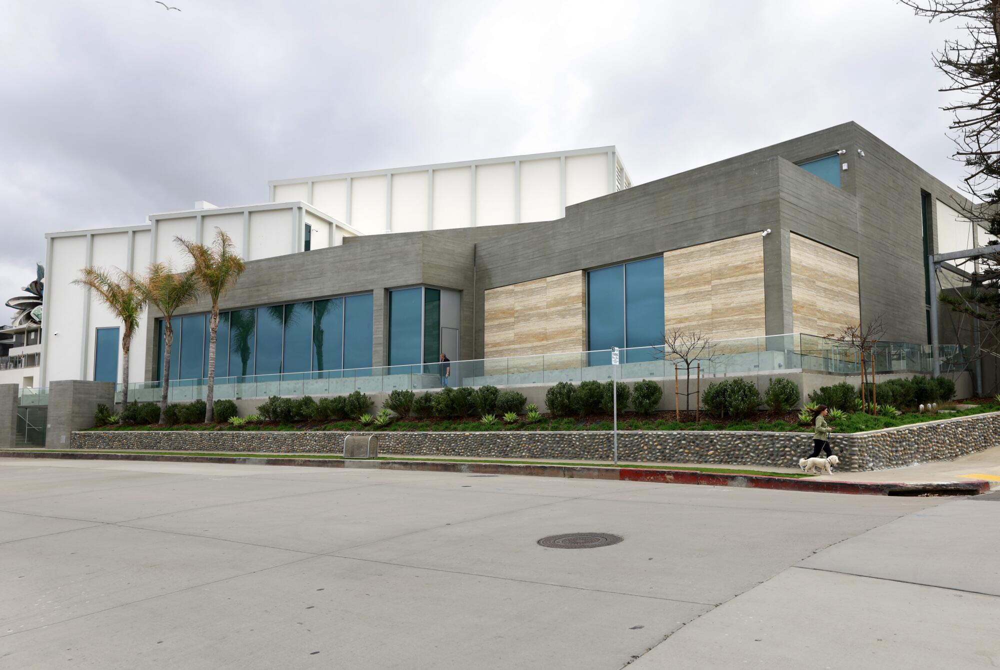
The redesign, led by the firm’s founder, Annabelle Selldorf, has gracefully unified a jumble of buildings from various eras, added 30,000 square feet of gallery space and reoriented the entire structure to the stunning feature it had long turned its back on: the Pacific Ocean.
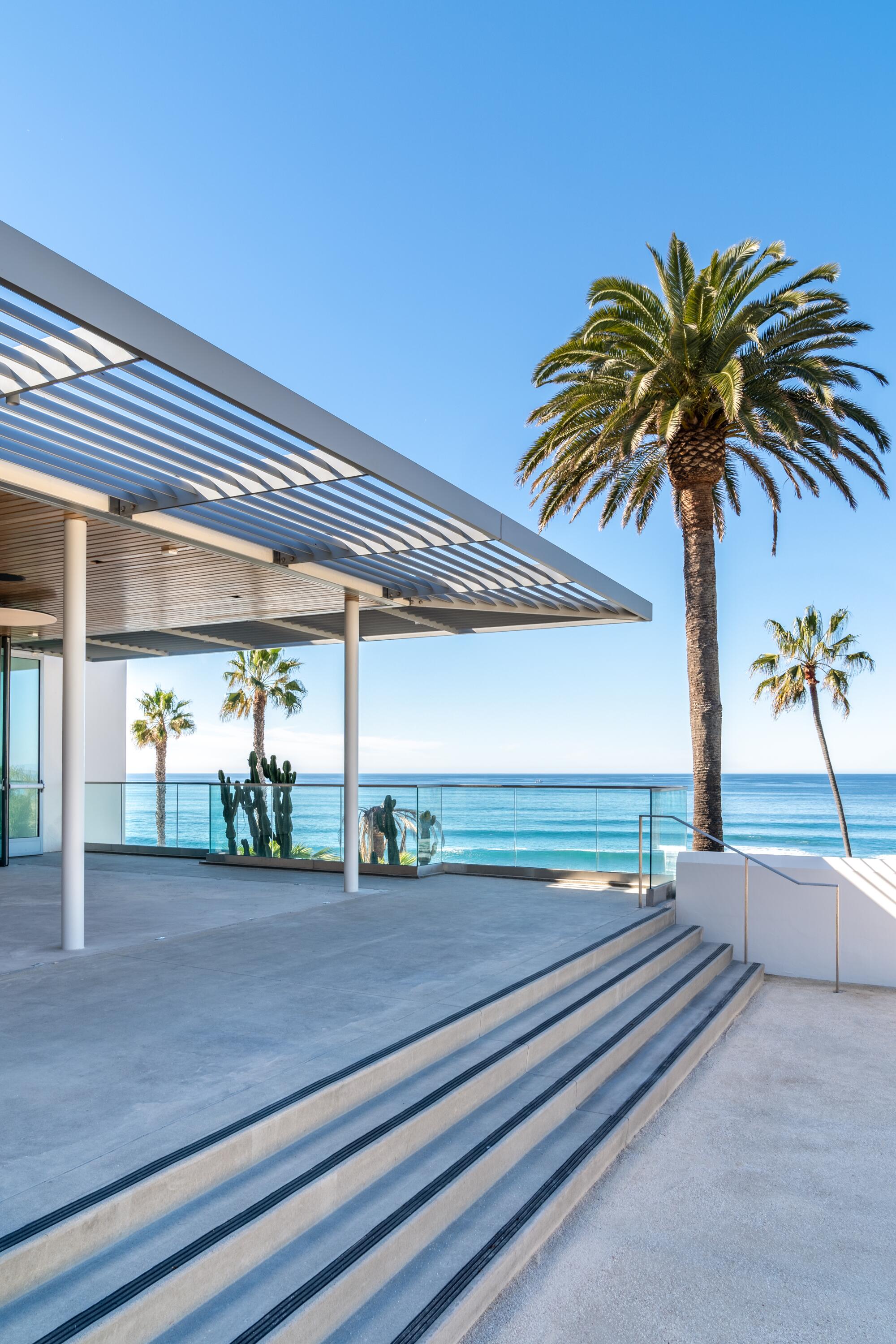
On the northern end of the property, a new public art park boasts terrific views of the water. It’s an infinitely better use of the space than what was there prior to the renovation — MCASD‘s parking lot and a dumpster. It had to be the most extravagant dumpster real estate in all of California.
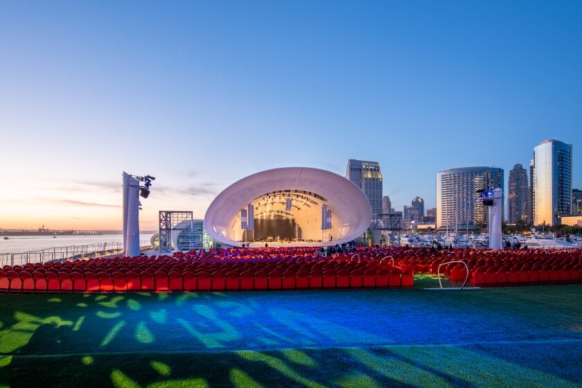
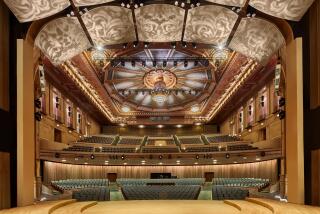
A San Diego guide for architecture-loving locals and tourists alike, with two sparkling new museum renovations, a seaside bandshell and more.
The museum, which reopened to the public on April 9, now has a more prominent entrance, improved circulation routes and greater accessibility — including a wheelchair lift on the western side of the building, which can draw a visitor straight up to the terrace areas rather than requiring a zigzag journey up a very steep grade.
It has also made critical improvements to back-of-house functions. In the old structure, for example, the freight elevator opened right into the middle of a gallery, which meant that, for aesthetic purposes, drywall was frequently used to hide the infrastructure. Getting art into and out of the building required — quite literally — ripping out walls. Now the freight elevator leads to a transition space between galleries and is protected by a large panel that can be easily opened and closed.
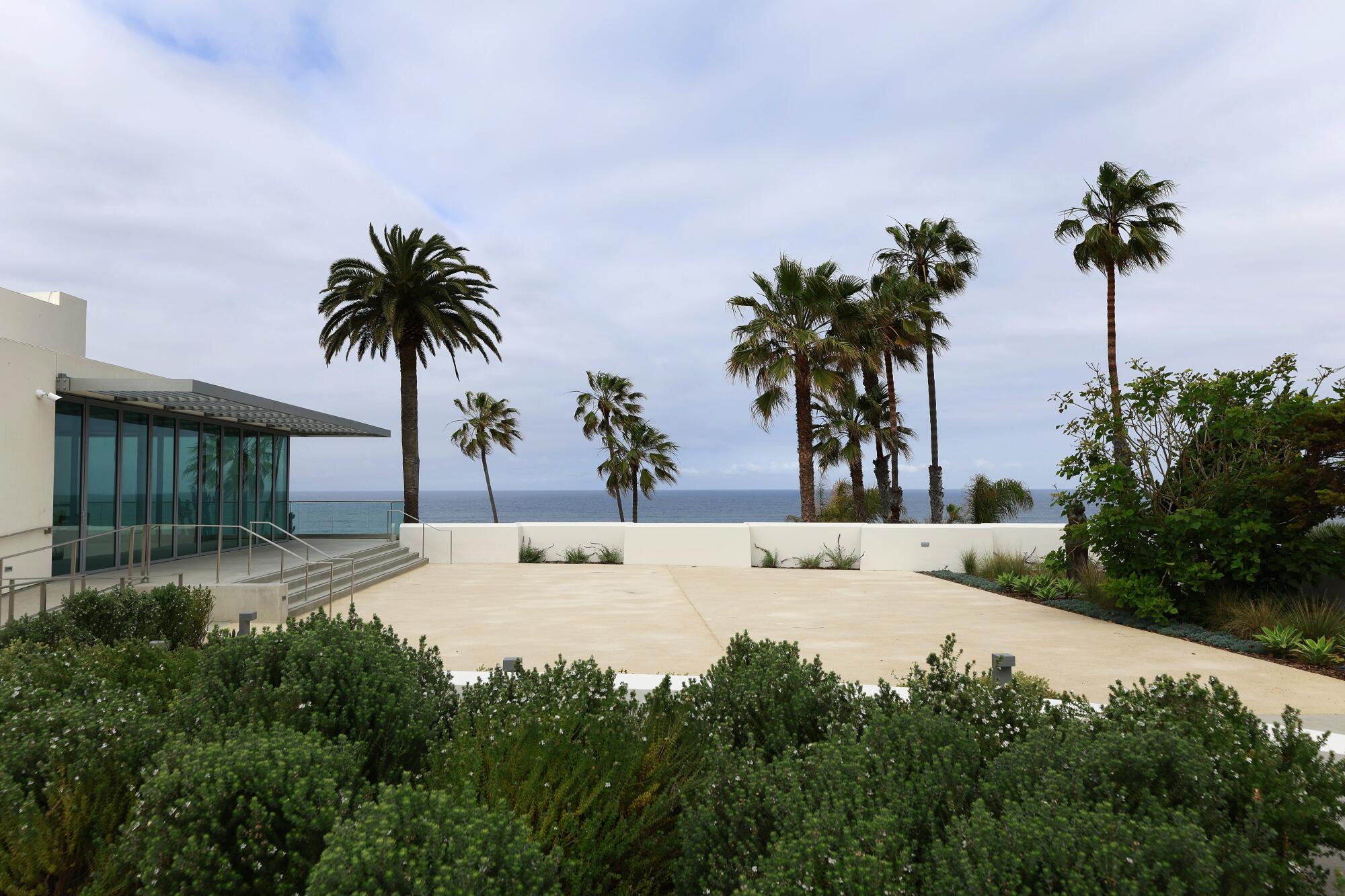
It makes sense that La Jolla’s Museum of Contemporary Art San Diego sits next to the Pacific Ocean, since its buildings are a bit of an architectural coral reef: a series of accretions that have been added to, subtracted from and reconfigured for decades.
It’s been a long road to get there.
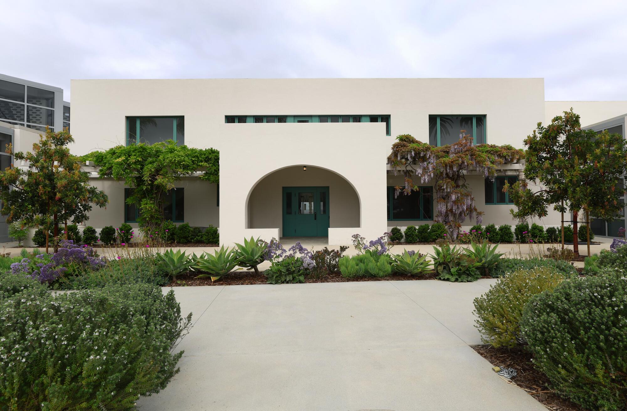
MCASD’s accretion of buildings began life as a residence designed and built by early Modernist Irving Gill for philanthropist Ellen Browning Scripps, completed in 1916. By the 1940s, that building had been converted into an art center, and as its needs grew, so did the architecture. In 1950 and 1960, expansions by San Diego firm Mosher Drew added gallery space around the residence, as well as a theater.
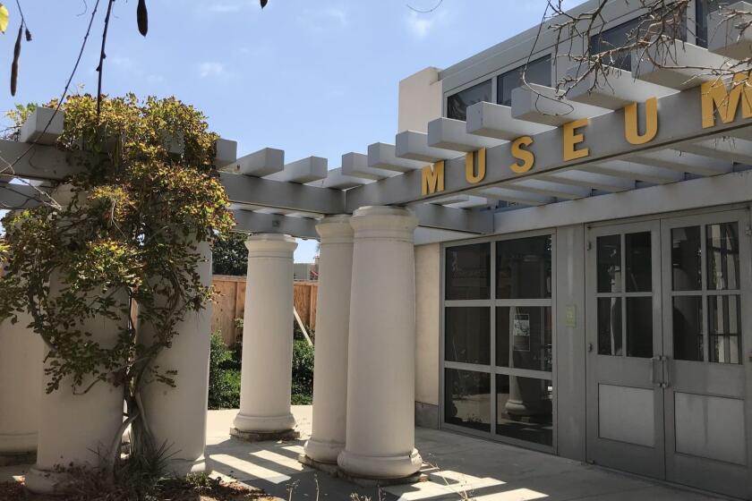
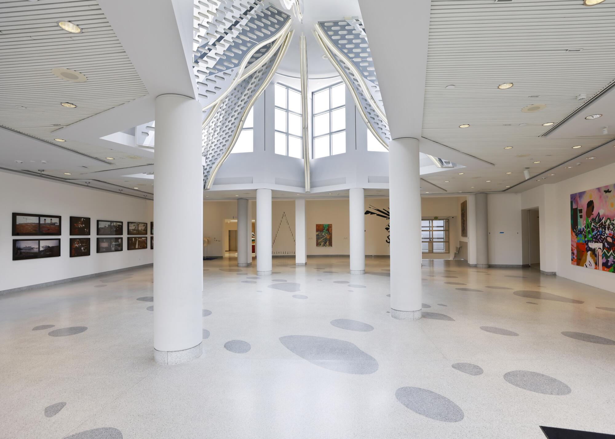
Another expansion in 1996 by Venturi, Scott Brown and Associates, the Philadelphia firm founded by famed postmodernist Robert Venturi and his partner Denise Scott Brown, removed portions of the Mosher Drew design and rebuilt Gill’s graceful facade — including a lovely, arched sun porch — which they framed with pergolas of bold Doric columns. The additions also included a cafe, a three-acre sculpture garden with ocean views and a new entrance: Axline Court, a star-shaped atrium that features a series of decorative fins that descend from the ceiling and are bordered in neon light.
The atrium brought a splash of postmodern drama to an otherwise low-key structure.
By 2014, however, MCASD was ready to expand yet again since the museum had no dedicated space for its permanent collection.
Selldorf’s plan reimagined the theater as a double-height gallery space and extended the museum’s exhibition areas into an adjacent property that had been acquired by the museum roughly a decade before. But controversy emerged with the plan to relocate the main entrance to the new wing and remove the pergolas that had been added to the complex by Venturi, Scott Brown (now known as VSBA). Among other things, the open letter alleged that the moves would turn Axline Court into an “empty atrium” and that relocating the entrance to the south was “a slap in the face to Gill.”
Neither of those eventualities has come to pass.
Axline Court remains its exuberant postmodern self and still functions as a critical juncture. For one, it is a vital point of connection between the museum’s northern and southern wings — and interestingly, currently the site of an installation of works by artists from San Diego and Tijuana. It also serves as a free public gallery and point of access to the ocean-view terraces and sculpture garden on the western side of the building — no admission necessary. At night, the atrium’s neon lantern remains visible from the street.
And the Gill facade? It pops.
In fact, it’s hard to imagine that it might be overlooked next to the cafe and the new ocean-view art park. Moreover, judicious plantings around the structure prevent it from being overwhelmed by the scale of what is now the museum’s longer, albeit still low-slung, facade. Removing the Venturi, Scott Brown pergolas has made Gill’s design more visible than ever. And these structures haven’t completely disappeared from San Diego; one of them can now be found right up the block in the garden of the La Jolla Historical Society.
Ultimately, Selldorf and her team have found a way of elegantly knitting together all of the spaces from the various historic eras but also allowing each of these eras to shine through. To walk along Prospect Street and Coast Boulevard, the two thoroughfares from which MCASD is most visible, is to go on a tour of 20th century architectural history: Gill’s intimately scaled early Modern work, Mosher Drew’s Midcentury boxes and Venturi, Scott Brown’s arched facades — which were inspired by Gill’s architecture (such as the La Jolla Woman’s Club, located across the street). To this, Selldorf added her own vocabulary in the new wing: simple board-formed concrete volumes clad with travertine, which give the new building a sedimentary feel — a visual nod to the coastal cliffs on which the museum resides.
One of the principal charges of the renovation, says MCASD Director Kathryn Kanjo, “was to give us more space and be mindful of who we are, of our history, and opening it up.”
At a time when architecture seems to be obsessed with grand gestures — the pyramidal apartment building, a bird-shaped train station, the car museum in flames — one would think design has become all about cranking out the instantly Instagrammable object.
The $105-million renovation was led by Selldorf, with a team of designers and architects from her 70-person New York City office, including Sara Lopergolo, Wanda Willmore, Ryoji Karube and Corey Crist. The San Diego-based LPA Inc. served as executive architects.
San Diego’s second museum redesign: The Mingei
The MCASD project is one of two recent museum revamps in San Diego that stand out for their surgical dexterity and artful restraint. A $55-million renovation and expansion of the Mingei International Museum by LUCE et studio, a six-person San Diego firm founded by Jennifer Luce, has added 10,000 square feet of space to the nearly four-decade-old craft and design institution housed in Balboa Park. And it’s helped transform the museum’s relationship to the public spaces around it.
The makeover reimagines a structure that could have been trapped in historic amber had the architect or the museum’s leadership, led by CEO and Executive Director Rob Sidner, been less ambitious.
The House of Charm, as the building that houses the Mingei is more formally known, was designed by Carleton Winslow under the direction of supervising architect Bertram Goodhue (the creator of L.A.’s Central Library) for the 1915-16 Panama-California Exposition. Like many structures in the park, it draws from a mix of colonial architectural styles, including Mission Revival and Spanish churrigueresque — much of it inspired by Mexican religious architecture of the colonial era. (Balboa Park is a veritable fetish feast of all things Spanish colonial.)
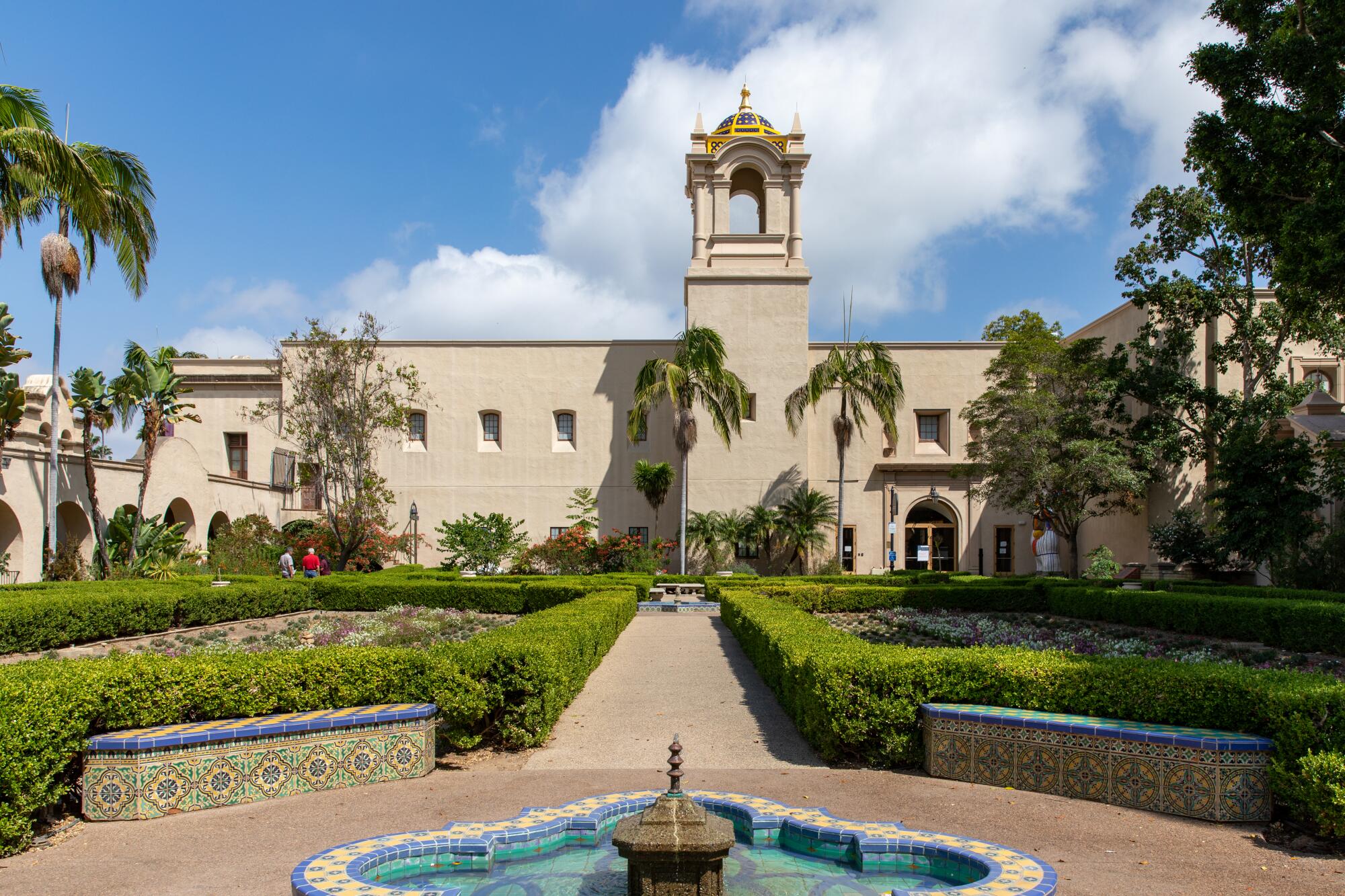
But the building was intended more as showpiece than as habitable structure. “Like many exposition buildings, these buildings are just about the facade and how they make space within the landscape,” says Luce. “The interior was just a box.”
Nor were they designed for the long haul. In the 1990s, the House of Charm was torn down and rebuilt due to structural issues — making it a historic structure that is ersatz in nature, not to mention several levels of meta: a historic structure that is a reconstruction of a historic structure that was itself a copy of historic designs from Mexico.
Luce and her team — which included Ann Worth, Kei Tsukamoto and Lori Krause — began with the ground floor: reimagining a space that in its previous incarnation had been architecturally closed off from the street, with little access to daylight, its prime point of entry obscured by a wall of vegetation and an arched esplanade.
Previously, visitors to the building would have been greeted by a reception desk and an elevator bank, followed by a warren of exhibition areas. The architects have now reimagined this space as a wide-open public commons that visitors can traverse without having to pay admission. The area now buzzes with activity.
Blind arches were punched out to make way for windows. A new entry was added on the western side of the building, which now allows a direct point of access to the Alcazar Garden, a lovely formal garden inspired by the landscapes at Seville’s famed Moorish palace, the Real Alcázar.
The architects then consolidated the Mingei’s gallery functions on the second floor, which opened up the lobby to a new contemporary restaurant (Artifact), a coffee counter (Craft), a gift shop and a stepped public seating area where you can simply take a seat and relax. Around the lobby, vitrines and wall hangings feature works from the permanent collection — including an exquisite (and functional) cherrywood bench by celebrated woodworker George Nakashima — thereby functioning as a free public art space.
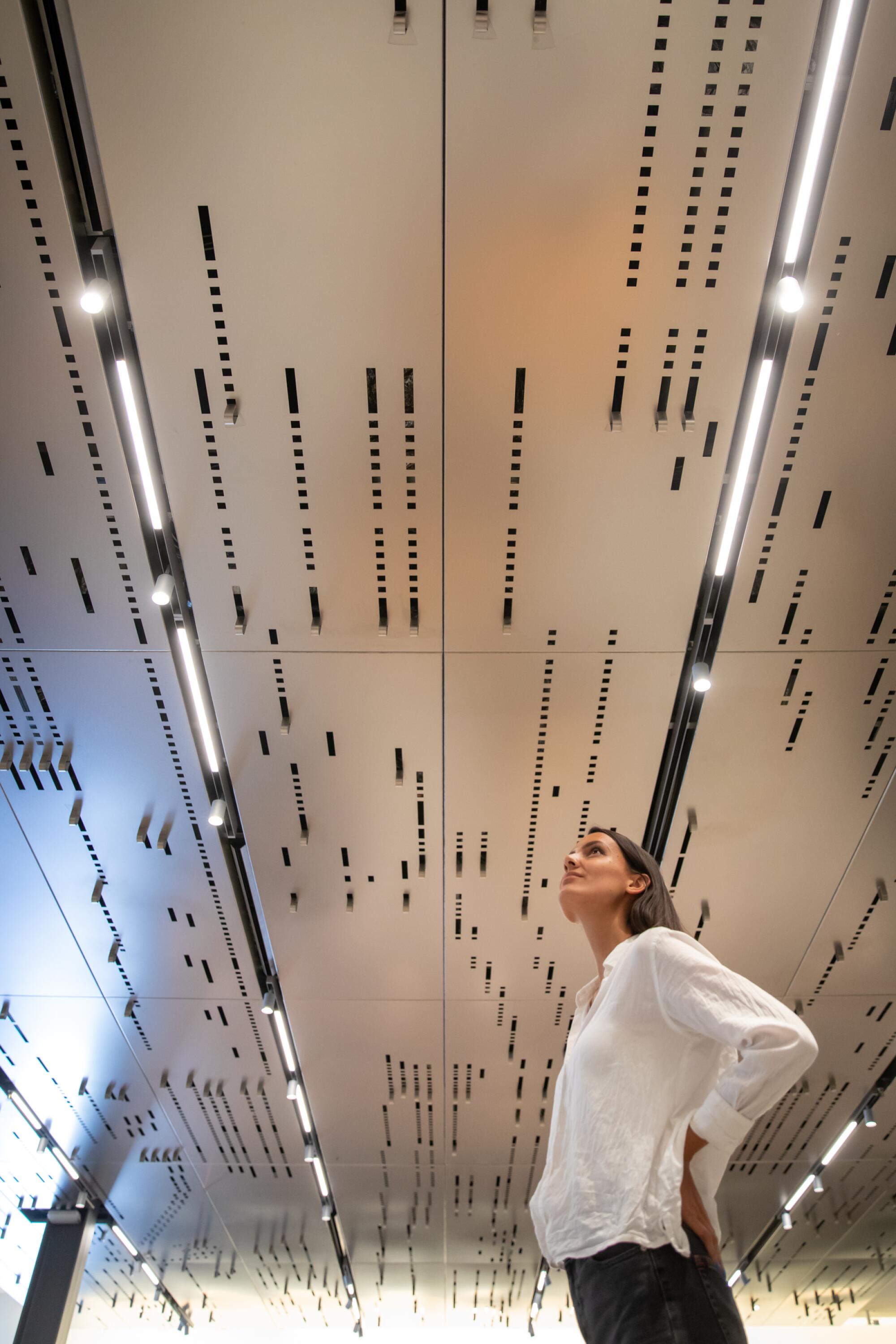
Luce, in collaboration with metals fabricator A. Zahner Co., also designed a ceiling canopy for the lobby, titled “Suspended Refrain,” which harkens to the geometric patterns of player piano rolls. Made of die-cut stainless steel, the design renders the player piano roll for the late-‘60s jazz standard “What Are You Doing the Rest of Your Life?” that was popularized by Barbra Streisand. It’s a sleek bit of design that updates the museum’s aesthetics while nonetheless harkening to vintage craft.
Some of the most dramatic improvements are the ways in which Luce and her team have deftly reimagined existing spaces. A loading dock on the building’s southern end, which had long lay unused due to its steep grade and awkward angle, was reimagined as a small, ground-floor theater space with a pleasant outdoor patio on top. (The patio connects to the restaurant at lobby level.)
On the second story, a series of terraces, which had long been blocked off, were rehabilitated — and now provide postcard views of Balboa Park.
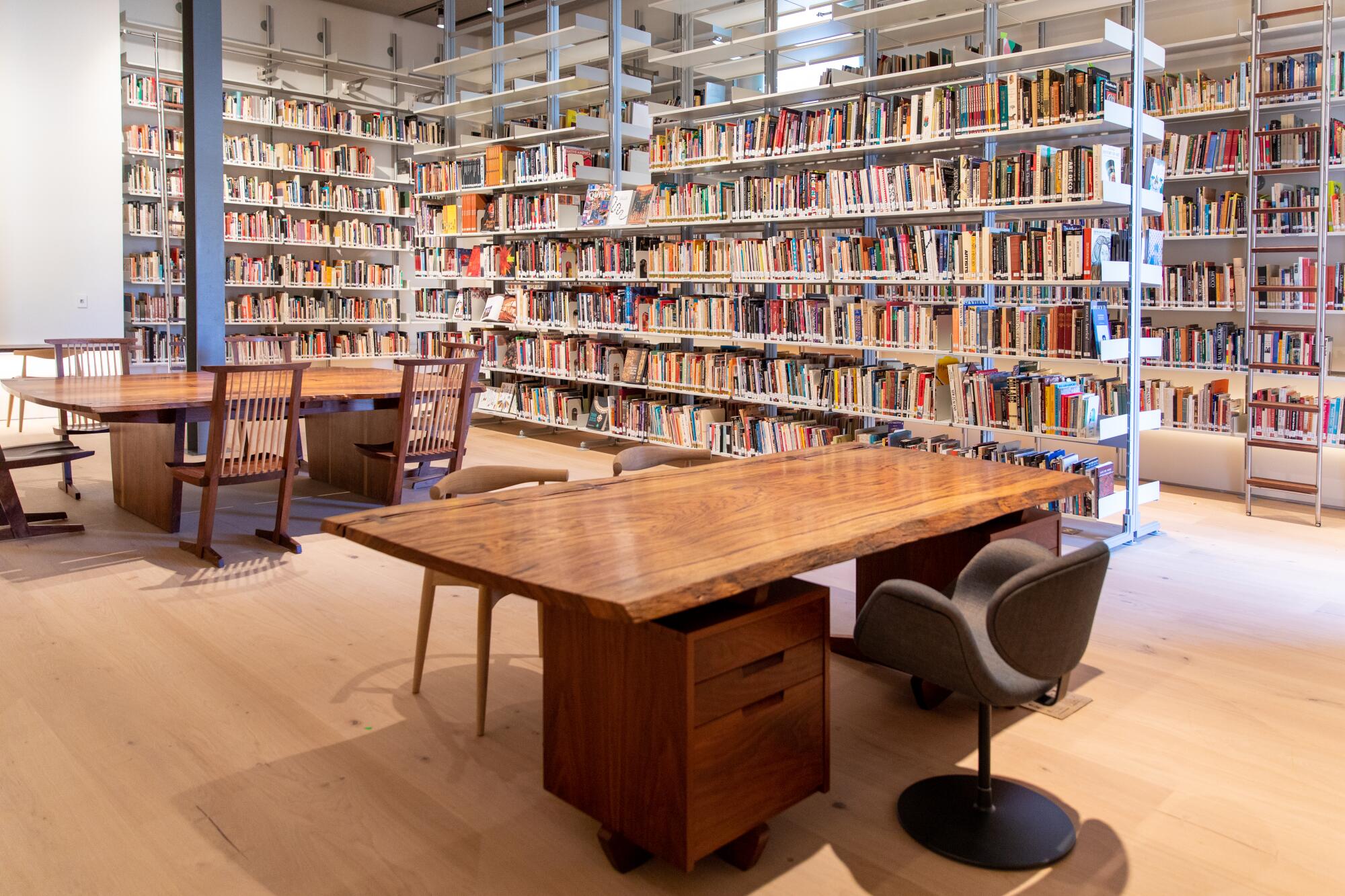
The Frances Hamilton White Art Library, a reference space, had been hidden away at ground level. Now it has been reimagined as a light-soaked study space on the second floor — complete with a walnut and hickory study table designed by Nakashima and Vitsoe 606 modular shelves developed by German industrial designer Dieter Rams (a system so notable it resides in the permanent collection of New York’s Museum of Modern Art). For design bibliophiles, it is a fantasy space.
One of the more remarkable touches is the new staircase.
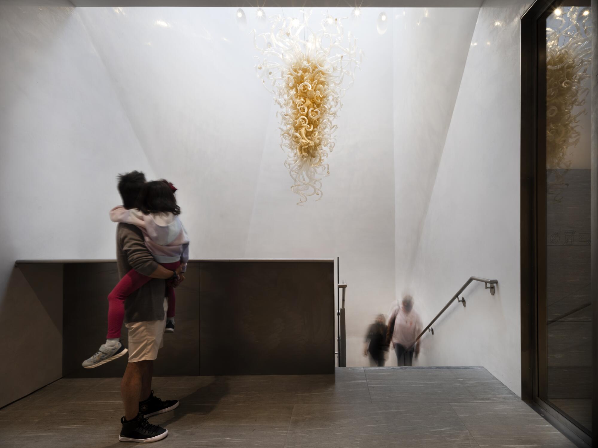
Though the building has a tower, it had been unused. As part of the renovation, the architects carved into it, inserting a staircase into its shaft. But rather than leave the shaft as a plain rectangular prism, Luce and her team created a series of subtle, origami-like folds in the walls around the stairs, which are capped at the top by a skylight. Throughout the day, the sun plays on these forms and on the Dale Chihuly chandelier suspended in the space.
(I could do without the Chihuly, but the museum is so well designed, I’ll give it a pass.)
Challenges lead to innovation
The renovations of MCASD and the Mingei are very different projects at very different scales, but they share certain qualities: difficult sites (both sit on steep lots with grades that drop by at least a story), historic architecture that needed to be upgraded for the 21st century, even as key aspects needed to be preserved, and the conversion of insular structures into ones that better engage the Southern California environment.
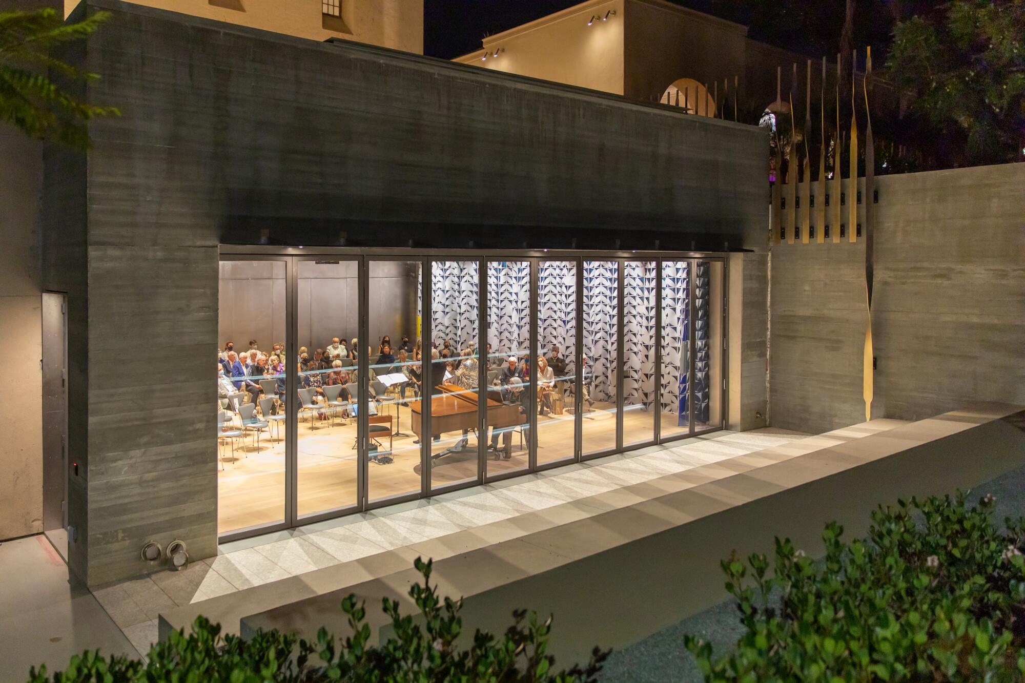
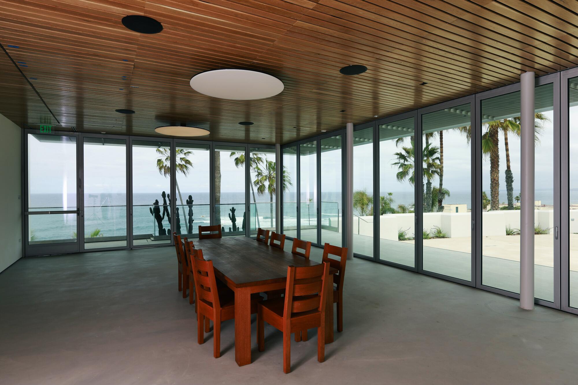
Both projects, in fact, are thoughtful about the ways in which they integrate fresh air and the outdoors into the museum experience, rather than simply encasing visitors in vast tombs of HVAC. At the Mingei, the new ground floor theater can be transformed into an indoor/outdoor amphitheater with the retraction of a 40-foot glass wall. At MCASD, there is the Sahm Seaview Room, in which Selldorf Architects took what was once the cafe’s loading dock and transformed it into a glass-walled event space that can be fully opened to connect with the outdoor art park.
These design moves, conceived prior to the pandemic, now feel incredibly prescient.
The niceties don’t come at the expense of the museum experience.
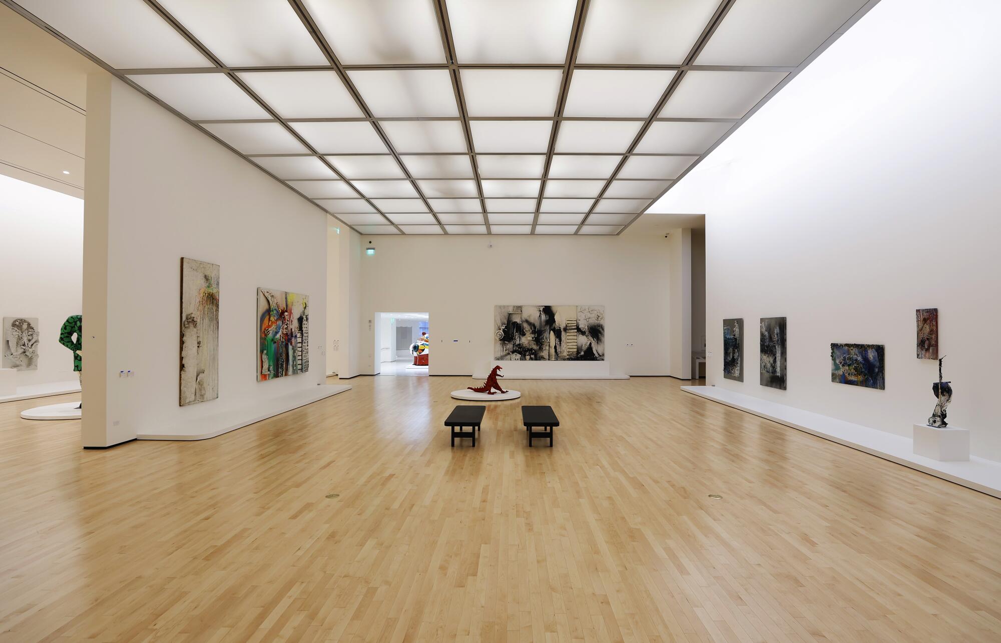
At MCASD, a museum that previously had a slightly confused circulation route, I was struck by Selldorf’s thoughtful sightlines, the ways in which the dimensions of the spaces vary to accommodate works of different scales, the shifting amounts of daylight that penetrate the different galleries, the windows that frame trees and slivers of ocean, the doorways that offer portals from the architecture of one era into another.
Selldorf is no stranger to museum architecture — nor is she a stranger to rethinking preexisting museums. She has led redesigns and updates of the Neue Galerie in New York and the Clark Art Institute in western Massachusetts. In 2018, she and her team helped design a reinstallation of the permanent collection at the High Museum in Atlanta.
In 2016, when Selldorf was still in the process of conceiving MCASD’s design, I asked her what it was like to reimagine a campus that contained works by so many notable architects. “You do it with a trembling hand,” she told me. “And you try to do everybody justice.”
Her hand did not tremble. And MCASD is a better experience for it.
More to Read
The biggest entertainment stories
Get our big stories about Hollywood, film, television, music, arts, culture and more right in your inbox as soon as they publish.
You may occasionally receive promotional content from the Los Angeles Times.
