Commentary: Critics say a San Diego museum’s Postmodern entry should be preserved. But why keep what doesn’t work?
Reporting from La Jolla — It makes sense that La Jolla’s Museum of Contemporary Art San Diego sits next to the Pacific Ocean, since its buildings are a bit of an architectural coral reef: a series of accretions that have been added to, subtracted from and reconfigured for decades.
A proposal for a new layer, however, has sparked architectural controversy.
An expansion by New York-based architect Annabelle Selldorf, scheduled to begin next month, would relocate the museum’s main entrance to the south and remove pergolas added by renowned Philadelphia architects Robert Venturi and Denise Scott Brown in 1996. (He is a Pritzker Prize winner; she, an acclaimed urbanist.)
The plan inspired more than seven dozen critics and architectural historians, including Pulitzer Prize winners Paul Goldberger and Inga Saffron, to sign an open letter to the museum describing the changes as “a tremendous mistake” that would “irreparably” damage a cultural landmark and “severely” weaken “La Jolla’s beloved village center.”
In Dezeen magazine, Mimi Zeiger called the Venturi-Scott Brown design “a key part of the duo’s ouevre.”
That last point is questionable. The addition by the pair’s firm, Venturi, Scott Brown and Associates (known as VSBA), simply isn’t comparable to their other major projects. Their critically praised Sainsbury Wing at London’s National Gallery has been given protected status by England’s culture secretary.
A temple to architectural purity, MCASD La Jolla is not.
The museum began life in 1941 as the Art Center in La Jolla, transforming a graceful residence that Modernist architect Irving Gill had designed on a steep La Jolla hillside plot for philanthropist Ellen Browning Scripps in 1916. By the 1950s, the La Jolla Art Museum, as it was then called, had expanded, with the San Diego firm Mosher Drew (known for its design of the swooping Coronado Bridge) enveloping the Gill residence in a new structure that added gallery space. The next decade, Mosher Drew added a boxy auditorium to the south that connected to the museum via a rectilinear portico.
The Mosher Drew structures were exactly the sort of rigid International Style Modernism that Venturi — who is known for conceiving the oft-recited architectural dictum “less is bore” — has spent his career rebelling against. When Venturi and Scott Brown landed in La Jolla in the 1990s — after a 1992 name change for the institution to the Museum of Contemporary Art, San Diego, and later, MCASD La Jolla after the 2007 opening of a downtown San Diego location — the first thing they did was scrap the Mosher Drew portico. They wrapped a portion of the building in an arched facade and chipped away at the 1950s structure, restoring (in a way) the arched sun porch of Gill’s original Scripps house. This, they framed with pergolas composed of bold, Doric columns.
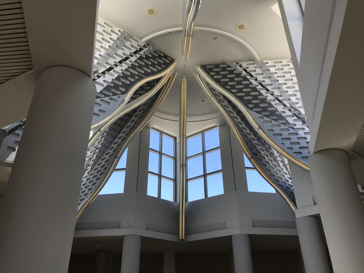
Venturi and Scott Brown also devised a new entrance to the museum that they sandwiched between the two Mosher Drew buildings: Axline Court, a flamboyant, Postmodern atrium capped by a star-shaped clerestory window and a neon-tipped decorative “lantern.” (Think: shining architectural fins that descend from the ceiling.)
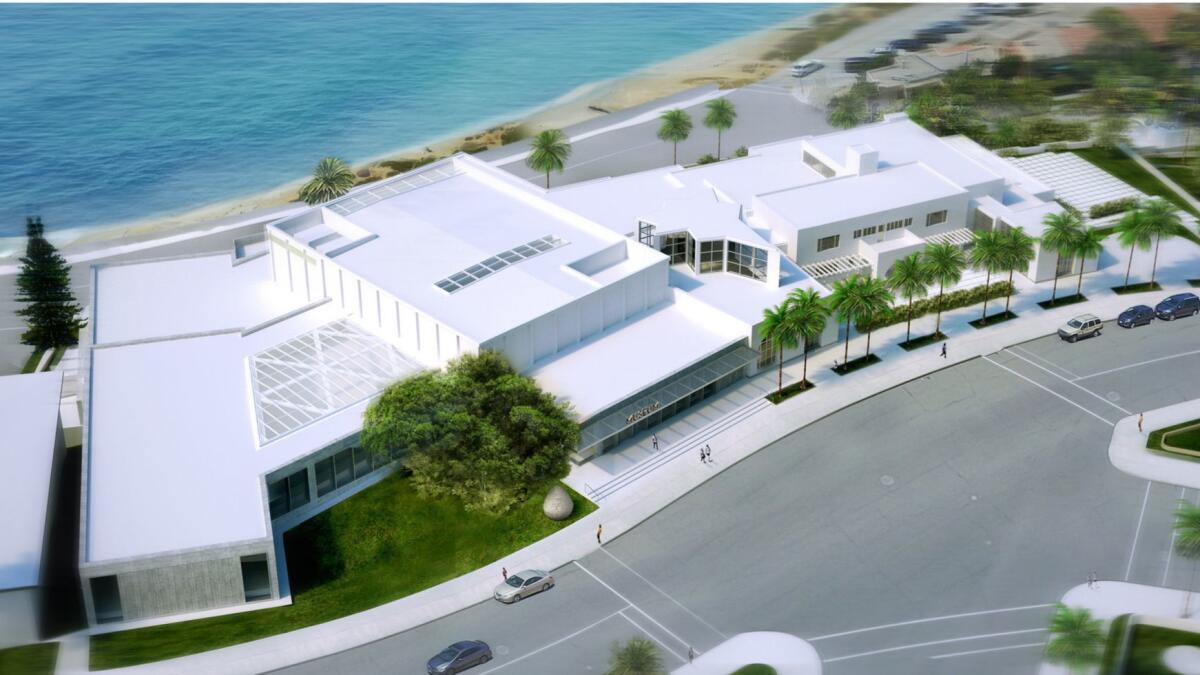
Now, MCASD La Jolla is set to be reconfigured again. Selldorf, whose firm is known for work on historic museum buildings — including the Clark Art Institute in Williamstown, Mass., and the Neue Galerie in New York — has been charged with adding 30,000 square feet of gallery space — the museum currently has no dedicated space to show its permanent collection — which she will achieve by transforming the auditorium into galleries and by adding another hall on a newly acquired property to the south.
To weave this Franken-complex together, she is removing a portion of VSBA’s arched facade and the pergolas. She is also shifting the museum’s main entrance to the south, aligning it with Mosher Drew’s auditorium building, which means that Axline Court will no longer serve as the principal point of access — though it will remain as a gathering space. It is these latter moves that have raised a critical outcry.
First and foremost, there is the question of the entrance.
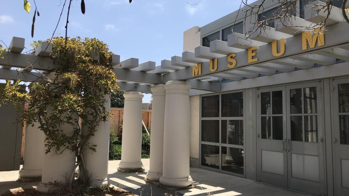
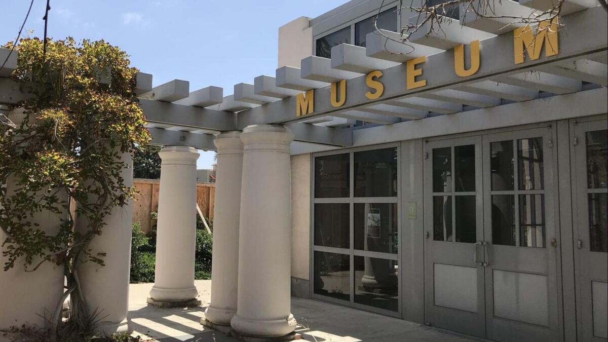
As part of their 1990s re-do, Venturi and Scott Brown placed the main doorway to the museum behind their concrete pergola, where it was not only difficult to find but also competed visually with the rebuilt arched sun porch of the newly uncovered Scripps house a few feet away — an entryway that, ironically, no longer served as entrance.
Confusion over the location of the entrance was such that about a year after the expansion was completed, the museum asked the architects to devise some sort of signage that would help point the way, hence the addition of the word “MUSEUM” in yellow capital letters above the correct doorway.
Goldberger, who was architecture critic for the New York Times and the New Yorker before becoming a contributing editor at Vanity Fair, is one of the major figures who signed the open letter condemning the Selldorf plan. In 1996, he wrote a glowing review of the Venturi Scott Brown expansion in the New York Times, describing it as “an exquisite project.” But in the piece, he also noted the awkward position of the entrance, which required visitors to “make an illogical turn to the left to arrive at the front door.”
Goldberger said this was a minor issue, in light of the museum’s “graceful composition” and its “public presence on the streets of La Jolla.” But as someone who has directed disoriented visitors to the entrance on numerous occasions, I would argue that an important part of a public institution’s public presence is a clear and welcoming doorway.
Then there is the matter of the pergolas.
In a 1996 review of the expansion, Los Angeles Times art critic Christopher Knight noted that the pergolas designed by VSBA echoed the delicate lines of a Gill-designed pergola that hugs the facade of the Scripps house, but that it did it on a much larger scale in “clever” “Toontown” fashion. The pergolas also serve to frame the Gill house, setting it apart from the street and the rest of the museum’s facade.
The petition argues that removing the Venturi, Scott Brown pergolas would “prevent visitors from experiencing [the Scripps house] in the way Gill intended: from the intimate, pedestrian-scaled space in front of it.”
But at this point, it’s hard to say what exactly we are experiencing of Gill’s original architecture.
When Mosher Drew wrapped its own building around the Scripps house in the 1950s, a portion of the Gill house was torn down during construction. This included demolishing the original sun porch, stripping part of the facade and filling in windows. In a lecture delivered in 1979, architecture critic Esther McCoy described watching pieces of the structure come down: “I saw the wrecking company razing it. Real labor to destroy a Gill building.”
So when VSBA uncovered the Gill structure, it wasn’t simply uncovering. It was also rebuilding. And to their credit, the architects went to terrific lengths to get it right: using poured concrete where Gill had used poured concrete and reinserting windows that matched the ones in historic photographs of the house.
The Scripps house now largely exists as fragments embedded in the larger museum, the most complete original portion of which is the entry foyer. And even that is not in its original state: It was refurbished first by Mosher Drew, then by VSBA, which added gray wainscoting. (One can only imagine what Gill, who was all about stripped-down Modernism, would make of wainscoting.)
Lastly, there are the issues of urban planning.
One of the principal arguments for leaving the current design untouched is to preserve the ways in which the museum relates to the streets of La Jolla. “Its street frontage, museum store and cafe extend the rhythm of Prospect Street’s lively storefronts,” reads the petition, “celebrating the museum’s location in the village commercial center and drawing visitors towards the building.”
In my experience, that is an optimistic view of how the museum relates to the street.
Although the museum sits within a commercial zone, it is at a point where the area grows increasingly residential. Pedestrian traffic tends to peter out two blocks away, both on Prospect Street to the north and Silverado Street to the east. One of the closest commercial sites to the museum is a restaurant more than a block away that was recently shuttered for renovations and shows no signs of reopening. Most folks who land at the museum arrive intentionally, not because they happen to wander in.
Moreover, the critical focus on the street ignores the site’s larger natural context: namely, the Pacific Ocean.
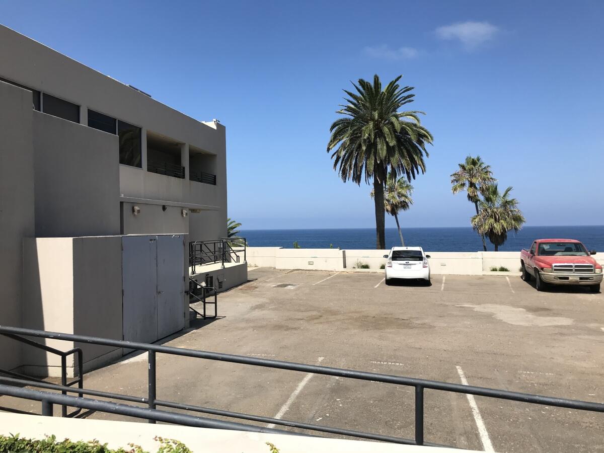
For whatever reason, MCASD La Jolla has historically turned its back on this incredible feature — with loading docks that offer views of the water and a sidewalk cafe that overlooks ... asphalt.
Moreover, if, as intended, you approach the museum by walking south on Prospect Street, the first thing you encounter on the museum’s property is not a garden, cafe or gallery. It’s the parking lot — a parking lot with resplendent views of the ocean where I’ve seen families (including my own) pose for group pictures amid the parked cars. It is absurd.
In their design, Venturi and Scott Brown smartly dealt with some of these challenges. The architects sliced windows into Mosher Drew’s more oppressive structures, allowing visitors glimpses of coastline in galleries that had once been boxed in. And they linked the ocean-view garden on the site’s eastern slope — now the Edwards Sculpture Garden — with the museum for easier access. (Previously, it was accessible to the public only from Coast Boulevard; the garden will remain unchanged in Selldorf’s design.)
In her redesign, Selldorf is working to reorient the entire museum complex to the ocean, its best asset. Parking will go underground, allowing for a public park, a more pastoral place to enjoy ocean views. Other spaces that engage the Pacific will include terraces, meeting rooms, an event space. In this regard, her makeover is overdue.
Postmodern architecture is experiencing a critical moment. It is at a point where it looks old enough to be outdated — too flamboyant in our age of austere iPhone minimalism — but not old enough to have achieved the status of venerable. Iconic structures, such as Michael Graves’ Portland Municipal Services Building in Oregon and Philip Johnson’s AT&T Building in New York (now the Sony building) have faced the threat of wrecking balls and ill-conceived renovations.
I am wary of erasing architectural history. But as Aaron Betsky noted in a column in Architect magazine about the case of MCASD La Jolla, “advocates are asking us to preserve a building that has a somewhat confused organization, banal spaces and ridiculous ornamentation.”
Selldorf’s plan holds on to elements of the site’s myriad design histories — to which she will add her own story. In a way, it’s in keeping with the museum’s own history as a place of continuous architectural evolution. There is no reason that evolution should stop in the 1990s.
ALSO
Museum of Contemporary Art San Diego expansion is a ‘mistake,’ critics say in an open letter
Postmodern architecture at risk, Part 2: The saga shifts to Chicago
Sign up for our weekly Essential Arts & Culture newsletter »
[email protected] | Twitter: @cmonstah
More to Read
The biggest entertainment stories
Get our big stories about Hollywood, film, television, music, arts, culture and more right in your inbox as soon as they publish.
You may occasionally receive promotional content from the Los Angeles Times.


