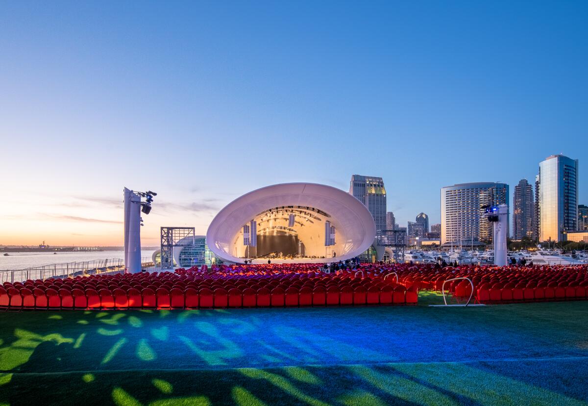
The Rady Shell at Jacobs Park, the new outdoor home of the San Diego Symphony, is one of several recent architectural projects in San Diego.
(San Diego Symphony)
A critic’s guide to San Diego’s new architecture — with a tour of beloved classics
San Diego has a lot going on architecturally: a pair of newly renovated museums, a new bayside band shell and buildings that, over the last decade, have helped redefine the skyline of the city.
Here’s a critical guide to what’s new, along with a few classics — as well as a hot tip on where to find churros.
Selldorf Architects’ renovation of MCASD in La Jolla and LUCE et studio’s redo of the Mingei museum give two established institutions a needed reset
Showing Places
(studio MAHA)
Museum of Contemporary Art San Diego — La Jolla
San Diego Arts
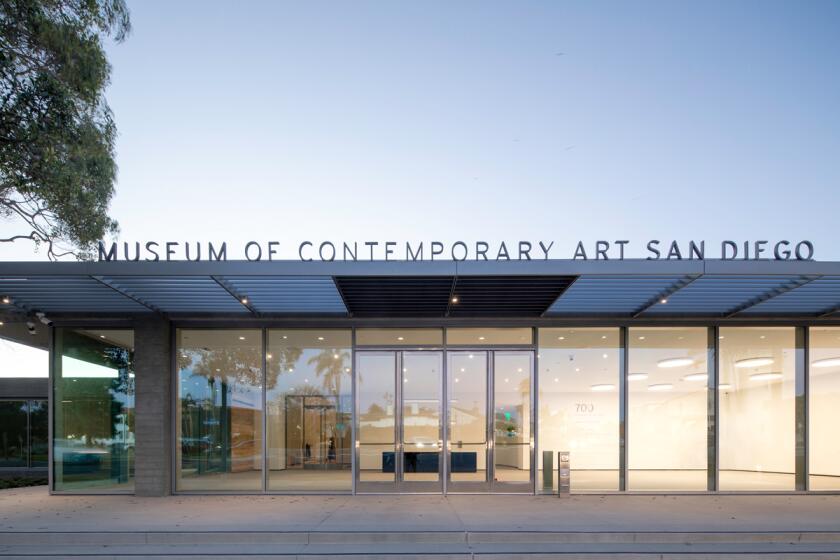
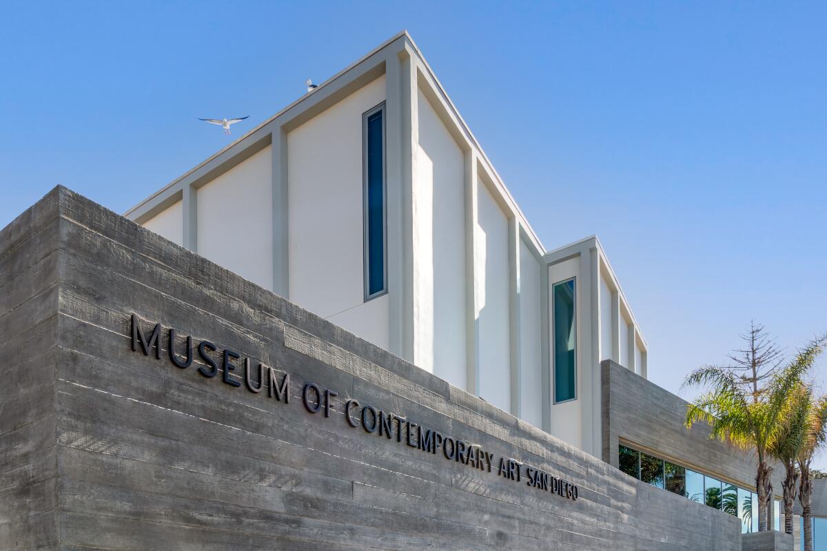
The Museum of Contemporary Art San Diego is looking spiffy after an extensive $105-million renovation by New York-based Selldorf Architects, founded by Annabelle Selldorf. Her firm’s redesign added 30,000 square feet of gallery space and artfully reoriented the entire complex toward its best asset: the Pacific Ocean, which sits, quite literally, across the street. The museum now features several new ocean view terraces and an outdoor art park.
The renovation did not entirely do away with what was there before. Still visible is the graceful facade of the 1916 home Irving Gill designed for philanthropist Ellen Browning Scripps. Elsewhere, you can find the midcentury galleries added by Mosher Drew, the San Diego firm that designed the Coronado Bridge, as well as the exuberant spaces created by legendary postmodernists Venturi, Scott, Brown and Associates — such as Axline Court, a star-shaped atrium capped with a series of decorative fins trimmed in glowing neon.
To this collection, Selldorf added a new wing that features a more visible entrance and a suite of brand-new galleries whose exteriors are clad in board-formed concrete and travertine — a nod to the sedimentary nature of the nearby coastal cliffs.
Don’t have time for the entire museum? Axline Court, the ocean view terraces and the Art Park are totally free.
Read All Read Less
Route Details

(Gary Payne)
The Rady Shell at Jacobs Park
Arts
The San Diego Symphony has a new outdoor summer home and its location couldn’t be more jaw-dropping: the Rady Shell at Jacobs Park, set on 3.7 acres on a spit of jetty that extends into the San Diego Bay and offers views of both downtown and the Coronado Bridge in the distance. And that’s just the location. The $85-million project also includes a dramatic tensile canopy bandshell that resembles, from certain angles, the protective exoskeleton of a gargantuan sea creature.
Designed by San Diego-based Tucker Sadler Architects and Soundforms Design Partners in London, the venue features a 4,800-square-foot stage before a gently sloped lawn that can accommodate up to 10,000 spectators. Among its more remarkable features is the white canopy, which serves as both roof and wall, and can be employed as a canvas for nighttime projections or illuminated from within, turning the entire structure into a lantern. (It also nods to the design of the neighboring San Diego Convention Center, designed by Arthur Erickson and completed in 1989, which features a series of canopies on its roof.)
A sensation of openness is maintained throughout, including on stage: The shell’s rear wall is made of glass, offering the audience glimpses of water beyond the performers. Most significant is the way in which the bandshell engages a waterfront whose vistas have for too long been wasted on parking lots.
Can’t make a show? The performance lawn area is open to the public for free on most days.
Read All Read Less
Route Details
(Mingei International Museum)
Mingei International Museum
San Diego Art
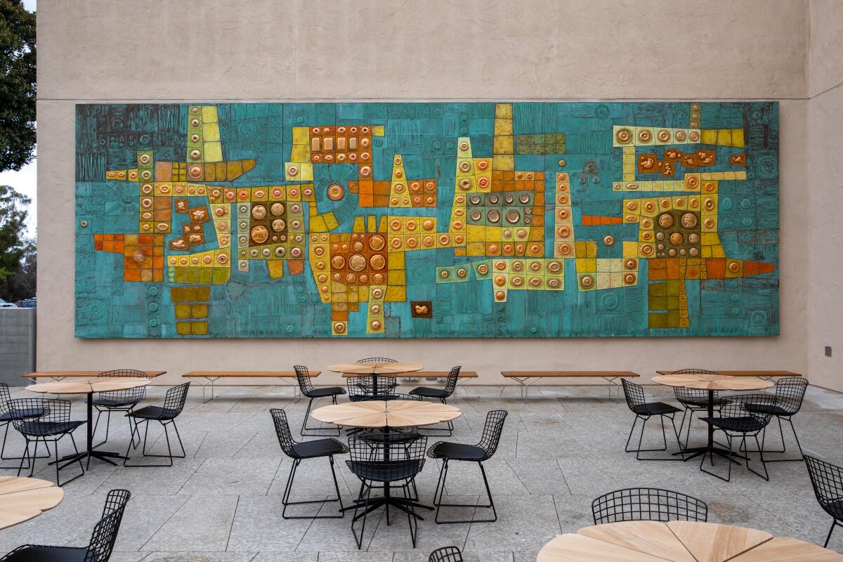
Since the 1990s, the Mingei International Museum, a craft and design institution in Balboa Park, inhabited a guarded-looking Spanish Colonial-style building originally designed by Carleton Winslow (under the supervision of Bertram Goodhue) for the 1915-16 Panama-California Exposition. But a renovation completed in 2021 by LUCE et studio, a San Diego-based architectural office founded by Jennifer Luce, has turned that insular space into something infinitely more welcoming.
Gone are the blind arches at ground level, replaced now by windows that admit daylight into a new commons that comes stocked with a cafe and restaurant. An unused loading dock was transformed into an event space that can be turned into an indoor/outdoor amphitheater by simply sliding open a glass wall. Second-story terraces, once blocked off, have been reopened to the public, offering unobstructed views of Balboa Park. An unused tower was reimagined as a grand staircase enveloped in delicate origami folds.
All around are the exquisite touches of handcrafted design, such as handsome (and 100% functional) wood benches by George Nakashima and Billie Tsien, delicate window screens by Christina Kim and a striking patterned curtain for the event space by Petra Blaisse. But the pièce de résistance is the, light-soaked reference library — with modular shelf system designed by Dieter Rams — a dreamy space that invites plunging ever deeper into the worlds of craft and design.
Read All Read Less
Route Details
(Carolina A. Miranda / Los Angeles Times)
Balboa Park
Arts
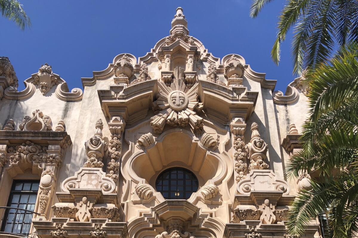
If you’re paying a visit to the stellar renovation at the Mingei International Museum (or the San Diego Zoo), then stay for the day, because Balboa Park is a feast — one that plays a key role in the architectural history of California.
It all began with the Panama Canal. To mark the completion of this engineering feat, San Diego staged the Panama-California Exposition in 1915 — and the theme was all things Spanish.
The chosen site, City Park, was promptly renamed Balboa Park, after Spanish explorer Vasco Núñez de Balboa. Overseeing the architecture was Bertram Goodhue, a New York architect who spent the 1890s traveling around Mexico, and who developed a Spanish colonial concept for Balboa Park. Reporting to Goodhue was architect Carleton M. Winslow, who designed many of the structures and saw them to fruition.
Their designs piled on an assortment of decorative motifs: Spanish baroque, Churrigueresque, elements of the Mexican mission style — combinations that historian Richard Amero once described as a “deranged phantasmagoria.” But the buildings helped spark the development of the Spanish Revival style, which came to define the architecture of California in the 20th century. (It’s a complicated legacy, since it’s also a tradition that has historically emphasized the Spanish over the Mexican, even though many designs were directly inspired by buildings in Mexico.)
Since the Goodhue-Watkins structures were built for an expo, they are all about the facade — so you’ll see the best of the architecture on a walk along El Prado. On the western edge of the complex, you’ll find the California Building (now housing the Museum of Us), readily identifiable by its tile-covered dome and its ornate tower. To the east lies the House of Charm, where the Mingei is now situated. (Do not miss the lovely Alcazar Garden directly to its south!) This is followed to the east by the Casa de Balboa (home to the San Diego History Center, the Museum of Photographic Arts and the San Diego Model Railroad Museum) and the Casa del Prado, both bearing facades that are ebulliently decorated.
For the best pictures, park yourself in front of the lily pond that fronts the Botanical Building (also built for the exposition), one of the largest lath structures in the world.
Also, if you’re there on a weekend, don’t forget the churros. There are stalls everywhere!
Read All Read Less
Route Details
(Nelvin C. Cepeda / The San Diego Union-Tribune)
The Salk Institute
Arts
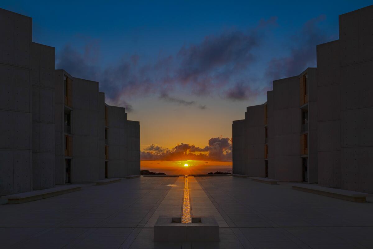
Can a scientific building feel like a religious experience? Yes it can. And the Salk Institute, located on a hillside overlooking the Pacific Ocean in La Jolla is certainly evidence of that.
The nonprofit research complex, completed in 1965, features a symmetrical, saw-toothed arrangement of brut concrete buildings designed by the famed Philadelphia architect Louis Kahn, which frame a travertine plaza that was designed by Mexican architect Luis Barragán. It’s like entering a procession — one that dissolves at the point ocean meets sky. Twice a year, during the spring and fall equinoxes, the setting sun lines up with a channel of water at the center of the plaza for an effect that feels a little bit Stonehenge, a little bit Mayan pyramid.
Beyond the aesthetics, the complex was designed with deep reverence for its purpose: a place where scientists conduct research. Mechanical systems were put on separate floors form the labs so that any repairs wouldn’t disturb the scientists. The lab spaces were designed with maximum flexibility so that they could be adapted over time. Light wells draw the sun into the building’s deepest recesses, and offices are separate from laboratories to force researchers into the fresh air.
It’s a breathtaking spot. Unfortunately, due to the pandemic, public tours remain suspended — and the buildings aren’t visible from the street, so attempting a drive-by is impossible. However, you can submit your information to the Salk Institute via their website, and they will notify you when tours resume.
Read All Read Less
Route Details
(Tod Williams Billie Tsien Architects | Partners)
Scripps Research
Arts
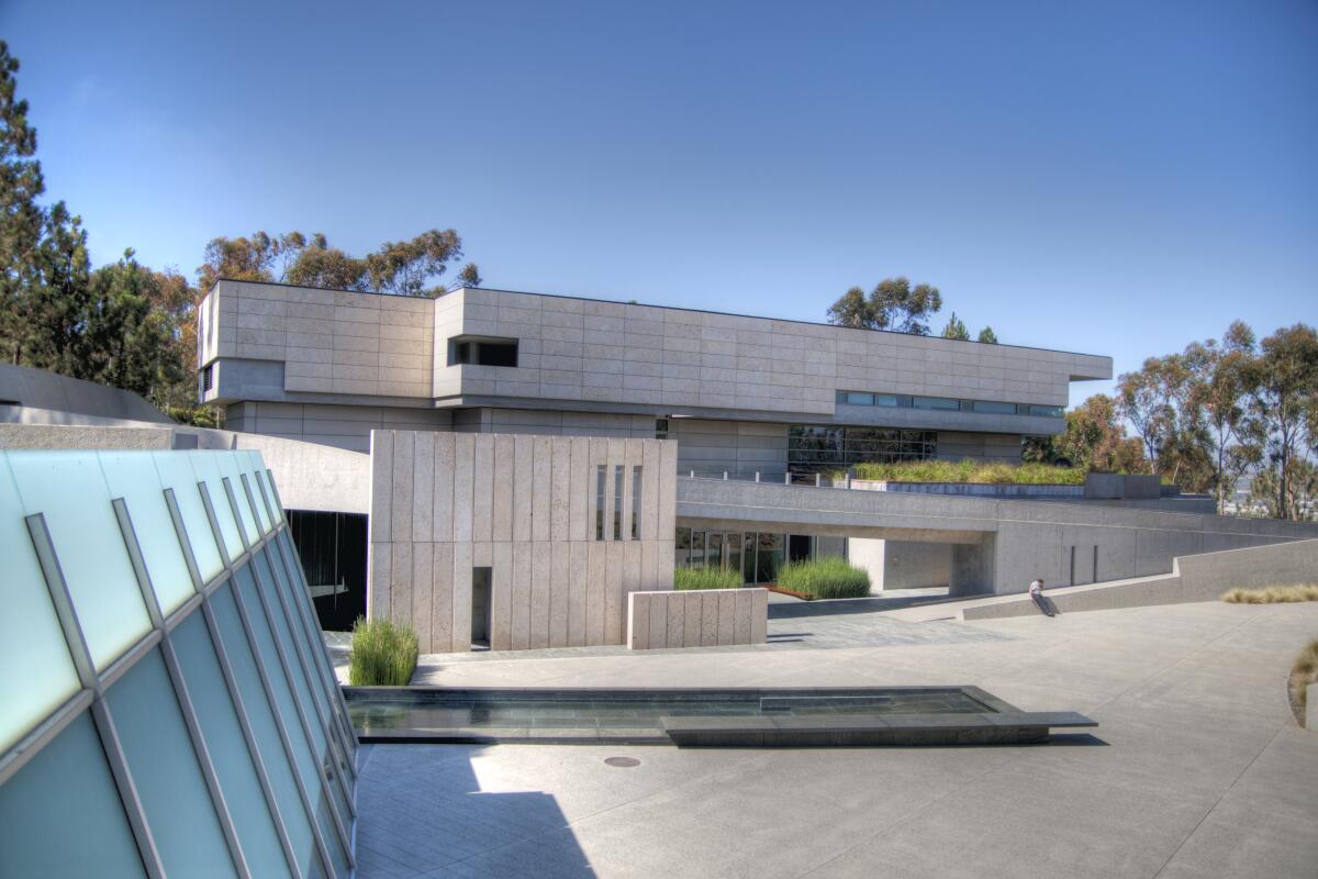
When Gerald Edelman, the head of what was then known as the Neurosciences Institute of the Neurosciences Research Program, commissioned New York-based Tod Williams Billie Tsien Architects to design a research campus for the study of the brain, he asked for a “monastery for scientists.” And that’s exactly what Williams and Tsien delivered.
Completed in 1995, the complex is tucked into the earth on a wooded slope in La Jolla and is so unobtrusive that it’s possible to cruise past without realizing that there is much going on architecturally. But enter the complex, and you’ll find three handsome structures that harbor a central plaza that maintains a meditative stillness even though the site is sandwiched between two four-lane roads.
Low-slung volumes made from sandblasted concrete — which not only emerge from the earth, but seem of it — bear a simple rectangular pattern. Walk through the complex and you’ll encounter a series of reveals: below-grade nooks from which a tree might grow, views of San Diego in the distance and a partiallysheltered circular plaza that serves as outdoor antechamber for a striking 350-seat auditorium whose interior volume is framed by a series of elegant origami folds.
When then New York Times architecture critic Herbert Muschamp visited the building in 1995 (which now belongs to Scripps Research, a biomedical research and teaching facility), he described it as “the most inspiring new American building I saw all year.” It is, indeed, a beguiling neighbor to Louis Kahn’s Salk Institute, which lies just down the road.
In nonpandemic times, the auditorium was the site of public events, including regular concerts, but currently it is closed to the public. Keep an eye on the website for news on reopening.
Read All Read Less
Route Details
(Erik Jepsen / UCSD / Board of Regents of the University of California)
Geisel Library (UCSD)
Arts
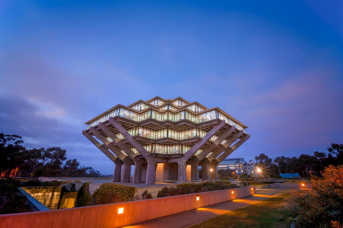
When my ship comes for me, I’m hoping it looks like UCSD’s Geisel Library.
Designed by William L. Pereira & Assoc. — the firm that also brought you San Francisco’s Transamerica Tower and the now-demolished buildings of the Los Angeles County Museum of Art — the library, as David Langdon once wrote in ArchDaily, is one that wonderfully inhabits “an ambiguous state between massiveness and levitation.”
Named for Theodor “Dr. Seuss” Geisel, whose papers reside at UCSD, the library occupies a prime piece of real estate: a mound that abuts a canyon on the north side of campus. The building itself has a UFO-like profile, with a middle floor that is wider than those above and below it. That structure rests on series of brutalist concrete piers that rise up out of the earth, giving the impression that the bulk of the library building is hovering just over the horizon. In fact, there are two stories underground, in addition to the six above. (In 1993, architects Gunnar Birkerts Associates and Buss completed an expansion that added additional space below grade.)
Geisel Library’s position alongside a canyon means that from certain angles, approaching the library requires a descent before an ascent, a path that feels reverent and gives the building added power. In choosing his unusual form, Pereira said he wanted to “convey to future generations the idea of the power and permanency of the knowledge contained inside it.” More than half a century out, the library retains its power.
As of April 2022, the library is open to the public, but rules can change due to the shifting nature of the pandemic. It is advisable to check the website before arranging a visit and adhere to campus signage on masking.
Read All Read Less
Route Details
(Erik Jepsen / UCSD / Board of Regents of the University of California)
Jacobs Hall (UCSD)
Arts
It’s a bit of a fool’s errand to recommend individual buildings on the UC San Diego campus. The site is well stocked with intriguing structures that run the gamut of the 20th century. This includes designs by Irving Gill, Julia Morgan, Mosher Drew and William Pereira — as well as one of my favorite campus structures: a fabulous three-story ‘60s-era breezeway between Mayer and Bonner Halls that was designed by Risley & Gould and built to evoke a honeycomb pattern. The short of it is that you could spend an entire day looking at architecture at UCSD, and for that, I recommend picking up a copy of the highly informative book, “University of California San Diego: An Architectural Tour by Dirk Sutro.”
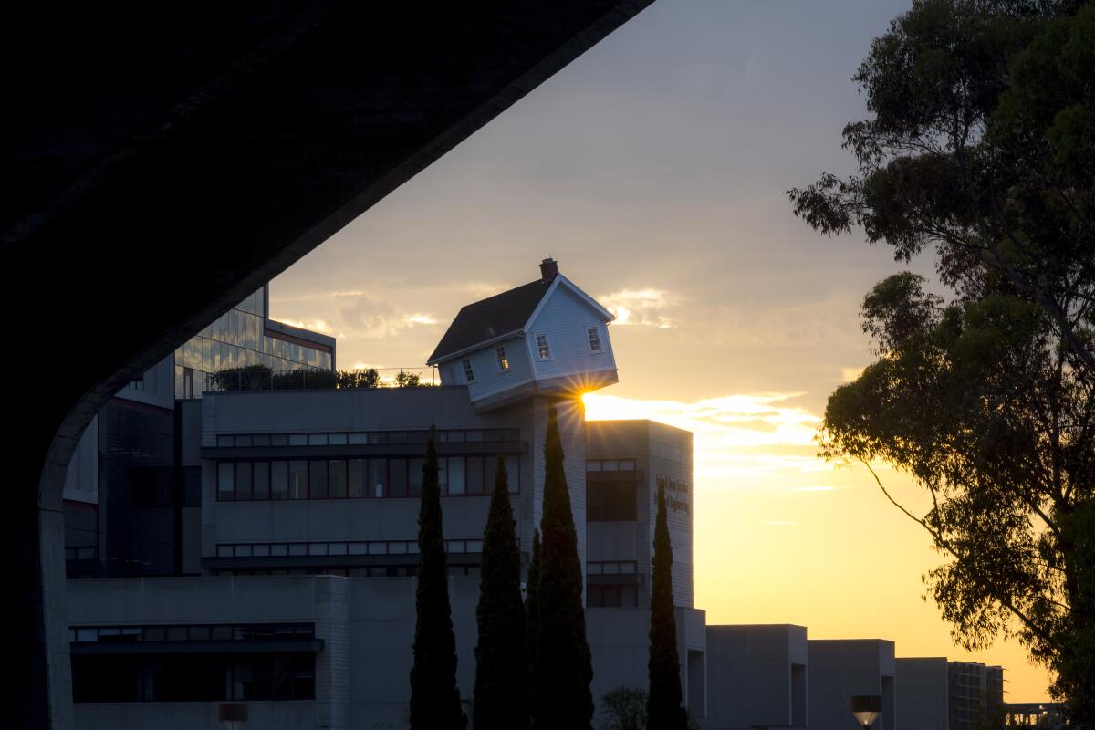
But if you want to be surgical, I recommend the requisite pilgrimage to Pereira’s Geisel Library, followed by a quick jaunt across the street to Jacobs Hall, which houses UCSD’s engineering department. Designed by Buss, Silvers, Hughes & Associates and completed in 1990, I’m intrigued by its combination of materials: a stepped glassy structure that is punctured by four smaller wings of brutal concrete. It’s a building that carries engineering in its bones — and as the daughter of an engineer, I am here for it.
But mainly you are here to check out the strange sight on the roof: a pale blue suburban house that seems to have fallen out of the sky and impaled itself on the corner of a concrete wing. The house is a sculptural installation by Do Ho Suh titled “Fallen Star,” and it was made possible by the Stuart Collection, which commissions contemporary art around campus.
In ordinary times, “Fallen Star” is open to visitors, but as of April 2022, remains closed due to the pandemic. (Keep an eye on the website for any changes.) But even at a distance, the building and the sculpture are a sight worth seeing.
Read All Read Less
Route Details
(Safdie Rabines Architects)
Scripps Seaside Forum (UCSD)
Arts
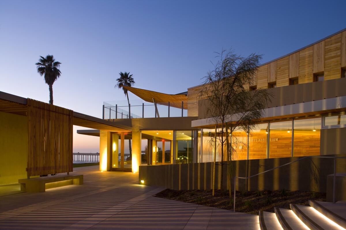
University event spaces are generally less about form than they are about function — and dreary neon lighting. But the Robert Paine Scripps Forum for Science, Society and the Environment, operated by the Scripps Institution of Oceanography at UC San Diego, has several things going for it.
One, the location couldn’t be better: on a low bluff, right on the beach in La Jolla. Second, the two-story wood-and-concrete structure has a rugged informality that makes it feel like anything but a stuffy event hall. Doors can be swung open to admit ocean breezes right into the auditorium, which accommodates about 300 people.
Designed by the San Diego-based firm Safdie Rabines, and completed in 2009, it was prescient for the ways in which it employed passive ventilation to make for a pandemic-resilient space. A second story terrace, sheltered by a broad, tilted eave, adds a bit of design flourish — feeling like a sail or the prow of a boat, depending on the angle.
This not the sort of building to get architecture Instagram all agog. (It’s better in profile than when you face it straight on.) But it’s an inviting one. And it’s a great place for breakfast or lunch. On the terrace, you’ll find a casual public restaurant, Caroline’s Seaside Cafe, where you can dig into some pancakes or a chicken salad sandwich within view of the Pacific Ocean swells.
After your meal, walk north on Kennel Way and, in about 100 feet, you’ll run into an unassuming two-story white box that was built by Irving Gill in 1910. That structure served as the first lab for the Marine Biological Association of San Diego, later renamed the Scripps Institution of Oceanography — the educational institution that would one day form the basis of UCSD.
Read All Read Less
Route Details
(James Gregg / San Diego Union-Tribune)
San Diego Central Library
East Village Arts
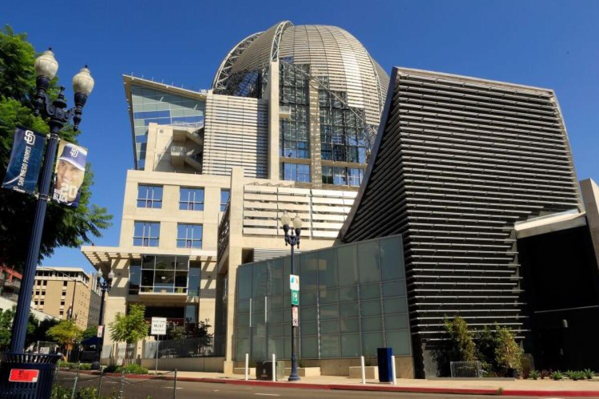
It took decades for San Diego to finance and construct a grand central library — and when it did, it went big. Really big. Like, nine-stories of poured concrete capped by a metallic dome, with half a million square feet of space, including an auditorium, a cafe, a gallery and a rooftop sculpture garden big. It is so big there is even a school tucked in there — on the sixth and seventh floors.
Designed by Rob Wellington Quigley, a San Diego-based firm, and opened in 2013, the San Diego Central Library is a building on an industrial scale that also looks and feels industrial — its forms evoking the machinery of the port in the distance. It can feel outsized given that the library’s immediate vicinity consists of low-lying condos (though Petco Park is located a block to the west).
But everything about the library is outsized, including the design flourishes that the architects threw at the building. The entrance is lined by windows that resemble open books. A cavernous entry lobby framed by concrete arches and criss-crossed by escalators also features a metallic basket-weave ceiling. A rare book room is designed to look like a 19th century living room. It’s a lot. And none of it quite synthesizes into a coherent building.
The building, however, does boast what is probably one of the most incredible public reading rooms in California: a light-soaked eighth-story space that offers glorious views of the bay. One story up, the dome shelters an open-air terrace that is also a fantastic spot in which to catch the views.
Currently, the library has suspended its architectural tours due to the pandemic, but keep an eye on the website to see when they return. Otherwise, the Central Library is free and open to everyone.
Read All Read Less
Route Details
(Darren Bradley / La Jolla Music Society)
Conrad Prebys Performing Arts Center
Arts
When the Museum of Contemporary Art in San Diego decided to revamp its theater as a gallery space, it left the La Jolla Music Society, which had long held its concerts there, without a home. So the organization went out and built one. And in 2019, it threw open the doors on its very own space: the $82-million Conrad Prebys Performing Arts Center, better known as the Conrad.
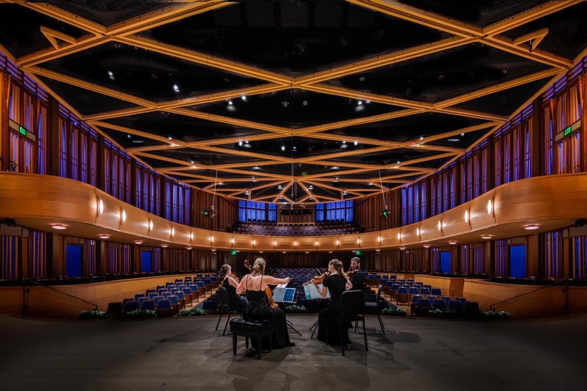
Designed by Epstein Joslin Architects, a firm based in Massachusetts, with acoustics by the famed Yasuhisa Toyota, the acoustician who did the sound design at Disney Hall, the Conrad contains within it the Baker-Baum Concert Hall, a traditional concert hall space with a capacity of nearly 500. Times classical music critic Mark Swed says the sound is “clear and noble,” but he tells me that he thinks it could use some fine-tuning.
The complex also has a smaller cabaret theater, the JAI, that accommodates 136 people, as well as an outdoor courtyard, also a performance site, dubbed the Wu Tsai QRT.yrd (because contemporary).
The new hall, unfortunately, sits at a rather uninspired site: in view of a luxury movie house called the Lot that consists of an ungainly grey box that has all the architectural charm of a big-box store. In response, the architects of the Conrad turned their building inward. The concert hall and its pleasant courtyard are screened from the street by a slatted terracotta-colored trellis that also serves as sunbreak. Unfortunately, this doesn’t leave much to admire in terms of facade. From the street, the slatted trellis comes off more as garden center than concert hall.
The aesthetics of the principal performance space, however, help make up for the exteriors. Walls are lined with vertical beams of Alaskan yellow cedar, evoking an abstracted tree pattern. And rather than clutter the building with a big lobby, the auditorium spills right out into the outdoor courtyard, a design that makes the most of fresh air.
Read All Read Less
Route Details
The biggest entertainment stories
Get our big stories about Hollywood, film, television, music, arts, culture and more right in your inbox as soon as they publish.
You may occasionally receive promotional content from the Los Angeles Times.
