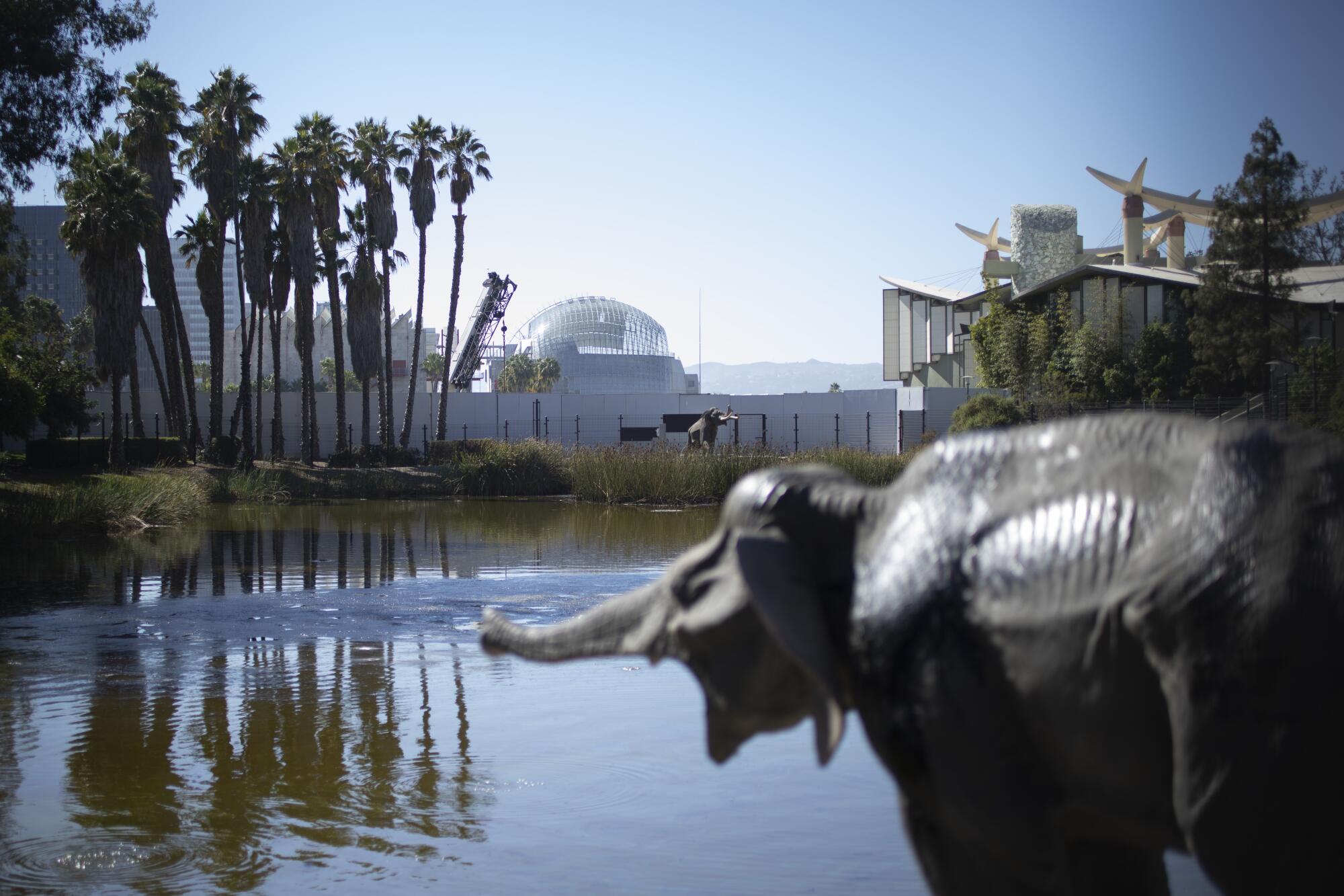
It looms in the distance behind the baby mammoth that cries for its mother at the La Brea Tar Pits. It rises behind “Levitated Mass,” Michael Heizer’s massive rock sculpture at the Los Angeles County Museum of Art. It materializes like a futurist zeppelin between rows of quaint Spanish Revival homes.
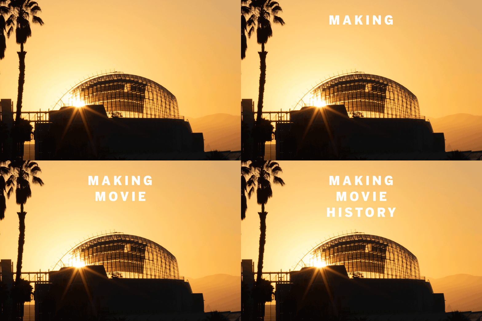
The ultimate film lovers’ guide to the new Academy Museum
FULL COVERAGE of the making of the Academy Museum of Motion Pictures.
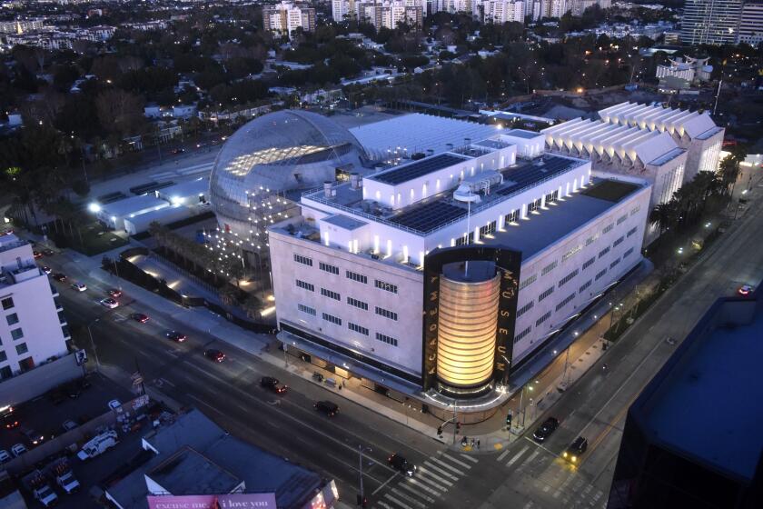
The Academy Museum of Motion Pictures has landed. And it has added an unmistakable silhouette to the landscape of Los Angeles.
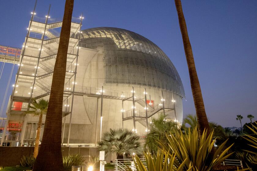
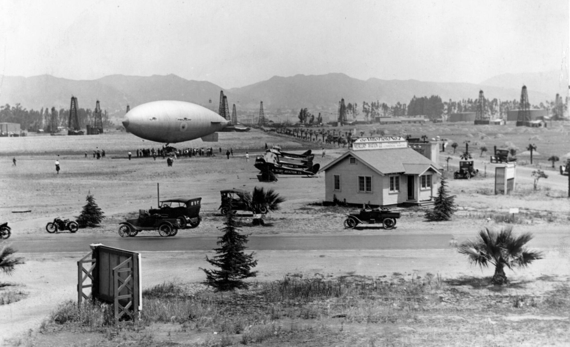
Its most dramatic feature: the new David Geffen Theater, a spherical building inspired by the dirigibles that used to touch down in the area in the early 20th century when the Miracle Mile was an unmiraculous lane and the land around Wilshire and Fairfax was an airfield. (An airfield, coincidentally, built by Cecil B. DeMille, who, in addition to working as a successful director, had a side hustle running an aviation company.)
In addition to dropping a space-age, 1,000-seat theater on Fairfax, the museum project, led by Italian architect Renzo Piano, has also beautifully preserved the old May Co. department store building to which the theater is connected — and that is truly excellent news.
A graceful Streamline Moderne structure designed by A.C. Martin and Samuel Marx and completed in 1939, the May Co. building was dubbed “the Store of Tomorrow” when it opened, jauntily marking the western gateway to the Miracle Mile. Its principal architectural flourish was a gleaming, multi-story cylinder at its corner covered in gold-leaf mosaic tile, a form that has been likened to a bottle of perfume.
After May Co. shuttered the store in the 1990s, the building languished. But the team at Renzo Piano Building Workshop, Piano’s namesake architectural studio, has given this handsome structure new life. In combination with the brash new Geffen Theater, the architect has remade the western edge of a blocks-long cultural complex that also includes the La Brea Tar Pits & Museum, as well as LACMA where he designed two other buildings: the Broad Contemporary Art Museum and the Resnick Pavilion.
This is no run-of-the-mill renovation and expansion.
The Geffen Theater — known colloquially as “the Death Star” — is absolutely inescapable. Its circular form is visible from the ramps of LACMA’s Pavilion for Japanese Art and over the sawtooth roof of the Resnick. Even if you leave the LACMA-Academy Museum complex to visit the independent art galleries a block west at 6150 Wilshire, well, the Death Star will follow you there too. You can see it peering at you from the second story of gallery 1301PE.
It’s a formidable design feat considering the building’s location at the architecturally cluttered corner of Wilshire and Fairfax, which currently harbors the Googie coffee shop-turned-filming location Johnie’s and the flaming spaghetti forms of Kohn Pedersen Fox’s Petersen Automotive Museum. Coming soon to the neighborhood: Swiss architect Peter Zumthor’s monolith museum building for LACMA, which will bridge Wilshire.
At this intersection of look-at-me design, Piano’s building seems to emerge as if it’s a giant eyeball to look out at you.
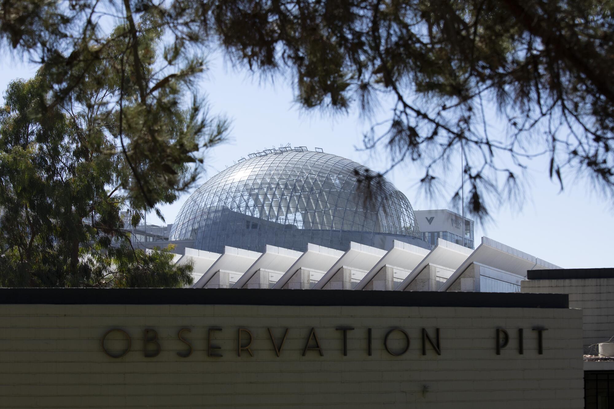
It’s quite the statement from Piano, the architect who had once been tasked with planning this area of the Miracle Mile museum complex — before being untasked.
A little background is necessary. And for that, we’ll need to go back to the May Co. building.
In the early ‘90s, there was talk of razing the old department store and developing the site as a pair of office towers and a hotel. Thanks to the advocacy of preservationists, including the Los Angeles Conservancy, those plans were shelved and in 1992, the building was declared Historic-Cultural Monument No. 566 by the city.
Two years later, LACMA picked it up at fire-sale prices — $18.3 million, to be exact. But due to a lack of resources, it employed the structure only half-heartedly, frequently subletting portions to other institutions. Moreover, LACMA West, as the May Co. building was renamed by the museum, felt marooned on the western edge of the property. “Being there felt sort of like squatting in an abandoned building,” wrote Times art critic Christopher Knight in a recent piece.
The last time I saw the insides of the structure prior to its takeover by the Academy of Motion Picture Arts and Sciences was at a private event for which the party planners had smartly shrouded the drab rooms in black velvet and kept the lighting strategically dim. It was a building to be covered up, not proudly displayed.
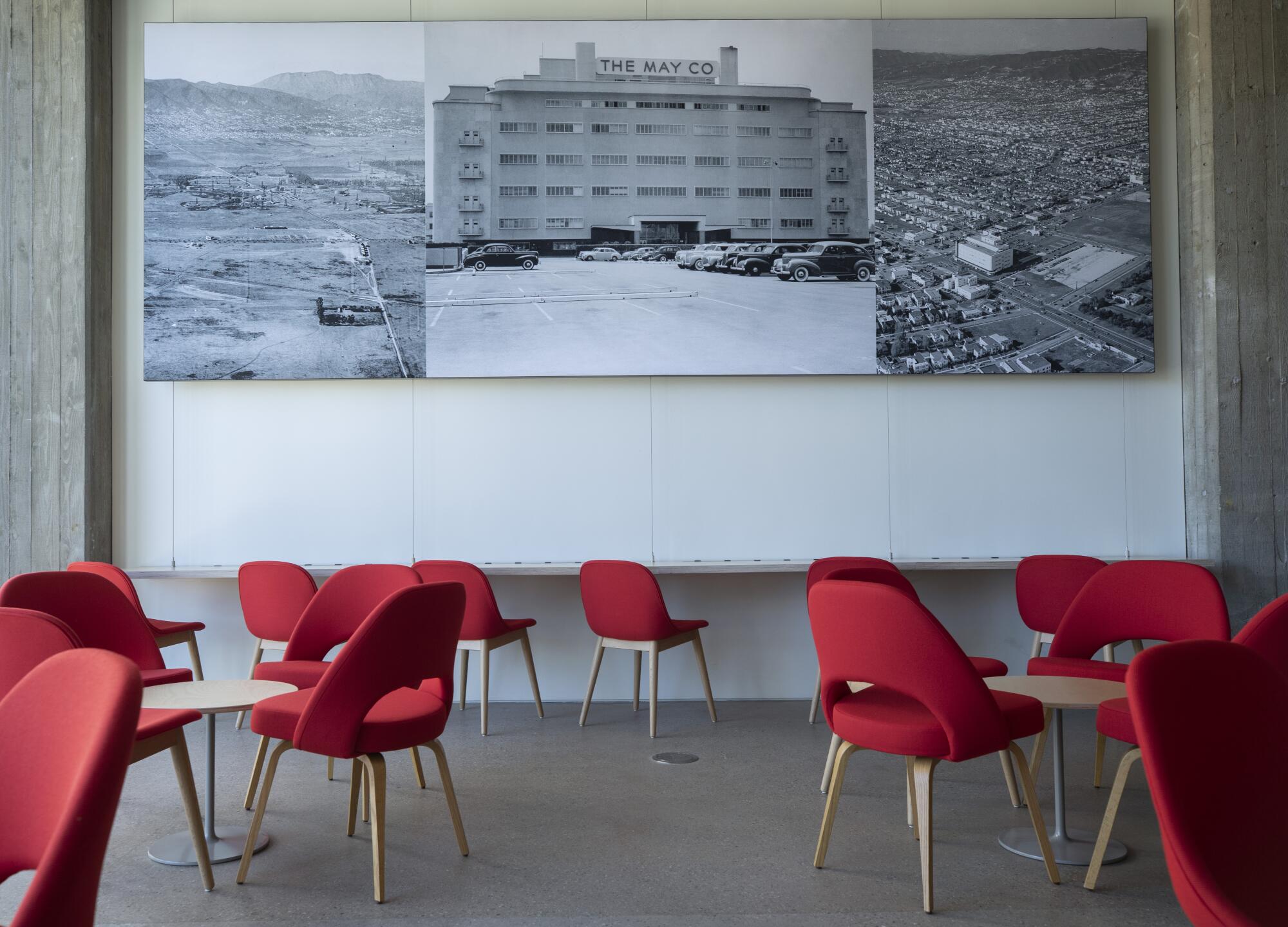
Enter Renzo Piano in 2003. That was the year the Pritzker Prize-winning architect — who has made a name for himself designing museums around the world, including Houston’s Menil Collection and New York’s Whitney Museum — was contracted by LACMA to design BCAM, a new pavilion for contemporary art that would be funded by Eli Broad. He was also asked to devise a master plan that would better integrate LACMA West with the museum’s existing muddle of buildings.
Piano’s design proposal placed the new BCAM building on Wilshire Boulevard between William Pereira’s 1965 Ahmanson Building and LACMA West to give the campus some urban continuity. He then connected the structures with an east-west walkway and a sequence of outdoor plazas — “piazzas” in Piano-parlance. The covered plaza at Ogden Drive, where the food and drink spot Ray’s and Stark Bar is located, is one of them.
An old department store building was thought to be unusable as a museum, but the film academy has proved different.
At the time, LACMA’s intention was to one day renovate the May Co. building to create space for additional galleries and a suite of offices, as well as a research center. But the 2008 market crash put an end to renovation plans, with Piano’s master plan only partially implemented.
A year later, LACMA director Michael Govan began courting Peter Zumthor to redesign the eastern campus, and work around the May Co. building was ditched. Zumthor, in an early interview, expressed skepticism for Piano’s master plan. “There’s this small European piazzettas style,” he told me in 2013, “which I think is ridiculous for Los Angeles.”
But in 2012 the Academy of Motion Pictures took over the May Co. building as part of a long-term lease arrangement with LACMA, and Piano was back in command of the unfinished western edge of the complex. His design for the Academy Museum completes the circulation routes he originally proposed to LACMA almost two decades ago. The design even includes a piazza on the north side of the building.
The completed project — which comes as LACMA is still trying to excavate foundations for its new building — feels like the dramatic denouement in a starchitectural poker movie: I’ll see your biomorphic blob and raise you a Death Star!
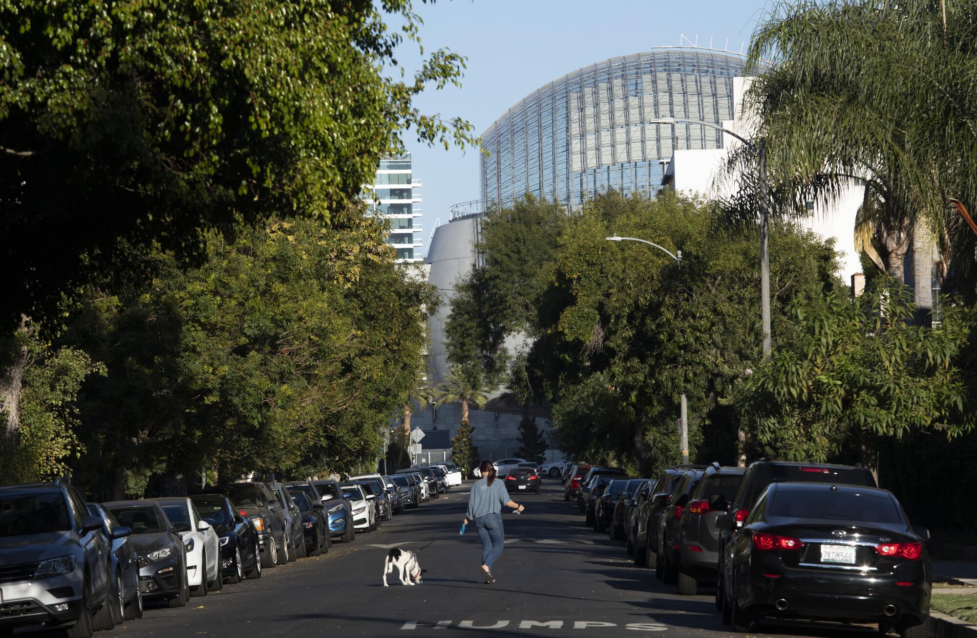
Naturally, it took a winding path to get here.
Originally, the Academy had hoped to place its museum on Sunset Boulevard near the 101 freeway, in a building designed by French architect Christian de Portzamparc. That plan also fell victim to the 2008 recession, and by 2012, the Academy had settled on the May Co. site instead, with Piano as the architect.
In the early years, Zoltan Pali of Studio Pali Fekete Architects (who stylishly transformed the Beverly Hills Post Office into the Wallis Annenberg Center for the Performing Arts in 2013), was also involved. But he left in 2014 amid rumors of tension with Piano — though his name remains in the credits as contributing to the museum’s concept design.
The global firm Gensler later came on board as executive architect, and the project was helmed, on its end by Richard Stoner and David Pakshong.
If there were throwdowns, you can’t tell by looking at the place, because the Academy Museum delivers the goods.
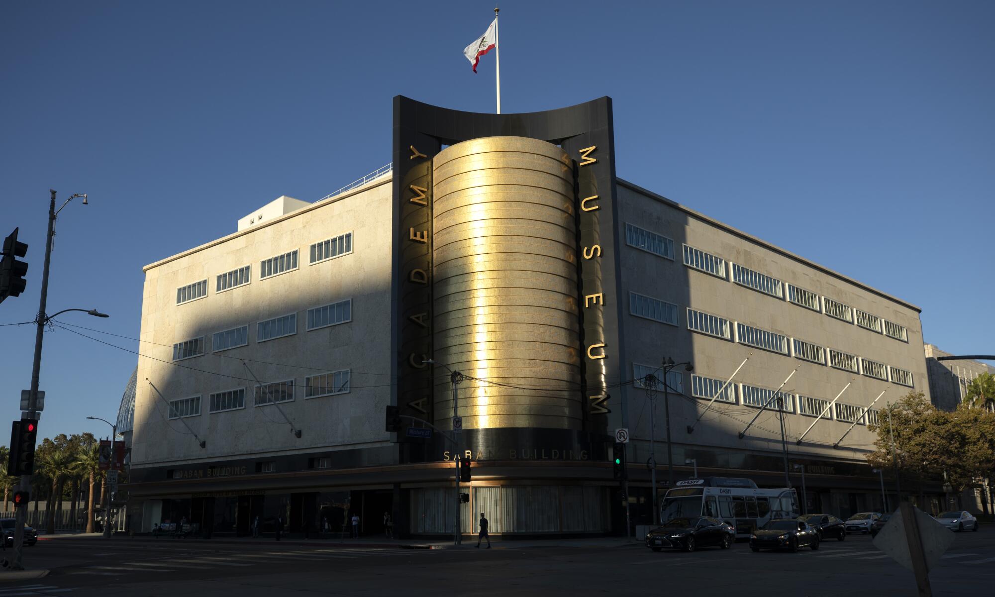
The May Co. building, now reborn as the Saban Building, is back from the brink with an architectural makeover that has left it looking sleek and updated — to the point that LACMA may deeply regret that it let the building slip from its grasp.
For starters, the architects removed an extension that had been added to the north side in 1946, bringing the structure back to its 1930s form. They then got to work restoring the exterior architectural elements, repairing hundreds of the Cordova Shell limestone panels and restoring the golden cylindrical volume — work that was carried out by restoration architect John Fidler.
The exterior now truly sparkles in the afternoon light.
Indoors, Piano stripped the building (which had undergone piecemeal renovations over the years) down to the basics: its concrete floor plates and the board-formed concrete columns. Escalators were relocated to the north side, stacked along the facade where the 1946 extension had once stood. That facade has since been replaced by a glass curtain wall, which admits daylight into the previously dim building and serves as a point of visual and physical connection to the Geffen Theater orb.
Around the escalators, slabs of floor plate have been removed, creating an industrial atrium that succeeds in drawing light down to the basement, where an education space and a separate screening room, the 288-seat Ted Mann Theater, are located. The atrium area offers a programmatic break from the dimly lit movie galleries.
It’s also a great location to display Bruce, the fiberglass shark from “Jaws.”
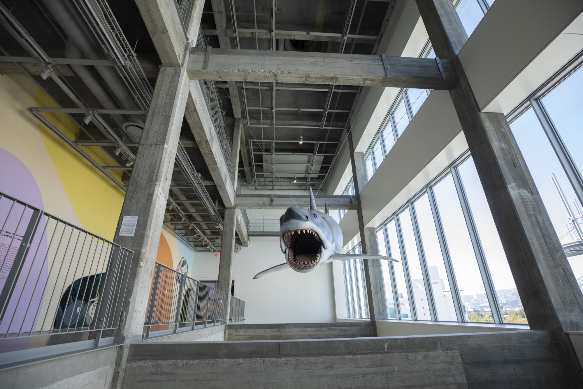
The May Co. remodel reflects Piano’s interest in revealing the function of structures.
Concrete columns and floors show their patches and repairs, evidence of the building’s past lives. Cable trays, electrical and ventilation systems are all exposed. (This is the designer, after all, who helped conceive Paris’ groundbreaking Centre Pompidou with fellow architects Richard Rogers and Gianfranco Franchini in the 1970s, a museum that wears its industrial core like an exoskeleton.)
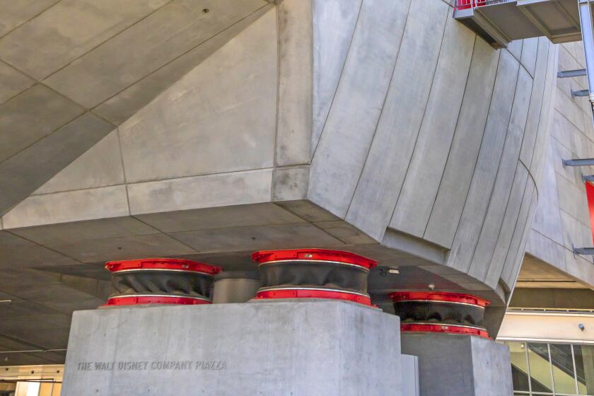
Base isolators, which steady a building in earthquakes, typically are hidden from view. But Academy Museum architect Renzo Piano left them for all to see.
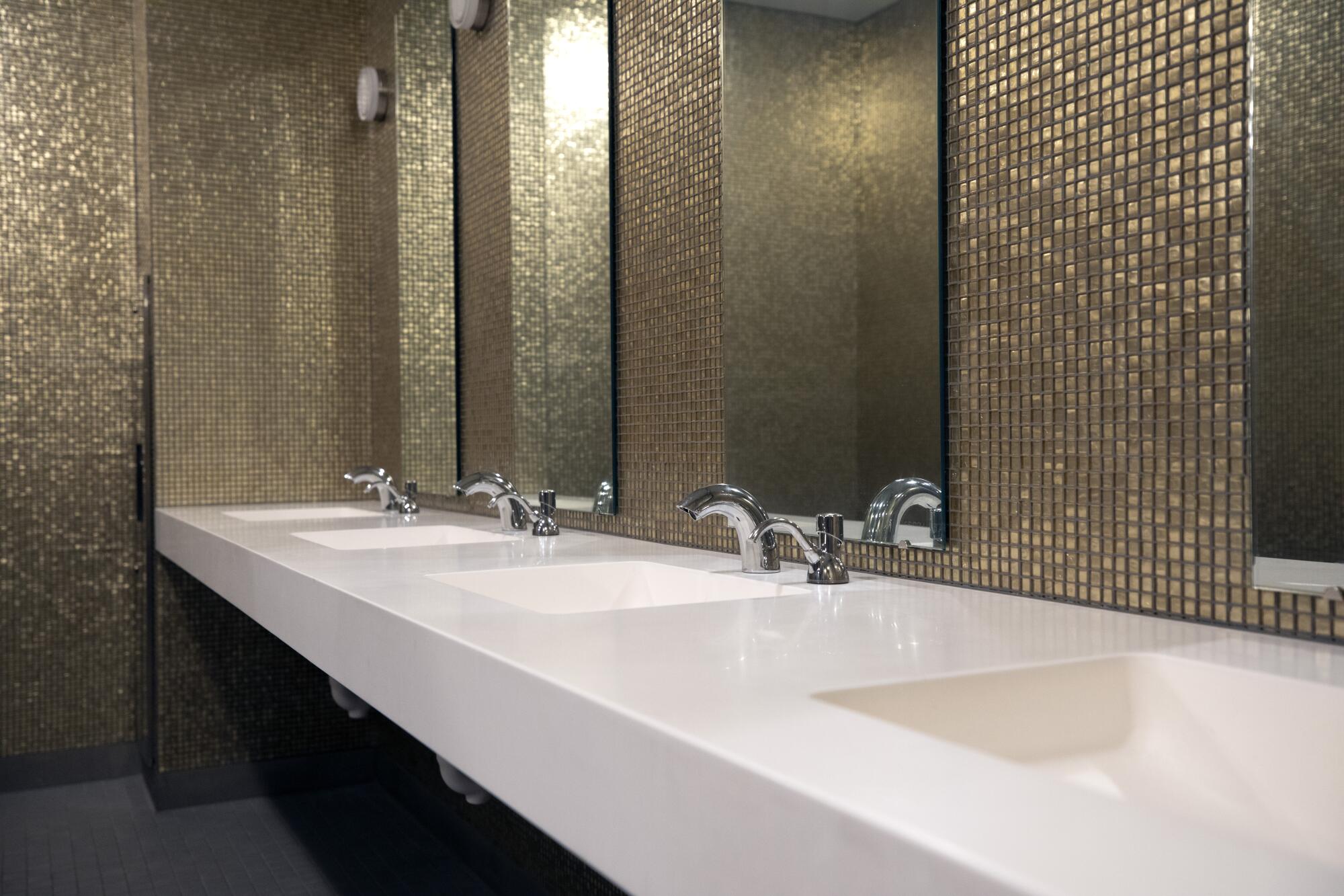
To avoid monotony — it’s a 250,000 square-foot structure, after all — color is deployed in strategic ways. Gold mosaic tile adds sparkly drama to the fifth-floor restrooms. In the Mann Theater, velvety seats are upholstered in a brilliant shade of Kelly green (a nod to the green felt tip pens that Piano uses to sketch out his ideas).
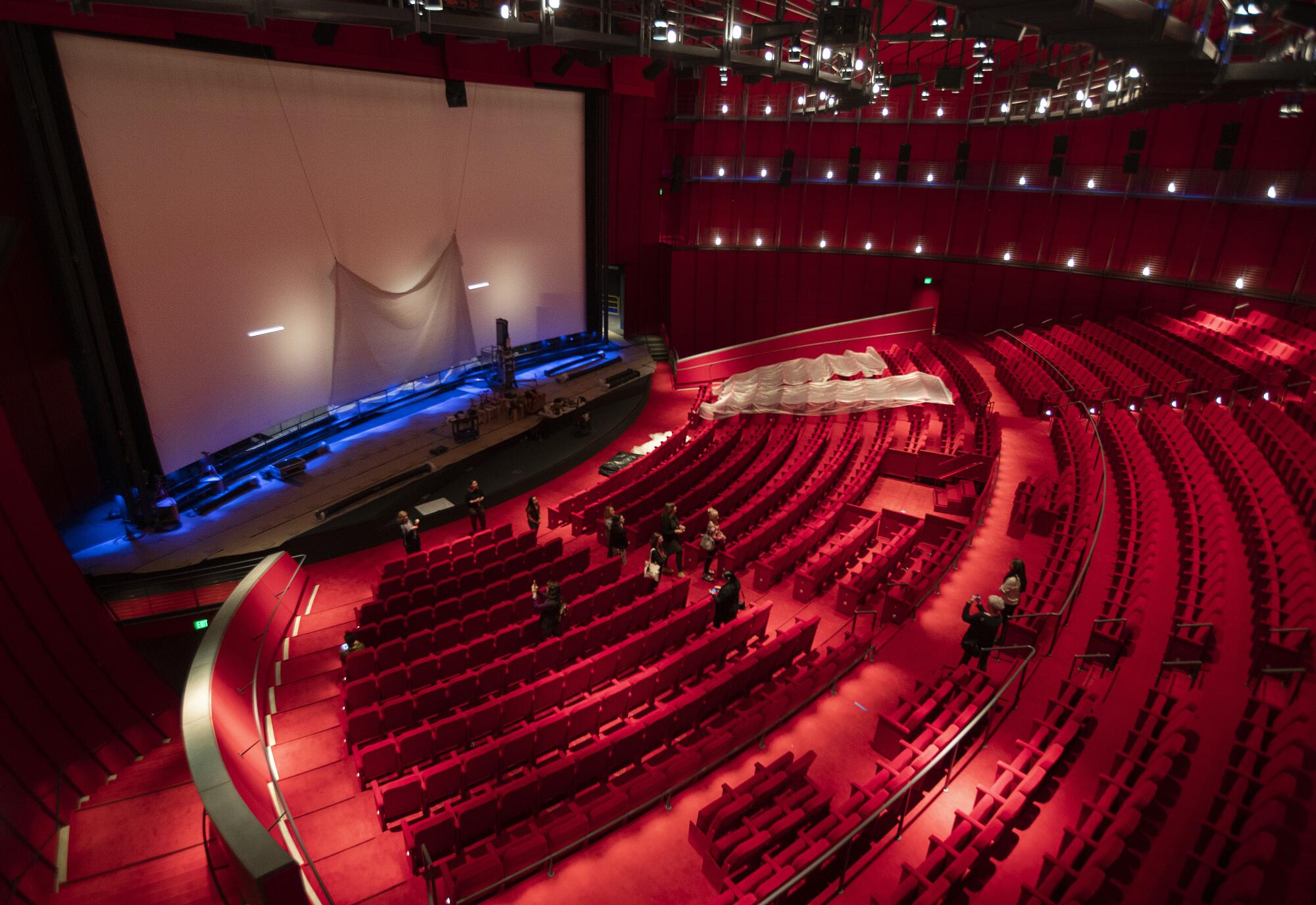
In other places, there are tones more familiar to Hollywood: namely, red-carpet red. The mezzanine is swathed in it. In addition, the interiors of the Geffen Theater are a blazing womb of ruby red, with red carpet, red walls, red seats, even a red ceiling. This will be a decadent place to see a movie. Just don’t wear red.
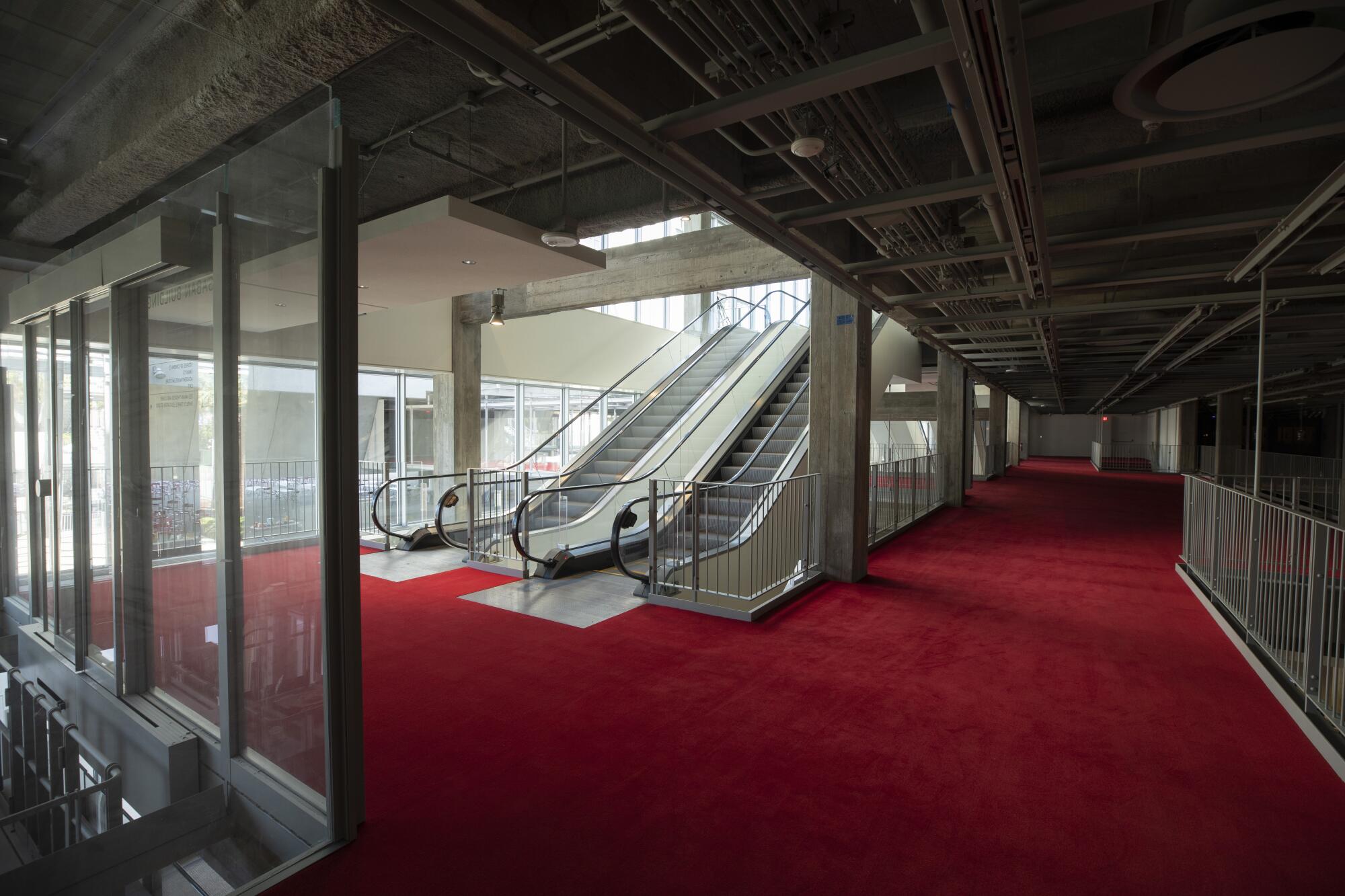
By and large, however, Piano has shown restraint, leaving the May Co. building’s interiors spare so that the Academy Museum’s curators can deploy them as they see fit.
“We saw this beautiful, raw industrial space,” says Jonathan Jones, a partner at Renzo Piano Building Workshop and the firm’s L.A.-based project architect. “This is really beautiful for this factory that is filmmaking, letting the sets fill that space.”
As a result, the museum’s exhibition designers — the L.A.-based firm WHY, founded by Kulapat Yantrasast — had plenty of flexibility for creating installations within that space. (Yantrasast did the unforgettable exhibition design for LACMA’s exhibition on samurai armor back in 2014.)
If the Academy Museum had miraculously hit its original 2017 opening date, it would have been a far less interesting or important place.
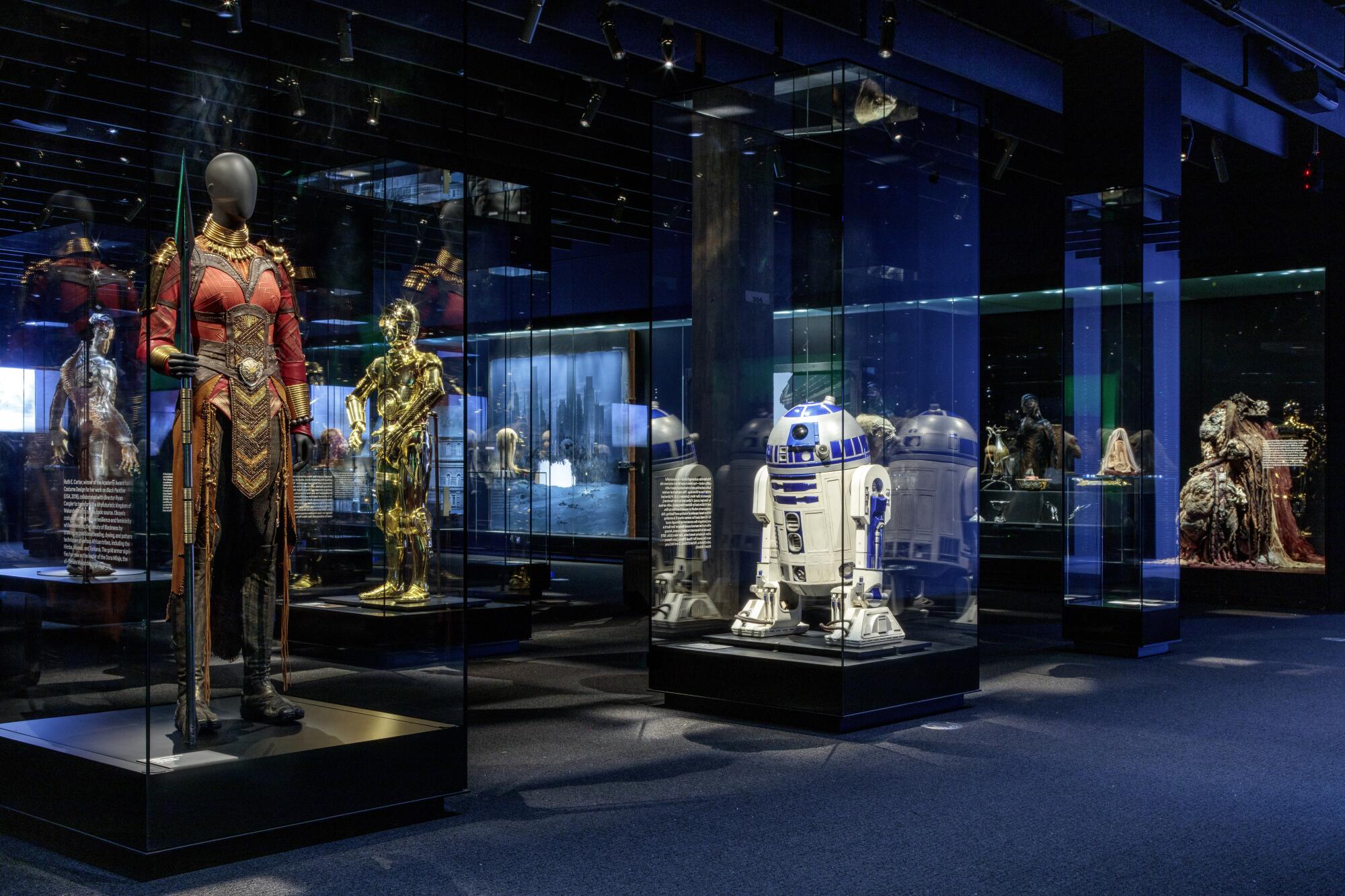
They needed all the flexibility they could get, since designing installations for a movie museum is no walk in the park: movie clips beg for a dark room, objects demand light, sound bleeds. But the designers at WHY have managed to tame these unruly, often contradictory demands, creating environments where visitors can experience the various facets of cinema without being overwhelmed.
A large gallery full of film clips might lead to a quieter environment bearing animation tools which might lead to a small space featuring storyboards. Light is adjusted gradually from one space to the next to allow the eye to do the same. Sound is piped in through elliptical speakers to prevent cacophony. In some of the object galleries, the polished concrete floors are left as is; in others, carpet is deployed to absorb sound, give the body a rest from hard surfaces or add a vital splash of color.
A large gallery devoted to Academy Awards history, for example, transitions to a smaller space bearing objects that inspire filmmaker Spike Lee. Designed to look like a Postmodern stoop, it is painted in the types of saturated hues favored by the director. It stops you in your tracks.
These bold transitions keep the experience of navigating the museum fresh. “It discourages passive looking,” says WHY’s Brian Butterfield, director of the studio’s museum design workshop. “As you go through a threshold, you have to stop and say, this is a different type of looking and a different type of narrative.”
In other rooms, the exhibition designers pay tribute to the architecture of the building, with display cases designed to mimic the geometries of the building’s columns.
While the May Co. building will be celebrated as a fine work of adaptive reuse, what will ultimately define the Academy Museum is its spherical theater, which attaches to the north face of the building via series of bridges, one of which is lined with red carpet.
When renderings of the design were first released in 2013, I was skeptical. The Geffen looked like a parasite attaching itself to the May Co. building. My first thought was “Aliens.” My second thought was a short story by Uruguayan poet and playwright Horacio Quiroga, about a creature that embeds itself into a woman’s pillow and proceeds to drain her of life. The internet settled on calling it the “Death Star.”
But as the design evolved, I began to warm to it. In renderings, the connection points between the two buildings became less anatomical and more architectural. When the building began to rise, I started to appreciate its vessel-like qualities.
I also appreciated Piano’s willingness to come at us with something truly weird. The buildings that he designed for LACMA are serviceable but don’t exactly rock the imagination. The Resnick Pavilion is a quiet structure, good for contemplation (until LACMA stuffed it to the gills). And the frumpy and critically unloved BCAM led many critics to declare that maybe it was time for museums to find another go-to architect.
The Geffen Theater is not lovable, but it is otherworldly. And it harkens to some of Piano’s wilder designs, such his adaptive reuse of an automotive factory in Turin, which he converted into a mixed-use development capped by a domed meeting space worthy of a movie villain.
In addition, getting a gander at the theater’s completed interiors has led me to have a greater appreciation for the building as a whole. Setting foot in it does indeed make you feel as if you are entering a vast spaceship.
A movie, says Jones, “has the ability to transport you to another place, to another world.”
“From this worldliness came this sphere,” he adds. “Renzo likes to call it the belly of the whale. There is a beauty in that, its concentric spheres. You go into it and you feel like you are inside a sphere.”
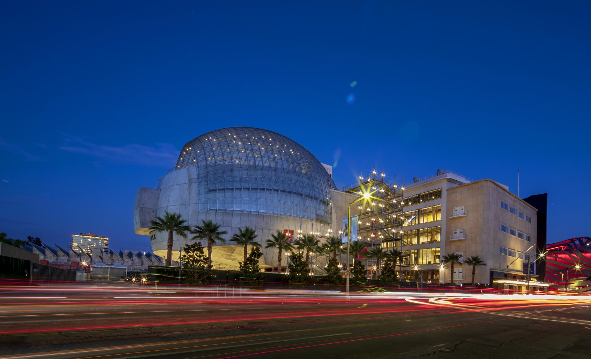
In the early 20th century, Art Deco architecture was inspired by the industrial, the modern, the futuristic. In the 1930s, the May Co. building, the store of tomorrow, embodied a vision of that future. Piano’s sphere does that for today.
And I, for one, am ready to go on a ride.

What to watch, read and listen to this fall: Your ultimate guide
More than 30 ways of looking at the fall season.
Recommendations for more than 160 movies, TV shows, video games, music events, books and Southern California cultural happenings.
FULL COVERAGE
More to Read
The biggest entertainment stories
Get our big stories about Hollywood, film, television, music, arts, culture and more right in your inbox as soon as they publish.
You may occasionally receive promotional content from the Los Angeles Times.
