In a new redesign LACMA experiences shrinkage — and shapeshifts yet again
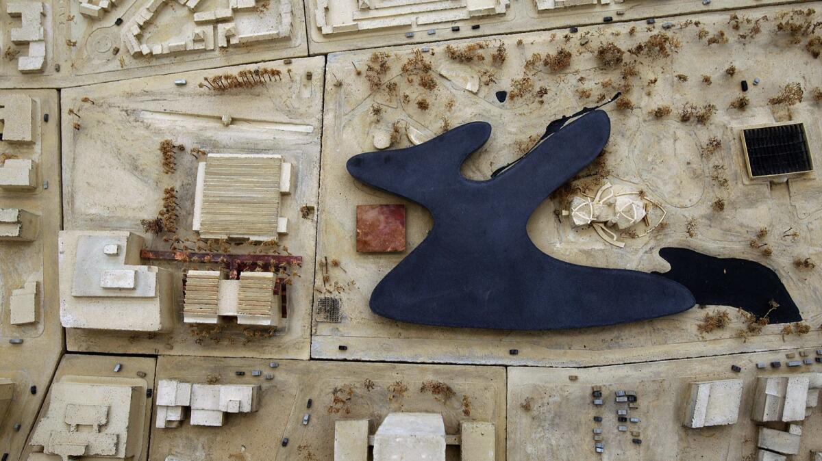
When Swiss architect Peter Zumthor presented his proposed redesign for the campus of the Los Angeles County Museum of Art in 2013, his plan for a charcoal-colored cement structure that, from overhead, resembled a sinuous black pool — a finger of which cantilevered dramatically over one of the La Brea tar pits — immediately generated a multitude of nicknames.
Many called it “the Black Flower” or “the Inkblot.” I once likened the building, meant to replace four structures that date to the 1960s, to the sleek Cylon Basestars of “Battlestar Galactica.” In other words, super cool.
Fast-forward six years to the handful of renderings of Zumthor’s ever-evolving design released late last week, and the comparisons aren’t quite so favorable. A schematic showing a sand-colored structure straddling Wilshire Boulevard drew irreverent pokes on Twitter, where the building was immediately likened to a coffee table. New York magazine architecture critic Justin Davidson compared it to the Autogrill chain of Italian highway restaurants whose visual trademark is a structure that bridges a road.
LACMA, the biggest encyclopedic museum west of the Mississippi, and the city want to erect something to be proud of. Yet three new renderings released when the county of Los Angeles’ final environmental impact report was made public last Friday show a structure that has shrunk from its original ambitions — both in scale and form.
Where once we had sci-fi, now we have an agreeable cream-colored concrete structure that in at least one schematic (the northward-facing view from Wilshire) bears the profile of a small-city airport terminal.
Of course, it’s hard to know what to make of the renderings. They were released without explanation and feature only fragments of the building — which makes analyzing the design about as easy as examining an elephant with a microscope. (LACMA director Michael Govan was not available for comment.)
Still, the new plans raise the very basic question of aesthetics.
Ecological considerations around the tar pits led to Zumthor’s building losing its artsy inkblot form. Museum and designer retreated from the idea of cantilevering a wing over the principal tar pool. Instead, a 2014 design proposal extended the building south, across Wilshire Boulevard, into a parking lot at South Spaulding Avenue.
The building’s outline has never quite recovered, resembling at first an amoeba — “The Blob that Ate Wilshire Boulevard” read a headline in Architectural Record in 2014 — and later a boomerang.
Now it has evolved yet again, looking like an antler belonging to Bullwinkle J. Moose, the cartoon ungulate from “The Adventures of Rocky and Bullwinkle.” The pronged structure that begins on LACMA’s main campus claws south, across Wilshire, into the Spaulding Avenue parking lot. If once the building had taken its elegant form from the primordial ooze that bubbles up from the tar pits, it has since seemed to bend over backward to occupy LACMA’s available real estate.
There is also the project’s reduced size.
The environmental impact report, a necessary step for the project to receive county funding and building permits, shows that the building has shrunk considerably since its last iteration — by more than 10%, or some 40,000 square feet. The report lists the project’s original proposed square footage at 387,500 square feet; it now stands at 347,500. Projected gallery space has shrunk as well — from 121,000 square feet to 110,000 square feet, roughly the size of one exhibition hall.
Also slimmed down is the museum’s planned theater space, which would accommodate only 300 seats, half of what’s available at LACMA’s Bing Theater, which is regularly used for film screenings and high-profile artist talks.
How space will be allotted within the new structure is also unknown; no detailed plans of the building’s interiors have been released.
ALSO: LACMA clears key hurdle, but rising costs force new museum to shrink in size »
For almost two decades, LACMA has been working on plans to raze and replace four of the older buildings on its polyglot campus: the three original pavilions from the 1960s by the firm of L.A. architect William Pereira and a later addition from the 1980s, by Hardy Holzman Pfeiffer Associates, a generally unloved structure that looks as if someone planted a Postmodern Mesopotamian gateway on Wilshire.
The revamp is supposed to contend with a number of problems: first and foremost, the decrepit state of Pereira’s original buildings, some of which leak. But also to provide a larger, more hospitable space for the display of art. The Pereira buildings have never been suited to their purposes, resembling boxy department stores more than a museum. At the Ahmanson Building, which houses many of LACMA’s permanent collection galleries, exhibitions occupy literal hallways.
In addition, some of the museum’s more remarkable, hard-to-exhibit objects have no place for regular display. This includes the Ardabil carpet, a famed 16th century Iranian textile almost 24 feet long and 13 feet wide, and the sumptuous Damascus room, a rare, intact example of a reception room from an 18th century Syrian home — complete with fountain and inlaid floors — that has never been shown at the museum. (It is on view at the King Abdulaziz Center for World Culture in Saudi Arabia.)
But the shrinking nature of LACMA’s Zumthor building raises questions about what exactly the new space will be able to accommodate. When the Zumthor design was unveiled in 2013, it was reported that the new building would have 170,000 to 200,000 square feet of exhibition space — at least 45,000 square feet more than the buildings they would replace.
By the time the design had been refined, the gallery space had shrunk to 121,000 square feet, right around the estimated 120,000 square feet contained in the four buildings to be razed. Now that number has shrunk even further, to 110,000 square feet — raising questions about how exactly the new space will accommodate the museum’s expansive permanent collection. (Not to mention the urgent question of what this display will look like thematically, as Times art critic Christopher Knight noted earlier this month.)
Whether the plan’s newly reduced size is due to neighborhood environmental concerns or fundraising issues — last year, the museum missed a year-end fundraising target — is also unclear.
The design gymnastics have occurred partly to fulfill Govan’s desire that the museum occupy only one floor. “I’m a big believer in horizontal museums,” he said at a talk he hosted with Zumthor in 2013. “All the great museums for me are horizontal.”
The rationale is that single-story museums are more accessible and eliminate hierarchy. But in a Los Angeles that is growing increasingly dense — growing up instead of out — the conceit also seems like a throwback to ’50s-era sprawl.
Moreover, the building’s interior design, perhaps its most important facet (this is, after all, a container for art), has yet to be fully articulated to the public, even as LACMA charges ahead with a construction timeline that has shovel hitting earth as soon as next year. In fact, the museum has already begun packing up objects, and about half its permanent collection galleries have been closed.
ALSO: Troublesome signs in LACMA’s risky reorganization plan »
Without a doubt, the eastern side of LACMA’s campus — once likened to a “homely, humped creature” by my former colleague Mike Boehm — is in desperate need of an overhaul. But surely one of L.A.’s most important museums deserves a building that will carry out its functions with both distinction and grace, not to mention enough room.
This is a $650 million investment for Los Angeles — for the city, for the county, for patrons and for the taxpayers who will ultimately foot $125 million of the bill. What exactly are we building? What purpose will it serve? How long will it last? We’ll need more than a few partial renderings to begin to answer those questions.
+++
A short visual history of LACMA’s evolving design:

[email protected] | Twitter: @cmonstah
More to Read
The biggest entertainment stories
Get our big stories about Hollywood, film, television, music, arts, culture and more right in your inbox as soon as they publish.
You may occasionally receive promotional content from the Los Angeles Times.


