Op-Ed: Does LACMA’s redesign deserve this much carping?
LACMA’s Michael Govan is without question one of the shrewdest museum leaders in the world, and at his direction we are about to get an entirely new Los Angeles County Museum of Art, designed by Peter Zumthor, one of the world’s great architects. So why do their plans have so many Angelenos’ cultural knickers in such a twist?
Over the past few years, with social media commenters in high dudgeon, a slew of art and architectural critics, including The Times’ Christopher Knight, have lobbed repeated salvos at the redesign. (Knight’s 2019 articles won him a Pulitzer Prize in May.) The angst has only heightened with the wrecking-ball demolition of the former museum buildings taking place along Wilshire Boulevard since April.
For the record:
12:20 p.m. Sept. 29, 2020An earlier version of this op-ed indicated that LACMA’s redesign included no designated galleries to display the permanent collection. There will be no traditionally defined galleries for the collection. Also, “Resnick” was misspelled and the Purple Line was misidentified as the Red Line.
Perhaps the carping is simply part of the give and take for a project of this scale. There is in fact much at stake and much to consider. If it isn’t Zumthor’s amoebic, ground-hugging design that bothers critics, it’s what it will effectively do to LACMA, at Govan’s behest.
With a loss of some 10,000 feet of gallery space compared to the old buildings, and with
no traditionally defined galleries to regularly display the permanent collection, LACMA appears to be letting go of its history and promise as an “encyclopedic museum”— or at least redefining it. Future exhibitions will be theme-based, similar it seems to what we’ve seen over the past few years in the museum’s Resnick building, for better or worse, or just meh.
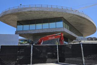
The new building will be made of Zumthor’s signature material, concrete, including the interior walls, which is likely to present a number of pragmatic issues for the hanging and rehanging of art. The flat, low-rise structure itself, which will bridge Wilshire Boulevard, looks to its haters like a pancake, a coffee table, an overpass or an Italian travel stop. What’s more, they say, it costs far too much, enough to saddle LACMA with layers of serious debt for years to come.
Govan’s response to all of these issues has been, essentially, don’t worry, we’ve got this, be happy.
Yet many remain unconvinced, to say the least. When interior renderings and schematics were finally made public in mid-September, revealing “somber” gray walls, asphalt-dark floors and a maze of gallery “clusters,” Govan promised a sublimely fluid museum experience devoid of the usual art historical hierarchies. One anonymous commenter on the Los Angeles County Museum on Fire blog weighed in with a less sanguine judgment: “A lazy act of self-satisfied claptrappery.”
As LACMA nears completing demolition of its 1960s and ‘80s-era buildings, the museum finally releases a floor plan for architect Peter Zumthor’s museum rebuild.
So it goes. One positive outcome of all the controversy is the realization of how much Los Angeles actually cares about LACMA. The Getty Center, for all its power and appeal, remains a distant wealthy cultural cousin. The Hammer is engaged and important, but its office-building location is restrictive. MOCA is diminished, damaged from years of uncertainty and turmoil, still finding its way with a new director, Klaus Biesenbach. Its neighbor, the Broad, has its curated moments, but often feels generic — one man’s collection with selfie stick-wielding tourists.
LACMA, on the other hand, feels like our museum — its mid-town campus welcoming and accessible, and soon to have its own Purple Line stop; its wide-ranging collections familiar, even beloved. If the Wilshire corridor is L.A.’s linear center, as has often been suggested, LACMA is arguably the heart of the city, which is why the plan’s detractors care so much, and why Govan does too.
Govan has always been a mover and shaker of the first order, a ripper-upper and a builder. He was tapped as a grad student by Thomas Krens for the Guggenheim, where he was deputy director for six years — a period that coincided with the Guggenheim’s global expansion — before moving on to the Dia Art Foundation, which he also “redesigned,” transforming an old Nabisco box factory on the Hudson River into Dia:Beacon, a huge permanent space for the foundation’s collection. In 2006, when he was hired to direct LACMA, the goal was to take it to the next level, to take on and even surpass New York’s arts hegemony.
Govan’s knack for showmanship undergirded with artistic cred — he studied with Allan Kaprow, the renowned “Father of the Happening” — has found fertile ground at LACMA. Witness Chris Burden’s insanely popular museum gateway “Urban Light,” or Michael Heizer’s “Levitated Mass,” the transportation of which from desert to museum grounds Govan was savvy enough to make it a public event. Some years ago, he also tried to add a massive (and massively expensive) hanging train engine from artist Jeff Koons, but the project never got off the ground. Govan believed that LACMA needed not just a great encyclopedic collection but also a beacon, a landmark, a grand gesture to make the museum a destination. Which brings us to Zumthor.
One much-decried issue has been Govan’s lack of transparency, including his refusal to host an architectural competition. Yes, he can be stealthy, but when it comes to Zumthor, who can blame him? The Pritzker Prize-winning architect has never built in the U.S. before, and LACMA will be his largest project to date. Why go through a painfully democratic process when you’ve already got Zumthor?
It doesn’t hurt that the architect’s name — pronounced Tsoom-tor — sounds like a superhero. And you don’t have to be a critic to see the strength of Zumthor’s ascetic exactitude. Take a look online at his buildings, the Therme Vals in Switzerland, the Kunsthaus Bregenz in Austria, or the Kolumba Museum in Cologne, which fuses a contemporary structure to a bomb-damaged church.
“Spirituality, sacredness, mysticism and aura are terms that most of our visitors associate with the architecture of the museum and other Zumthor buildings,” says Kolumba director Marc Steinmann. He also notes that Zumthor won over the Kolumba staff with his obsessive attention to detail, telling them that “memories can be connected with a door handle.”
LACMA’s buildings from the 1960s were pedestrian, vertical, confining, the mid-1980s addition looking from Wilshire Boulevard like a giant mausoleum. Zumthor and Govan are clearly attempting to place the art-going experience on a higher, newer plane, one that forsakes the normal strategies. Yes, the risks are great, but so are the possibilities. After all, one woman’s “somber” is another’s “meditative,” one man’s coffee table is another’s Sam Maloof masterpiece. In Zumthor, Govan has an architect capable of merging the metaphysical and the material, of creating sacred spaces, in this case above the La Brea tar pits.
My bet, and I believe a safe one, is that these high-functioning professionals have in fact got this, down to the door handles, and that the result will be as promised: sublime.
Tom Christie, former arts editor of the L.A. Weekly, divides his time between Los Angeles and Berlin.
More to Read
A cure for the common opinion
Get thought-provoking perspectives with our weekly newsletter.
You may occasionally receive promotional content from the Los Angeles Times.


