What will LACMA’s new building look like inside? Here are the long-awaited gallery plans
At last. After months of demurring, the Los Angeles County Museum of Art has made public a floor plan for its new building, designed by Swiss architect Peter Zumthor. The release includes half a dozen new renderings that offer some answers to what form the galleries will take in his blob-shaped building that will bridge Wilshire Boulevard.
The topline: Other than necessary mechanical systems and bathrooms, the building’s entire second story will be devoted to galleries, a total of 110,000 square feet of exhibition space. The galleries are composed of two dozen rectilinear spaces — basically, boxes — arranged in clusters and surrounded by interstitial spaces that will also display art.
Other services, among them the museum’s education department, shop and three restaurants (including a new wine bar), will be at ground level. As will a 300-seat theater in the section of the building on the southern side of Wilshire.
It is a porous, flexible design, says LACMA Director Michael Govan. “The visitor chooses the path,” he says, instead of “the museum leading you by the nose.”
The release of the plans comes after months of delays.
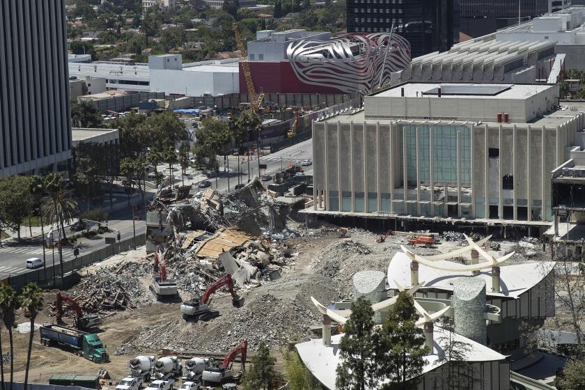
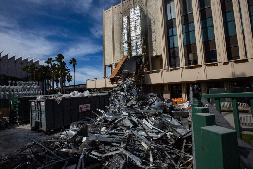
In February, Govan said the plans would be ready in March. In April, the museum pushed the release to early summer. Only now, as LACMA demolishes the last of its older buildings — all that remains of the 1960s structures by William L. Pereira & Associates is a fragment of the four-story Ahmanson Gallery — and begins excavation for the section of the building on the southern side of Wilshire, do we have some idea of how the largest museum in the western United States plans to showcase its art.
Like everything else about the building, it will not be traditional. “I did ask for and got something that would be very different,” says Govan. “I think it’s going to be absolutely sublime, but that’s for the public to see.”
The galleries
There have been countless unknowns surrounding LACMA’s vast rebuilding project: the nature of the landscaping, whether the underside of the massive concrete structure would feel like a pleasant, shady spot or an oppressive freeway underpass, where the museum’s playful Alexander Calder fountain sculpture might go.
The biggest question mark has hovered over the form and nature of the galleries — a troubling mystery given that the museum’s core mission is the care and display of art. This has been made more urgent because the layout not only will break with the traditional regional and chronological display of encyclopedic museums but it also has to inhabit a highly unusual form.
The newly released schematics reveal that the galleries will come in one of three forms: “core,” “courtyard” and “terrace.”
Twenty-six core galleries will offer the most controlled viewing experience. Arranged in four broad clusters around the new building, each is designed in the form of a square or a rectangle at various scales to accommodate everything from a large-scale exhibition to a single master work.
A single, combined entrance and exit is meant to provide a focused curatorial experience. Each will be sheltered from daylight, with controlled lighting systems to allow the display of fragile works, such as photographs, textiles and paper.
Here’s a look, including photos, at demolition underway at the Los Angeles County Museum of Art, where three buildings have been taken down. What’s next?
In between these clusters are the courtyard galleries.
These spaces, at the juncture of different paths through the building, will also serve as display sites. The courtyards will receive some visible daylight — sidelight — and will showcase three-dimensional installations as well as works that don’t require highly controlled lighting conditions.
Around the building’s perimeter are winding terrace galleries, which will have direct sunlight and views of the city and Hancock Park. These will accommodate more durable objects that can be displayed in broad daylight, such as Roman sculptures, temple statuary from Asia and other works designed to weather the elements.
Govan likens each cluster to “a European village” — like a medieval Italian town, where myriad roads might lead to a small plaza.
“You might come to a [courtyard] gallery through any number of paths,” he says. “Once you are inside a core gallery ... then you are 360 degrees controlled by the curatorial proposition.”
The format, he adds, will allow for a more considered display of different types of works from like-minded collections. In the old Ahmanson building, Southeast Asian art was displayed in a darkened, light-controlled gallery whether it was paper or more durable sculpture.
“They had to put everything in the dark: paper and sculptures made for temples,” he says. “Now you can put the paper [in a core gallery] and the sculpture [in a courtyard or terrace gallery] — like a temple with light.”
Some of the spaces are big enough for other uses.
“We do talks, we have done concerts in galleries, we do readings in galleries,” Govan says. “So we have sized some of these spaces very generously, so we can have them in galleries.”
What it will look like
While the renderings and floor plan provide some vision for the LACMA of the future, key details are still outstanding.
The renderings depict solemn (too solemn?) gray interiors with black terrazzo floors, although the exact nature of these materials is still being finalized.
Architect Michael Mann, a managing director at Skidmore, Owings & Merrill, the international architecture firm collaborating with Zumthor on the building’s design, engineering and construction, says the team has been working on getting the wall’s color and texture just right.
“You can’t imagine the energy that has been spent getting the right concrete mix,” he says. But the plan is for the color scheme to be gray and the surfaces smooth.
The bigger question is the floor. Mann says they’ve exploring two options: polished, poured concrete, as well as a softer-on-the-knees asphalt terrazzo, a type of material currently used in Europe.
“Peter has it in his studio in Haldenstein,” Mann says. “It’s really quite beautiful. It’s not like you would think.”
While beautiful, there is also the question of how these materials will read at a scale of 110,000 square feet. That’s a whole lot of asphalt and concrete.
Mann says his team has also worked on a lingering question related to all that concrete: namely, how the museum will manage the installation and deinstallation of works on such a hard surface. (Boring into poured concrete is more complicated than hammering a nail into drywall.)
Mann, who has studied Zumthor’s buildings in Europe — including two museums, the Kunsthaus Bregenz in Austria and the Kolumba Museum in Germany, which feature vast areas of poured concrete — says that has been worked out. Works are hung using anchors instead of regular nails. And there are methods for patching up concrete after art has been moved.
L.A. private equity titan Tom Gores is facing an ouster campaign for his LACMA board seat over his firm’s investment in a prison telephone service.
“We’ve been working with Peter — he worked with the curators at Bregenz about how to patch,” Mann says. “There is a precedent that we will bring to LACMA.”
Zoë Kahr, LACMA’s deputy director for curatorial and planning, notes that working with concrete is “a different methodology, and it will take some practice to perfect it. But our team — preparation and installation and our exhibition design team — have been involved in every facet of analyzing concrete samples.”
On the ground
At ground level, the floor plan puts other details into focus.
The underside of the structure — as well as the ceiling in the exhibition spaces — will not be flat concrete, like an overpass, but will bear a rhombus pattern drawn from the building’s structure. It will also be illuminated.
On the southern side of Wilshire, on what has long been a parking lot at Spaulding Avenue, the 300-seat theater will occupy the ground floor of the elevated building’s southernmost leg.
The yet-to-be named theater replaces LACMA’s 600-seat Bing Theater. But Govan says the museum will also have access to the two theaters at the neighboring Academy Museum of Motion Pictures when that institution opens in spring.
The southern side of Wilshire, site of a new wine bar, is where Govan hopes to relocate Calder’s colorful 1962 mobile “Three Quintains (Hello Girls),” which is activated by sprays of water.
The museum is in discussions with the Calder estate about the move. “Originally, it was in an angular pool,” says Govan. “Then it was in a circular pool. There has to be some testing done.”
On the northern side of Wilshire, at the base of the building’s various piers, will be loading docks, a restaurant, a cafe and the museum shop. Ticketing will remain at the Smidt Welcome Plaza, next to Chris Burden’s “Urban Light.” The education department will be based at the foot of one of the piers. This will include an art gallery visible from Wilshire.
“Education will program that gallery with art works, but a program that makes sense for it,” says Govan. “This street-engaging art storefront — that, we have never had before.”
Also on the northern side will be outdoor spaces for events, including screenings, talks and live music.
“When we have our galas or events, we have to close the plaza,” says Govan. “So this is prewired for setting up a dinner for 500.”
The curatorial piece
Part of Govan’s plan for the new building is to re-conceive the encyclopedic museum. To move away from the regional and chronological model of showing art — that linear Western march that leads museum-goers from ancient Greece and Rome to medieval European art to everything Renaissance, with side galleries devoted to the rest of the world.
The building’s design, with multiple points of approach and fluid paths, is designed so that no story is given primacy over another, Govan says. “We looked at an overall structure that would be nonhierarchical. No obvious front or back.”
And if the goal is to show more work by women and non-Western artists, he notes, installation needs to be rethought: “If you only have women in the last 10 minutes of a collection, you need a new way to organize the museum.”
Dear Peter Zumthor, We haven’t met, but I have been following your work on a design for a new building at the Los Angeles County Museum of Art ever since word leaked (13 years ago) that you had been tapped for the project.
That might mean a cross-departmental exhibition that mixes works from various regions or a thematic show that looks at a certain topic — say, landscape painting — over time.
How exactly this will play out in real life, however, remains to be seen. (Times art critic Christopher Knight was no fan of one such show, “To Rome and Back: Individualism and Authority in Art, 1500-1800,” which he described as “bland and ineffectual.”)
Govan and Kahr are reviewing more than 200 proposals submitted by LACMA curators for how the Zumthor building might be installed.
“The proposals range widely from single-focus, single-artist presentations to looking at a single medium, to looking at a theme, to looking at a place across time or time across a place,” says Kahr. “They speak to all of the different approaches you can take to art history in a museum, and that’s an amazing opportunity the museum has.”
The architecture, she says, will help support some of the curatorial fluidity. Interstitial spaces such as the courtyard galleries and terrace galleries can provide “adjacencies” between cultures — say, the links between Latin American and Asia — rather than having everyone boxed off in their own worlds.
Some installations will remain fixed because of stipulations that they remain on display as a condition of their donation. This includes the Carter Collection of Dutch paintings, which will occupy a permanent space in the new building, and the Lazarof Collection of Modern and Impressionist art, which will be installed at the Broad Contemporary Art Museum, the Renzo Piano-designed building on the western edge of LACMA’s campus.
Where construction stands
Currently, the tab for construction stands at $750 million. Govan says he has received $655 million in pledges toward the project and, of that, $300 million has been paid. (This includes $125 million from Los Angeles County taxpayers.)
Will the building adhere to that budget? Big construction projects have a way of climbing in price as construction progresses. Just ask the Academy Museum next door, which is $100 million over budget.
But Govan says that so far, the budget remains on track: “Ninety-six percent of the trade and contracts have been bid out, so the risk level on cost has plummeted. There is very little risk now.”
Of course, that is betting on not turning up any mammoth remains during construction. The La Brea Tar Pits, after all, are right next door.
Michael Govan responds to critics who say building a new Peter Zumthor-designed complex will leave the museum swimming in debt. With demolition just weeks away, we look at LACMA’s tax forms and current debt load.
Govan estimates that the building will be completed by 2023, with move-in scheduled for 2024 — an ambitious timeline.
But Mann says that so far, there hasn’t been a single missed deadline — even with the COVID-19 pandemic.
“I tell you,” he says. “If this team can’t do it, nobody can.”
More to Read
The biggest entertainment stories
Get our big stories about Hollywood, film, television, music, arts, culture and more right in your inbox as soon as they publish.
You may occasionally receive promotional content from the Los Angeles Times.
