How will Meghan and Harry mash up California style and British (royal) tradition?

For native Angeleno Meghan Markle and Britain’s charming Prince Harry of Wales, the first stop on the way to happily ever after will be setting up house inside Nottingham Cottage, a.k.a. Nott Cott, a (comparatively) modest-sized, rose-covered brick cottage behind a white picket fence on the grounds of Kensington Palace.
Previously home to William and Kate, B.K. (in the time before kids), Nott Cott’s newlyweds will now put their own stamp of style on the royal residence that is rumored to have low ceilings and an absence of air conditioning.
So how do you marry effortlessly chic SoCal style with the formality of British tradition under one red-tiled roof?
We asked four Los Angeles-based interior designers to put their talent and imagination to the test and show us how they would negotiate a royal redecoration that incorporates the flavor and elements of both.
The following are designer mood boards for a living room, study, master bedroom and kitchen that are fit for a princess and could also be adapted for our own California castles and cottages on this side of the pond.
Master Bedroom
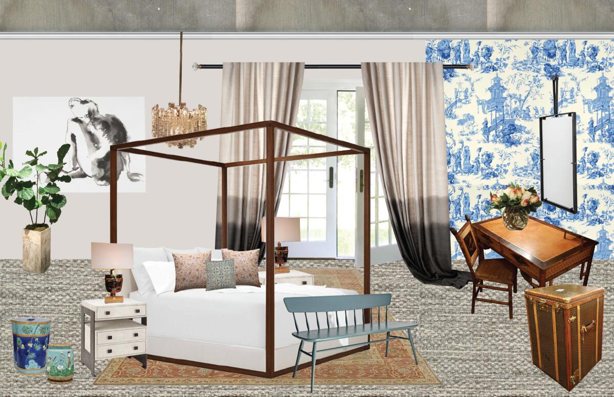
Designer: Bridgid Coulter, principal, Bridgid Coulter Design, Santa Monica
“I started as if they were really my clients,” said Coulter, “what do they love, what do they care about and what would they want to blend their two worlds and celebrate their love.”
Coulter said her design also blends vintage with modern and elements of European tradition with California casual.
Coulter included artwork by Inslee Fariss, an artist Markle is reported to collect, and chose a vintage cane desk and modern four poster bed as a nod to the couple’s trip to Botswana. “I read that they fell in love, or had a solidifying moment there,” said Coulter, “so I wanted to imply a little bit of safari life.”
Countdown to the Royal Wedding: Your complete guide to the royal wedding 2018 »
A pristine, turn of the 19th century Goyard trunk Coulter spotted at the Paris Flea Market represents luxury, history and travel, while a 1960s chandelier with icicle-shaped crystals bathes the room in romance.
Coulter said, “The ombre drapery feels like California, but formal drapes are very European and modern … it shows generations of color, and they’re merging generations of family.”
Brass bedside lamps are designed with the classic masks of the dramatic arts, “and that’s an homage to her life as an actor.”
Get the look: Wallpaper: Schumacher; ombre draperies: Carolyn Ray; bed: Ralph Lauren; artwork: Inslee Fariss; Windsor bench: Moving Mountains; mirror: John Pomp; flooring: Design Spec Floor Coverings; Tabriz Turkish rug: BCD Inventory; pillows: Zak + Fox, and BCD Custom Textiles; vintage cane desk and Goyard trunk found at the Paris Flea Market.
::
Kitchen
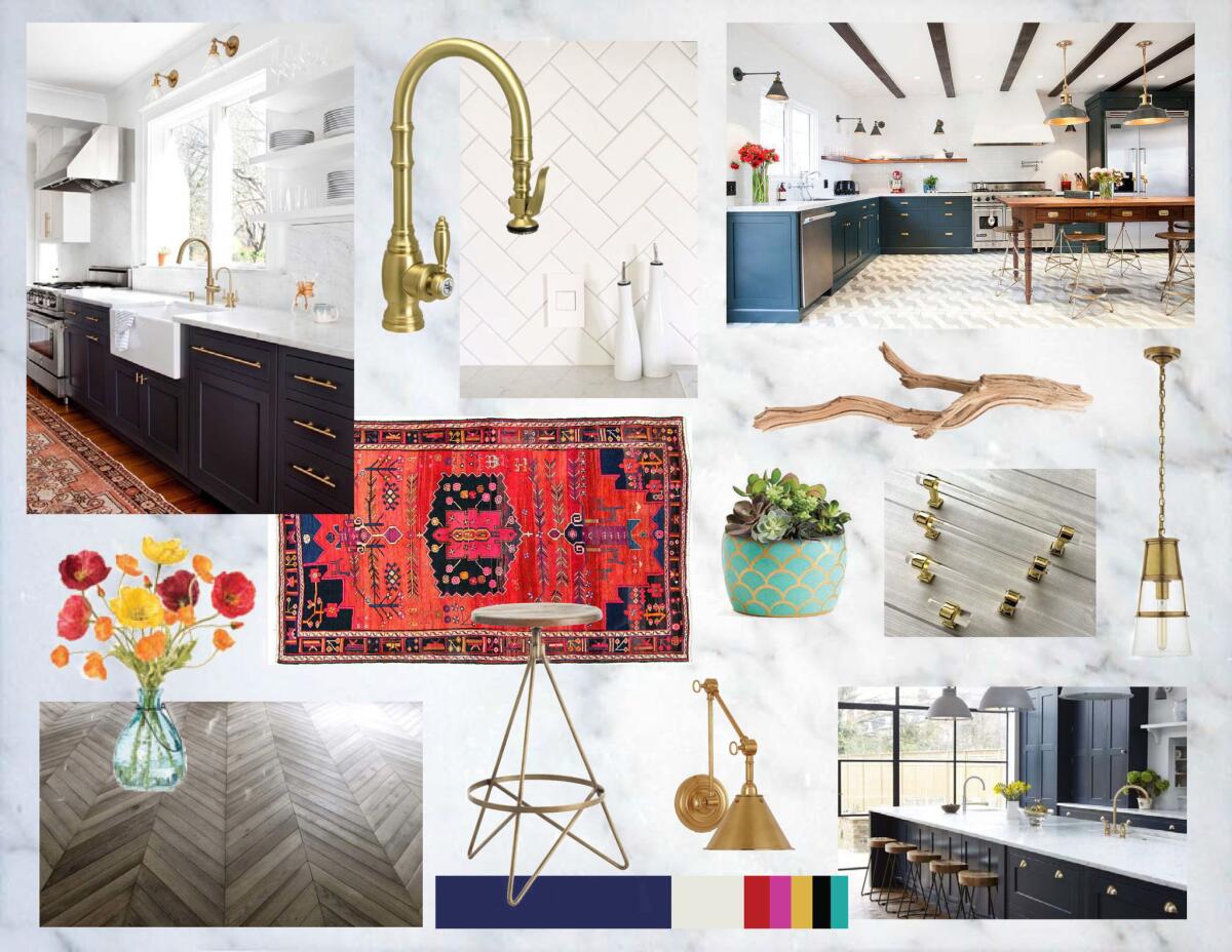
Designer: Samantha Williams, principal, Ederra Design Studio, Pasadena
“I took a look at pictures of Meghan’s (previous) apartment in Toronto to get a sense of her style,” said Williams, “and I noticed that things were generally pretty white and light with a lot of simple materials — nothing too fussy, but with some antiques mixed in.”
Her goal for the kitchen: create a “buttoned-down” timeless English look with a relaxed Californian vibe. “We thought the combination of rich, navy blue cabinets with pretty, classic brass hardware … combined with simple elements like the subway tile, light countertops and succulents would make it feel comfortable and Californian.”
Williams envisions gray-washed, reclaimed oak in a herringbone pattern for the flooring for a relaxed, laid-back style with traditional English appeal. “A vintage rug in a bold palette adds life to the space and would help brighten dreary London days,” said Williams.
To add layers of vibrancy and a touch of California, Williams accessorized with succulents, loose, hand-cut flowers and driftwood. “I felt like it would be a nice reference to the beach and the outdoors which we love so much in Southern California.”
Get the look: All lighting: Visual Comfort; tile: Walker Zanger; cabinet hardware: Forge Hardware Studio; faucet: WaterStone; stool: Arteriors.
::
Living Room
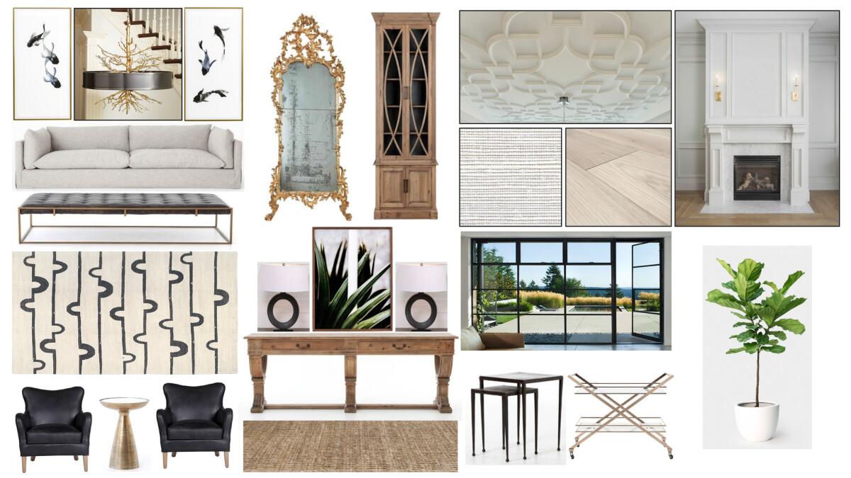
Designer: Jason Lai, principal, L2 Interiors, Culver City
“My inspiration came through who she is and what she is all about,” said Lai, “and she’s like this fashion queen.… I pictured her living this very California, glamorous life, very chic and fun.”
“Because the bones of the house are not going to change much, I wanted to bring in furnishings and accessories to update it to make it feel more contemporary,” said Lai, who explained that incorporating the British influence would be achieved using Harry’s existing heirlooms and accessories.
Lai’s plan replaces windows and doors with black iron casement designs to let in more light, and installs bleached-oak flooring. “It’s super natural,” said the designer of laying a wood floor with only a clear finish, “it’s a trend I’ve been seeing and putting in all our projects.… It’s no longer that dark wood.”
To complement existing moldings, new, contemporary molding would be added to the ceiling. “It’s a more contemporary, young style… a little bit more girly and fun to bring both ages together,” said Lai.
An interior fig tree (that doesn’t require much light), palm leaf art on the entry table and grass cloth wall covering on panels around the fireplace channel California vibes, while a striking chandelier with black iron drum and gold plated branch gives a nod to nature.
“Honestly, from what I can see of her style,” said Lai, “any outfit she wears would look stunning in this room.”
“I wanted everything to be bright and fun and airy and very comfortable,” said Lai, “but not embarrassing if the Queen comes over for a cocktail.”
Get the look: Giltwood Rococo mirror: Susanne Hollis; sofa: Four Hands; chandelier: Global Views; coffee table: Four Hands; chair: Four Hands; Chant Black rug: Tufenkian; side table: Four Hands; Julen display cabinet: Revelation by Uttermost.
::
Study
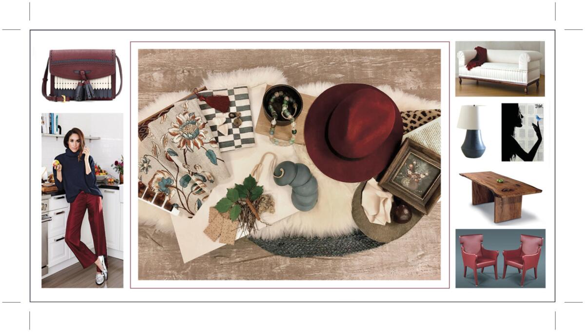
Designer: Dana Triano, principal, Dana Triano Designs, West Hollywood
“I wanted to capture the effortlessness of L.A. and the buttoned-up, more scripted, London style,” said Triano. “Another dichotomy was the fact it would be a home library that would act as both retreat and working environment.”
The room’s color palette was inspired by the couple’s noteworthy sense of sartorial style. “He always looks so pulled together,” said Triano, “and she’s a fashionista… I was inspired by the colors they choose to wear.”
Triano went to Claremont Fabrics on La Cienega, a classic English fabric resource, to find an English floral in a modern color way. “I was inspired by this combination because I thought the check brought a little bit of youth or fun … and the crisp color way of the floral fabric pulled in the claret and blue.”
When it came to picking design elements, Triano said, “I was looking for strong silhouettes. I think there is a clean, classic, elegant way about the two of them so I wanted the pieces to feel stylish, structured and updated.”
Triano said she chose the couch for its modern take on a British classic. “It’s a Chesterfield sofa, a classic English sofa, and it’s usually leather and tufted.… This one has the same silhouette, but they didn’t tuft it and it’s got super-clean lines. They did an intricate box pleat at the base and a pleated rolled arm.”
Textural elements are represented with a white fur throw, matte-finish ceramic lamp and cream-colored plaster walls, and exotic details from their pre-engagement trip to Botswana round out the decor.
A must-have for the room was a partners desk. “The two of them appear to be amazingly in sync with each other,” said Triano, “I love the idea of them teaming up with laptops and facing each other.”
“The reason I chose this particular desk was that it was a live-edge desk made from a beautiful piece of wood … so it had that organic, California-ness to it and also highlighted the natural beauty of the world’s resources. The purity of that element just rang true to me, as a lovely place for the meeting of the minds.”
Get the look: sofa: Brampton Pleated Sofa by Dmitriy & Co; Leather chairs: Ignazio Gardella at Richard Shapiro Studiolo; lamp: Rose Tarlow at Melrose House; all fabrics: Claremont Furnishing Fabric Company; brogue and fringe purse: Burberry.
Bonnie McCarthy contributes to the Los Angeles Times as a home and lifestyle design writer. She enjoys scouting for directional trends and reporting on what’s new and next. Follow her on Twitter @ThsAmericanHome
ALSO
How designer Nate Berkus blended old and new in his L.A. kitchen remodel
They found a real estate unicorn: A house with great ‘bones,’ ready for decorating
You’ve never seen a kitchen island sink like this
How online art galleries are serving up talent — and sales — without the 'tude
Sign up for The Wild
We’ll help you find the best places to hike, bike and run, as well as the perfect silent spots for meditation and yoga.
You may occasionally receive promotional content from the Los Angeles Times.


