How designer Nate Berkus blended old and new in his L.A. kitchen remodel
When celebrity designer Nate Berkus renovated the 80-square-foot kitchen above his garage — it’s actually the Hancock Park home’s original carriage house — his goal was to salvage as much of the charm and character of the original 1928 Spanish Colonial as he could.
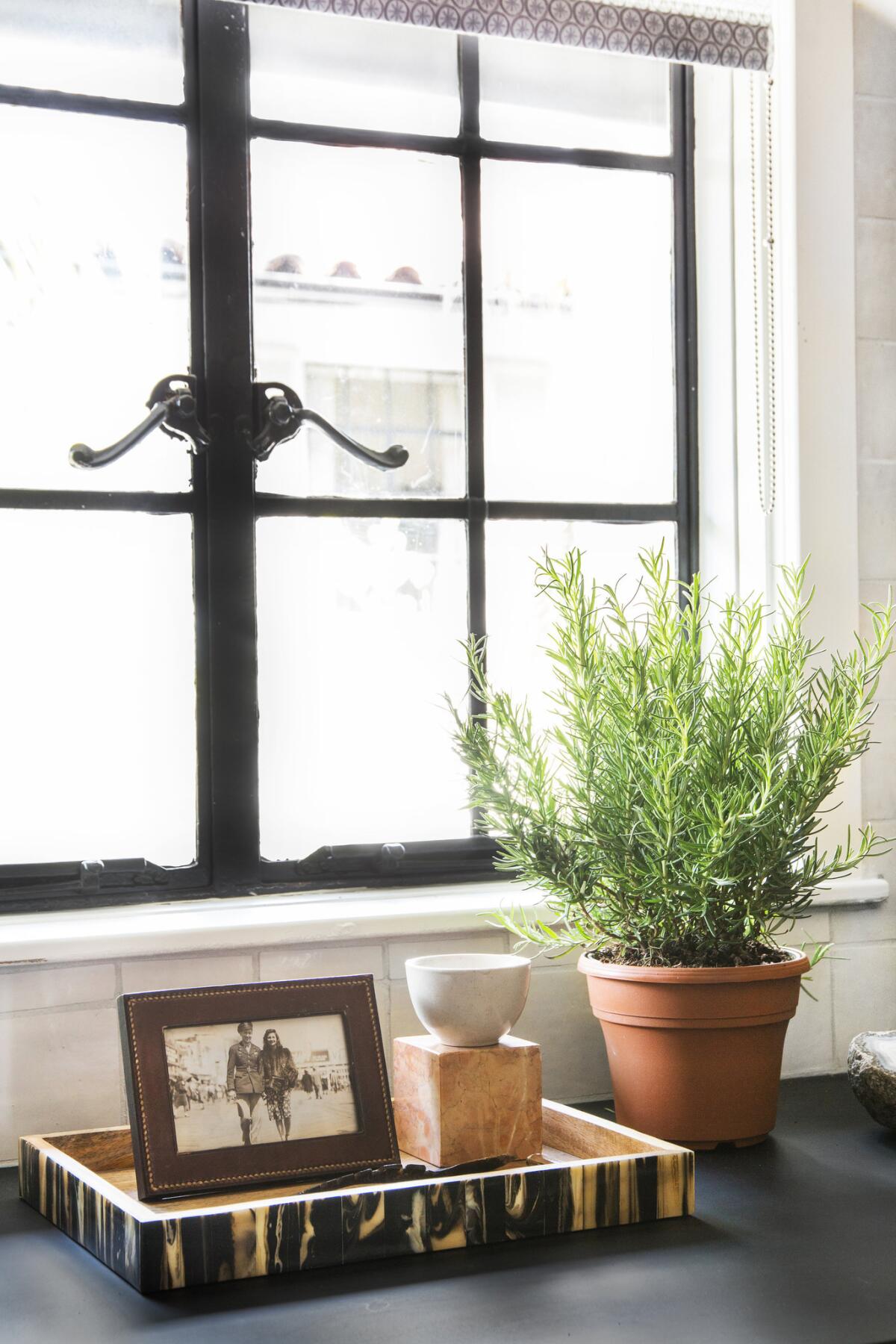
That meant maintaining the vintage Shaker-style cabinetry and keeping the 1920s glass and iron frame window above the sink. But he had no intention of living in the past.
Berkus walked us through the remodel, his design choices and how he saved money on cabinetry:
“I always reach for things that have age and patina,” Berkus said, “and I’m aware of what already has inherent character, but the more I’m out there in the world shopping, and sourcing … the more interesting some of the newer solutions are.
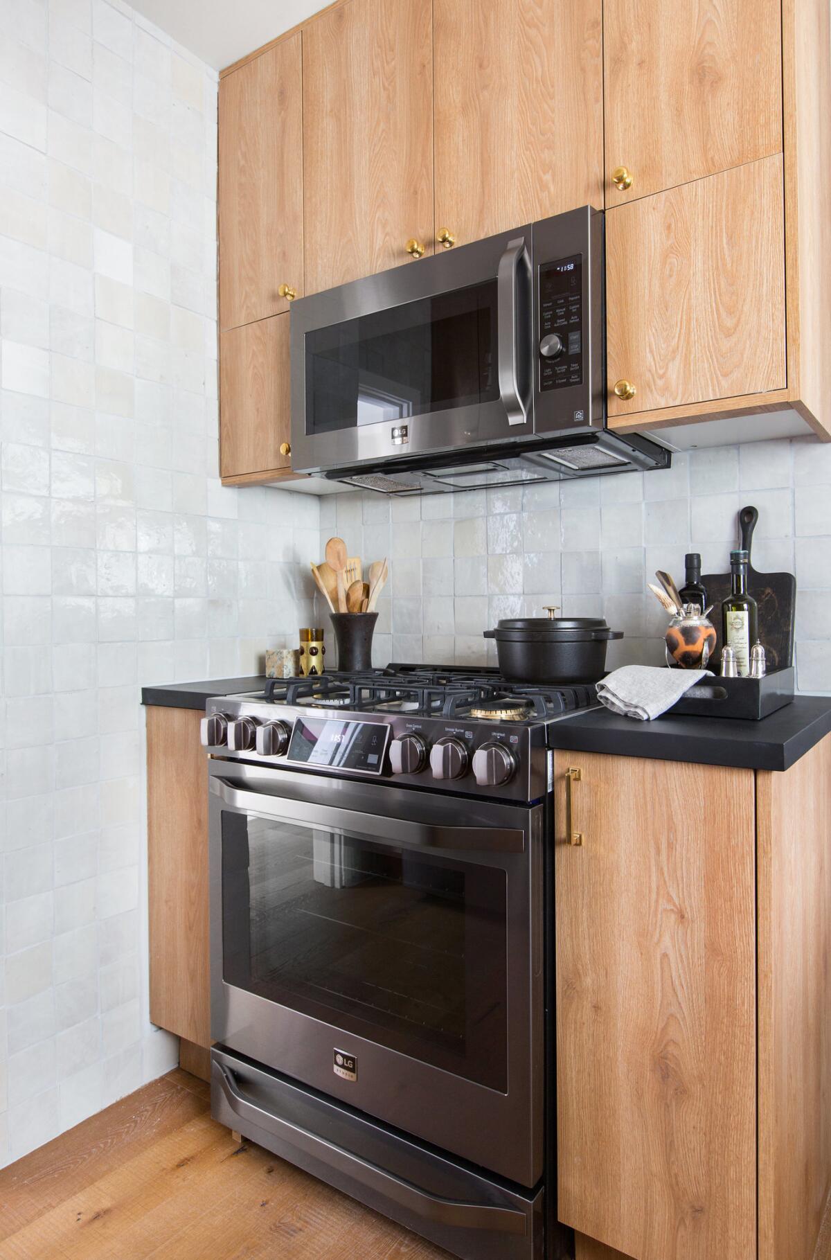
“This kitchen, for me, has a timeless, forever feel, but it’s using a new cabinetry product that didn’t exist 10 years ago, black stainless-steel finish on appliances that didn’t exist a year ago and Clé tile I didn’t know about nine months ago. So what’s fun is I think it all blends very well with the original elements, but it’s definitely a kitchen for right now.”

As artistic advisor for the LG Studio line of appliances, Berkus had a hand in creating some of that innovation himself.
“This was an opportunity for me to use the black stainless-steel finish, which I had specified for other projects but never lived with in my own home,” Berkus said about the LG Studio suite of full-size appliances he installed. (“I don’t believe in tiny-sized stuff,” he said.)
For additional cabinets, Berkus turned to IKEA, then finished them off with textured melamine doors from the Impression collection in a Tahoe finish from a company called Semihandmade, which designs custom-look drawer and cabinet facings for basic cabinet boxes. The fronts are three-quarters of an inch thicker than standard IKEA facings, and flat-front panels extend slightly past the drawer or cabinet base for a more seamless, built-in look. “It’s brilliant, actually,” Berkus said of the storage solution. “You can buy the cabinet boxes from anywhere, and they sell the doors and the skins so you can change anything to what you want it to be.”
In terms of renovation, Berkus kept restructuring to a minimum, adding only a gas line and an additional wall to accommodate cabinetry around the gas slide-in range.He wrapped the room in 4-inch squares of textured zellige tiles in Weathered White from Clé and installed pre-engineered, wide-plank, white oak floors from Urban Surfaces.

“Everything got new hardware,” said Berkus, indicating the 4-inch brass pulls from Merit Metal “That is such an easy kind of fix. The sink was replaced, and the faucet” — from Signature Hardware in unlacquered brass — “was wall-mounted as it was originally.”
New, darkly stained butcher block countertops were chosen for classic appeal, not practicality: The kitchen services what is a home office space for Berkus and his husband, designer Jeremiah Brent, and is not the main kitchen prep area for the family, which includes 2-year-old daughter Poppy. (The couple announced on Valentine’s Day that they are awaiting the arrival of a baby boy). “We put down cutting boards when we work in this kitchen, and I don’t mind things that are stained and aged and chipped.”
4 tips for big style in a small space
“A small space is not the place to bring every design idea you’ve ever loved to life,” Berkus said. “You need to really edit and hone your decisions, lay it out, look at the finishes next to one another and ask yourself if there’s harmony in your choices.”
Simply put, in a smaller space less is more. Here are his four tips for making it work:

1. “Make sure all of the elements in the space are complementary,” Berkus said. “It’s not a space to overload with pattern or saturated color.”
2. “Honor what is already there. The fact that you can stand at the sink and look out the window and see the garden is something that I would never change, and never spend the money to change.”
3. Maximize storage. “The towers flanking the refrigerator go all the way to the ceiling,” Berkus said, “and there’s cabinetry wrapping the stove; it’s not particularly wide, but it’s enough to stack up baking pans or a blender.
4. Find a place “where you have a little bit of room to do just do something beautiful.” In the case of his kitchen nook, Berkus intentionally left the area near the sink clear of shelving or cabinetry. Instead, he hung a favorite framed etching by Jacques Villon. “It’s relaxing to see that not every wall is filled with millwork,” Berkus added.
For an easy way to follow the L.A. scene, bookmark L.A. at Home and join us on our Facebook page for home and garden design, Instagram, Twitter and Pinterest.
ALSO:
Architect Barbara Bestor goes green in colorful kitchen remodel