A Pacific Palisades home is remodeled to welcome a stunning ocean view
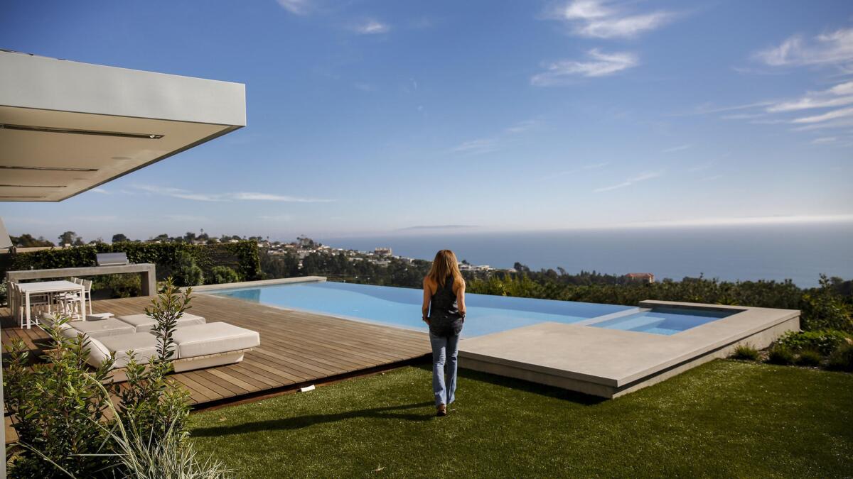

A home on the mountains with a commanding view of the Pacific Ocean is a shame to waste, which is why architect Takashi Yanai took on the remaking of Susan Harbert’s Pacific Palisades home.
Yanai, a partner of Ehrlich Yanai Rhee Chaney Architects, said his firm doesn’t normally accept renovation projects, but “they don’t make any more Pacific Ocean view properties.”
Built in a traditional style, the Pacific Palisades home failed to take advantage of its great location. “When you walk in, you wouldn’t even know the ocean was there,” Harbert says of her home’s former configuration. French doors and segmented windows all along the ocean-facing side obscured the beauty outdoors. She bought the home in July 2014 knowing she would make major changes.
Now, the home is a three-bedroom, three-and-a-half bathroom picture of subtle modernity. Yanai dispensed with a pitched roof and trellises, replacing them with elongated boxes. Rheinzink, a 100% recyclable zinc material, defines the roofline of the home.
MORE: Before and after ocean-view renovation photos »
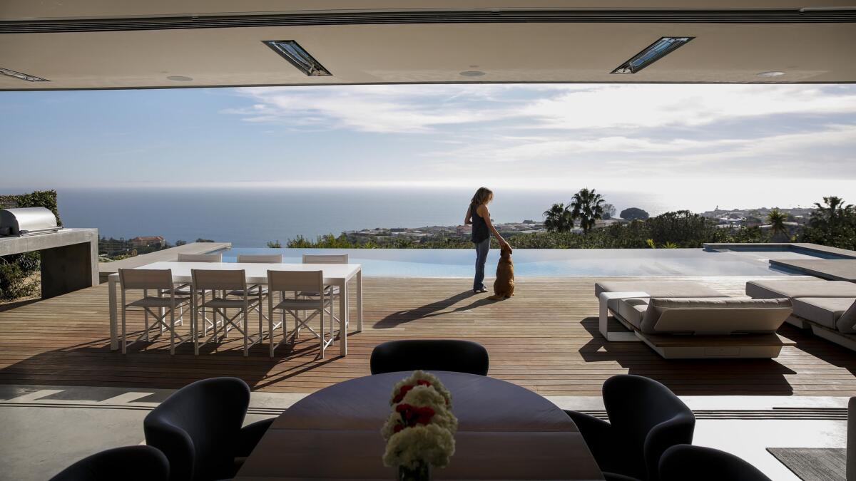
Inside, what started out as separate family, living, dining, kitchen, study and laundry rooms were all combined into a single 40-foot-wide space. A 40-foot wide motorized sliding glass door that pockets completely away also was installed, welcoming the outdoor views with wide-open arms, as it were.
“When you’re inside, you still feel like you’re outdoors,” says Harbert, who usually keeps the doors secreted away.
“I wanted to create an open, light-filled space that maximized the connection to the outdoors and the view,” Yanai says.
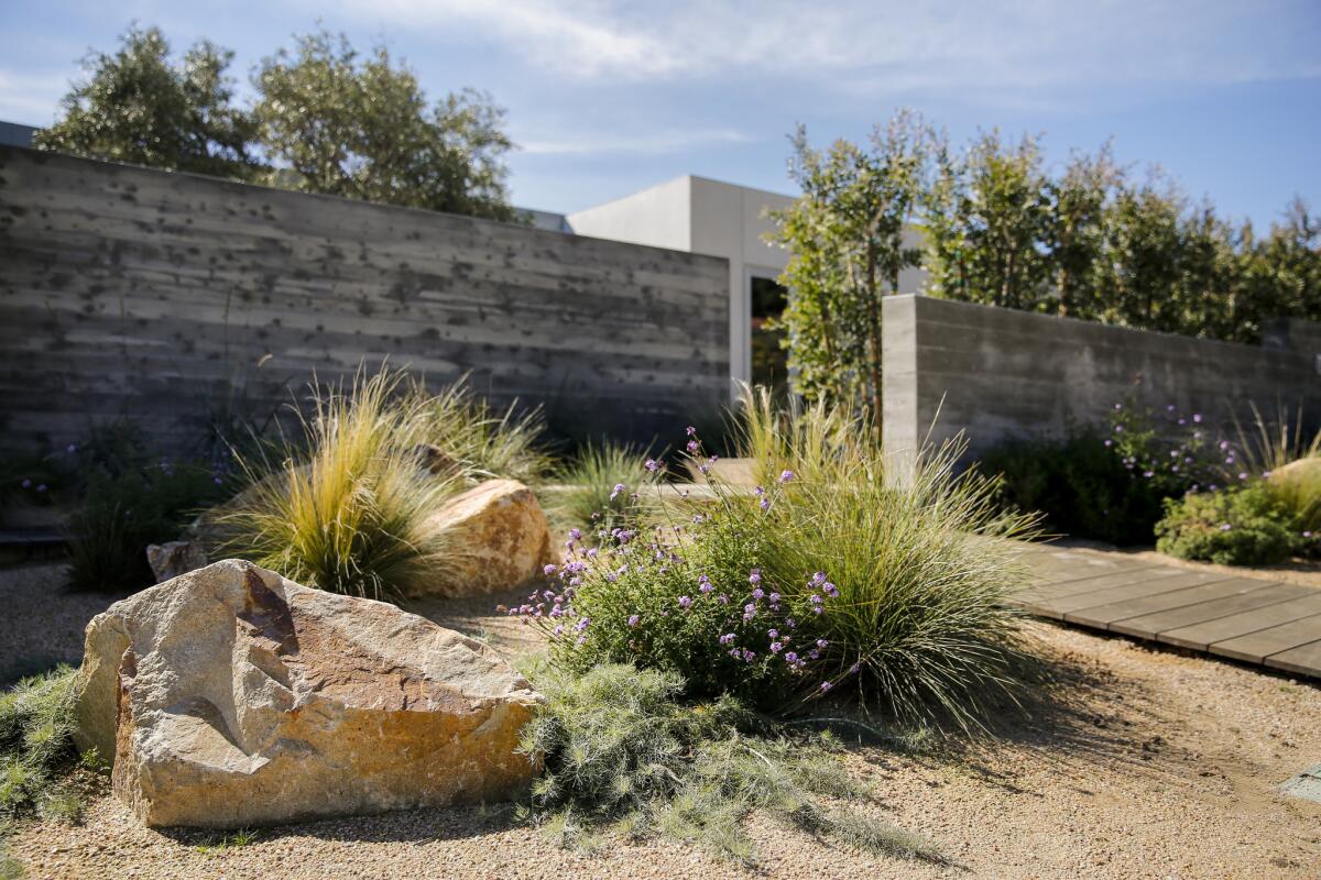
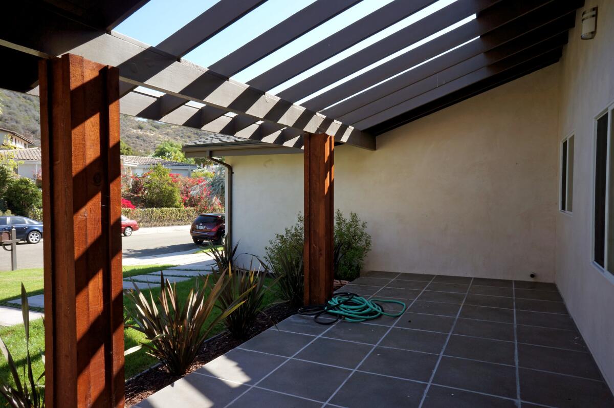
Rather than an old school grass lawn, the new entry sequence designed by EYRC Architects in collaboration with landscape firm Terremoto retained Harbert’s privacy. Board-formed concrete walls created an internal courtyard off the front door, accessed by an ipe boardwalk, echoing the beach vibe of many seaside neighborhoods. Within that internal courtyard, landscaper David Godshall of Terremoto installed an oak tree, whose striking silhouette can be viewed from inside the home.
When you’re inside, you still feel like you’re outdoors
— Susan Harbert
A plant palette with silvery gray and blue tones, plus flecks of seasonal color, inspired by the Santa Monica Mountains, now grace Harbert’s lawn. The plants have low water needs. The decomposed granite in warm tan complements the home’s cool gray, giving it a “dune-inspired feeling,” Godshall says.
But grandeur wasn’t just the goal, so was comfort. Only Harbert lives in the home full-time, but her children and their friends would often stay a few nights. So Yanai also designed the home to be comfortable in many situations — for two people, for a family when children were over, and for hundreds of people during a party.
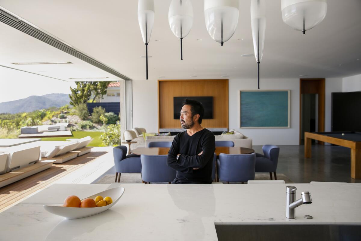
EYRC Architects kept the ceiling heights below 10 feet, creating a more intimate atmosphere for such a large open room. Rather than going for height, Yanai went horizontal, drawing the eye outward. Full-height teak frames at the sitting area, fireplace and the portal to the hallway leading to the bedrooms done by Martin and Carter Woodworking also add warmth to the space.
Yanai was so successful that Harbert says, “Nobody feels left out [in the house].” Someone at the kitchen inside can easily converse with those swimming outside or those lounging in the family room.
MORE: Before and after ocean-view renovation photos »
Yanai says, “It’s a backdrop for Susan and the different aspects of her life and lifestyle.”
Harbert is a single professional with two grown children. She volunteers her services at Center for Juvenile Law and Policy at Loyola Law School, which seeks justice for those who are wrongly incarcerated.
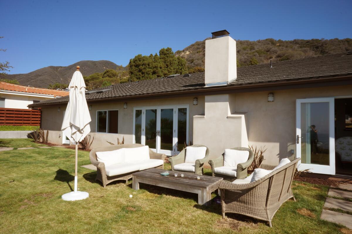
The interior design by Debbie Minchenberg also reflects the home’s minimalist leanings. Only four materials are repeated throughout the house: teak wood, concrete, Calcutta stone and white glass. “I didn’t want to fight with the scenery,” says Minchenberg, “I didn't want the house to look overly designed. The fabric selections for the furniture that I designed are quiet — sand tones and blue like the sea. I selected chairs, tables and bar stools as sculptural elements.”
The only exception to the home’s color scheme would be a decadent oversized sofa/lounge bed designed by Minchenberg, which sits in the guest room. “It’s super fun,” says the designer. “I kind of want one.” (The memorable piece was inspired by a 1970s design by Terrance Conran called the Sexy Bed.)
Now far from its humble and unpromising beginnings, the home is an oasis for Harbert, who says, “I feel so lucky to come home to a house this peaceful and calm every day.”
For an easy way to follow the L.A. scene, bookmark L.A. at Home and join us on our Facebook page for home design, Twitter and Pinterest.
ALSO:
Before & After: See the dramatic 'jewel box' garden makeover
A modern home connects a family to the outdoors — and to one another
Sign up for The Wild
We’ll help you find the best places to hike, bike and run, as well as the perfect silent spots for meditation and yoga.
You may occasionally receive promotional content from the Los Angeles Times.


