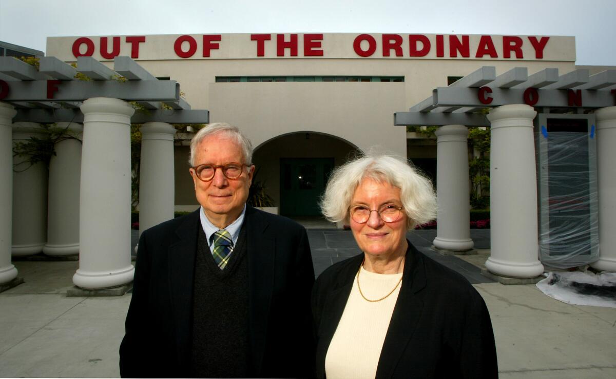
Remembering Robert Venturi, godfather of postmodern architecture and champion of everyday oddity

Robert Venturi, the Philadelphia-based architect whose buildings and writings championed “messy vitality” above the rational order of Modernism, died last week at age 93.
For generations of architects, “Learning From Las Vegas” by Venturi, his wife and longtime collaborator Denise Scott Brown and Steven Izenour is a seminal text, as important as Le Corbusier’s 1923 essay collection “Toward an Architecture.” Published in 1972, the bestselling book used research and analysis to dissect the most lowbrow of subjects, the Las Vegas Strip. It provided guidelines for how to understand American postwar cities and the growing suburbs that defied the traditional architectural logic of the East Coast or European cities. And importantly, especially for Angelenos, it gave architects the freedom to enjoy the symbolic, everyday roadside architecture — like Randy’s Donuts or Tail o’ the Pup — that they’d previously been taught to despise.
Venturi and Scott Brown are credited with ushering postmodernism into the world, to the chagrin of many, including Venturi. The unloved architectural style is often associated with eye-catching aesthetics — jarring combinations of bright colors and historical references, the worst of which continue to decorate mini-malls across Los Angeles. More hallmark examples include architect Charles Moore’s Beverly Hills Civic Center, which collages together Spanish Revival with courtyard and colonnades with Art Deco details painted in postmodernism’s signature colors, pink and aqua. Or Walt Disney Studios in Burbank by Michael Graves, just off the 134 Freeway. There, seven terra-cotta dwarfs appear to hold up the Greek temple-like roof.
Venturi, however, was less interested in style; he was in pursuit of meaning, asking how might architecture respond to the richness and uncertainty of 20th-century life?
It’s a tall order to ask that a building, through its form, ornament and materials, communicate something about our daily existence, but Venturi tried, and sometimes failed. Even now, 100 years after recalibrating architectural ideas of Bauhaus, we tend to believe that architecture should reach some kind of higher order of purity or good taste.
Venturi rejected those moralities.
Though he famously quipped “Less is a bore” in response to architect Mies van der Rohe’s Modernist maxim “Less is more,” Venturi’s first book provides more than sound bites. The influential treatise “Complexity and Contradiction in Architecture,” published by the Museum of Modern Art in 1966, provides lessons in generosity and humor that seem particularly relevant in our own time troubled by ideological polarization.
“I prefer ‘both-and’ to ‘either-or,’ black and white, and sometimes gray, to black and white,” he wrote.
“We were happy to be finding all these ugly things”
— Denise Scott Brown
Venturi and Scott Brown’s postmodern architecture isn’t kitsch — although there are moments where their designs swerve a bit too close — nor does it perfectly re-create the past. Instead, their approach is deadpan, like Ed Ruscha’s photographs of parking lots or his 1966 series “Every Building on the Sunset Strip.”
What is ugly and ordinary, their terms, is archly observed and then amplified.
This shows up in Venturi’s early 1960s work, such as the residence he designed for his mother. With a pitched roof and sly ornament, the Vanna Venturi House in suburban Philadelphia rejects the doctrines of Modern architecture.
In “Learning from Las Vegas” there’s a cartoon-like sketch drawn by Venturi. It depicts a low, boring, boxy building topped by a giant sign nearly twice as high. The billboard proclaims “I AM MONUMENT.” A similar technique appears in their unbuilt design for the Thousand Oaks Civic Center from 1969. Monumental letters, meant to be seen from the 101 Freeway, spell out “Thousand Oaks” across a low berm surrounding a parking lot.
Venturi and Scott Brown’s architecture favors accessibility over abstraction, whether it’s the Best Products Catalog Showroom in Langhorne, Pa. — a big-box furniture store with a facade patterned in and oversized print resembling floral upholstery — or the Sainsbury Wing of the National Gallery in London, where Venturi and Scott Brown willfully embraced and then misused elements of Classical architecture.
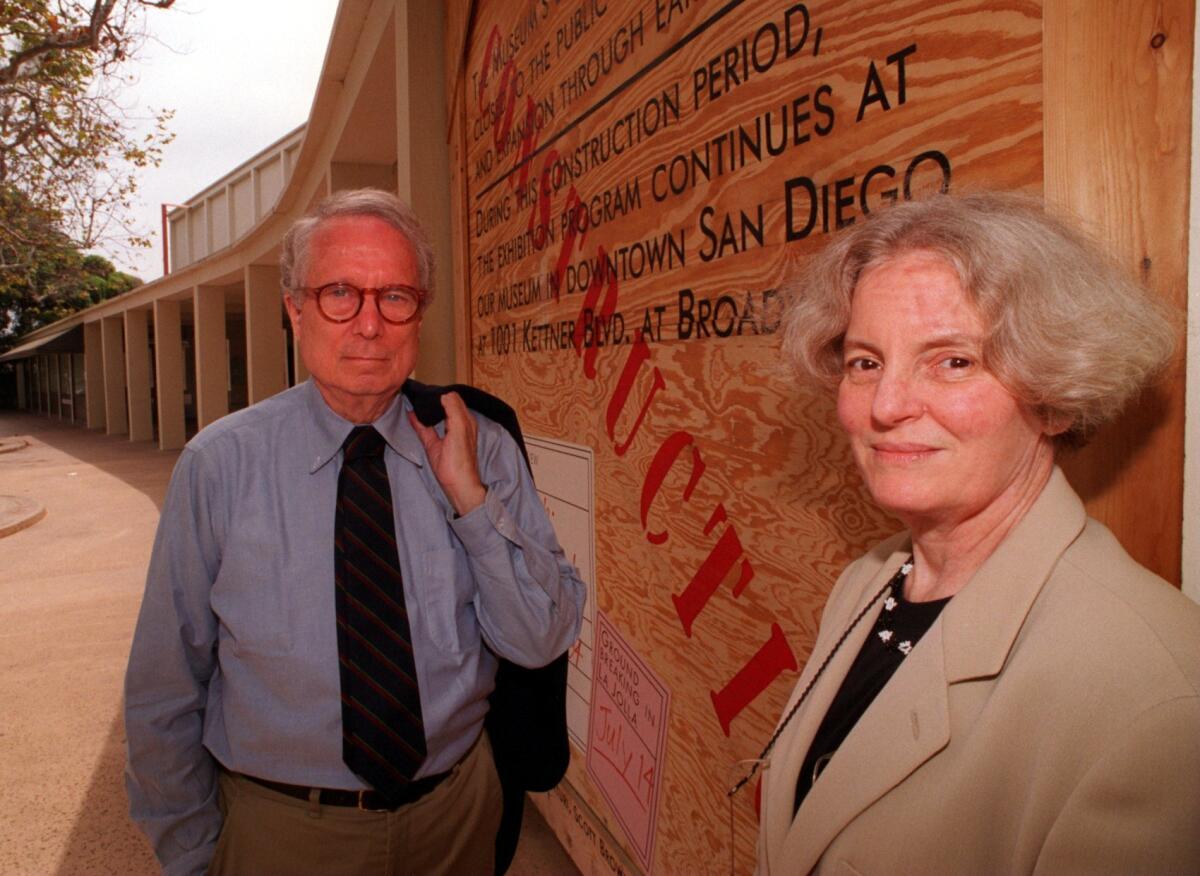
Until recently, Southern Californians could visit the Museum of Contemporary Art San Diego in La Jolla and experience the pair’s addition; their colonnade, however, and other exterior elements have been demolished to make way for a newer addition by New York–based Selldorf Architects.
Venturi met Scott Brown at the University of Pennsylvania, where they were both faculty, and married in Santa Monica in 1967. When I interviewed her in 2017, the always-outspoken Scott Brown recalled speaking up at a faculty meeting at Penn in 1960. (She argued against the demolition of university’s library.) “After that Bob came up to me and said, ‘I agreed with everything you said.’ And I said, ‘Then why didn’t you say anything?’ From that time on, we got more and more involved in each other’s work.”
She joined the firm Venturi & Rauch as partner in 1969, bringing with her an interest in sociology and expertise in urban planning — two areas that would influence the firm’s design approach.
Later, the firm’s name reflected her collaboration, changing to Venturi, Rauch & Scott Brown, and then Venturi, Scott Brown & Associates after John Rauch resigned from practice. In 1991, Venturi was awarded the Pritzker Prize, the highest honor in architecture, although the jury failed to recognized Scott Brown’s contributions. The slight could have been corrected in 2013, when the Pritzker Prize was petitioned to retroactively include Scott Brown as an equal; the prize committee refused.

Scott Brown was co-chair of the Urban Design Program at UCLA when she and Venturi visited Las Vegas together — a trip that would eventually lead to “Learning From Las Vegas.” In our interview, I asked about the photo she took of Venturi on their early trip in 1966. His back is to the camera — à la Rene Magritte, she recalled — and casino signs in the distance flank him. The image encapsulates so much about Venturi’s approach to architecture. “We were happy to be finding all these ugly things,” said Scott Brown.
“We were kind of falling in love with each other.”
More to Read
The biggest entertainment stories
Get our big stories about Hollywood, film, television, music, arts, culture and more right in your inbox as soon as they publish.
You may occasionally receive promotional content from the Los Angeles Times.


