Applause, and a caution, for the planned Museum and Institute of California Art
In the wake of the exciting news that UC Irvine plans to build a Museum and Institute of California Art, two thoughts have been rumbling around inside my head.
One concerns art, the other, architecture. Both have to do with the epochal transformation in California’s artistic fortunes over the last two generations or so.
Let’s start with the art.
The history of art in California remains shockingly understudied. Even now, when artists working here rank among the world’s top tier, there is no place to go to see even a thumbnail history laid out in paintings, sculptures, photographs and other works of art.
L.A. is a global powerhouse for new art and, thanks to the Getty, for art scholarship. But no museum, including the art section of the multidisciplinary Oakland Museum of California, tells the backstory.
The excellent mission of MICA, encapsulated in the name, is to change that.
L.A. is a global powerhouse for new art and, thanks to the Getty, for art scholarship.
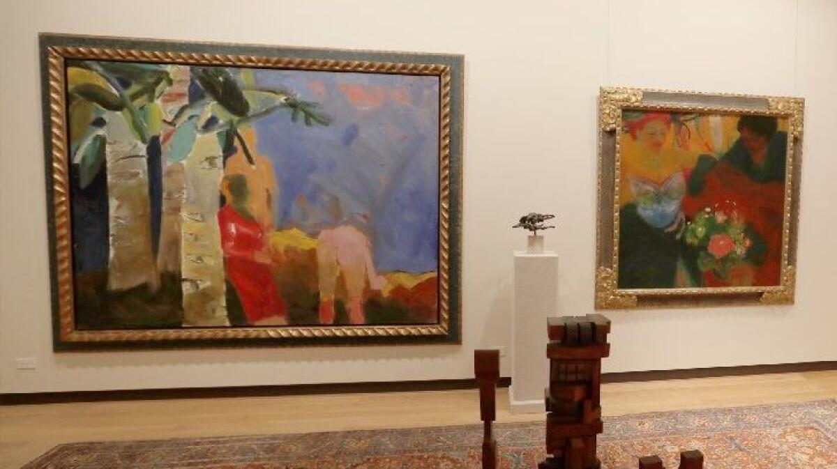
Its acquisition of the collection assembled over 30 years by Orange County developer Gerald E. Buck is an incomparable start, a leap forward on a long journey. I was struck by what the museum could mean when I visited the late collector’s private viewing space in Laguna Beach.
In the front room, the big, chromatically lush painting “People and Eye Trees in the Park in Madrid” by Joan Brown (1938-1990) is a riveting example of what we can look forward to. A wunderkind, Brown painted it in 1961 when she was just 23.
She had studied with Elmer Bischoff, whose blazing domestic interior, “Late Afternoon,” hangs next to her big, 6-by-8-foot canvas. Brown had come up as part of Bischoff’s gifted circle of older Bay Area painters, which also included David Park and Richard Diebenkorn. With brilliant painterly skill — plus a cheeky dose of wit — her picture embodies what was then at stake.
The work is a nature scene with a couple of figures who appear to be setting out blankets in a wooded park. The luxurious genre descends from the celebrated French tradition of young men and women shown disporting themselves amorously in parkland settings.
Brown’s composition is also startling. She divided the canvas right down the middle, creating two roughly equal zones.
In the left zone, a gauzy female figure in red emerges from a grove of trees, a ghostly aura behind her and each trunk incongruously spotted with staring eyes. All gaze upon the picture’s right half.
This zone of the picture is dominated by wide slathers of color. They start at the top in a big, brushy patch of sky-blue and pink, then are layered in strips of yellow, crimson and, across the bottom, earthy brown. If the left half is figurative, the right half is mostly abstract, painted with sweeps of a loaded brush.
The right half is virtually an Abstract Expressionist painting — a skillful example of the kind of gestural art that had dominated American painting for more than a decade. The exception is a female nude, art’s quintessential classical subject, seen down in the very lowest register of the right-hand side.
The nude is on her hands and knees, as if bowing to the abstract painting before her in a gesture of respect for what was then hailed as the modern triumph of American art.
As she genuflects, though, her pose also does something impudent: Head and torso disappearing behind the fleshy pink amplitude of her derriere, she blithely moons the viewer. She’s razzing us.
Smart, sassy and very funny, Brown’s great painting is her “Luncheon on the Grass.” Édouard Manet’s similarly sized 1863 masterpiece was a keystone in the revolution of Modern art. Invoking that, Brown’s palpable ambition is thrilling.
She lays out the genuine struggle underway between abstract and figurative painting — especially but not only in Northern California, a birthplace of the Abstract Expressionist movement and home to the contrary Bay Area Figurative style. She is fully versed in the exertions of the skirmish between them, while asserting — not just with vigor but with lacerating humor — that, in the face of it, she intends to do as she darn well pleases.
That’s avant-garde art’s birthright. Her painting stakes out territory.
Brown sees art’s forest for the trees. Before last week I hadn’t seen this picture in the flesh, but now I’m convinced that it’s a touchstone for a vital moment in California art.
The marvelous canvas also needs to have its bombastic carved and gilded picture frame removed and replaced. This isn’t just a taste issue. Buck, the collector, seems to have erroneously thought such gaudy Old Master framing would signal the actual importance of under-recognized California art, since he used it repeatedly to frame paintings in his collection.
Instead it smacks of nouveau riche insecurity. To have the work available on a public museum wall in perpetuity will accomplish what a showy picture frame cannot.
MICA will rise or fall on questions like this — on the number of times it can make California art history come into similarly sharp and illuminating focus. Which brings us to the architecture.
New museum buildings are an exercise typically fraught, tough to pull off on a budget that doesn’t impinge on success with the artistic mission. For them I often recommend, only half-jokingly, hiring an engineer to build an industrial warehouse, then engaging an architect to retrofit that for museum purposes.
Who doesn’t love the Geffen Contemporary at MOCA, the Tate Modern in London, Mass MOCA in the Berkshire Hills or DIA Beacon in Upstate New York? All of them are museums carved out of just such industrial spaces. Imagine how cool that would be at the carefully clipped and blandly corporate main entrance to UC Irvine.
An added bonus: Think of the bundle of money it would save.
Since a rejiggered warehouse is unlikely to happen, consider Plan B. Shelve the current scheme, which a museum spokesman described as an international search for prominent design talent for the high-profile job. That’s the wrong way to go.
In fact, it’s another version of the gaudy picture-frame problem. Brown’s painting doesn’t require such desperate validation, and neither does MICA need to be framed by it.
MICA and the Buck Collection are important precisely because they keep their confident eye on the prize — understanding and valuing the extraordinary art of California. Shouldn’t that extend to the staggering wealth of talent among California architects?
Frederick Fisher and Partners have designed two well-received additions for the Colby College Museum of Art, plus a large extension of the Huntington Library’s Scott Galleries. Elements of the latter even nod to 1960s California Light & Space art by Larry Bell and James Turrell.
Johnston Marklee has designed the eagerly anticipated Menil Drawing Institute for Houston, opening soon. The firm’s Sharon Johnston and Mark Lee break ground shortly on UCLA’s Margo Leavin Graduate Art Studios in Culver City.
Michael Maltzan Architecture recently finished the Moody Center for the Arts at Houston’s Rice University and is expanding UCLA’s Hammer Museum. Fifteen years ago, Maltzan designed the renovation of a Queens factory to become a temporary outpost of New York’s Museum of Modern Art.
wHY Architecture has had great success with Michigan’s Grand Rapids Art Museum and the new Speed Art Museum, next door to the University of Kentucky in Louisville. Founding principal Kulapat Yantrasast was a lead architect on Tadao Ando’s lauded Modern Art Museum of Fort Worth.
All four architecture firms, based in Los Angeles, have worked on other museum and gallery plans, large and small, and have dealt in educational projects (including within the UC system). No doubt other designers should be considered — not least Prtizker Prize-winners Frank O. Gehry and Thom Mayne.
Any one of these gifted California architects would easily be a credible choice to design a museum whose mission is understanding and celebrating the exceptional, globally influential evolution of California art. (Heck, they could even reliably retrofit a warehouse in honor of “The New Industrial Parks Near Irvine,” the 1974 masterpiece of Minimalist photography by Lewis Baltz.) Searching for an international superstar to confer promotional credibility is just an insecure architectural equivalent to those flashy Old Master picture frames, undercutting the reason for MICA to exist — not to mention hobbling its chance for success.
Twitter: @KnightLAT
MORE NEWS AND REVIEWS:
Yayoi Kusama: Lots of mirrors, not so much reflection
Boring architecture? Yes, please
LACMA raises general admission price to $20
More to Read
The biggest entertainment stories
Get our big stories about Hollywood, film, television, music, arts, culture and more right in your inbox as soon as they publish.
You may occasionally receive promotional content from the Los Angeles Times.
