The southern entrance to the Natural History Museum of Los Angeles County in Exposition Park has long been a rather dour affair. Facing a grassy lawn and the L.A. Memorial Coliseum, the entrance consisted of three muted doorways tucked into the center of a long, windowless building from the 1920s with a vibe that was more secretive vault than public museum.
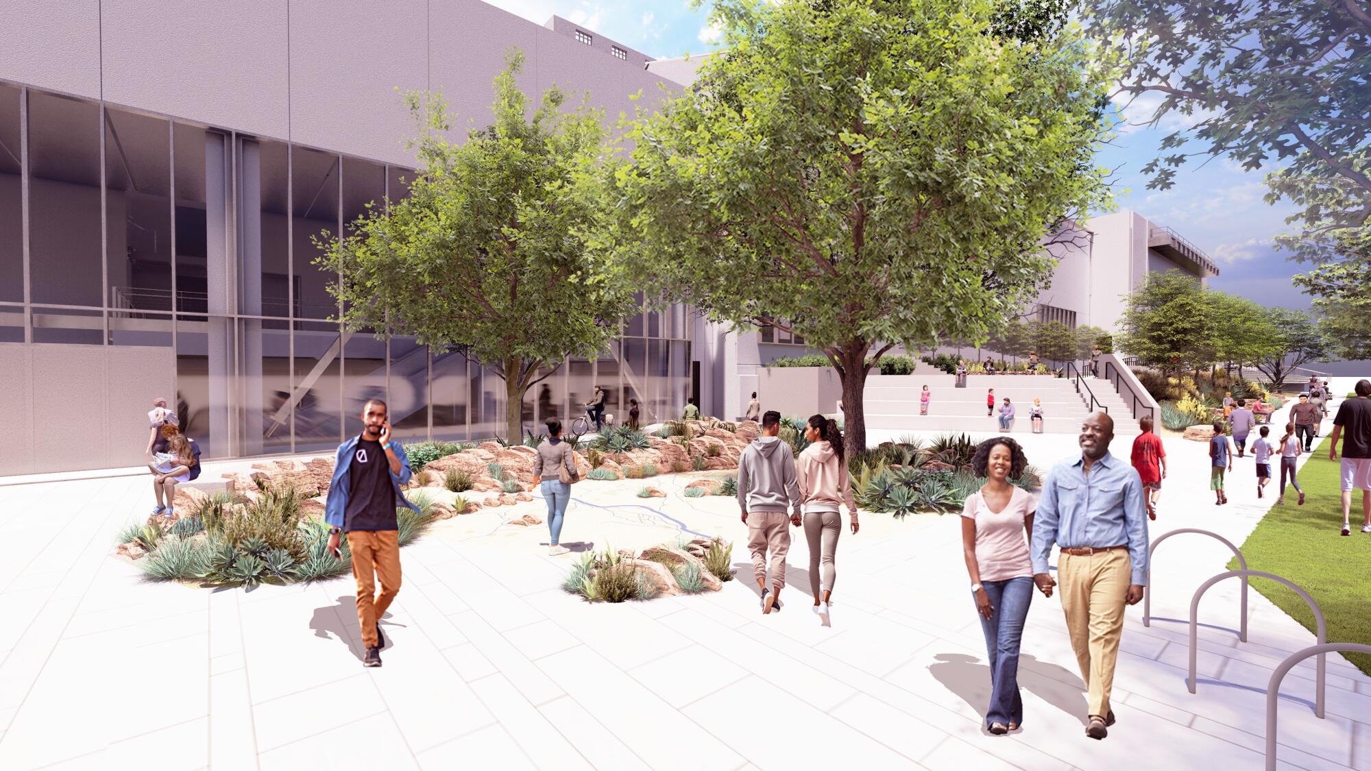
That will soon change. This month, the museum will complete principal construction on a 75,000-square-foot renovation and expansion that will bring some needed openness to the facade.
Designed by Frederick Fisher and Partners, with landscape by Mia Lehrer’s Studio-MLA and installation design by Studio Joseph, the $75-million project will add a 400-seat theater, a cafe that can be accessed independently of the museum and a new welcome center that also functions as free gallery space. The latter will feature the skeleton of a rare long-necked dinosaur dubbed “Gnatalie,” as well as Barbara Carrasco’s 1981 mural, “L.A. History: A Mexican Perspective.”
This is not the first time that the Natural History Museum has retooled an entrance. In 2013, CO Architects completed work on an illuminated glass pavilion on the northern side of the building that features the skeleton of a 63-foot-long fin whale — making the museum more visible from Exposition Boulevard. The current revamp will give prominence to the museum’s western and southern flanks, which will ultimately face off with Ma Yansong’s rising Lucas Museum to the west. (On the eastern side, the museum’s original 1913 building, which was designed by Frank Hudson and William A.D. Munsell and which has been added to piecemeal over the years, still greets visitors with a series of graceful Spanish Renaissance arches — but it feels tucked away.)
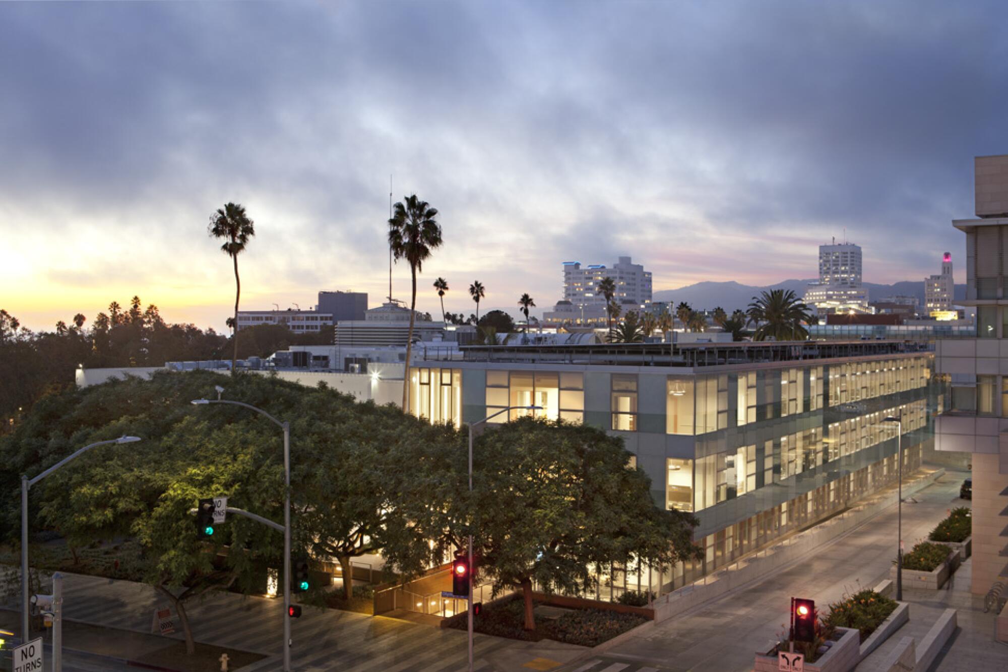
For Frederick Fisher and Partners, established in 1981, the expansion — set to open in the fall — is yet another of the countless cultural projects the firm has completed around the country. They transformed an old elementary school in Queens into the experimental art space P.S. 1 (now MoMA PS1), reimagined a seaside estate once occupied by Marion Davies as the Annenberg Community Beach House and added sleek American art galleries to the Huntington Library, Art Museum, and Botanical Gardens. This is on top of educational buildings at Caltech, an environmentally minded addition to Santa Monica City Hall and a rising computer science hub at Princeton University in New Jersey.
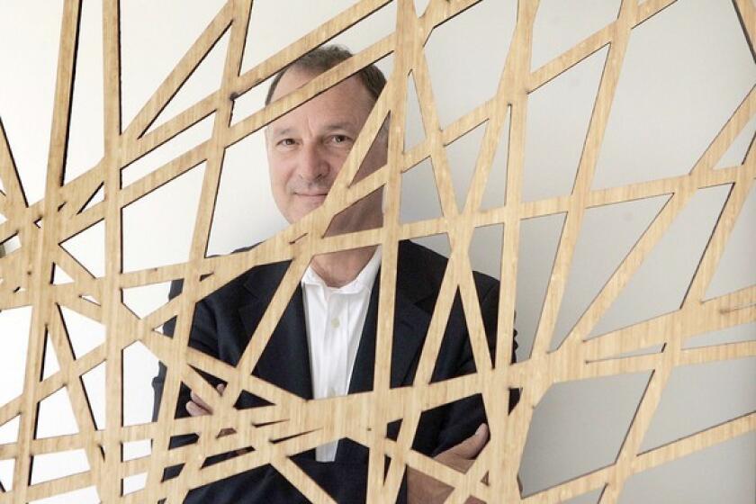
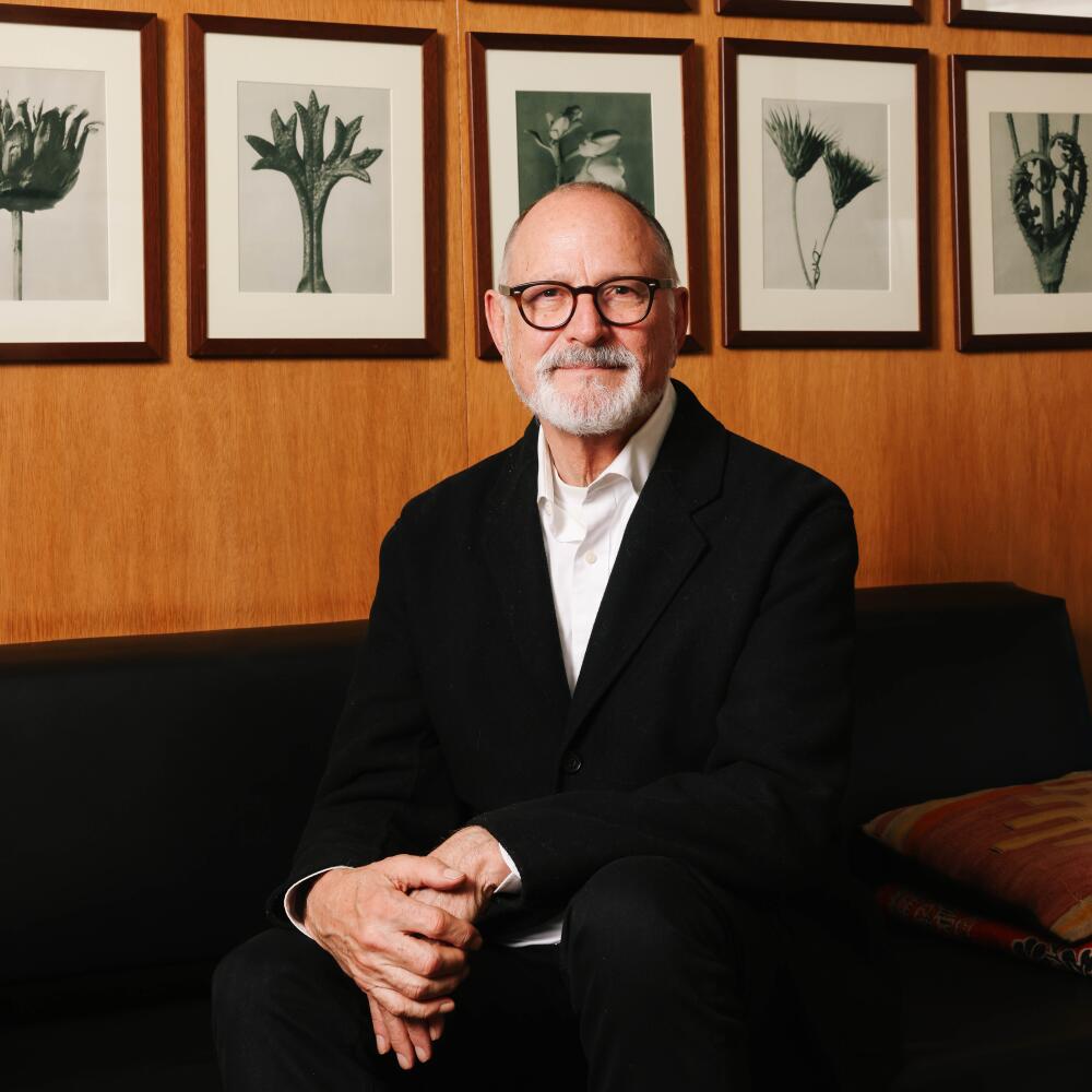
For Fisher, 74, the project also marks a moment when he is starting to step back. “I’ve made a dramatic transition over the last few years,” he says, “the idea of the singular person with a vision, that’s now become more communal.” He and his original partners‚ Joseph Coriaty and David Ross, have welcomed a new generation that will drive the firm’s vision forward.
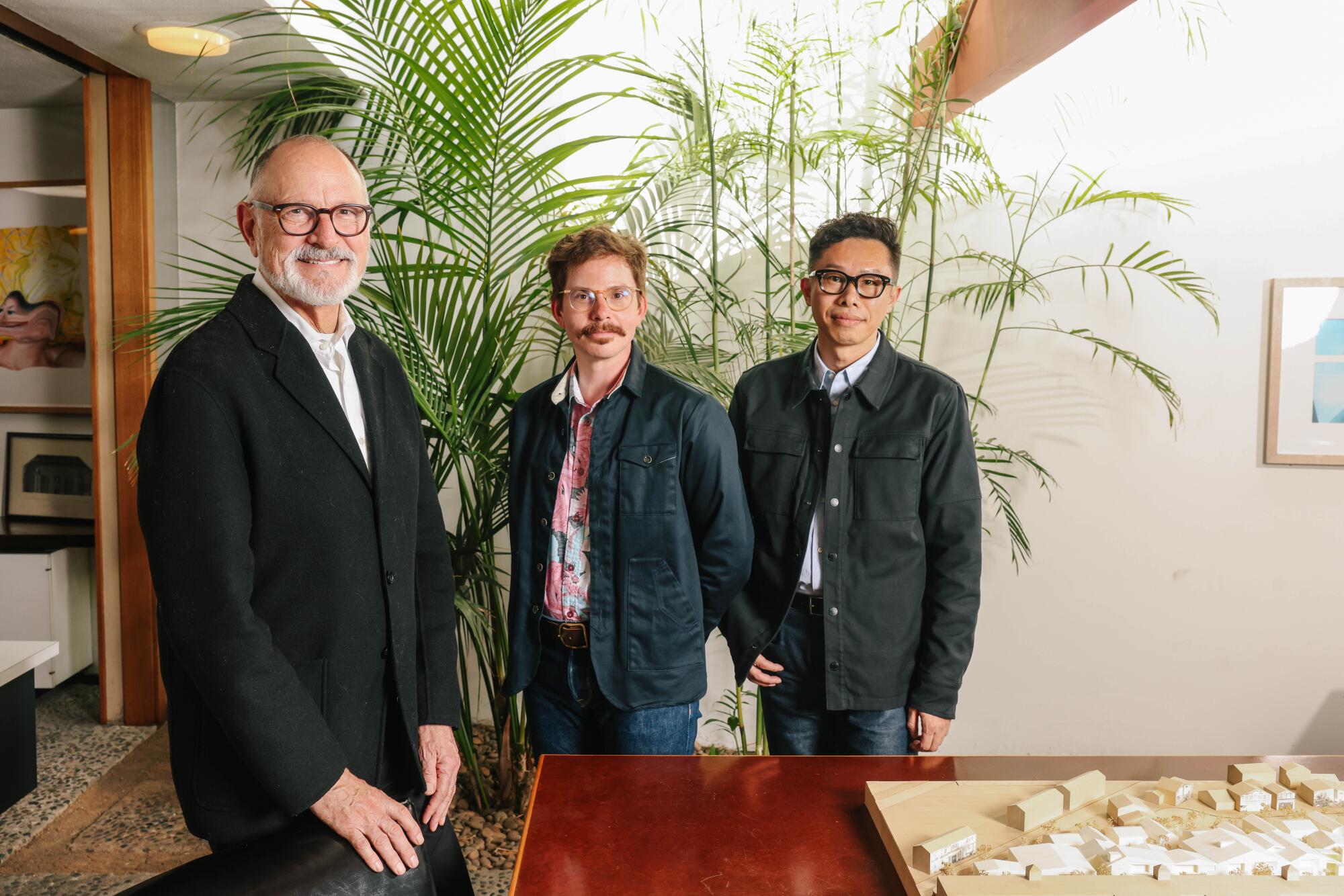
In fact, joining Fisher for our interview were partners Nathan Prevendar and Takashige Ikawa (referred to as Taka by colleagues). And they are preoccupied with the issues facing young architects, like maintaining a positive office culture and testing out new technologies — be it virtual reality or artificial intelligence.
Though that doesn’t mean they’ve abandoned tried-and-true ways of doing things. “It may be an old hammer, but we might use it with the flashy new power drills,” says Prevendar.
“I try to tell myself, ‘Calm down, it’s just the next pencil,’” Fisher says with a laugh.
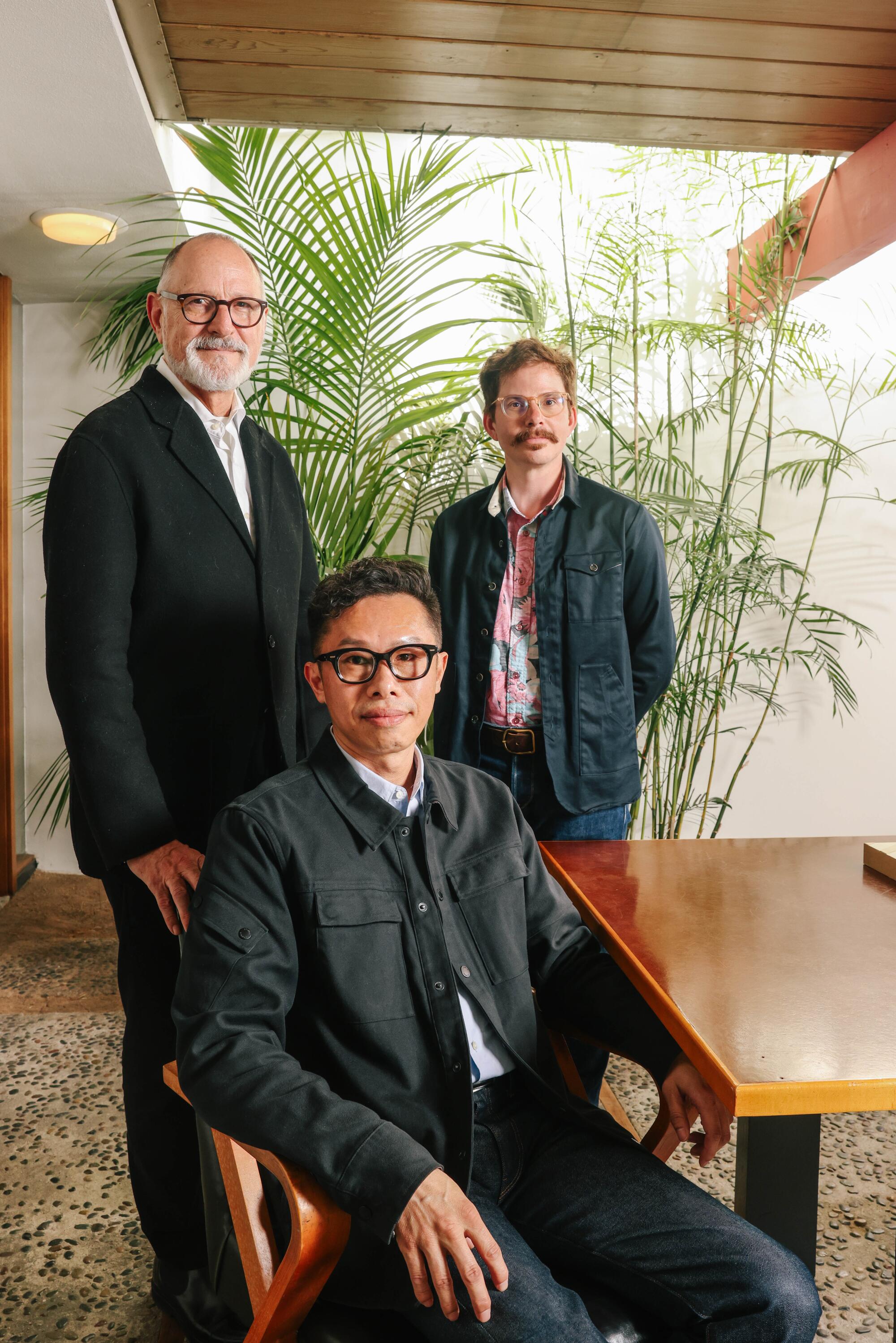
In March, I sat down with the trio in their Westside offices, housed in a remarkable 1955 building designed by the late Modernist A. Quincy Jones that is studded with plant-filled courtyards, sunny skylights and bright splashes of color.
In this conversation, which has been condensed and edited for clarity, they discuss what it means to intervene in an existing building, how climate change has shaped their designs and what they love (and don’t) about their Jones-designed headquarters.
Let’s begin with the Natural History Museum. How do you see your structure shifting the architectural approaches taken in the past?
Fisher: I can sum it up in one word: transparency. [Museum President and Director] Lori Bettison-Varga will tell you that’s why we were hired. They did audience surveys early in the process, and people in the community were literally a bit afraid of it — this giant, hulking, opaque building.
Prevendar: That’s the genesis of this: the museum opening itself to the neighborhood. We’re not just a big, huge monolith.
To him, architecture has a role in resolving the complexities of culture, not necessarily dramatizing them.
Fisher: There’s now a giant gallery that you will be able to come in on the Exposition Park side, [and] the idea is that it allows some important experiences without paying admission. Then this glass box, multipurpose space, lobby cafe — it all kneels down to the community.
The new gallery also has two great big windows where you’ll be able to glimpse Gnatalie, the sauropod, and you can glimpse stuff that you can have access to from the park. And when you are in the museum, you can see Mia’s landscape design. Exposition Park is a giant park, but it has remarkably little usable green space, so that will be an important part.
Prevendar: At one time, it was a horse race track, the whole area.
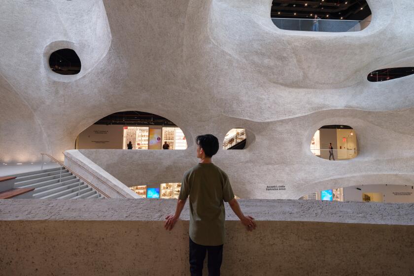
Natural history museums have fraught histories. Studio Gang has designed a building that takes the concept out of the 19th century and brings it back to nature
Your firm has worked on a lot of expansion and renovation projects. How do you manage the dance of creating something new while not overwhelming what’s already there?
Fisher: I had an epiphany at the Gagosian show [“Jean-Michel Basquiat: Made on Market Street”]. It focuses on the two-year period [from 1982 to 1984] when Basquiat lived in Gagosian’s house on Market Street. I lived in Venice at that time. A couple of years before that, [light and space artist Robert] Irwin had done that installation at the Malinda Wyatt Gallery [which was also on Market]. He took the front off the building and put in a scrim and let the light do what it did. I had the great luck of seeing that by accident. I was riding my bike and I saw the empty storefront and I was like, “What the heck is this?” It was this piece about perception. And, literally, across the street, you have Basquiat doing what he is doing, and it’s the opposite: It’s naming, materiality.
Which path do you take? I took the path of emptiness, of non-naming. This goes back to the notion of the additions. How do you interact with another object? Are you competing with it? Are you background? There is no one answer to that. For the Schmidt Hall project [at Princeton], we have this gorgeous Gothic Revival building and a [Venturi Scott Brown] building — so how do we put something between them that doesn’t overwhelm or trivialize?
Ikawa: There are three different ways: blend, contrast, complement. The one we take depends on what’s there.
For Schmidt Hall, you’re working with mass timber, a type of engineered wood that can result in less emissions than concrete and steel. Is this the first time you’ll be using it? And how do you see climate concerns evolving how you design?
Fisher: It’s our first time. We had actually designed that building in steel, but Princeton has this commitment to being net zero by 2046 [the university’s 300th anniversary] or sooner and in order to get there, they need to build more low-emissions buildings. We love it. It’s like doing an early Ford factory in Detroit — they were built with mass timber. It has warmth. Human beings like being around wood.
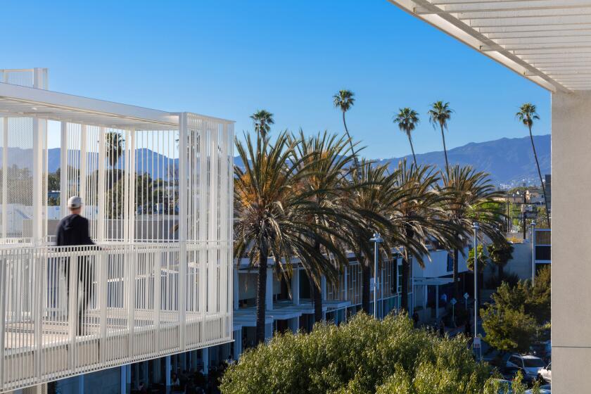
As architects, we try to take the initiative. In the case of the Santa Monica City Hall project, we had a client who said they wanted to go the whole way: full Living Building Challenge [a sustainability program devised by the International Living Future Institute]. That’s the highest standard for sustainability, they set a very high bar. Buro Happold worked on the mechanical. They knew it would be difficult but they knew it could be done.
Ditching concrete for wood, reinventing the court apartment, and rehabilitating old landfill as parkland show how designers are tackling climate change
Prevendar: It’s vastly evolved our thinking. The Santa Monica project was the fork in the road for us: getting manufacturers to divulge what’s in that adhesive and what’s in that carpet. There was an article about cutting quartz countertops in the [San Fernando] Valley and those laborers getting [sick]. So let’s not spec that type of product in our project.
Taka and I are working on a project in Wisconsin and they don’t have a big budget so we are thinking about how we use materials — using modular construction because there is less waste. We want to bring wellness into design. Give access to natural light, warm materials.
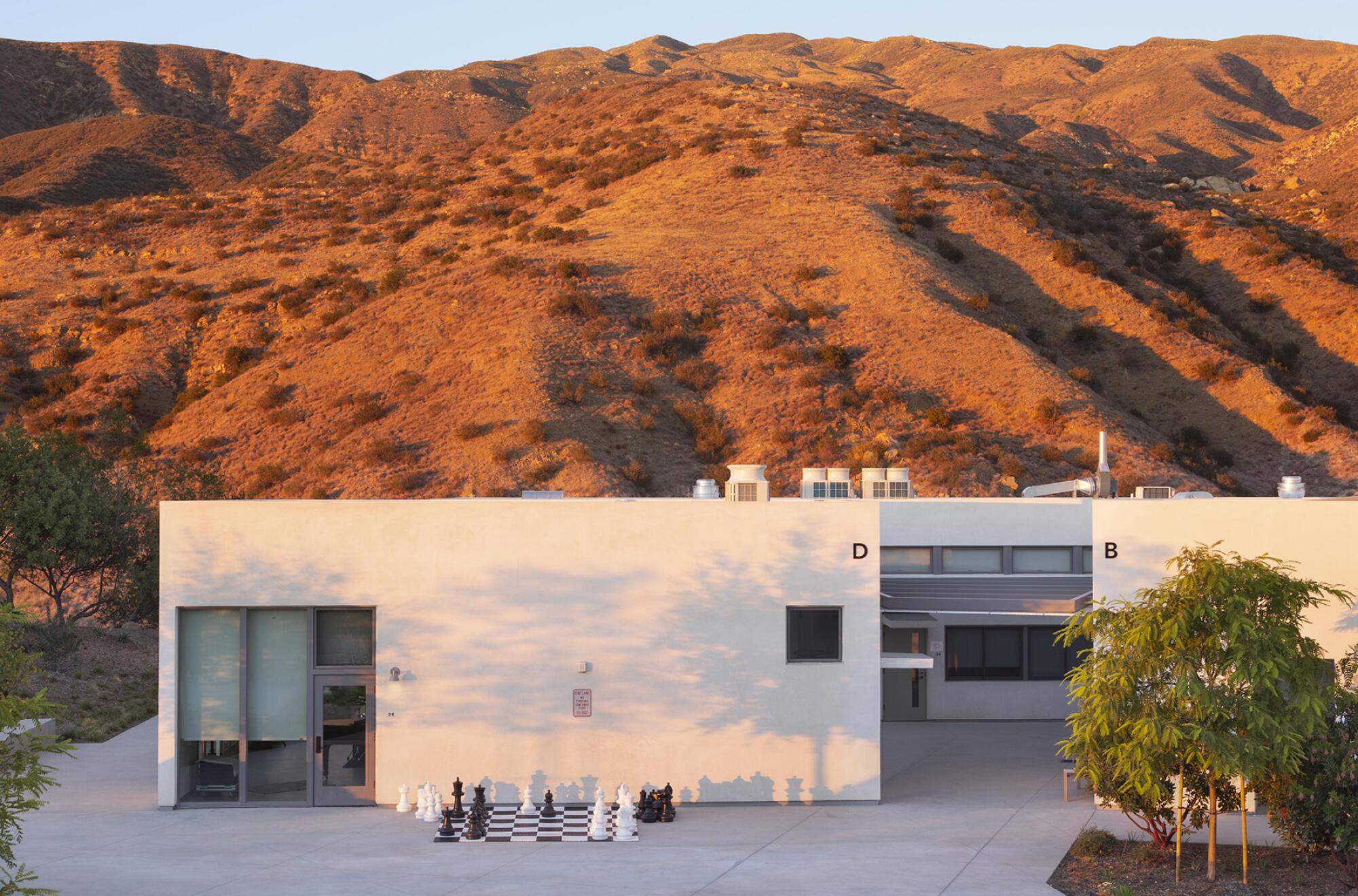
Speaking of climate, your firm also designed buildings for the Ojai Valley School — to replace a portion of the upper campus destroyed by the Thomas fire in 2018.
Ikawa: The existing style there is wood with an overhang [where embers can lodge]. We designed a building to avoid that. It’s a wood structure with stucco — no overhang — and we treated the edges and the roof so that they do not catch fire. Another important thing when fire happens is how quickly firefighters can get to the site, so we fixed the road. We also supplied battery power so that firefighters can fight the fire.
Fisher: With a fire, you lose power, and then you can’t pump water.
Ikawa: There was solar there, but there was no battery. So you couldn’t store energy there. Now you can store energy. It also means that you can take the school off-grid.
What lessons have you learned by inhabiting a building by A. Quincy Jones?
Fisher: I think the No. 1 thing is being in harmony with nature: seeing the light move through at different times of day, feeling the air move through the building, seeing trees and bushes and these little courtyards — that notion of biophilia. Humans come from nature, and we feel better when we are in nature. The second thing is the intimacy and domesticity. You’re not in some anonymous workspace.
Prevendar: My family comes from a maker, millwork background, so the biggest thing is the honesty of the building and the materials. A column or a beam is a column or a beam. It’s not about adding all of this ornament. It’s completely influenced our projects. We don’t stick stuff just to stick it there. When we have collaborators, we can actually point to what we are talking about.
Ikawa: It’s a tool.
Prevendar: It‘s also something that shows what not to do. [Laughs.] Even though we re-roofed the building this year, we are still dealing with leaks. You want the roof line to be as thin as possible, but you need at least 6 inches to make it work.
Fisher: A lot of the Midcentury architecture, it was cheap. Elaine Jones, Quincy’s widow, said Quincy told his clients that buildings should not live longer than their mortgages. Well, this is now 70 years old — and that is twice as old as it was built for.
Ikawa: For me, it’s the variety of spaces. Each room is slightly different or very different in how you feel light and air. You can walk through the building and your emotion changes. It’s like music.
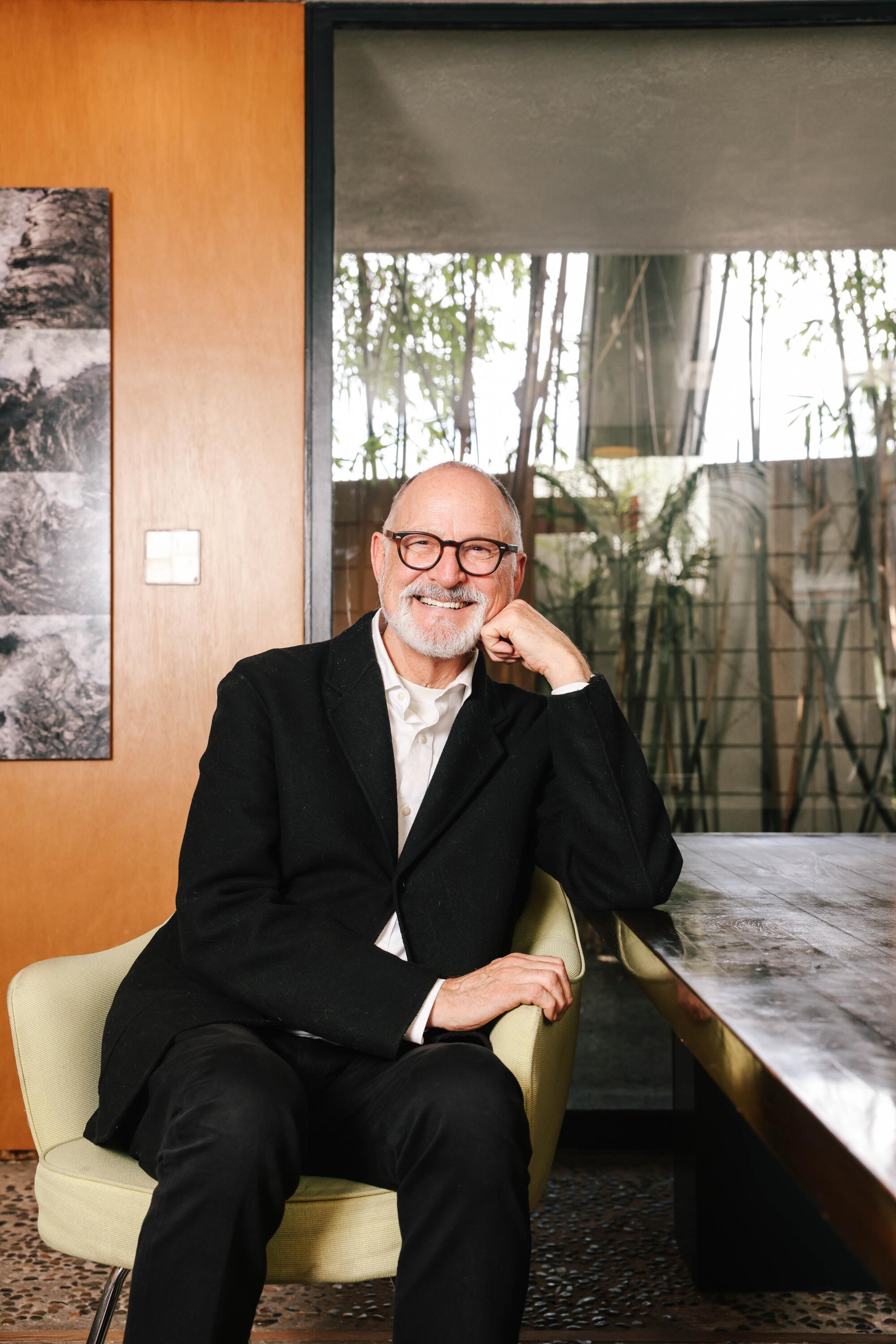
“I’ve made a dramatic transition over the last few years,” Fred Fisher says, “the idea of the singular person with a vision, that’s now become more communal.”
Fred, what haven’t you designed that you would like to?
A library and a museum are two of the projects I’m most interested in. We’ve been lucky to work on both, but not as an isolated project. There is one project out there that would be my dream: the new museum at UC Irvine [the Jack & Shanaz Langson Institute & Museum of California Art]. Given Irvine’s history with light and space, and all of the artists I know — we’ve worked with James Turrell and Eric Orr, collaborated with them on installations — that would be a dream.
More to Read
The biggest entertainment stories
Get our big stories about Hollywood, film, television, music, arts, culture and more right in your inbox as soon as they publish.
You may occasionally receive promotional content from the Los Angeles Times.
