Appreciation: How Milton Glaser’s ‘I ❤️ NY’ logo taught us to talk in emoji
The city: New York.
The time: The ’70s.
The vibe: Post-white-flight urban decay. High crime rates. Graffiti-drenched subways. Landlords torching their own buildings for the insurance money. Plus, there was the tiptoe to bankruptcy in 1975 that left the city hours away from insolvency as the federal government refused a bailout (generating the famous New York Daily News cover line “Ford to City: Drop Dead”).
This was followed two years later by a blackout that plunged the city into darkness for 25 hours. All of it was echoed and exaggerated by Hollywood, in films about police corruption (“Serpico”), vigilantism (“Death Wish”) and profligate amorality (“Taxi Driver”).
To all of this, graphic designer Milton Glaser responded with four little pieces of type in 1977 that would help change the way the world saw New York: “I ❤️ NY.”
Was it read “I Heart New York?” or “I Love New York” or “I Love En Wye”?
It didn’t matter.
Everyone knew what it meant. It meant you hadn’t given up on New York, a city that underneath its beat-up exterior harbored the words of Amiri Baraka and the jagged vocals of Lou Reed and the chopped-up building-sculptures of Gordon Matta-Clark and the blazing shows of the Fania All-Stars, which brought 50,000 salsa music fans to their feet at Yankee Stadium in 1973.
And Glaser evoked those ideas with utmost simplicity: three black letters in a chunky typewriter font and a blazing red heart, laid out in a neat square.
As the story goes, the designer sketched out the initial concept on a torn envelope in the back of a taxi cab. (That drawing now resides in the collection of the Museum of Modern Art.) It was a quick gesture that ended up becoming iconic almost instantly, relentlessly copied and pirated and spoofed — and remains so to this day. A quick scan of Etsy turns up adaptations of the logo with images of hot dogs, pigeons and even New York Gov. Andrew Cuomo’s face.
“I’m flabbergasted by what happened to this little, simple nothing of an idea,” Glaser said of the design in a 2011 interview with the Village Voice. “It just demonstrates that every once in a while you do something that can have enormous consequences.”
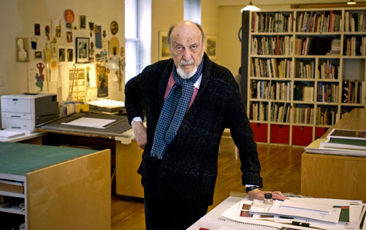
Glaser died on Friday — his birthday — at the age of 91.
He leaves behind work of such enormous consequence that it has become embedded in our design DNA.
While best known for the “I [Heart] NY” logo, the designer had his hand in myriad other aspects of visual culture. He not only helped establish New York magazine in 1967, he designed the magazine’s covers as well as its elegant, swooping logo, the typographical equivalent of a coquettish society lady reclining into a chaise longue. (Perfect for a publication obsessed with the doings of Manhattan’s well-to-do.) The logo, with some tweaks, is still in use to this day.
Milton Glaser, designer of iconic ‘I [heart] NY’ logo and Bob Dylan silhouette poster, dies on 91st birthday.
In ‘67, he also created the poster for Bob Dylan’s greatest hits album, featuring the musician in black silhouette with streaming, psychedelic hair. Six million copies of that design ended up in the hands of Dylan fans — one went to MoMA’s collection.
Three years later, he was onto filmmaker Michelangelo Antonioni’s counterculture flick “Zabriskie Point,” for which he designed a poster that shows the icons of American culture seemingly careening full speed towards the earth. In the ’90s, he created the winged logo for Tony Kushner’s Tony Award-winning play “Angels in America.”
There are countless other achievements: logos for the Brooklyn Brewery and Elektra Records, album covers for Columbia, bold book jackets, original fonts, and even a futuristic children’s toy shop called Childcraft that was all primary colors and rounded edges. Glaser designed the poster for the Los Angeles County Museum of Art’s International Buddhist Film Festival in 2003, with its echoes of the Postmodern. A decade later he was helping channel a 1960s design zeitgeist for the TV series “Mad Men.”
As writer Christopher Bonanos writes in his tribute to the designer in New York magazine: “If they’re talented and they’re lucky, designer-artist-creators get to lob an icon out into the larger culture. ... If they’re great, maybe they create two. Milton Glaser, though, operated on another plane.”
Part of his success can be attributed to his worldliness and the myriad cultural fonts from which he drew. The Bronx-born son of Hungarian immigrants (he was born in 1929), Glaser received his degree at the Cooper Union for the Advancement of Science and Art. Other formative experiences helped shape his work, too: early drawing classes with the social realist artists Raphael and Moses Soyer and a Fulbright to the Academy of Fine Arts in Bologna, Italy, where he studied with still-life painter Giorgio Morandi.
In the 1950s, when he and some classmates — a group that included artists Seymour Chwast and Edward Sorel — founded a design group called Push Pin Studios, their bright, graphic work, inspired by sources such as Art Nouveau and comics, was prescient of psychedelic art at least a decade before psychedelic art was recognized as a thing. In fact, Glaser was quick to point out that his work was not inspired by drugs at all.
“I’ve never taken any drugs at any time,” he told NPR’s Terry Gross in 1981. “In fact, I’ve probably only taken aspirin two or three times in my life.”
The poster of Dylan drew from the silhouette self-portraits of Marcel Duchamp and the artist’s interest in Islamic pattern. Other designs were inspired by sources as diverse as indigenous art and Italian painting.
As it turns out, the “I [Heart] NY” logo was more a favor than a commission.
It was 1976 and the creative team at the Madison Avenue advertising firm Wells Rich Greene had coined the phrase for the state of New York’s economic development agency, which was trying to promote tourism to New York as an economic salve. Glaser figured the campaign would last for “two weeks.”
“I did it for free,” he said in the Village Voice interview.
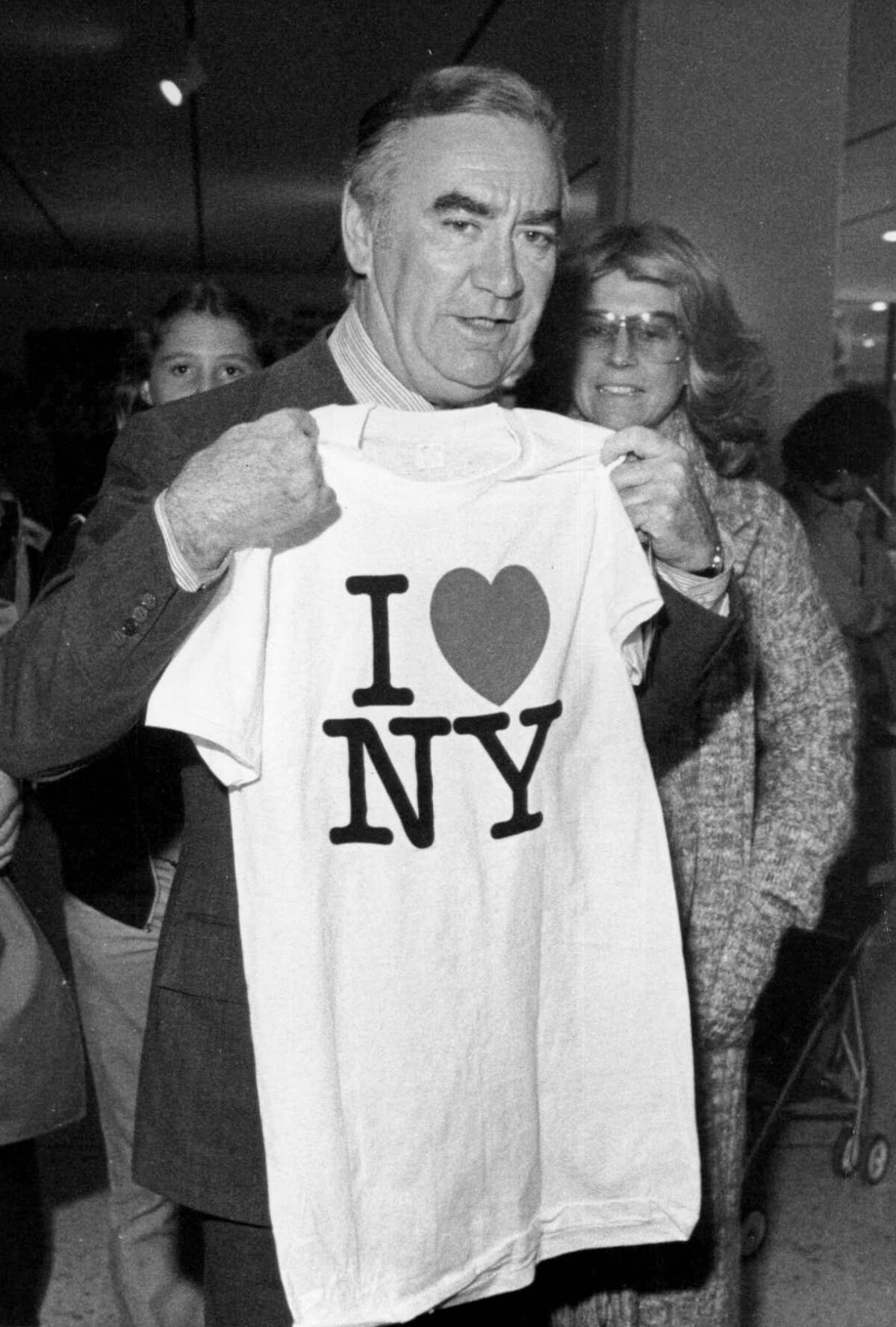
By the following year, when the design was released in its final form, it quickly became a merchandising juggernaut — emblazoned on caps, coffee mugs and key chains. A photo from 1977 shows New York Gov. Hugh Carey holding up a T-shirt with the design at an “I Love New York” festival in Albany.
Glaser, who by all accounts was rather professorial in his demeanor, never regretted doing the work pro bono: “The truth is, I have enough money to live the life I want to live. I don’t think about how it would be if I had another couple million. I have no needs that are not being fulfilled.”
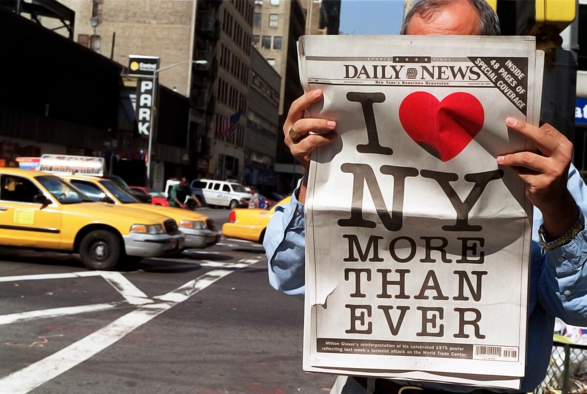
After the Sept. 11, 2001, attacks on New York City, he recreated the logo with a bruised heart and a few extra words: “I [Heart] NY More Than Ever.”
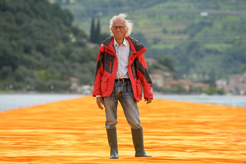
Christo’s 1991 installations of more than 1,000 colorful umbrellas in Southern California and Japan resulted in tragedy. Christo created ephemeral projects across the globe
Like so much of Glaser’s work, “I ❤️ NY” became part of the popular culture because it was so smart, yet so simple. But also because it was so prescient.
Today, we communicate via emoji palettes that feature hearts not just in red, but in a rainbow of colors. Countless times a day, we blend symbols with typography. We may not always know how to articulate these communiqués verbally, but we know what they mean.
And that was something that Glaser and his contemporaries at Push Pin already had a grasp of in the 1950s.
“We essentially broke down the firm distinctions between design, typography and illustration,” he told NPR. “To a large extent work had become very specialized. Illustrators didn’t design and designers didn’t illustrate. At Push Pin, we started to merge the distinction.”
But it was ultimately his passion that gave the design meaning.
Asked how he felt about New York in 2011, he told the Village Voice: “New York is so mutable and so surprising. Even if you don’t love it, it is always compelling, always interesting, and never boring. ... I do love New York.”
Raised hands. Red heart. We know what he means.
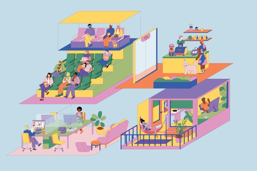
COVID-19 has Thom Mayne, Michael Maltzan, Barbara Bestor, Rachel Allen and more Los Angeles architects rethinking design, from balconies to doorknobs.
More to Read
The biggest entertainment stories
Get our big stories about Hollywood, film, television, music, arts, culture and more right in your inbox as soon as they publish.
You may occasionally receive promotional content from the Los Angeles Times.
