Commentary: LACMA caught the teardown bug. But the architectural cure isn’t a bulldozer
NEW YORK — Several times I’ve made my way to Diller Scofidio + Renfro’s recent expansion and renovation of the Museum of Modern Art in New York. The project, completed in October, is the latest iteration of Edward Durell Stone and Philip Goodwin’s ever-changing building, including major additions by Philip Johnson, Cesar Pelli and, most recently, Yoshio Taniguchi.
As DSR partner Charles Renfro mentioned to me on one of those visits, his firm touched almost every inch of the museum. In Taniguchi’s section the firm lifted ceilings where they were too low, lowered them where they were too high, connected spaces that felt isolated, revived early modern elements that were sorely missed, and decongested and resurfaced zones that felt and sounded like train platforms.
In a new wing to the west, the firm added more than 40,000 square feet of gallery space, most of it connecting cleanly with MoMA’s existing galleries. The work has been carried out in what Renfro described as a “surgical” manner, using a light touch that respects the museum’s existing fabric. Improvements are not necessarily obvious.
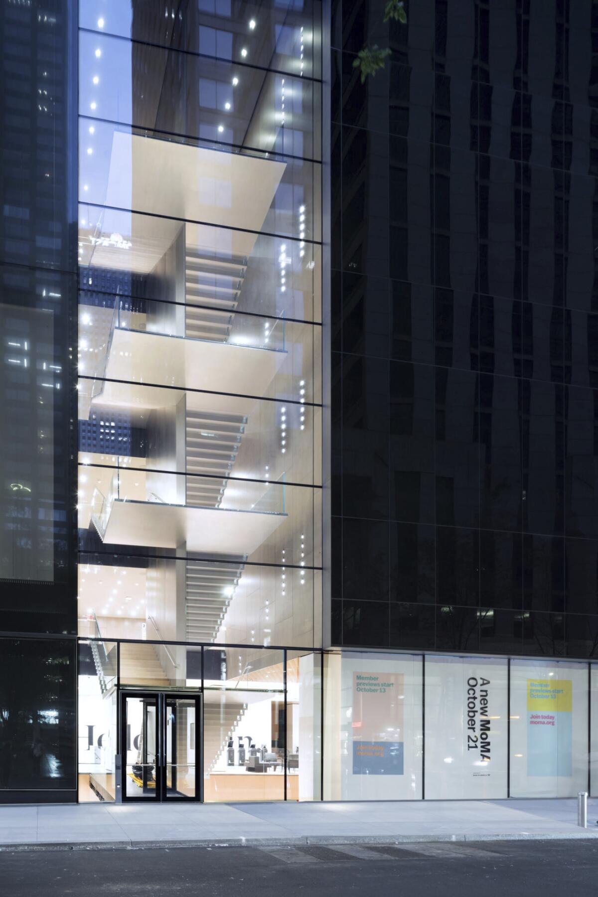
The most dramatic moves are designed to open the museum to the city around it, including select ground-floor galleries that offer free entry and a large floating staircase facing a massive vertical expanse of glass overlooking Midtown.
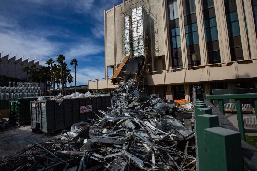
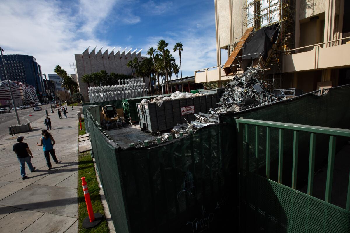
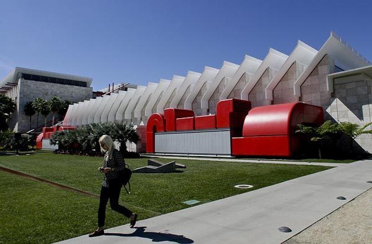
On the surface, DSR’s careful approach is quite the opposite of Peter Zumthor’s plan for the Los Angeles County Museum of Art. Zumthor, who is known, perhaps ironically, for his elegant, almost obsessive attention to material, space and light, has proposed to take a bulldozer to the museum, designed in 1965 by local architects William L. Pereira & Associates, the designers of essential modern buildings like San Francisco’s Transamerica Pyramid and UC San Diego’s Geisel Library, as well as L.A.’s LAX Theme Building and CBS Television Studios.
Lost in the scorched-earth plan will be Pereira’s three classically massed sandstone and steel pavilions filled with midcentury touches like terrazzo and hardwood, beveled metal detailing, floating stairs and multifloor views, organized around a raised plaza along Wilshire Boulevard. The plan also will jettison Hardy Holzman Pfeiffer’s blocky, out-of-scale Robert O. Anderson wing abutting Wilshire. The only remaining components will be Renzo Piano’s 2008 BCAM building and the 2010 Resnick Pavilion, and Bruce Goff’s 1988 Pavilion for Japanese Art.
Michael Govan responds to critics who say building a new Peter Zumthor-designed complex will leave the museum swimming in debt. With demolition just weeks away, we look at LACMA’s tax forms and current debt load.
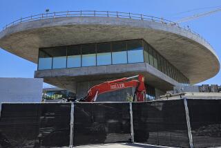
In Pereira’s place will rise Zumthor’s amorphous, concrete pavilion, floating about 60 feet over street level and audaciously bridging Wilshire. Its galleries no doubt will be beautiful, showcasing the architect’s trademark infusion of tactile, luminous poetry. Zumthor’s plans call for creating varied spaces, using illumination and spatial shifts as an art unto itself. His design promises wonderful views of the neighborhood through large sheets of uninterrupted glass.
You could argue that this approach is what Los Angeles is all about: starting over. The city, after all, emerged almost out of nothing, becoming a major metropolis in record time.
In its wake fell orange fields, arroyos, vineyards, ranches and, in the post-World War II era of urban renewal, entire neighborhoods such as Bunker Hill and Chavez Ravine, often replaced by housing tracts, pedestrian-unfriendly superblocks and still more housing tracts. In place of trolley lines came concrete freeways. In place of an unwieldy river came a concrete channel.
But that was Los Angeles then. Los Angeles now is a very different place. Today’s Los Angeles is infinitely more complex and layered, facing a whole new spectrum of challenges. One of the greatest is not how to rip away neighborhoods but how to put them back together, healing the gaping wounds of violent planning and incrementally merging the best pieces of the past and present.
This includes restoring streets for pedestrians, supplementing highways with rail, knitting communities together with public space, recovering paved-over rivers and lakes, transforming industrial buildings into home and offices, and returning beloved buildings to their former glory with timely, modern additions. It’s telling that the city’s winning argument for the 2028 Olympics wasn’t starting over; it was taking advantage of existing resources.
Zumthor’s building is a return to an outmoded form of architecture and urbanism, to a time when planners sought above all to bring order to a chaotic city, seeing their potential metropolis as an abstraction: a utopia of glass and steel, free of messiness, crime and germs. Perhaps the most influential planning mind of the 20th century, Le Corbusier, described the city as “a blank piece of paper, a clean tablecloth, upon which a single, integrated composition is imposed.”
Zumthor’s single, integrated composition (now tan instead of black!), raised high above the grime of the city, is just a building. The strength of LACMA as it stands now is its complexity; it’s more like a city, and a vibrantly messy one at that. It’s connected to the street, the neighborhood and its varied parts, encouraging movement between structures, levels and plazas, whether you’re in the museum or not. It’s one of the few major destinations in L.A. that feels like a true urban environment, not a newly manufactured one.
LACMA Director Michael Govan has touted Zumthor’s single-story, self-contained form as an anti-hierarchical realm where no one type of art rises above another. But whatever benefits that idea may carry, and whatever variety and grace Zumthor’s design may hold inside, how can we, from an architectural, urban and environmental standpoint, promote tearing down and starting over?
How do you hang paintings on concrete walls? “With great difficulty” is the joke answer.
This is not to say that we have to keep LACMA exactly as it is, that we have to fetishize the past at the expense of the future. After its lobotomy at the hands of Hardy Holzman Pfeiffer, LACMA cannot be considered a historic landmark. Which presents a great opportunity. What if, as most competitors in LACMA’s doomed 2001 redesign competition suggested, the museum combined the best of old and new? Why not preserve LACMA’s boisterous, jumbled, urban feel? If seismic improvements and other upgrades are needed to Pereira’s buildings, why not reimagine and dialogue with some of them instead of leveling all of them?
Although some take issue with Piano’s BCAM and Resnick additions, commissioned by Govan, they do prove the effectiveness of this kind of architectural conversation. They interact with the scale, character and flow of Pereira’s buildings, each making the other more vibrant. And many of the most effective new museums do the same, making something mesmerizing out of older spaces, whether an industrial facility (like a former Govan project, Dia Beacon, in New York state or the hugely popular Mass MoCA in North Adams, Mass.), war bunkers (the Boros Foundation in Berlin) or Modernist architecture (a midcentury E. Stewart Williams bank building, now the Palm Springs Art Museum’s Architecture and Design Center).
Couldn’t Zumthor, or someone else, do the same? Rather than erect another elite acropolis to the arts lifted on high? We already have the Getty, another missed chance to build into the city’s urban fabric.
DSR’s elegant, respectful addition at MoMA also has its missed opportunities. To make way for their plans, DSR infamously tore down Tod Williams and Billie Tsien’s splendid American Folk Art Museum, a 2001 structure full of interlinked, light-filled galleries. Its textured bronze façade, folding like a tectonic plate, was one of the most unusual, artful pieces of the often-formulaic New York skyline.
DSR argues that the building presented insurmountable challenges, like changes of floor height. But taking on those challenges could have given the MoMA addition the one wrinkle it’s missing: a physical connection to its context, and something to distinguish itself from the existing MoMA.
DSR’s new galleries are too seamless; there’s no way to tell the old from the new or, in some cases, no way of knowing where you are. By demolishing the Williams-Tsien building, MoMA followed an outdated agenda, ripping up the neighborhood to build a temple to itself. Why not, at least in part, keep a splendid section of that neighborhood and let it work together with something new?
The designs for both MoMA and LACMA are serenely beautiful. Both treat art, and the experience of viewing it, with reverence. But both contain outdated thinking about the city around them. Both connect visually to the outside world via large windows and balconies (almost as if the city were another painting in their galleries), but they don’t connect in real ways. Neither fully embraces its messy, complicated metropolis, its messy, complicated past and its messy, complicated opportunities.
Jean Nouvel, a competitor in the 2001 LACMA competition (and ironically the designer of the supertall tower atop the new MoMA addition), discussed how knitting old and new can profoundly capture the story, the truth of a place while opening up dynamic possibilities:
“The architectural and urban history of LACMA should be made into something positive. Each era should be desirable, the existing foundations upgraded. … The great temptation is to build a heroic milestone which makes you forget the neighboring buildings’ weaknesses.”
More to Read
The biggest entertainment stories
Get our big stories about Hollywood, film, television, music, arts, culture and more right in your inbox as soon as they publish.
You may occasionally receive promotional content from the Los Angeles Times.
