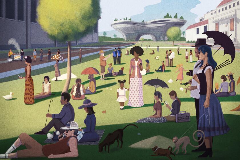
Three design teams propose La Brea Tar Pits revamp. The mammoth’s future? Uncertain
How do you make a functional, contemporary park and museum in which a fiberglass Columbian mammoth family can also feel comfortably at home? That is a puzzle three international architectural firms have tried to solve with competing plans for revamping the public park, museum and paleontology research sites that make up Los Angeles’ La Brea Tar Pits.
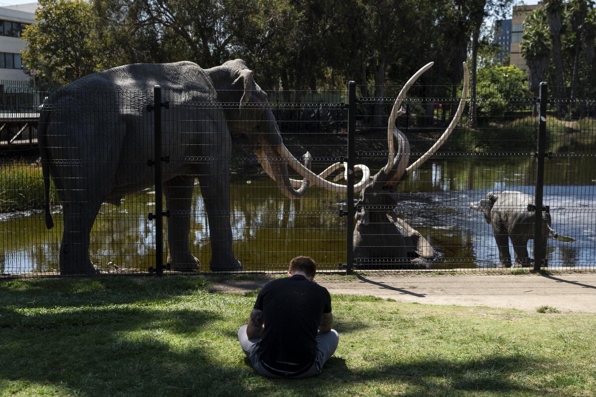
One plan largely preserves the existing architecture of the George C. Page Museum, opened to the public in 1977, and adds a new wing to the northwest, along with pedestrian pathways over the Lake Pit, the bubbling body of water that borders Wilshire Boulevard. Another maintains the footprint of the Page but adds a more transparent story on top, lifting the entrance of the museum to make it more visible. The third plan calls for an entirely new museum design: a series of stacked plates that reveal the strata of earth that compose the site. It also removes the beloved fiberglass mammoth that dwells in the lake, along with its baby and spouse, and places the family in an exhibition hall inside the new museum structure.
“It’s a conceptual approach,” says Lori Bettison-Varga, who oversees the Natural History Museums of Los Angeles County, the entity that manages the tar pits. “When people see these [plans], they shouldn’t think they are not malleable.”
Altogether, the plans represent a significant — er, mammoth? — change to a heavily visited part of Los Angeles that is in the process of being rebuilt.
We’re collecting your favorite memories about the 13-foot-high, 25-foot-long fiberglass creature.
Next door to the tar pits, the Los Angeles County Museum of Art is already shutting down galleries in anticipation of the construction of a new building, designed by Swiss architect Peter Zumthor to bridge Wilshire with its antler-like form. On the western side of the block, the Academy Museum of Motion Pictures is completing a renovation and expansion that adds a spherical, space-age theater to the remade May Co. department store building that will serve as its home.
Now the tar pits are going for a fresh new look. In June, the Natural History Museums of Los Angeles County announced a new master planning process for the tar pits, in part to address the site’s aging infrastructure. The 42-year-old George C. Page museum, designed by architects Willis Fagan and Frank Thornton, is not only short on exhibition space, it occasionally leaks. Plus, some of its displays are wildly outdated — such as the creaky animatronic saber-toothed tiger that is forever devouring a giant ground sloth, its tinny roar on permanent loop.
In addition, LACMA’s impending redesign provides an opportunity to rethink the circuitous, often confusing pathways that connect the tar pits to other sites within the land parcel (not the neighborhood) called Hancock Park. The revamp also offers the opportunity to rethink how the park, one of central L.A.’s most important green spaces, greets the street. Currently, there are limited entrances and a lot of fence.
On Monday evening, architects from Weiss/Manfredi, which worked on Seattle’s acclaimed Olympic Sculpture Park; Diller Scofidio + Renfro, the architects of the Broad museum; and Dorte Mandrup, a Danish firm with experience working on UNESCO World Heritage sites, presented their concepts in a two-hour public event at the El Rey Theatre. (Copies of the plans are available on the website at tarpits.org.)
All of the teams, says Bettison-Varga, “talk about the streetscape and needing more entry points and how everything is a little bit hidden, about way-finding and how to get visitors from different points in the place.”
The teams have also thought about the museum and park as a cohesive indoor/outdoor unit.
“They all have elements of visible collections and they all respect what we’ve heard about not wanting something really tall,” she adds. “They have all approached the actual dig sites and excavation areas as opportunities for people to sit and watch and engage and learn.”
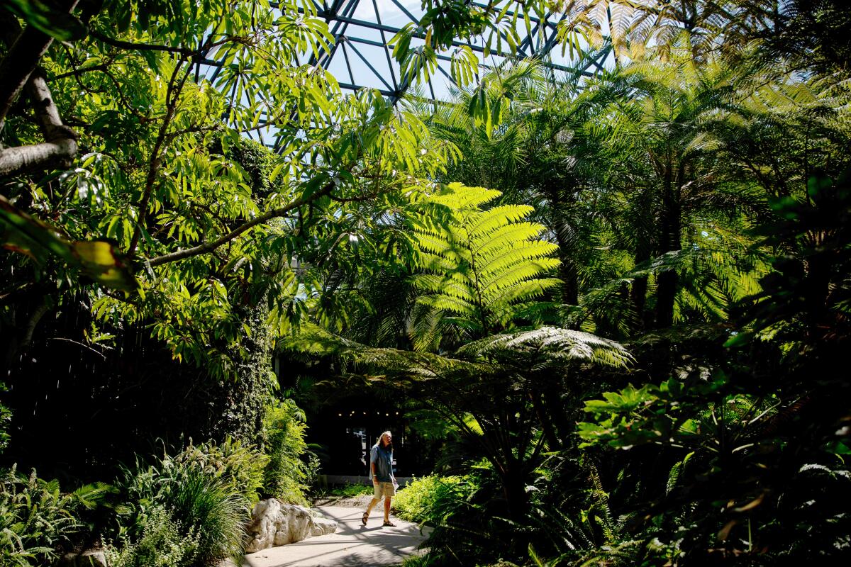
Ultimately, the design challenge is to weave together this highly unusual place: a public park that is also an active dig site, which also serves as a place in which to see paleontological relics and explore the notion of geological time.
“The importance of this location is democratizing science,” says Bettison-Varga. “We want people to see science here as accessible. We want to engage students of all ages.”
If all goes well, that can be done without losing the surreal weirdness that makes this unusual site so L.A.
Which brings us to the proposals — and the fate of our tar-trapped mammoth: Los Angeles icon, inadvertent movie star (see the 1988 cult flick “Miracle Mile”), fiberglass paean to the agonies of life and death.
Concept #1: Loop-de-loop
Of the plans submitted, the concept presented by the New York-based Weiss/Manfredi is the one that most preserves the current architecture of the park — while making some very notable additions.
The Page Museum stays, as do its gently sloping berms — the ones that thousands of Los Angeles children have employed as a favorite tumbling site. To accommodate the need for additional exhibition space, the architects have proposed a new elliptical wing to the northwest, on what is now a parking lot. (Parking would go underground.)
The new wing, composed of a series of gently ascending ramps, would house the Page’s collection, along with the visible laboratories (a concept the museum helped pioneer). The current building would then serve as a gathering and event space that could more readily hold the large groups of schoolchildren who come through on field trips.
The new and old wing would be connected by an entry hall that would be tucked under the berm. But it would be visible, because the architects have sliced open the berm to reveal the innards of the museum.
“Currently, the Page is a very introverted building,” says Michael Manfredi, founding partner of Weiss/Manfredi. “By creating that kind of horizontal cut along the Page, anyone wandering along the path can peek into the museum.”
At night, this space could be illuminated from within and showcase projections and animations. “Even if you haven’t paid to be in the museum, you can be pulled into this publicly visible lens,” adds Marion Weiss, also a founding partner.
Their design also rethinks some of the more inhospitable aspects of the outdoor areas.
They propose adding 400 new trees and increasing the lawn by 20%. A shade canopy, whose pattern is inspired by the patterns of leaves and bubbles on the tar seeps, would greet visitors at the corner of Wilshire and Curson, providing shelter from the sun.
In addition, the various meandering pathways that seem to lead nowhere have been streamlined into a series of three loops, one of which circumnavigates the scientific area to the northwest where excavations are still ongoing, another that surrounds a lawn at the center of the park, and another that bridges the Lake Pit, which would allow visitors to walk over and around that body of water.
In this plan, the mammoth clinging to life at the lake’s edge is a featured point of interest.
“Our sense is that you can read all the text in the world,” says Weiss, “but not understand this place in the way that you understand it when you are looking at those mammoths.”
Concept #2: Upgrading the museum
The proposal submitted by Dorte Mandrup represents a more significant reworking of the Page Museum structure.
“We keep the museum, not as it is — but upgraded,” says the firm’s founder and namesake, Dorte Mandrup.
The berm remains, so children can still tumble. But the museum structure would be gutted, essentially doing away with the courtyard garden.
“The courtyard you have now is very pleasant,” she explains, “but it doesn’t have a relationship to the tar pits.”
To the existing shell of the Page, Mandrup adds an additional story, surrounded in glass, with a rooftop garden. As part of the plan, the museum’s entrance is raised — thereby making it more prominent. (Currently, it is buried on the south side of the berm.)
Through the expanded museum space, the architect then creates a series of geometric pathways that navigate both up and down through exhibit galleries, visible storage and visible laboratories that cut across every floor.
“The museum needs more area for the activities that they want to do,” she says. “By reusing the building, you save a lot of waste and embedded energy.”
The glassy structure on top would add transparency and nod to the building’s current design by featuring a photovoltaic print of the Manuel Paz frieze of ice age landscapes that currently decorates the exterior of the Page’s roofline.
Mandrup, who is working in collaboration with landscape architects Martha Schwartz Partners, does away with the surface parking lot on the northeastern corner of Hancock Park, draping it with a roof garden.
“By covering the parking lot, you increase the park 20%,” she says.
Within the park, she too has worked to clarify the circulation, not only adding entry points to the park but using wooden boardwalks to mark the main circulatory areas, while narrower, gravel-lined paths serve as offshoots for exploration. Moreover, these permeable surfaces can capture rainwater.
And the mammoth family?
It stays. “It does engage people,” says Mandrup. “The kitschy things, those are the things we always somehow love.”
Concept #3: An urban ecosystem
It is the final plan, presented by New York-based Diller Scofidio + Renfro, that would require the most significant overhaul of the current museum structure — not to mention some very familiar elephantine objects.
The plan calls for razing the existing museum structure and replacing it with a series of four stacked, overlapping plates surrounding a glassy box that peeks over the mound. This would house an interlocking series of exhibition, laboratory and visible collection spaces.
On the exterior, the plates would be landscaped, with enough grade for tumbling. (Very important, that tumbling business.) The arrangement of forms would also allow visitors to enter the museum from any one of the cardinal points, making the museum more accessible.
In addition, the plate system would make visible the striated layers of earth that compose the site.
“I think it’s important to acknowledge that this piece of ground is super special,” says Elizabeth Diller, one of DS+R’s founding partners. “There is a history there before there was a city.”
To add green space, parking would be removed entirely from the park and placed around the perimeter or in off-site structures. (A move that will no doubt draw various neighborhood coalitions to the planning meetings.)
The idea is to provide a greater connection between museum and landscape. “It’s a hybrid architecture-landscape that is more of a continuum,” she explains. “The museum is as much indoor as outdoor.”
Diller thinks of the tar pits park not so much as a series of discrete functions but as overlapping ecological zones — “ecotones,” she calls them — and each would fade into the next.
The landscaping on the north would be arid and grow more dense and moist (more Pleistocene-like) as it approached the creek in the middle of the park. The area around the Lake Pit could be visually connected with the asphalt on Wilshire by employing darker tones around its shores.
In this plan, however, the fiberglass mammoth in the Lake Pit — first hauled to the site in the ’60s by sculptor Howard Ball on a hitch attached to his Volkswagen — would have to go.
“What we are proposing is to take it out of the lake and put it in a gallery that features the history of the tar pits and pop culture,” says Diller. “To save it ... but just change the feel and tone of the lake and the surrounding landscape.”
Will Angelenos appreciate the feel of a Lake Pit without its mammoths?
Says Diller: “I might get in trouble on that one.”
If you live in Los Angeles, perhaps you’ve been to Exposition Park — maybe to catch a Trojans game at the Coliseum, or to see the Space Shuttle Endeavor at the California Science Center, or to let the kids run around the dinosaurs at the Natural History Museum.
More to Read
The biggest entertainment stories
Get our big stories about Hollywood, film, television, music, arts, culture and more right in your inbox as soon as they publish.
You may occasionally receive promotional content from the Los Angeles Times.
![A view of the Lake Pit with mammoth at the La Brea Tar Pits (5801 Wilshire Blvd., Los Angeles; [323] 934-7243, http://www.tarpits.org), neighbored by grassy fields and the Los Angeles County Museum of Art, have been attracting visitors for more than a century.](https://ca-times.brightspotcdn.com/dims4/default/ba32406/2147483647/strip/true/crop/500x333+0+0/resize/840x560!/quality/75/?url=https%3A%2F%2Fcalifornia-times-brightspot.s3.amazonaws.com%2F1d%2F98%2Fdc7c8deb54259cc2e7609b51f499%2Flat-laoil-l5b4w5nc20100715154426)
