Scrap the ‘fiesta’ fonts. It’s time to rethink Hispanic Heritage Month design
I am obsessing over Gochisu-Dofu, the ultimate weeknight dinner. I’m Carolina A. Miranda, art and design columnist at the Los Angeles Times, and I’ve got all the bean curd and the essential culture news:
Ctrl-Alt-Delete Hispanic Heritage aesthetics
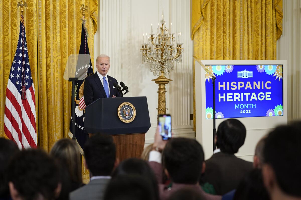
We are currently in the middle of Hispanic Heritage Month, which runs from mid-September to mid-October. There are plenty of reasons to celebrate the contributions of the nation’s nearly 64 million Latinos. What I’m not celebrating is the related graphic design, which is often a pastiche of brightly-colored patterns and stylized decorative fonts with awful names like “Taco Modern.”
Hispanic Heritage Month began as National Hispanic Heritage Week in 1968, an event that largely involved a succession of U.S. presidents (starting with Lyndon Johnson) issuing proclamations in honor of U.S. Latinos. In 1988, Congress established Hispanic Heritage Month, fueling an expanded slate of news conferences during which politicians and business leaders stood alongside some Hispanics and obligatory Hispanic Heritage Month graphics.
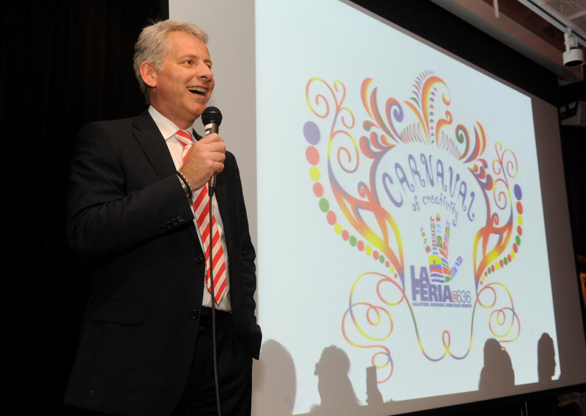
These graphics have become, over time, a visual trope.
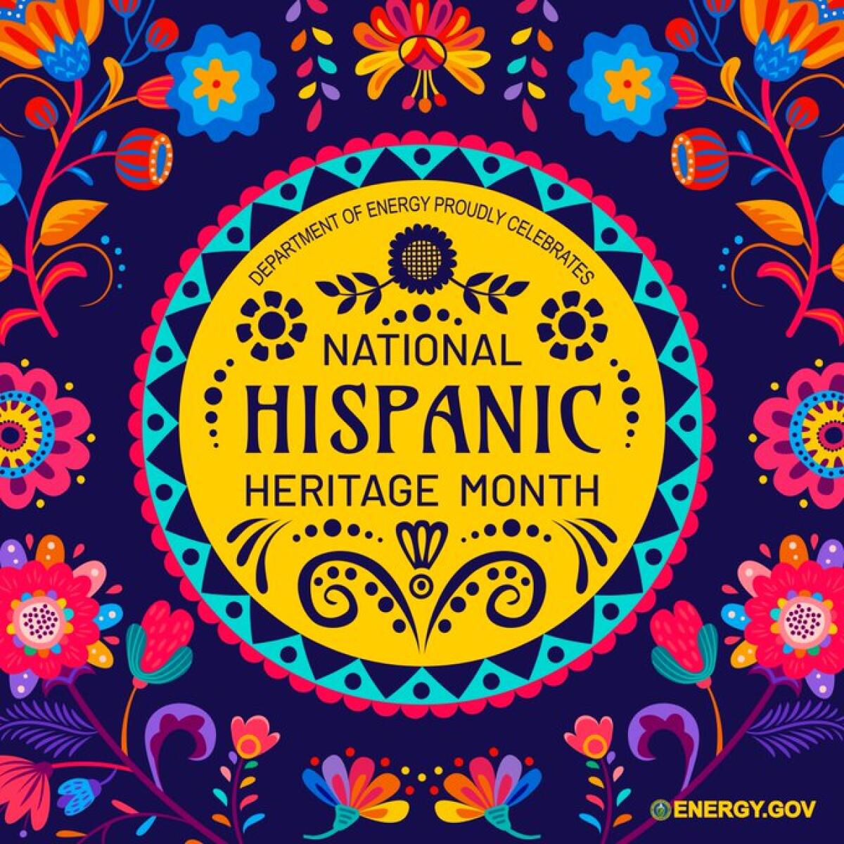
The geometric patterns of textiles and ornate features of amate painting (work on bark paper) from the Mexican region of Puebla have long been a point of inspiration. But over the last half-dozen years I’ve also seen the rising influence of a papel picado aesthetic — after the Mexican cut-paper banners that combine Indigenous, European and Asian influences and reference important folk art traditions in Puebla. The style can likely be attributed to the growing U.S. popularity of Day of the Dead, during which papel picado is a decorative element. Another likely influence: Disney Pixar’s “Coco,” released in 2017, a film whose logo evokes cut paper.
This season has generated a bevy of such designs commissioned by everyone from the Office of the Vice President to the Department of Energy and the Ford Motor Co.
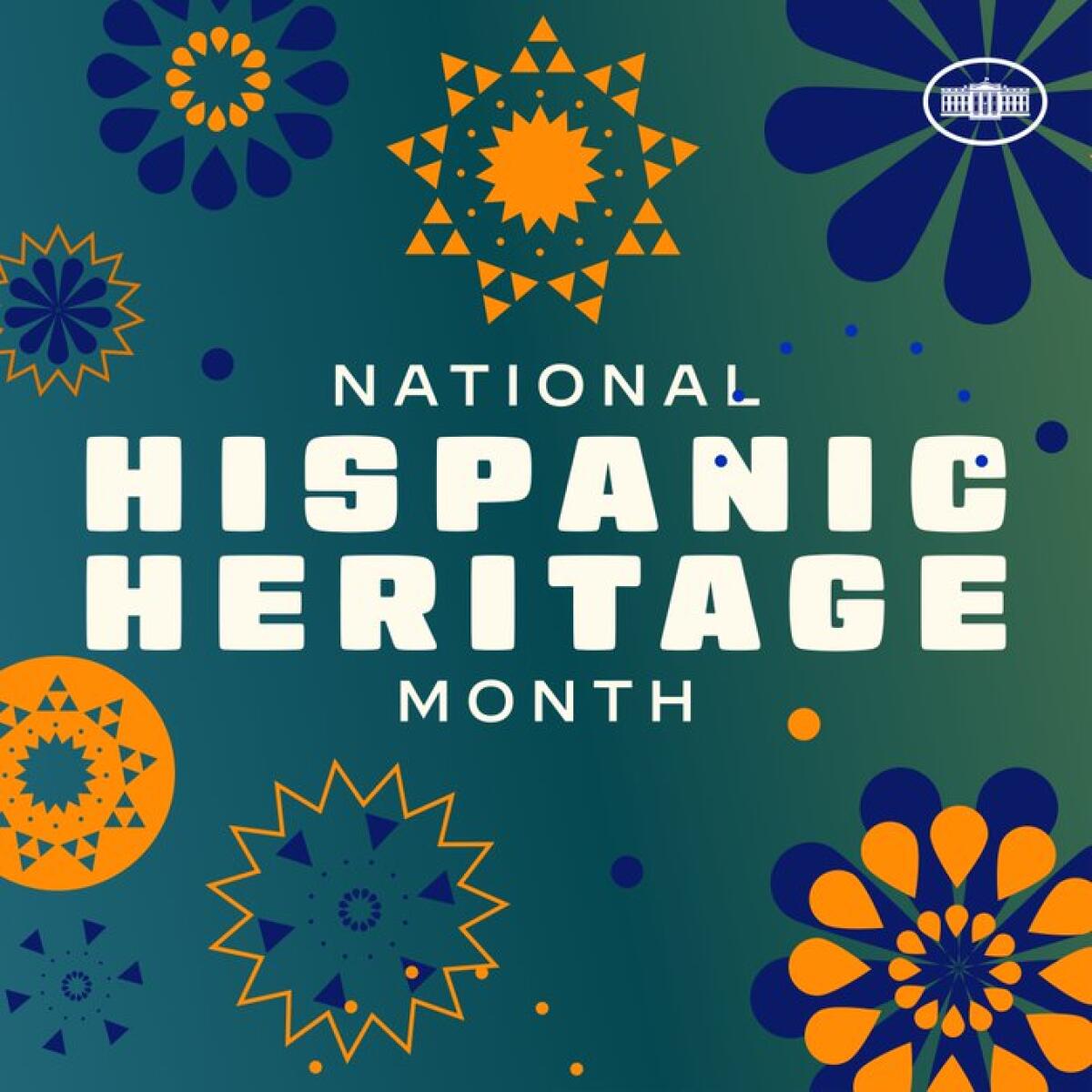
Taken individually, the designs aren’t necessarily bad. But collectively, they feel reductive. Elements of folk art (largely Mexican) are somehow supposed to convey the cultures of an entire continent. “It’s a caricature that tries to embody the whole Latin American identity and culture,” says Juan Villanueva, a Peruvian-born typographer based in New York, “but that’s an impossible task.”
Moreover, folk art tends to inspire many of the designs while other Latin American design movements, such as the unique brand of Modernism that shaped the graphic look of the 1968 Olympics in Mexico, never enter the picture.
Make the most of L.A.
Get our guide to events and happenings in the SoCal arts scene. In your inbox once a week.
You may occasionally receive promotional content from the Los Angeles Times.
Many Hispanic Heritage Month graphics posted to social media are simply lazy: harvested from stock sites such as Freepik, Canva and Etsy. These are often largely interchangeable with Cinco de Mayo graphics — visually conflating the contributions of Latinos to U.S. culture with a Mexican historical event that is now generally used as an opportunity for chain restaurants to hawk nachos and margaritas.
Worst of all are the decorative fonts, which I call “fiesta fonts,” since so many have the name “fiesta” in their title, including “Lady Fiesta” and “Fiesta Rumba.” “Taco” is also a theme: “Taco Crispy, “Taco Salad,” et al. Naturally, there is even a font called “Taco Fiesta” — because I guess Latinos are one big taco party? (Design critic Anne Quito has written about a similar phenomenon in the Asian community: “chop suey fonts,” frequently used as a marker of Asian-ness in restaurant design but also wielded by xenophobes.)
Ellen Lupton, a curator emerita at the Cooper Hewitt, Smithsonian Design Museum in New York, tells me via email that these fonts are “the equivalent of junk food in graphic design. They amplify cliches and stereotypes. For example, they use playful, crude, crafty shapes, as if Latin American designers don’t also create refined, sophisticated, industrial artifacts and architecture.”
Villanueva suggests Hispanic Heritage Month could instead be an opportunity for organizations to partner with Latinx and Latin American graphic designers to generate something thoughtful. “Put a budget on it,” he says. “There is so much talent in Latin America and people in the U.S. who are looking at this landscape of stereotypical designs and they don’t see themselves reflected in it.”
He points to typography created by Beatriz Lozano and Miguel Angel Contreras Cruz, to name just a couple of the designers currently innovating in the field.
Like Villanueva, I’d like to see organizations be specific rather than generic. Is the 2023 design influenced by Mexican folk art? Perhaps the 2024 design can be inspired by Puerto Rican painting. 2025 can draw from Andean band posters. And maybe those influences can be explicitly stated rather passed off as broadly “Hispanic” (whatever that is).
One of the better designs I’ve seen emerge this month comes from U.S. Soccer and AT&T, in a collaboration between artist Luis Pinto and men’s forward Ricardo Pepi. A double-headed eagle speaks to Pepi’s roots on both sides of the border between El Paso and Ciudad Juarez. Naturally, the accouterments of soccer are also depicted. It’s a design that tells a very specific story, as design should do.

Cut-and-paste templates might be quick and easy, but they feel cheap. The Latino presence in this country is deep, rich and complicated. Let’s have design that reflects that.
On and off the stage
A group of prominent performers, including Lin-Manuel Miranda and Phylicia Rashad, traveled to Washington, D.C., this week to brief congressional leaders on the crisis facing theater. The event marked the introduction of the Supporting Theater and Generating Economic Activity Act, a federal funding initiative that, if passed, could cover 20% of the eligible organizations’ collective budgets. The Times’ Ashley Lee has the details.
Definitely not in crisis is the production of Luis Alfaro’s “The Travelers” at the Los Angeles Theatre Center. The plot centers on an injured man who materializes at a down-on-its-heels monastery in the Central Valley. The play “proceeds,” writes Times theater critic Charles McNulty, “intuitively rather than logically,” albeit with moments of meaning and renewal.
In a story about how “The Travelers” came to be, The Times’ Reed Johnson spoke with Alfaro and the team behind the play. It is a lovely conversation about how the pandemic has challenged theater — but also how it has challenged artists to respond to the existential questions of our moment.

In and out of the galleries
“We were like a terrorist cell against the tyranny of good taste,” director John Waters says about his early days as a filmmaker. Now the man known for gross-out is the subject of an exhibition at the Academy Museum of Motion Pictures. Contributor Manuel Betancourt hung with the very funny Waters and paid a visit to the show’s “Filth Shop.”
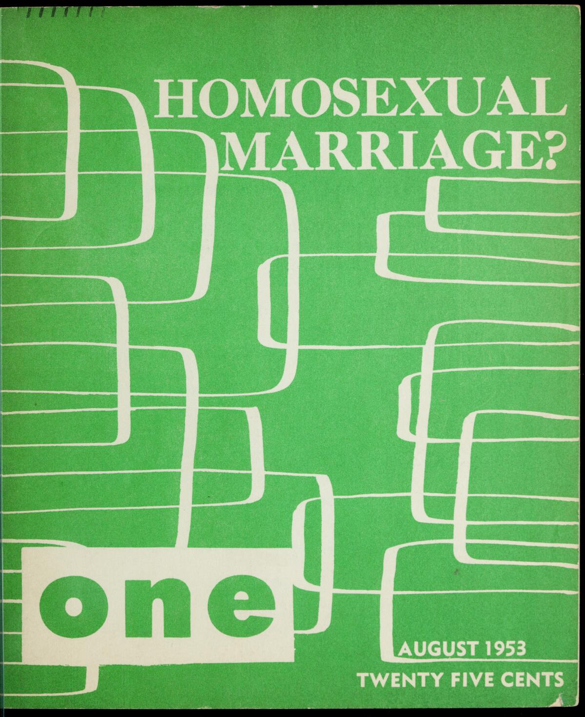
Betancourt also reports on a new exhibition at the Los Angeles LGBT Center exploring the legacy of One magazine, the pioneering gay publication launched by One Inc. in 1953. Accompanying the show is a month-long queer histories festival. One Institute director Tony Valenzuela sees this historic show as an “urgent” call to action at a time of rising homophobia. Plus, those ‘50s-era graphics and vintage spreads are a delight.
Marquell Byrd and Abigail Lopez-Byrd have established the Compton Art & History Museum as a cultural outpost showcasing the rich history of their city. “Sounds of the City,” for example, tracks Compton’s prominence as a center of hip-hop on the West Coast. As a visitor tells contributor Carren Jao, it’s an opportunity to see exhibitions “for the community in the community.”
The nonprofit Los Angeles Contemporary Archive holds objects and other ephemera connected with contemporary art and performance in Los Angeles. This year, they will be a part of the Hammer Museum’s “Made in L.A.” biennial, which opens on Oct. 1. Culture writer Deborah Vankin got to poke around the archive, which includes props, costumes, letters, pay stubs, police reports and even some half-empty bottles of 409.
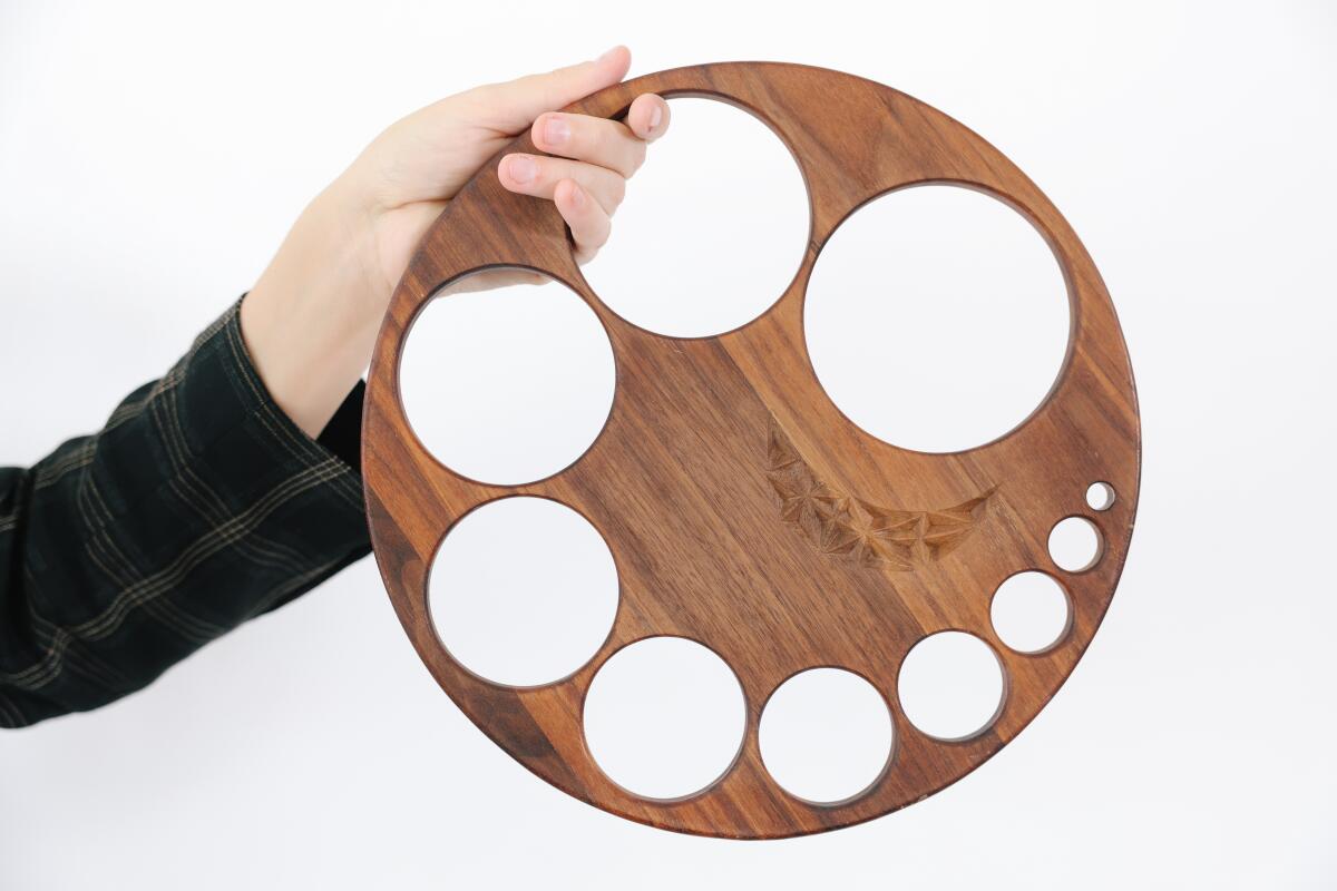
An exhibition at LAST Projects featuring work by Erica G. Peralta and Rafael Cardenas explores the restaurant as a space of leisure and labor.
Design time
Times design scribe Lisa Boone has an essential guide to the iconic Los Angeles homes you can tour — among them, Pierre Koenig’s hilltop Stahl House and the two-century-old Ávila Adobe.
Enjoying this newsletter? Consider subscribing to the Los Angeles Times
Your support helps us deliver the news that matters most. Become a subscriber.
The housing situation in L.A. is so dire that a company called Brownstone Shared Housing has converted two homes and an office space into a series of sleeping pods that rent from $500 to $900 (!!!) month. The Times’ Terry Castleman has a peek at the pods.
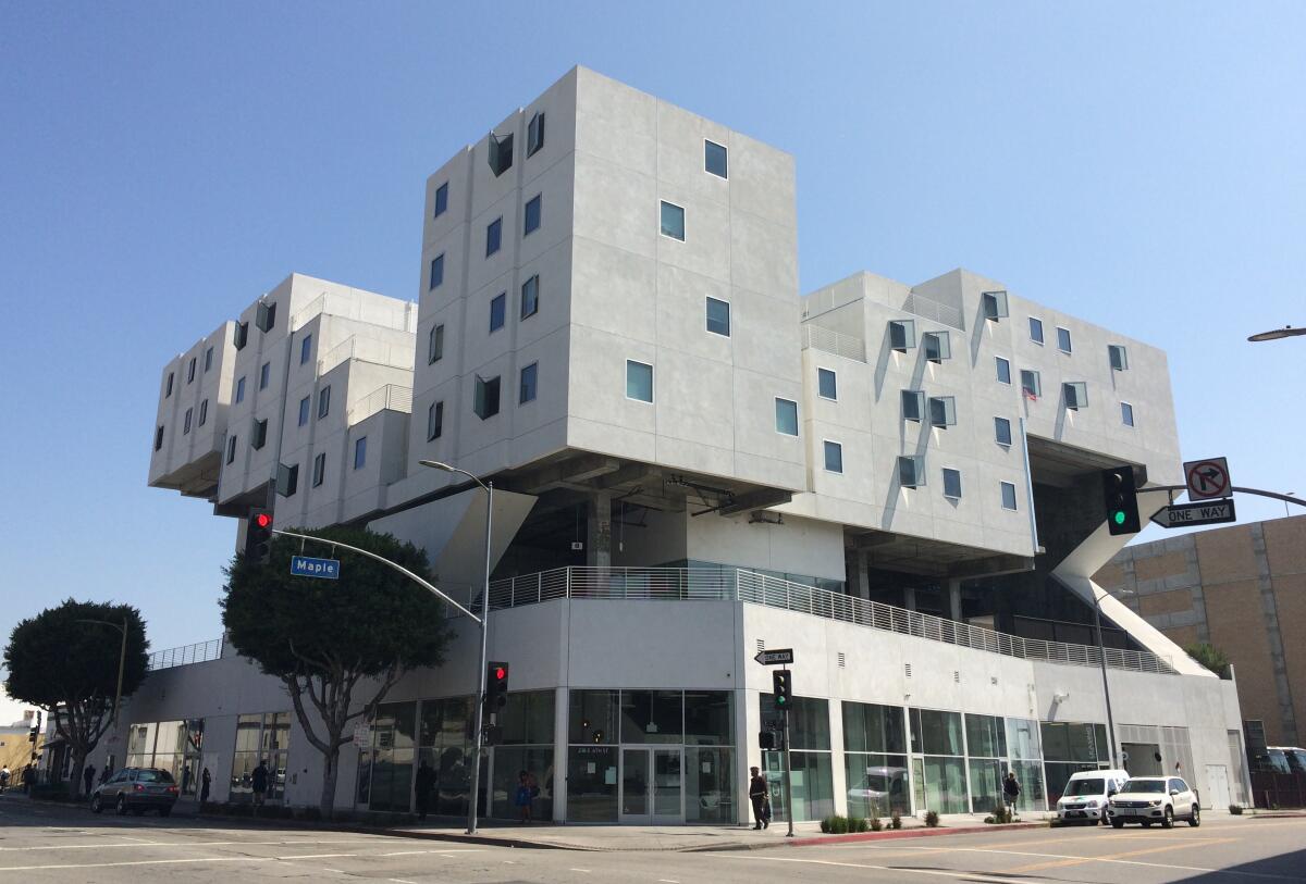
Since we’re on the subject of housing, architecture writer Mimi Zeiger has a good read on the financial collapse of the Skid Row Housing Trust, an organization that helped foster a vital debate about how design can create supportive environments for the unhoused. Continued investment remains a critical piece of the puzzle.
Just dance
Melissa Barak, who was appointed artistic director of Los Angeles Ballet last year, is ushering in a new era for the company. The Times’ Steven Vargas sat down with Barak, a former LAB dancer and L.A. native, to discuss her vision for the company — which includes extending its presence around L.A. and beyond.

Essential happenings
Steven Vargas has got the goods on what’s going down in L.A., including a performance by Hubbard Street Dance Chicago at the Ahmanson Theatre.
Moves
Scott Altman has been named president and CEO of the Los Angeles Master Chorale. He joins the chorale from the Cincinnati Ballet, succeeding Jean Davidson, who left in March to run the National Symphony Orchestra.

The American Institute of Architects Los Angeles has announced its Board of Director Awards (formerly the Presidential Honor Awards) for 2023. The Gold Medal has been awarded posthumously to Earl E. Gales Jr., who helped found one of the nation’s largest minority-owned architecture firms and did foundational work on L.A.’s Metro rail system. You can find the full list of winners here.
Plus, AIA’s statewide chapter honored L.A. architect Lorcan O’Herlihy with its 2023 Maybeck Award for outstanding achievement in architectural design. (Want a backgrounder? I profiled O’Herlihy in 2018.)
The Academy Museum of Motion Pictures has ratified its first labor contract nearly a year after bargaining began.
Passages
Erwin Olaf, a Dutch photographer whose staged images of everyone from artists to royalty leaned into the theatrical, is dead at 64.
Michael Gambon, a veteran of stage and screen who is perhaps best known for playing Dumbledore in the “Harry Potter” films, has died at 82.
Tenor Stephen Gould, known for his performances of Wagner operas as well as his occasional explorations of musical theater, died at 61.
In the news
— Artist Marco Brambilla has created an Elvis-inspired work for the Vegas Sphere and it employs “the language of excess.”
— A pair of Confederate-themed windows in the National Cathedral in Washington, D.C., have been replaced by designs from painter Kerry James Marshall.
— Greg Allen checked out the windows and writes about how they honor protest.
— John Baldessari’s estate is currently embroiled in a pair of lawsuits relating to damaged works and a canceled show.
— A couple of Chinese influencers created a video story about a teapot that escapes from the British Museum and it has gone viral.
— NBC recently ran a report ranking the Hollywood Walk of Fame as one of the worst tourist attractions on the planet. L.A. Taco’s Javier Cabral says not so fast.
— Your NFTs are worthless.
— All the books being used to train generative AI systems.
— Related: What the intersection of ChatGPT and jazz criticism looks like, from jazz critic Nate Chinen.
— And because I can’t get enough of our tech overlords, I’m adding Malcolm Harris’ “Palo Alto” to my reading list.
— I’m also adding this Manhattan sardine store to my life list because I’m always here for tinned fish aesthetics.
— Stop calling it “content.”
And last but not least ...
As a half-Peruvian, it is incumbent upon me to note that the Mexican aliens have Peruvian roots.
The biggest entertainment stories
Get our big stories about Hollywood, film, television, music, arts, culture and more right in your inbox as soon as they publish.
You may occasionally receive promotional content from the Los Angeles Times.


