Clippers unveil new logo with compass and ship. Here’s where to buy merchandise
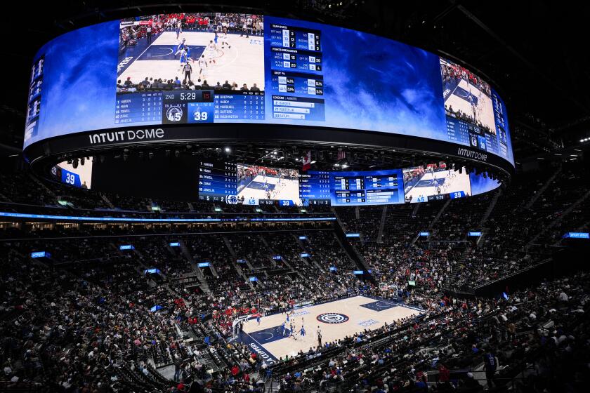
The Clippers are starting a new era next season when they move to their state-of-the-art arena, Intuit Dome.
So why not have a brand new look to go with it?
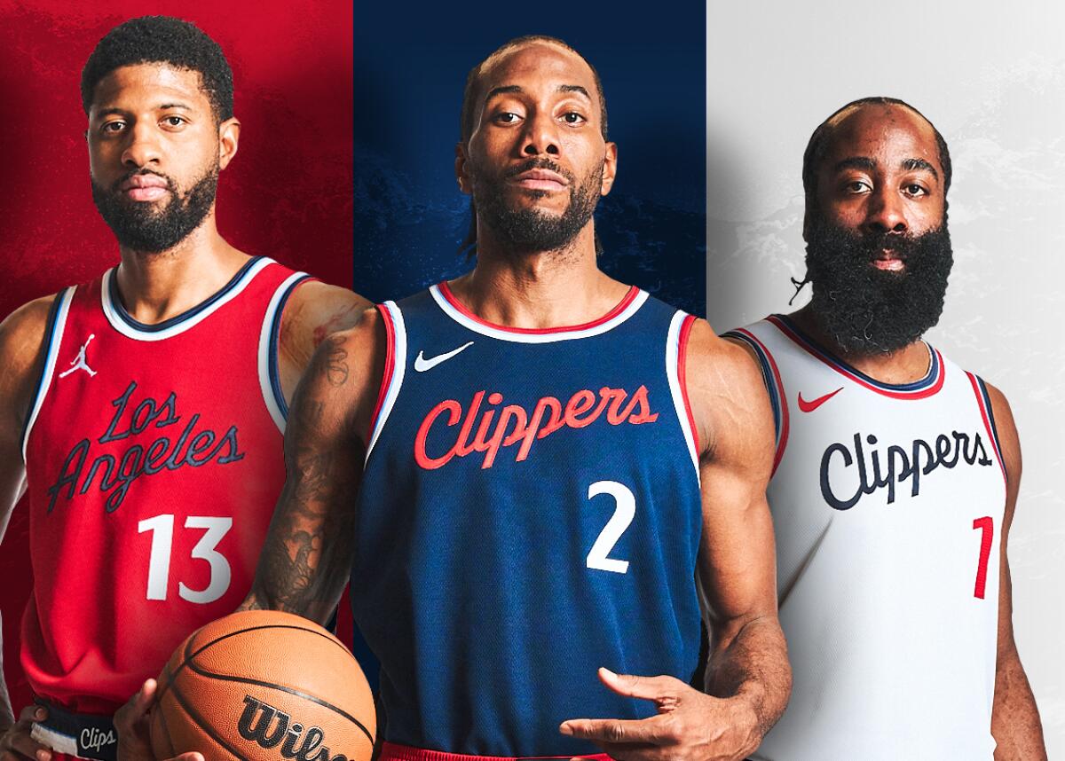
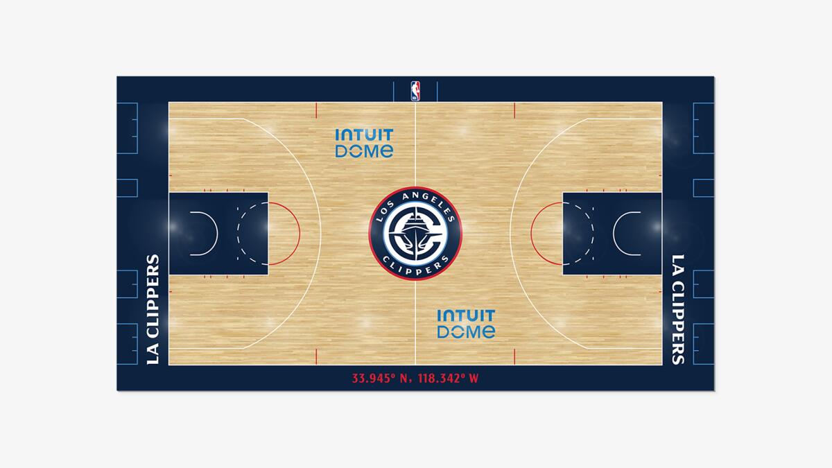
On Monday, the Clippers unveiled a new logo and new uniforms, all of which will debut at the same time the team relocates from downtown Los Angeles’ Crypto.com Arena to Inglewood at the start of the 2024-25 season.
This will be the Clippers’ second major rebranding in less than a decade. The last one came in 2015, about a year after current owner Steve Ballmer purchased the team from Donald Sterling. The logo was changed for the first time since the Clippers moved to Los Angeles in 1984, and the results weren’t exactly popular with many fans.
Clippers owner Steve Ballmer is determined to give fans the best experience they’ve ever had at an NBA arena. Will he achieve his dream?
The organization is hopeful that the new look, which leans heavily into the team’s nautical roots, will receive better reviews.

“We have been on a long journey, gathering feedback and insights from across Clipper Nation,” Gillian Zucker, Clippers and Intuit Dome president of business operations, said in a statement. “We listened to as many voices as we could and then engaged specialists to arrive at a timeless design that blends bedrocks of our past and our future. Our new marks are meaningful and strong, capturing our roots and our aspirations.”
The new logo features the letter “C” designed to look like a compass surrounding the silhouette of an oncoming ship. Easter eggs for sharp-eyed fans include the north marking of the compass pointing to the “N” in Los Angeles and the hull of the ship being designed to resemble the seams of a basketball.
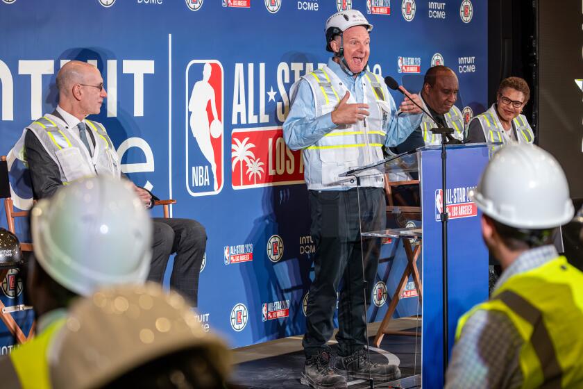
Clippers owner Steve Ballmer is his usual vibrant self in helping NBA Commissioner Adam Silver announce the 2026 All-Star Game will be at the Intuit Dome.
Based on the comments on the Clippers’ Instagram and X pages, reactions are largely split down the middle. Some applaud the new logo, calling it “clever,” “classy” and “sick” (the good kind). Detractors call it “boring” and “pretentious,” with some comparing it to the logo from an expansion team or a small college.
Many people appreciate that a boat has been incorporated into the logo, with several fans admitting to not even realizing that a clipper is a nautical vehicle. Others have pointed out, however, that the illustrated vessel looks more like a cruise ship than a clipper.
The new jerseys will feature “a modernized classic script in naval blue, ember red, and Pacific blue,” the team stated. Limited-edition merchandise will be available at ClippersHQ.com and at the Grove on Monday and Tuesday from 10 a.m. to 9 p.m.
More to Read
Get our high school sports newsletter
Prep Rally is devoted to the SoCal high school sports experience, bringing you scores, stories and a behind-the-scenes look at what makes prep sports so popular.
You may occasionally receive promotional content from the Los Angeles Times.

