Here’s what you need to know about the government report on climate change. For starters, it’s real.
The conclusions contained in a draft federal report on climate change are unequivocal: Human-induced global warming is real, and left unchecked, the consequences could be dire.
Although not new, the findings are at odds with claims by President Trump and members of his administration, who continue to assert that the extent of the human contribution to climate change is not clear.
In June, Trump announced that the U.S. would withdraw from the agreement reached in Paris in 2015, in which nearly 200 countries pledged to reduce emissions of heat-trapping greenhouse gases, saying the deal was bad for the country.
The report’s authors, however, say the factors driving climate change are quite clear.
“Many lines of evidence demonstrate that human activities, especially emissions of greenhouse gases, are primarily responsible for the observed climate changes over the last 15 decades,” the authors wrote. “There are no alternative explanations.”
The report, a synthesis of the available science prepared by 13 government agencies, is part of the National Climate Assessment, which is mandated by Congress and is supposed to be published every four years.
The latest draft has been extensively reviewed, and the authors are waiting for permission from the Trump administration to release the report to the public — which probably explains why it was leaked to the New York Times.
“We have not received any indication yet that it is not on schedule for publication,” said Katharine Hayhoe, a professor of political science at Texas Tech University and one of the lead authors of the report. “But understandably there are fears that it won’t be approved, or that it could be returned to the authors with substantial changes that we might not be comfortable with because they aren’t consistent with the science.”
The draft report concludes that average temperatures over much of the world in recent decades have been much higher and have risen faster than at any time in the last 1,700 years. It is “extremely likely” than more than half of the rise in global temperatures since the mid-20th century was the result of human activity, it says.
Even small temperature increases can have major effects, such as an increase in the number of droughts and extreme storms, melting polar ice sheets and rising seas.
Scientists have generally hesitated to attribute specific weather events to climate change. But the authors say there is now relatively strong evidence for a human contribution to events such as the heat waves in Europe in 2003 and in Australia in 2013.
Here are some more of the findings contained in the many charts and maps included in the draft report:
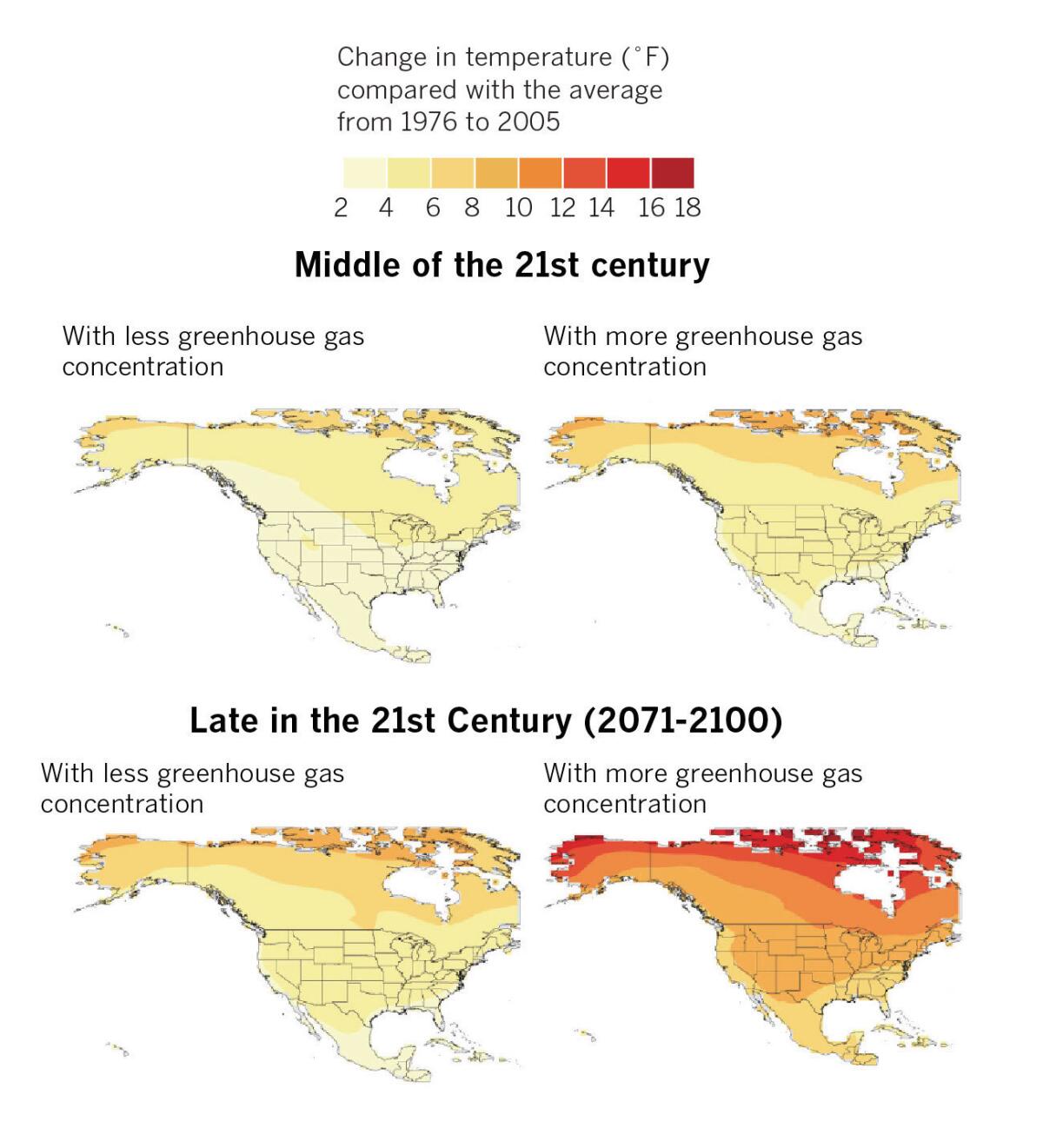
Projected changes in average annual temperature
The report lays out in stark terms different possible scenarios if countries continue to depend on coal, oil and other fossil fuels as their primary energy sources, or if they convert their economies to cleaner energy sources and reduce emissions. These maps show the projected change in average annual temperatures in the U.S. depending on the concentration of greenhouse gasses in the atmosphere.
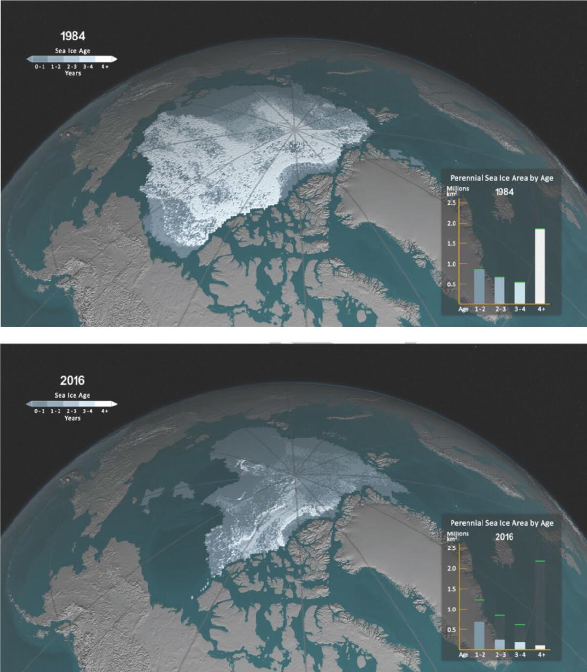
September sea ice in 1984 versus 2006
The Arctic is warming at a rate that is about twice as high as the global average. Satellite imagery has shown a dramatic decline in Arctic sea ice for the month of September from 1984 to 2006. At this rate, scientists say, Septembers could become nearly ice-free in the Arctic Ocean by the 2040s.
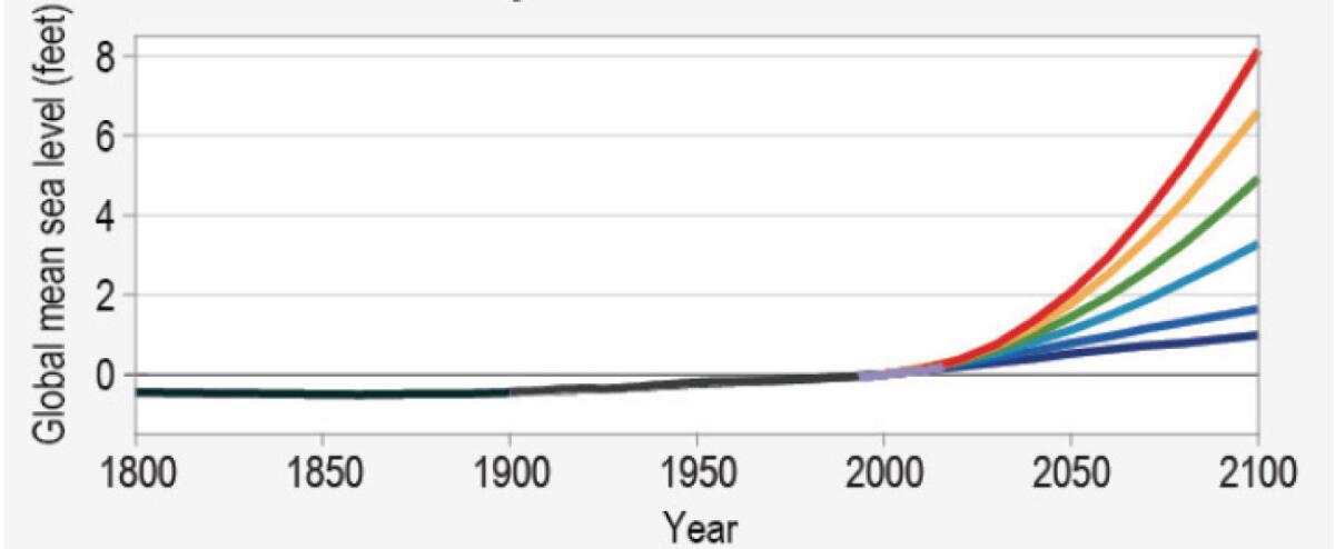
Sea-level rise
The world’s oceans are rising at a faster rate than before, threatening coastal communities with more frequent and extreme flooding. This chart shows the past and projected sea-level rise under six scenarios. The lowest scenario is what would be expected if the rate of sea-level rise stays the same as over the last 25 years. The most extreme scenario — a sea-level rise of about 8 feet — assumes a rapid mass loss from the Antarctic ice sheet.
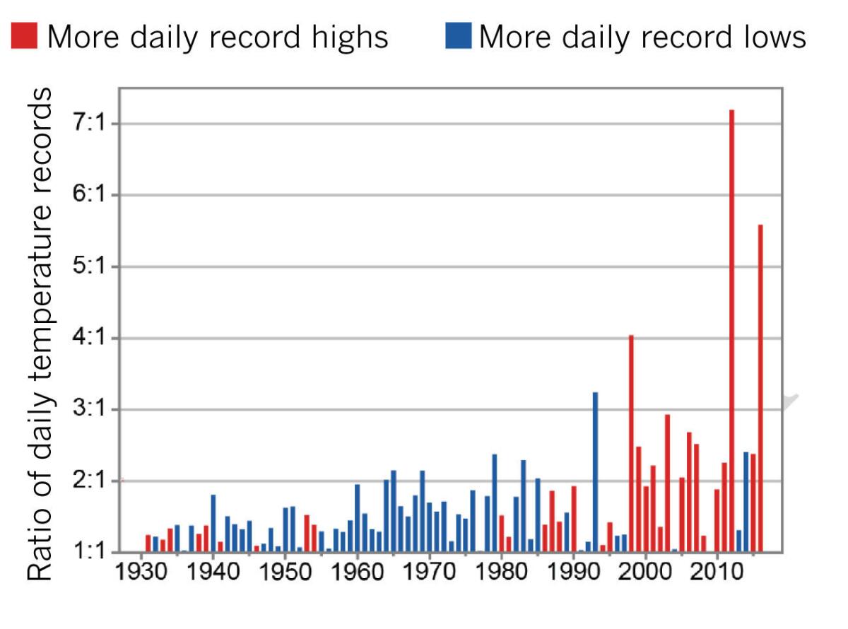
More record warm daily temperatures
Recent decades have seen marked changes in temperature extremes across the U.S. This chart shows that record warm daily temperatures are occurring more often. The red bars indicate years with more daily record highs than record lows, and the blue bars indicate years where the reverse happened.
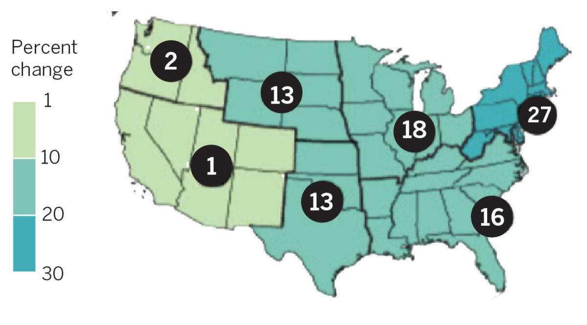
More heavy precipitation
The intensity and frequency of rain and snow events have been increasing in most parts of the U.S. This map shows change in one measurement for extreme precipitation: the maximum daily precipitation in consecutive five-year periods between 1901 and 2016. The circled numbers are the percentage change for different regions.
Sign up for Essential California
The most important California stories and recommendations in your inbox every morning.
You may occasionally receive promotional content from the Los Angeles Times.


