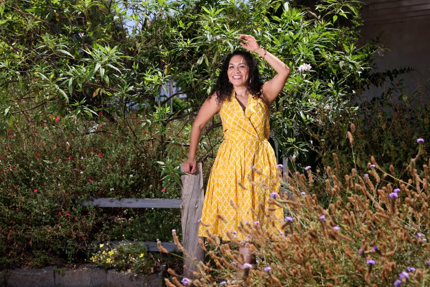
Design adds privacy and color as a frontyard becomes a living space
Garden designer Naomi Sanders was gratified to learn that a recent landscape design she created in Venice was copied by a neighbor.
“I feel flattered,” she said with a laugh. “It’s great when homeowners see something or are inspired by a garden and apply it at home.”
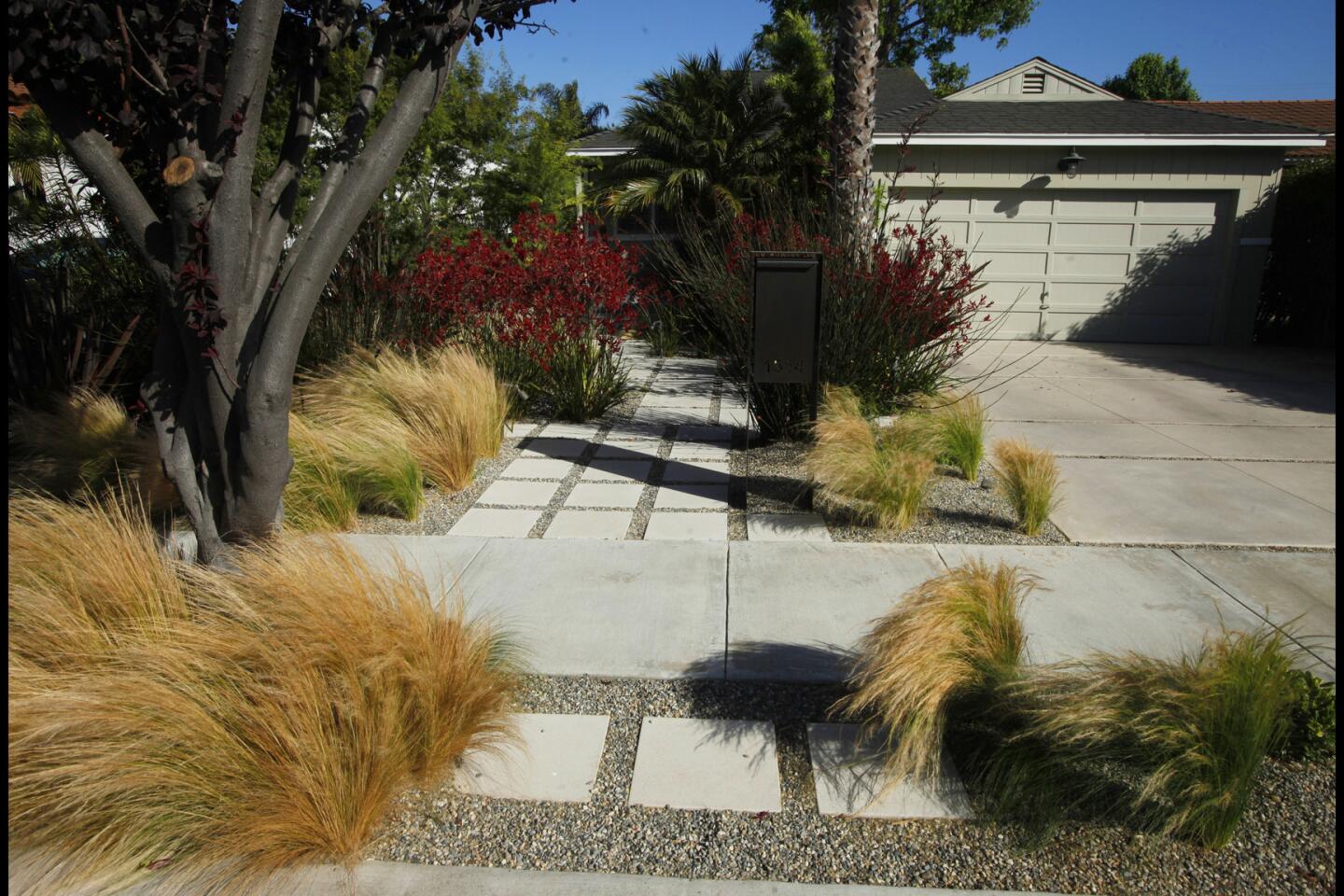
The imitation is understandable: Working with a limited variety of plants, Sanders transformed the frontyard of a nondescript 1952 home into a striking, secluded space that feels fresh and modern.
The homeowners wanted an outdoor area they could enjoy without being isolated from their neighbors. But they never used the frontyard because they felt exposed to the street.
Before diving into the makeover, Sanders examined the architecture of the house. “There was a weird disconnect between the [1950s] architecture and the driveway, which are right next to each other,” Sanders said. “I wanted to create a flow between the spaces as well as a connection between the driveway and the house.”
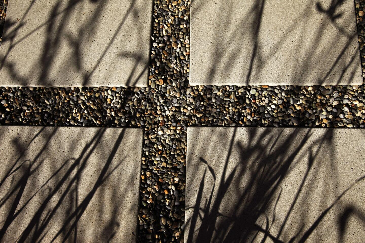
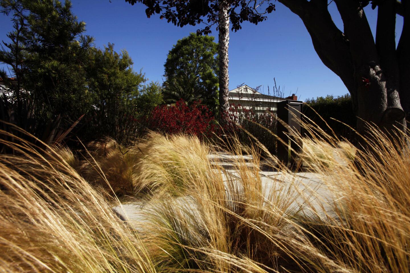
Sanders painted the house green to help it recede from the street. This allowed the garden to stand out and feel larger than it was. Motivated by drought concerns, she also pulled up the lawn and installed a new driveway complemented by graphic pavers surrounded by gravel that works as a permeable hardscape.
Contrary to the homeowners’ initial impulse to remove all the original foliage, Sanders chose to keep the home’s older, established plants. A large palm tree was saved for its ability to create separation between the driveway and the landscape. And palms on the side of the house were maintained for their textural elements. “They lined the walkway and screened the side of the house.”
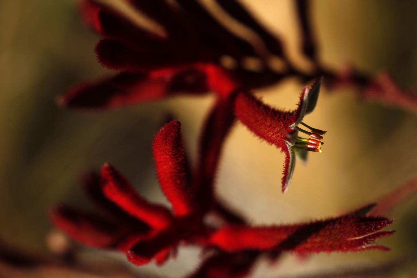
Tall red kangaroo paws planted along the walkway added privacy and color. “They are bright and vivid, and yet you can still see through them,” Sanders said. “They have a nice relationship with the putty green of the house. “ Despite their transparency, Sanders views the tall perennials as a privacy screen. “It doesn’t make sense to have a fence,” Sanders said. “The plants are your fence.”
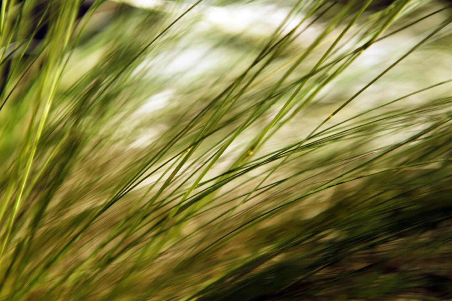
New Zealand flax and Mexican feather grass add subtle movement. “Movement is a major part of the design,” Sanders said. “I wanted it to be soft and feathery as you walk through the space.”
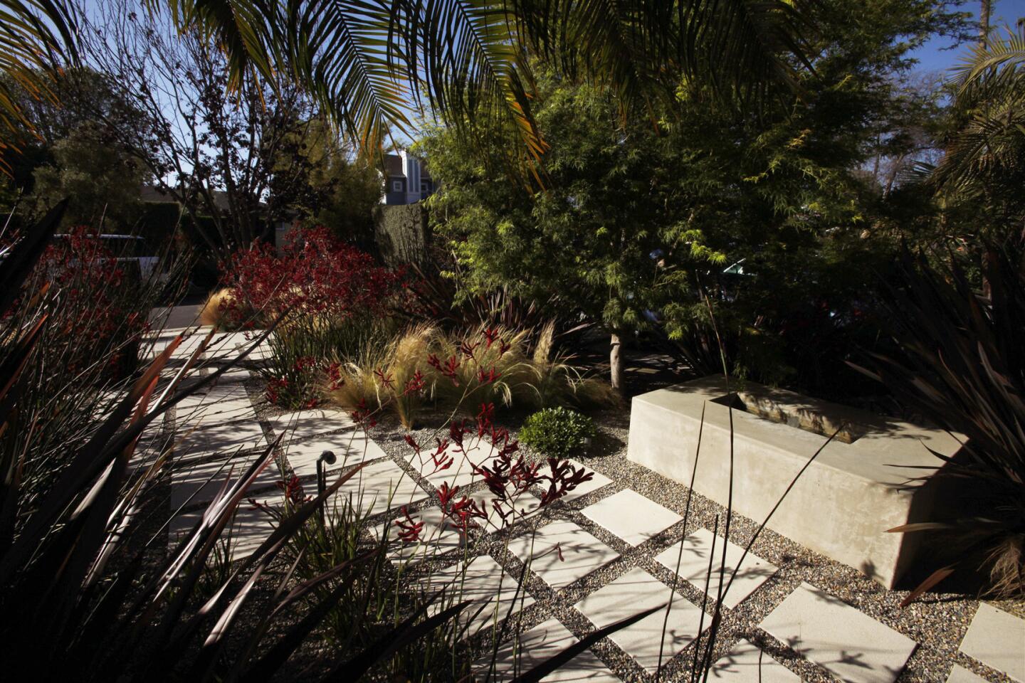
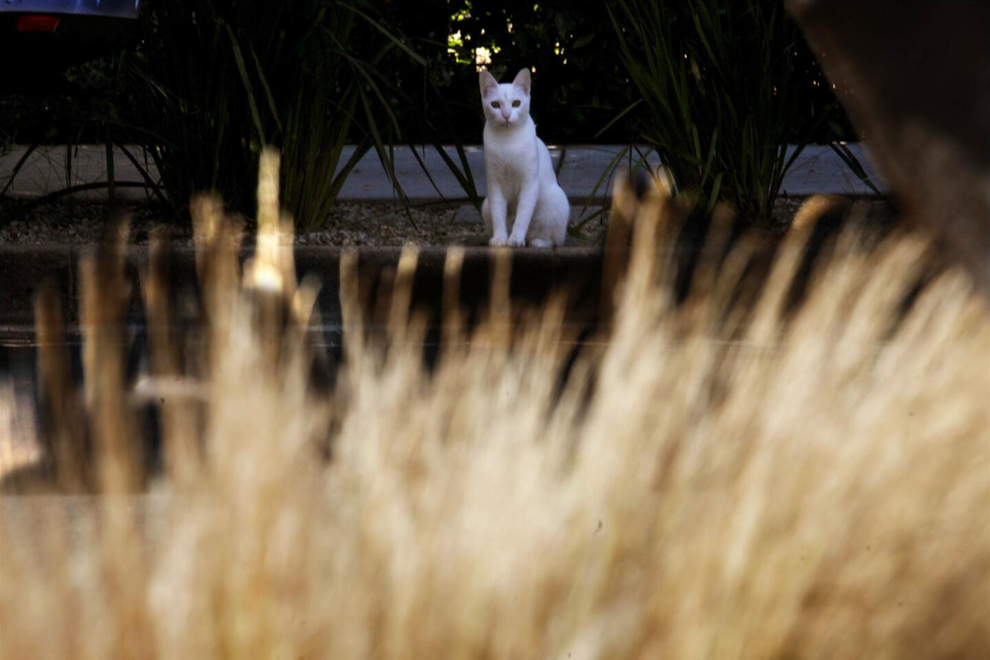
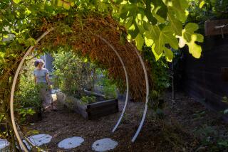
The frontyard is now a clean and simple free-flowing outdoor area, with secluded places to sit and relax. A concrete water fountain in the center serves as a gathering spot with sturdy surfaces for seating and entertaining. Sanders also broadened the steps to the front door to add more seating. It’s a peaceful hangout complemented by the warm color contrasts from Japanese maple and tufted clumps of small cape rush. It doesn’t feel like you are sitting in the frontyard next to the driveway.
Repeating plants and pavers was a central part of the garden’s design and what makes it so visually elegant. Although Sander can empathize with gardeners who can “lose their way with plants,” she suggests looking at an outdoor space in a cohesive way. “No matter how small or large or space, maximize its use as much as possible. It doesn’t have to be just a frontyard. It can be a gathering spot.”
::
Sanders’ pattern of seven plants
Landscape designer Naomi Sanders transformed the frontyard of a nondescript Venice home using a simple plant palette. Here she shares the seven plants she used in repetition to create a welcoming frontyard and private, usable living space:
Acer palmatum dissectum ‘Seiryu’ / Japanese maple
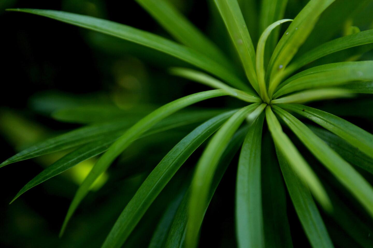
Podocarpus macrophyllus / yew pine
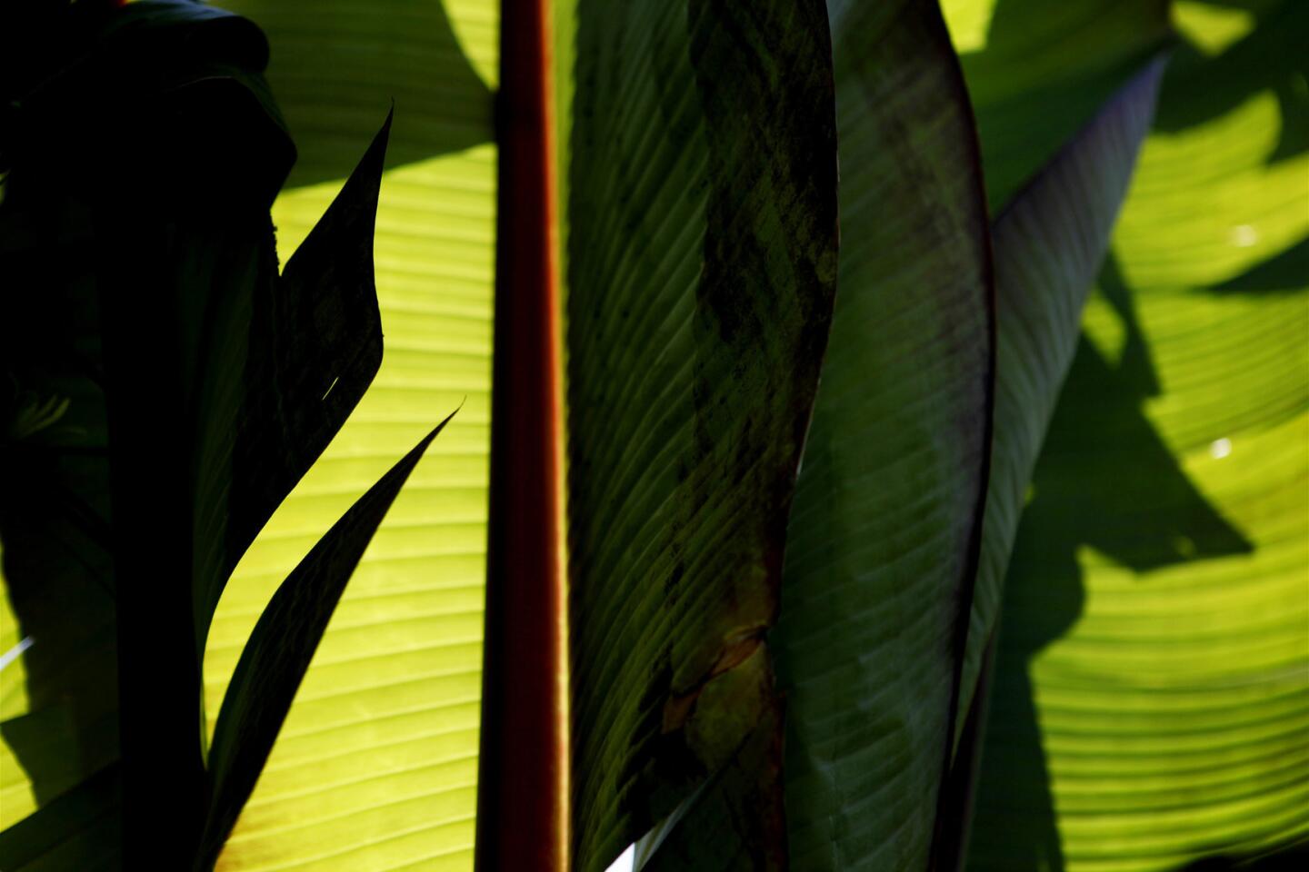
Phormium tenax ‘Bronze’ / New Zealand flax
Chondropetalum tectorum / small cape rush
Anigozanthos ‘Big Red’ / kangaroo paw
Stipa tenuissima / Mexican feather grass
Pittosporum tobira ‘Wheeler’s Dwarf’
