Sleek, contemporary style in Silver Lake
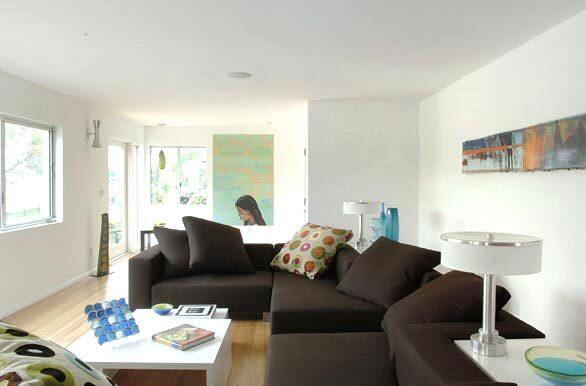
Karen and Guy Vidal, the designers behind the fanciful Moroccan-flavored house that was featured as Homes Feb. 21 cover story, deployed the same sort of playful sensibility to their own house in Silver Lake, though in a much different way. The couple remodeled a 1937 residence into a sleek, contemporary family home. Here in the living room, a sofa designed by the Vidals is complemented by custom lighting, including the stainless steel sconce in the background. The figural painting is Maya by Alexandra Wiesenfeld, and the long artwork is by Michael Illes, whose pieces consist of layer upon layer of color until the paint is almost dimensional at the edges, Karen Vidal says. (David Phelps / For The Los Angeles Times)
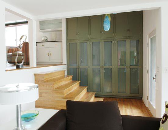
The opposite view shows the entrance to the home. The pendant lights are vintage Italian glass. The storage units are actually stainless steel laboratory furniture that has been powder-coated. (David Phelps / For The Los Angeles Times)
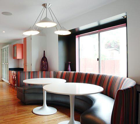
Steps lead up to the dining area. Before the Vidals remodeled the house, the foyer was very enclosed, and the dining room felt more like a landing. For a practical solution, Karen Vidal, the youngest of seven children, called upon a memory from her youth: her grandmothers huge banquette, which seemed to accommodate any number of people. The seat is vinyl practical, given that the Vidals have two children and the seat back is Maharam upholstery. The lighting is custom, but the dining surface is anything but: twin tables from IKEA that can be slid apart, allowing easy passage to or from the center of the banquette. Im all about cross-shopping, Karen Vidal says. You want to look good, but not all of your clothes have to be from Barneys. Your house is the same way. (David Phelps / For The Los Angeles Times)
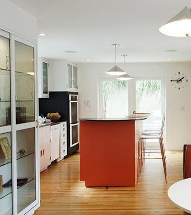
The custom lights in the kitchen echo the design of the fixture above the dining tables. The cabinetry consists of more metal laboratory cabinets, which became a running element throughout the house. She and her husband wanted some a nod to the houses 1937 roots, but all the period elements had long been stripped from the structure. The solution came in the form of the cabinets, which are all from Hanson Lab Furniture. In the 30s there was quite a predominance of this cabinetry, Karen Vidal says. Its a little bit of a throwback. The countertops are high-density resin with a thin overlay of akume wood. The Vidals like its low profile and say they can place a pan from the broiler onto the counter without worry. The bar stools are Lucite and have a pocket in the back where a magazine can be slipped in. (David Phelps / For The Los Angeles Times)
Advertisement
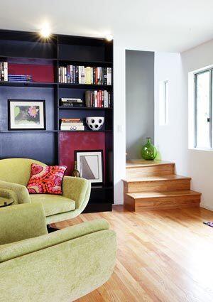
Across from the dining banquette is a library with two swiveling chairs, each large enough to accommodate a parent and child. (David Phelps / For The Los Angeles Times)
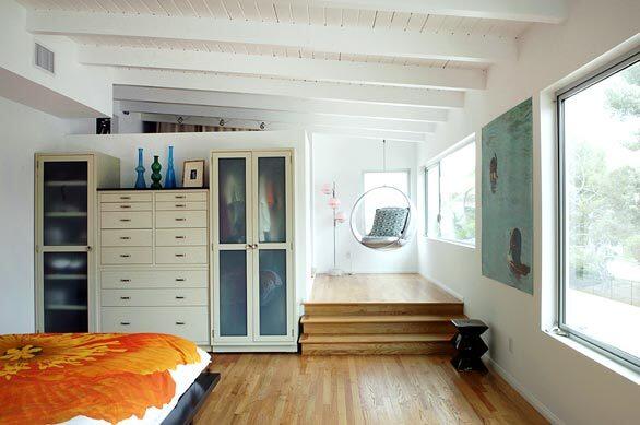
The master bedroom is another example of how color is deployed in a way thats far different than the Vidals recent Moroccan-flavored project. Here, splashes of color come from the artwork, and the bed. and, out of frame, a headboard upholstered in Paul Smith fabric. More lab cabinets were deployed as a wardrobe. Beyond the landing with the bubble chair lies are a closet and storage area. Im a minimalist maximalist, Karen Vidal says, citing the need to incorporate storage throughout the home. (David Phelps / For The Los Angeles Times)
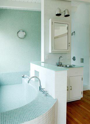
In the master bathroom, an oversized tub is lined in penny tile. The shower is tucked around the corner behind the vanity, which is actually more metal laboratory furniture. The countertops are glass, and the sink is stainless steel. (David Phelps / For The Los Angeles Times)
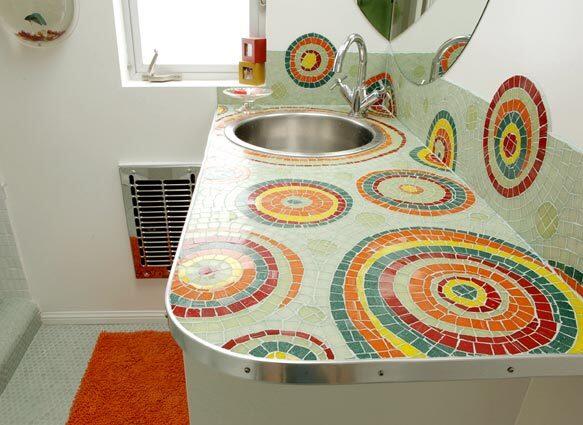
The childrens bathroom is defined by a mosaic countertop designed by Patricia Callicott. The tile itself isnt that expensive, so its really a matter of labor, Karen Vidal says. Its a small counter, but it makes a big impact. The mirror that the couple wanted in the room proved to be larger than the space allowed, so they simply cut it and wrapped it around the corner. (David Phelps / For The Los Angeles Times)
Advertisement
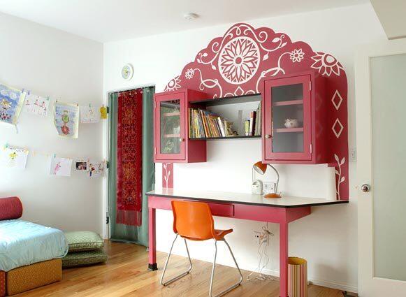
In daughter Gingers room, the Vidals wanted to create something magical for her, Karen Vidal says, so they coined the term Moroccan Moderne and crafted her desk using more of the those metal lab cabinets. When you repeat elements throughout a home, Karen Vidal says, it gives a certain harmony. The desk top is the same material as the kitchen counter, just in white instead of black. The closet curtain consists of scarves from downtown L.A.s Santee Alley that were grommeted, backed with sheer fabric and set on a hospital curtain track. More information: www.designvidal.com. (David Phelps / For The Los Angeles Times)

