Cramped Valley home is renovated in a modern ranch style
Even before Peter and Janet Shurkin moved into their 1950s Valley Village home, the couple knew they needed to make some renovations. “We liked it,” Janet says, “but the tiles would fall off and none of the cabinets were working properly.”
Peter had owned the 975-square-foot, two-bedroom, one-bathroom property in the San Fernando Valley for three years but had not been able to renovate the cramped, compartmentalized space. In fact, no major work had ever been done on the home.
When Janet, who manages musicians, became pregnant with Oliver in 2007, the Shurkins decided it was time to act. They looked into moving but decided it made more sense to invest in upgrades rather than purchase another property. But how to start? “We didn’t do architecture, we did music,” says Peter, who licenses music for film and television.
The couple found their architect, Casey Hughes, the old-fashioned way: through a chain of recommendations. Gloria Fowler, a friend and environmental design instructor at the Art Center College of Design in Pasadena, referred a contractor to work with the Shurkins, who in turn recommended Hughes, a winner of the American Institute of Architects’ Henry Adams Medal for Excellence in Architecture.
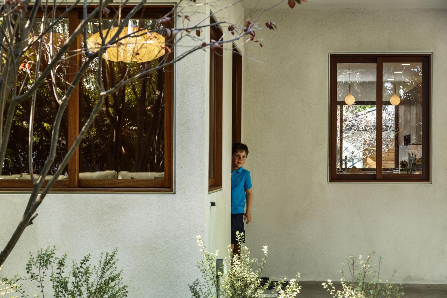
Out of all the architects and contractors the Shurkins had quizzed, they felt only Hughes understood what they had wanted to achieve: a modern ranch-style home that was both contemporary and comfortable.
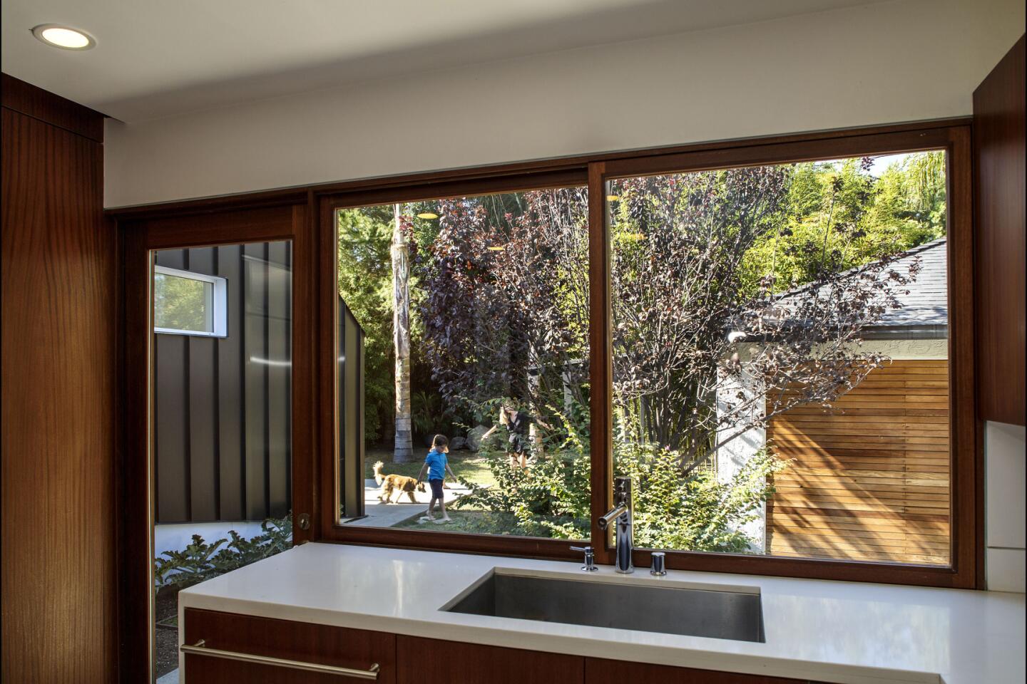
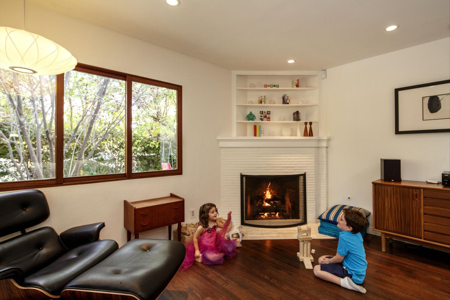
To realize the couple’s goal and to work within their budget, Hughes broke the renovation into two phases. The first pushed the north section out about 7 feet, adding approximately 265 square feet to the home. Inside, Hughes opened the floor plan by removing unnecessary walls to create a large living and dining room that flows into the kitchen, which, in turn, connects to the backyard through a sliding window and glazed door.
The architect organized the house around a dark, Mangaris plywood-clad central space that houses the master closet, bathroom, laundry, pantry and storage. A hallway that cuts through the space leads to the bedrooms on the west side, delineating the private and public areas. A vaulted ceiling with a skylight opens up at the center of the home, bringing in light.
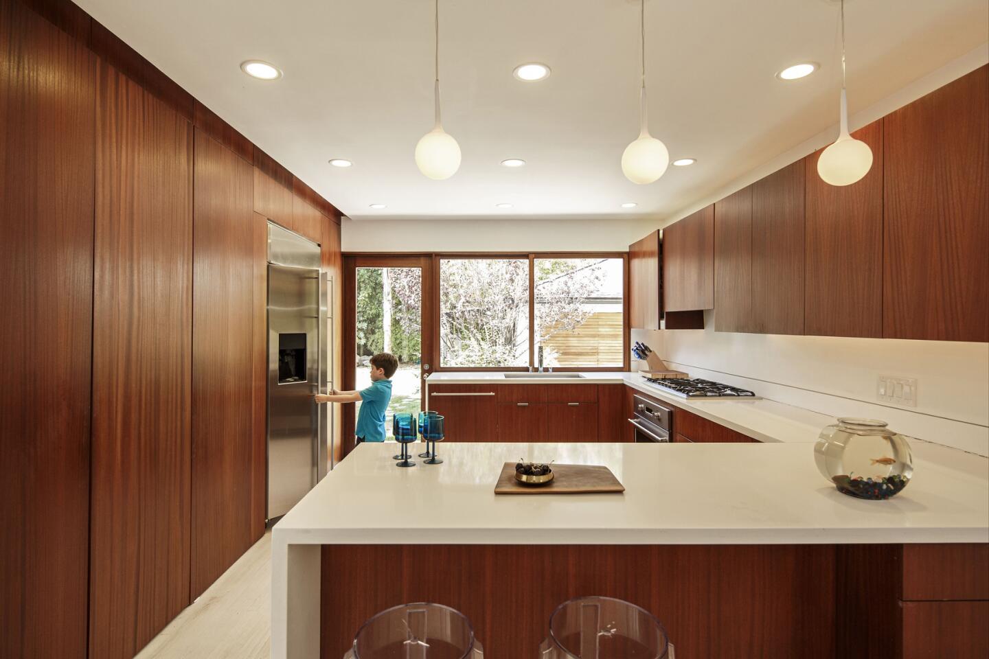
Hughes also upgraded the kitchen. Cabinets and drawers were overlaid with the same dark Mangaris wood product of the central hallway, which unified the space and warmed the interior. Touch-latch hardware eliminated the need for fussy handles and allowed the Shurkins to open and close their cabinets with just a gentle push. Whitewashed oak floors gave the space a light and airy feel.
After nine months, the first phase was completed. “We were just relieved when it was done,” says Janet. Throughout the first renovation, the couple and their baby lived in the converted garage, waiting to move in.
The Shurkins waited three years more to start the second phase of construction. “We wanted to pay off a lot of the expenses of phase one,” says Janet, “but we also wanted to be mentally ready again.”
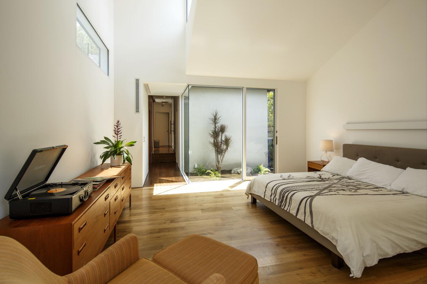
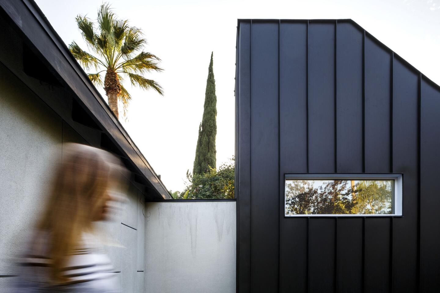
And they needed a little more room thanks to the arrival of baby Violet. The second phase added a 310-square-foot master suite that connected to the original home. To blend in with the existing structure and the garden beyond it, Hughes clad the suite with a dark chocolate-colored metal with standing seams. “It’s like the pinstripe suit,” the architect says. “It’s the thin strip that adds an edge to the design.”
Having some insight into the couple’s busy lives, Hughes designed their suite to be a sanctuary. Two 17-foot-tall light wells protrude from the cubic space. One is meant to catch soft northern light throughout the day, the other to capture light from the west at dusk. By adding a small hallway between the main house and the master suite, Hughes made room for a landscaped garden that can be viewed from the couple’s bedroom.
Hughes worked to ensure that every part of the now 1,500-square-foot, three-bedroom, two-bathroom house came together as a whole. “I love detailing,” says the young architect, whose father was a hobbyist builder. For example, Hughes made certain that sliding doors were flush with the floor, eliminating the usual bump between indoor and outdoor spaces.
The main home and the addition evoke two different yet complementary styles — one more traditional, the other more forward-looking — but the Shurkins say it works for them. “That’s how we are too,” says Janet. “We like Modernist architecture and design, but that’s not all who we are.”
More to Read
Sign up for Essential California
The most important California stories and recommendations in your inbox every morning.
You may occasionally receive promotional content from the Los Angeles Times.
