Commentary: ‘Spider-Man: Into the Spider-Verse’ is more than a movie. It’s a comic book come to life

Watch the trailer for “Spider-Man: Into the Spider-Verse.”
“Spider-Man: Into the Spider-Verse” is unlike any “Spider-Man” movie that has come before it.
Sure, it’s the first that centers on the story of Miles Morales, a black-Latino teen whose ascendance as New York’s newest friendly neighborhood hero updates a theme that has long been associated with Spider-Man lore: the notion that anybody can become a superhero.
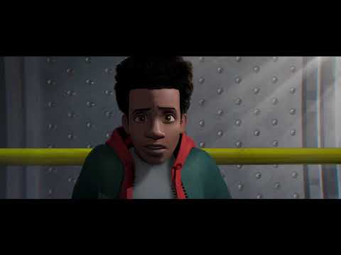
But beyond its inclusive storyline, “Into the Spider-Verse” is a vibrant, beautiful homage to comic books themselves. The movie’s animation style embraces elements of the medium that make “Into the Spider-Verse” feel like a comic book come to life.
Unlike picture books, where the images often help illustrate written stories, the art in comics is an integral part of the narrative. Comics tell their stories through a sequence of drawings, and while there are generally at least some words on a page, the premise is driven by these visuals.
Part of the magic of comic books is how the art can depict everything from quiet, still moments to grand, frenetic action scenes.
“Into the Spider-Verse” incorporates some of the more obvious visual tools from comics, such as sound-effect words popping up during certain scenes and caption boxes that deliver bits of narration. The movie even uses the familiar squiggly lines to denote when Spider-Man’s spidey senses are tingling.
Additionally, the film evokes the familiar look and feel of comics by integrating features from traditional comic-book art into its animation techniques.
“In a comic book, there’s no lens. So there’s no lens blur [in ‘Spider-Verse’],” one of the film’s art directors, Patrick O’Keefe, told Polygon. “To stay true to the medium, we decided to go with a CMYK offsetting as our blur.”
The film also utilized halftones, “because that’s old-school comic-book DNA,” added O’Keefe.
The color shift and the dot-based halftone effect contributed to the more (sometimes imperfect) comic-book look of the movie. And combined with a slower frame rate (comparable to hand-drawn 2D animated films), they helped create “Into the Spider-Verse’s” distinct visual aesthetic. Sony is reportedly seeking to patent the innovative animation process it utilized to create this look.
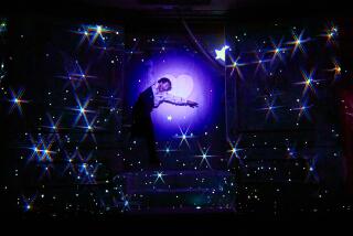
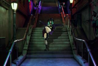
On top of this, each of the various Spidey heroes are rendered in their own unique styles, which mirror the variation of artistic influences in different comic books. “Into the Spider-Verse” is dynamic and fun and blows away preexisting expectations of what an animated superhero movie could be.
All of the elements make it easy to visualize scenes from “Into the Spider-Verse” as comic-book panels and some of the more breathtaking sequences as full two-page spreads.
“Spider-Man: Into the Spider-Verse” comes at a time when there seems to be an oversaturation of comic-book superhero-related offerings at the box office. But unlike many live-action comic-book superhero movies that seem to be striving to look more grounded in reality, “Spider-Verse” leans into its comic-book origins, and it’s a better movie because of it.
Twitter: @tracycbrown
More to Read
The biggest entertainment stories
Get our big stories about Hollywood, film, television, music, arts, culture and more right in your inbox as soon as they publish.
You may occasionally receive promotional content from the Los Angeles Times.


