Photos:: SFMOMA sneak peek: More space, more dude art and an Ellsworth Kelly-Agnes Martin surprise
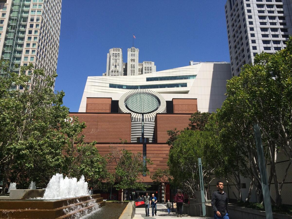
The San Francisco Museum of Modern Art reopens to the public next month with a 10-story addition designed by Snohetta. The billowing expansion peaks out from behind the building’s original Mario Botta-designed structure.
In an era in which commercial galleries open at the scale of Home Depot, it comes as no surprise that museums are also in an arms race for maximum square footage. Certainly, that’s the case with the new San Francisco Museum of Modern Art. After a three-year, $305-million expansion and renovation by the Norwegian firm Snohetta, it has gone from 70,000 square feet of gallery space to a mind-boggling 170,000.
In other words, a museum that could once be comfortably visited in a day, will now require at least two or three, if not more. This is not necessarily a bad thing.
SFMOMA has some pretty boss permanent collections. This includes key works by California artists such as Richard Diebenkorn, a massive collection of photography (almost 18,000 works), important early works by Abstract Expressionists such as Jackson Pollock, as well as Robert Rauschenberg’s infamous “Erased de Kooning Drawing” (1953), a “drawing” that consisted of erasing a drawing by Willem de Kooning. (Take that, “action” painters!)
The added space — a 10-story building with seven of those levels for galleries — also comes in handy to show the new Doris and Donald Fisher Collection, more than 1,100 works that the museum has in its care as part of a 100-year loan. As part of the deal, SFMOMA has to show chunks of the collection together once every 10 years, lest the world forget the buying prowess of the Gap founder and his wife. (To keep things all in the family, their son Robert J. Fisher is president of the Board of Trustees.)
SFMOMA’s new industrial scale means that it is currently impossible to come to too many firm conclusions about how art and architecture have come together in this narrow strip of land in a congested piece of the city south of Market Street. But that doesn’t mean the critics aren’t going for it. (For interesting takes, read my colleagues Christopher Knight and Christopher Hawthorne, as well as Oliver Wainwright in the Guardian and Charles Desmarais in the San Francisco Chronicle.)
I spent a day at the museum and devoted the time to exploring the Fisher Collection and other modern and contemporary art in Snohetta’s new marshmallow-like seven-story wing. My first impressions are that the building definitely works as a space to see art, with nicely staggered visual breaks, including big windows and outdoor space. But as architectural critics have duly noted, the new wing comes at the expense of the original Mario Botta-designed building and its powerful, bunker-like entrance.
As for the Fisher Collection? It’s definitely a score for the museum, boasting iconic and sublime works by figures such as Roy Lichtenstein, Andy Warhol, Ellsworth Kelly and others. And therein lies its problem. It’s a story of art we’ve heard before and one that is all about New York (much like Eli Broad’s collection in Los Angeles), with an added heavy dose of German artists.
Iconic West Coast artists such as Ed Ruscha and John Baldessari are represented only by a few works — and late ones at that.
It is also an oppressive testosterone-fest. By my count, the fifth floor Fisher galleries don’t feature a single work by a female artist. The fourth floor drops in works by Joan Mitchell, Lee Krasner and Agnes Martin, but these bookend what is essentially more dude art.
That said, the installation makes a case for why collectors should donate their collections to museums and not hoard them in private foundations. The curators at SFMOMA have installed the show beautifully, establishing intriguing sightlines and letting pieces breathe. The section devoted to Kelly, who died recently, is especially wondrous and abuts a small, chapel-like gallery that shows Martin’s works — two friends and colleagues in life, also together in death.
It all makes me curious to see the smart ways in which the curators will integrate some of these works into their permanent collection and other exhibitions once the museum has gotten beyond the whole we’re-open-look-at-our-new-stuff stage. The media frenzy may be happening now. But I think the real time to visit SFMOMA will be in six months or a year.
Here are a few images and thoughts:
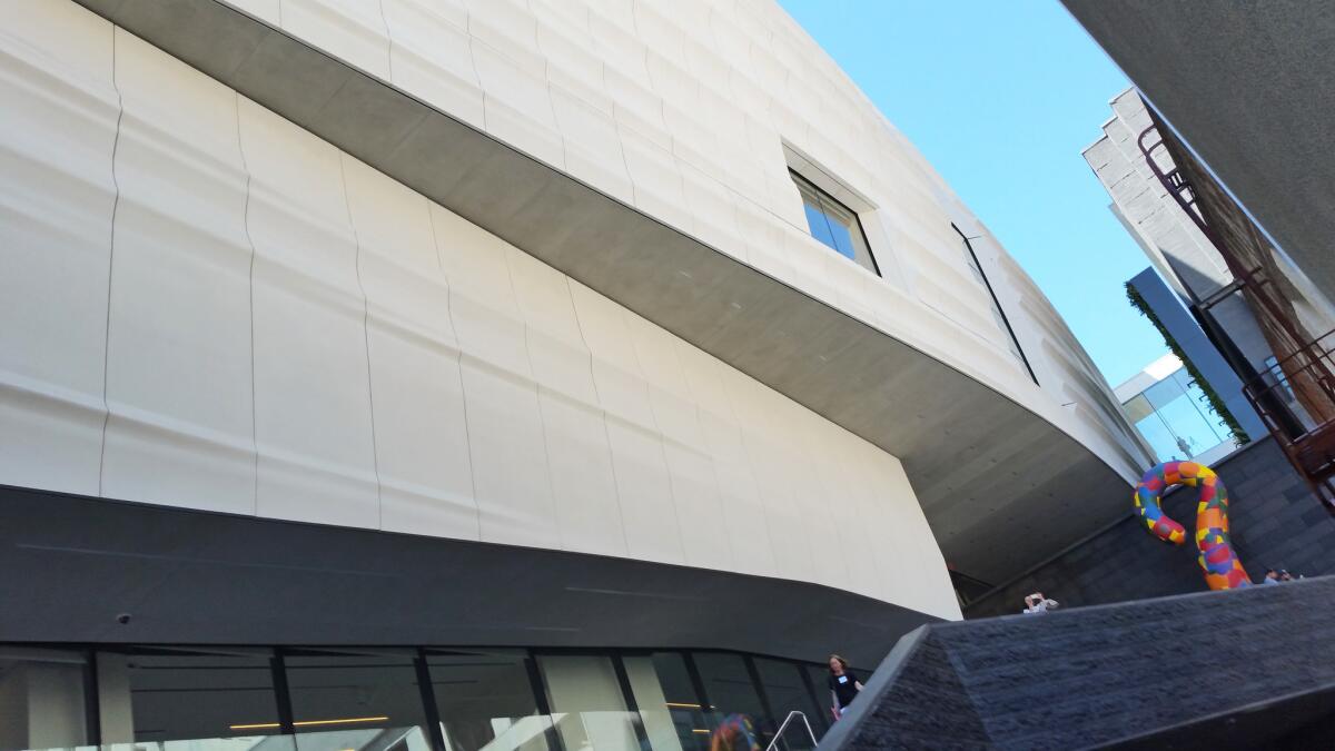
SFMOMA’s new entrance on Howard Street offers an upward view of the expansion’s rounded forms.
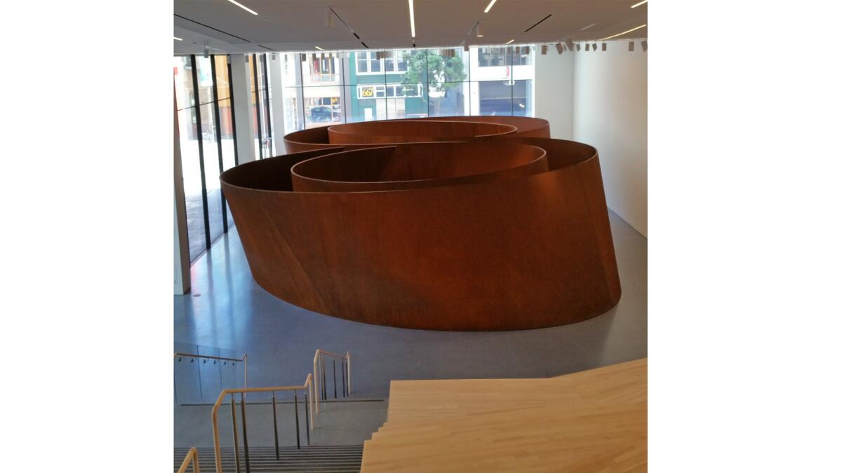
At entry level, the museum’s public spaces offer 45,000 square feet of free public space, including this Howard Street gallery featuring sculptures by Richard Serra.
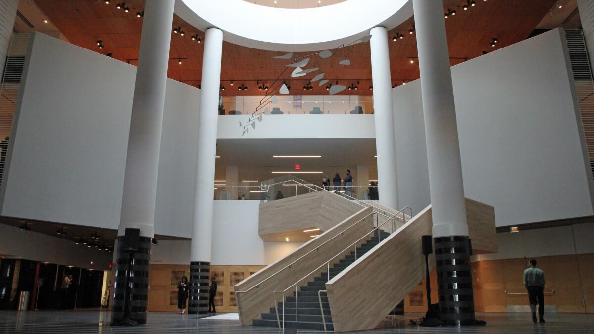
The Third Street lobby inside the old Mario Botta building replaces the Swiss architect’s strong granite entry with a soft maple staircase. Unfortunately, that removed the most interesting thing about the Botta building: its powerful staircase entrance.
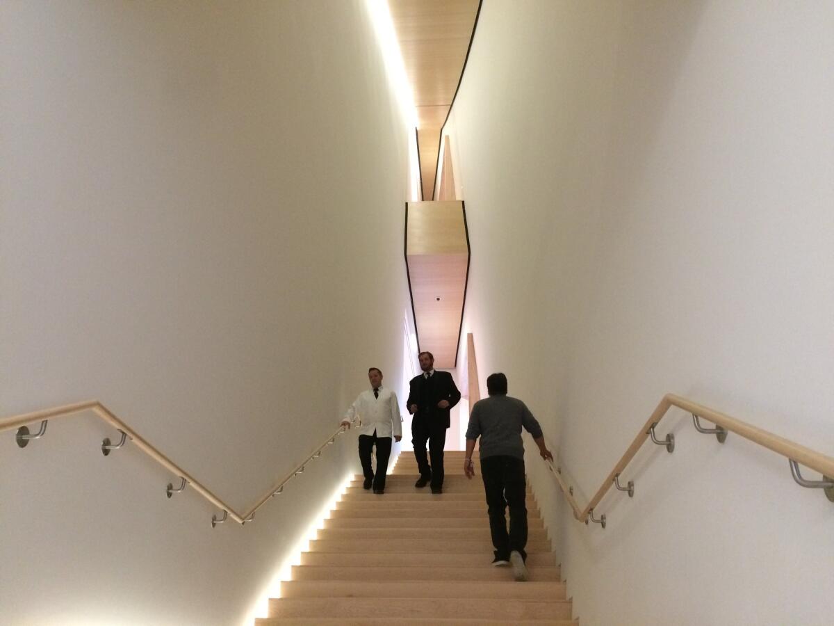
The staircases in the new wing hug the building’s undulating form, making for an experience that takes on varying geometries that narrow as you ascend. “Each stair is different,” said Snohetta founding architect Craig Dykers at the preview. “Take the stairs, please!”
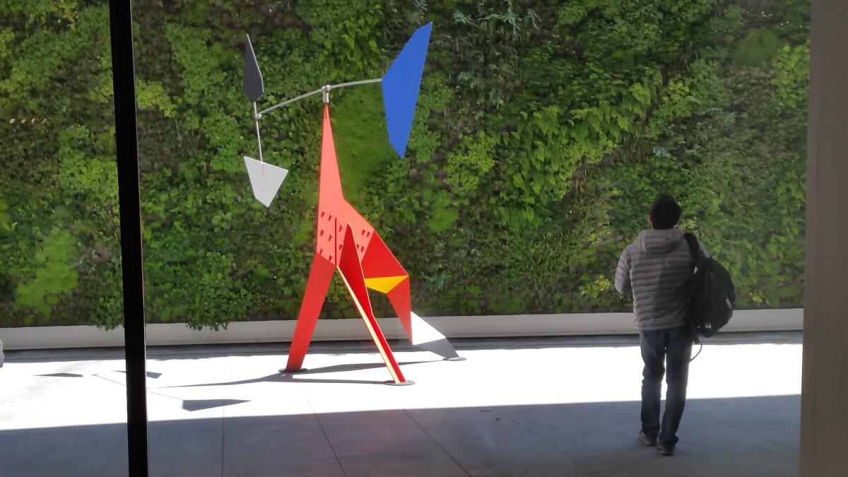
On the third floor, a permanently installed gallery of work by Alexander Calder leads to an outdoor garden featuring a large-scale sculpture by the artist.
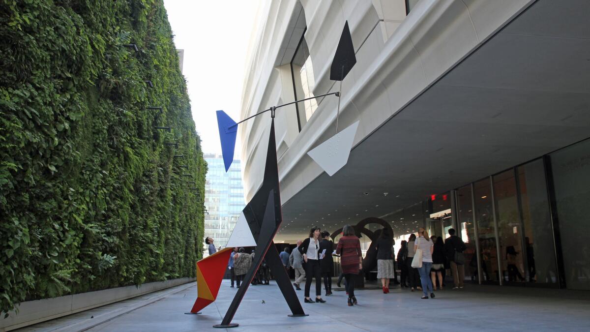
The building’s rounded edges soften its presence — an effect that keeps the third-floor sculpture garden feeling hospitable. (You don’t feel like you’re standing at the bottom of a vertical shaft.) The garden also boasts a green wall with native Northern California plants, a refreshing touch in the middle of this urban setting.
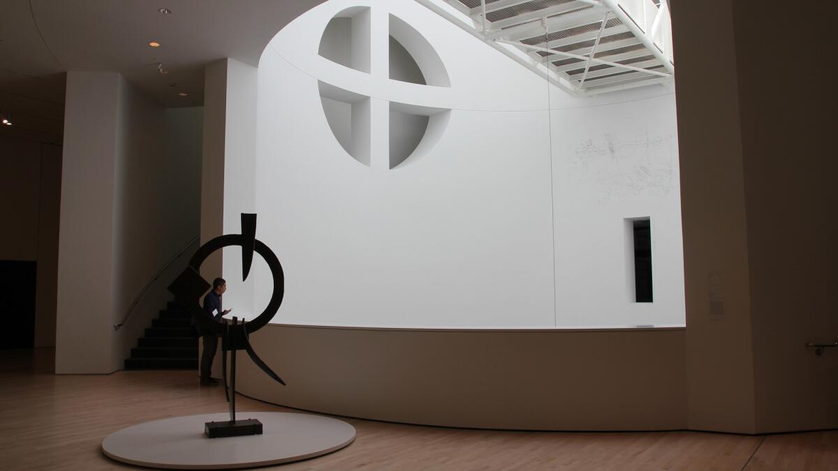
Visitors can peek out toward architect Mario Botta’s cathedral-like atrium.
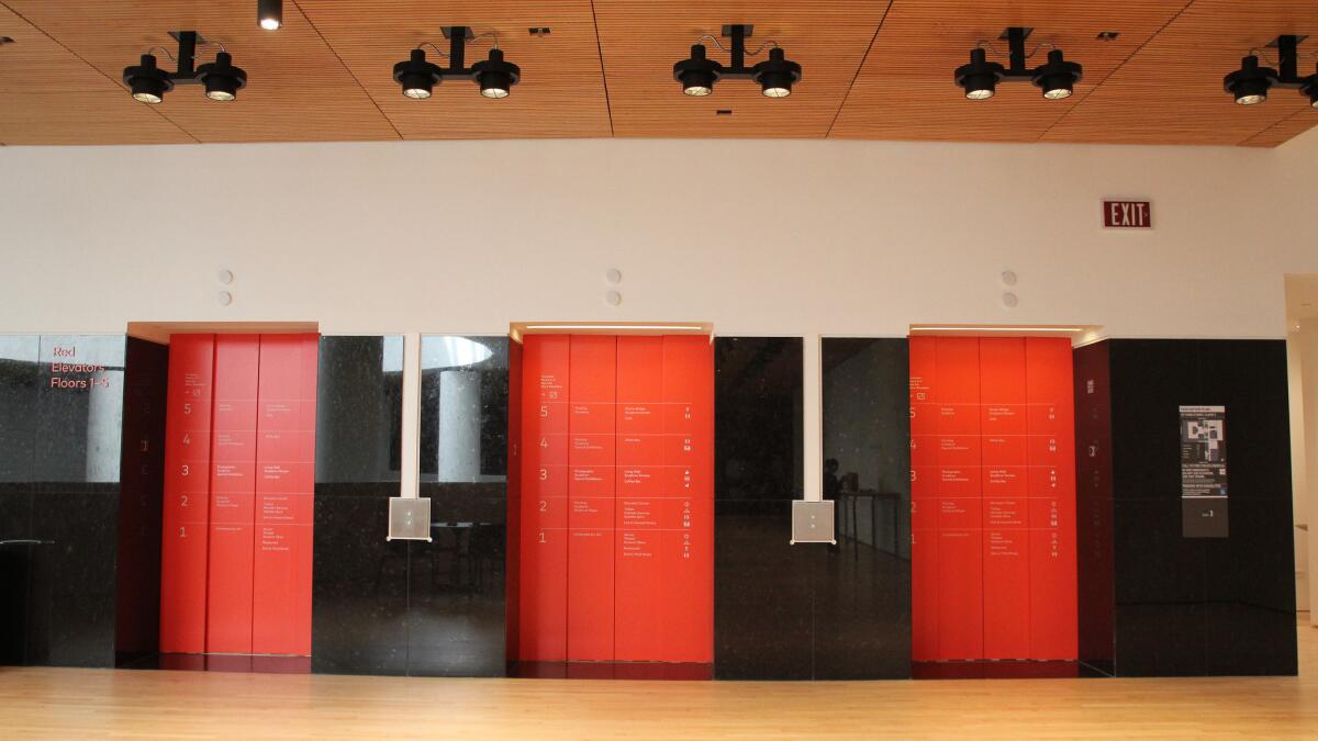
The original Botta-designed building could be very hard, with all of its black granite (in a government hall of records kind of way), but its details also provide an interesting pattern, which have been retained by Snohetta.
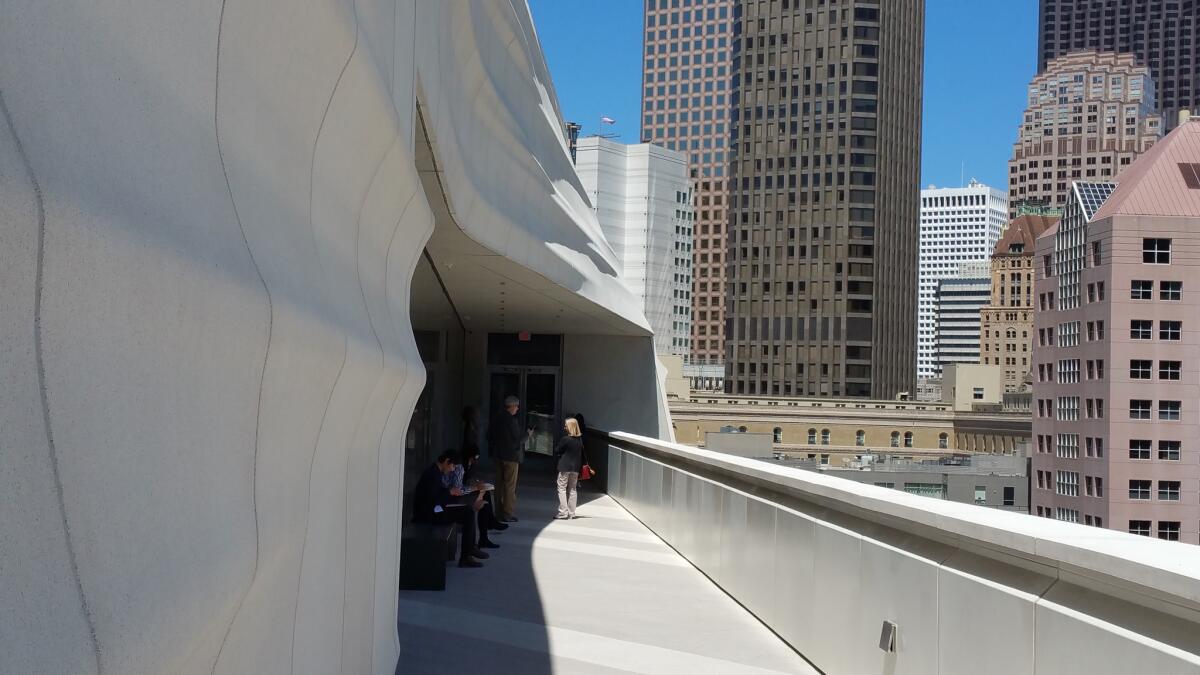
A well-placed seventh-story balcony offers excellent views of the city. It also provides a respite from the art-gazing. Snohetta’s thoughtful sequencing of the museum’s gallery and public spaces provide a nice mix of art and areas to relax and soak it all in.
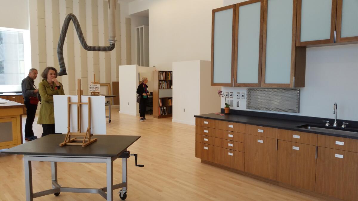
The seventh-story balcony offers views into the museum’s sunny new conservation studio. Snohetta partner Craig Dykers said it was important to him to accord comfortable spaces to the museum’s workers as well as the public.
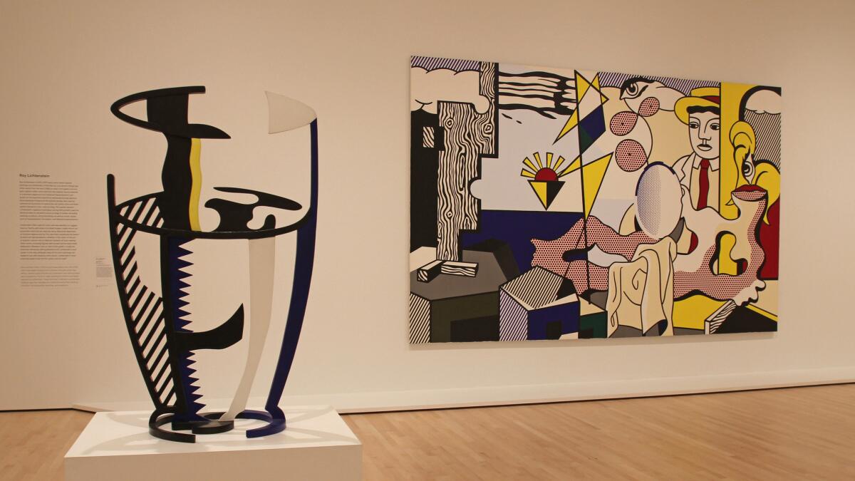
The fifth-floor Fisher Collection galleries open with a room full of work by Roy Lichtenstein before proceeding through the predictable path of established East Coast biggies, including Andy Warhol, Chuck Close and Sol LeWitt. In this story of art, West Coast artists barely register.
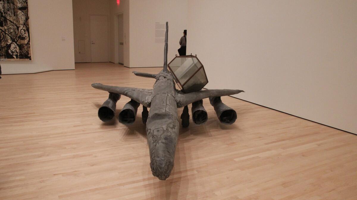
Another of the Fisher Collection’s more interesting pieces: German artist Anselm Kiefer’s “Melancholia” from 1990-91. Made of lead, it’s an airplane that harkens to the devastating bombing campaigns of World War II.
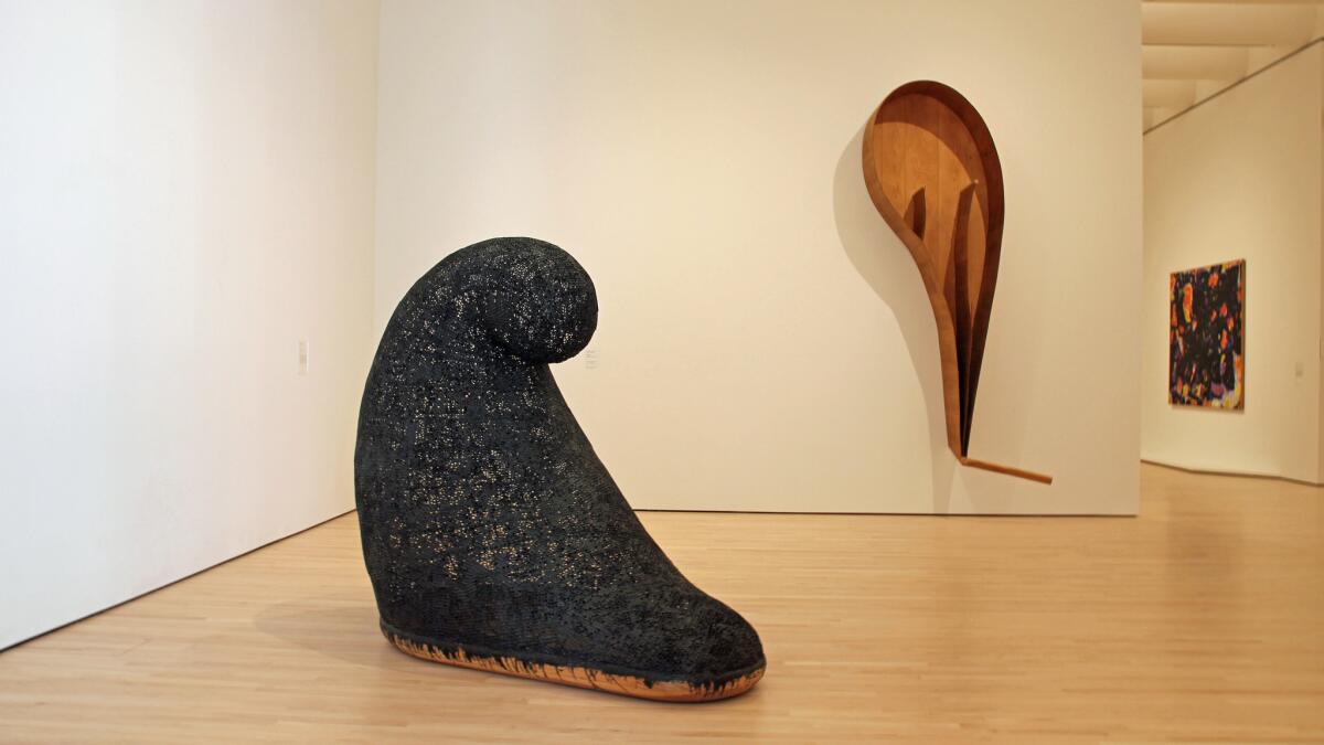
Also a welcome sight in the Fisher galleries: these wondrous sculptures by Martin Puryear. From left: “Untitled,” 1990, and “Malediction,” 2006-07.
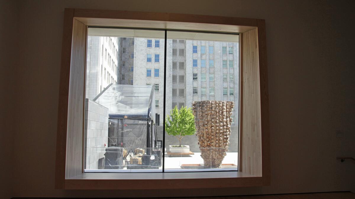
The fifth-floor Fisher Collection galleries contain nothing but works by men. (Apparently women don’t make art?) Thankfully, one of the well-placed windows offers a view of a cedar sculpture by Ursula von Rydingsvard.
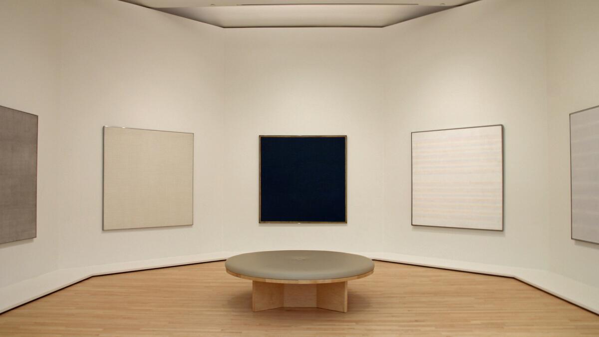
A hexagonal room of paintings by Agnes Martin on the fourth floor in the Fisher Collection galleries evokes the temple-like arrangement of the artist’s paintings at the Harwood Museum of Art in Taos, N.M.
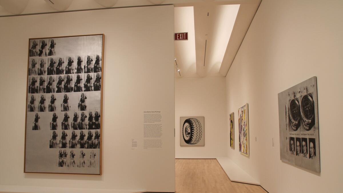
The Fisher galleries may be a parade of dudeness, but the collection is wondrously installed, with terrific sight lines that avoid overcluttering. It’s a lesson in how a museum with skilled curators and installers can make a predictable collection look pretty smashing. The warm light of the architecture also helps soften all of the testosterone.
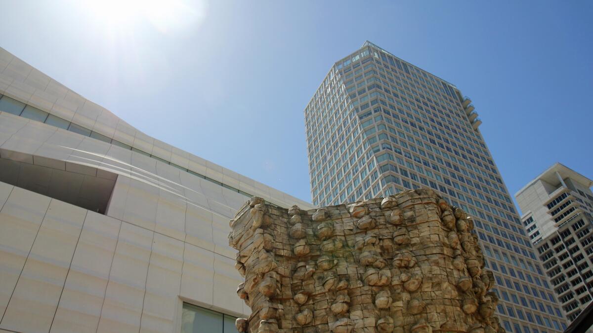
A view of Ursula von Rydingsvard’s 2006 sculpture “Czara z Babelkami” blends in with the upward view of the San Francisco skyline from the museum’s rooftop sculpture garden.
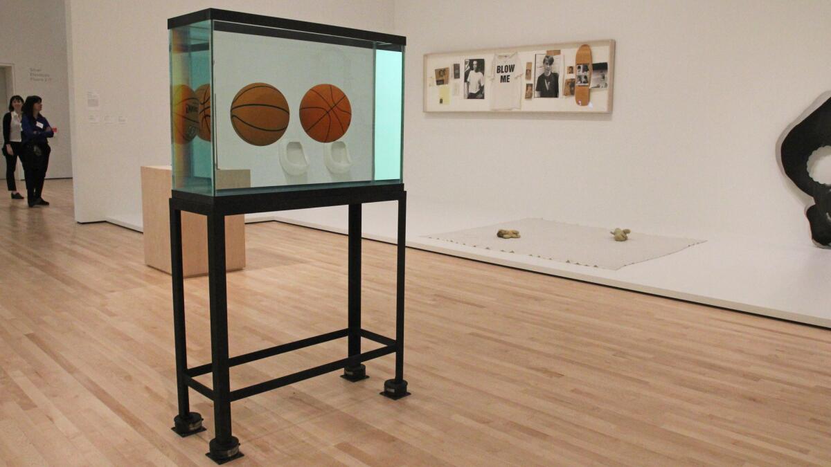
An area filled with contemporary works on the upper floors features recent donations and promised gifts to the museum, including a Jeff Koons equilibrium tank from 1985. A pair of urinal sculptures by Robert Gober, from 1987, can be seen through the tank.
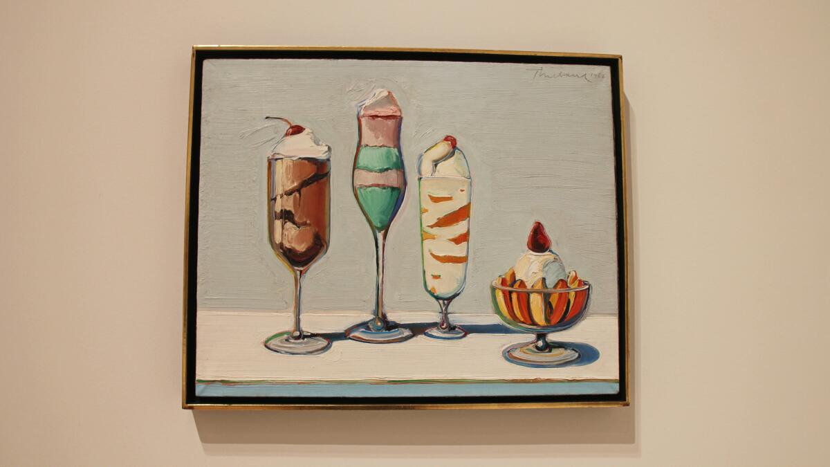
All of the abstract, contemporary and conceptual art left me a bit exhausted. So I popped in, ever so briefly, to the Botta building, to lay eyes on this painting by Wayne Thiebaud, “Confections,” from 1962 — a way to end on a moment of sweetness.
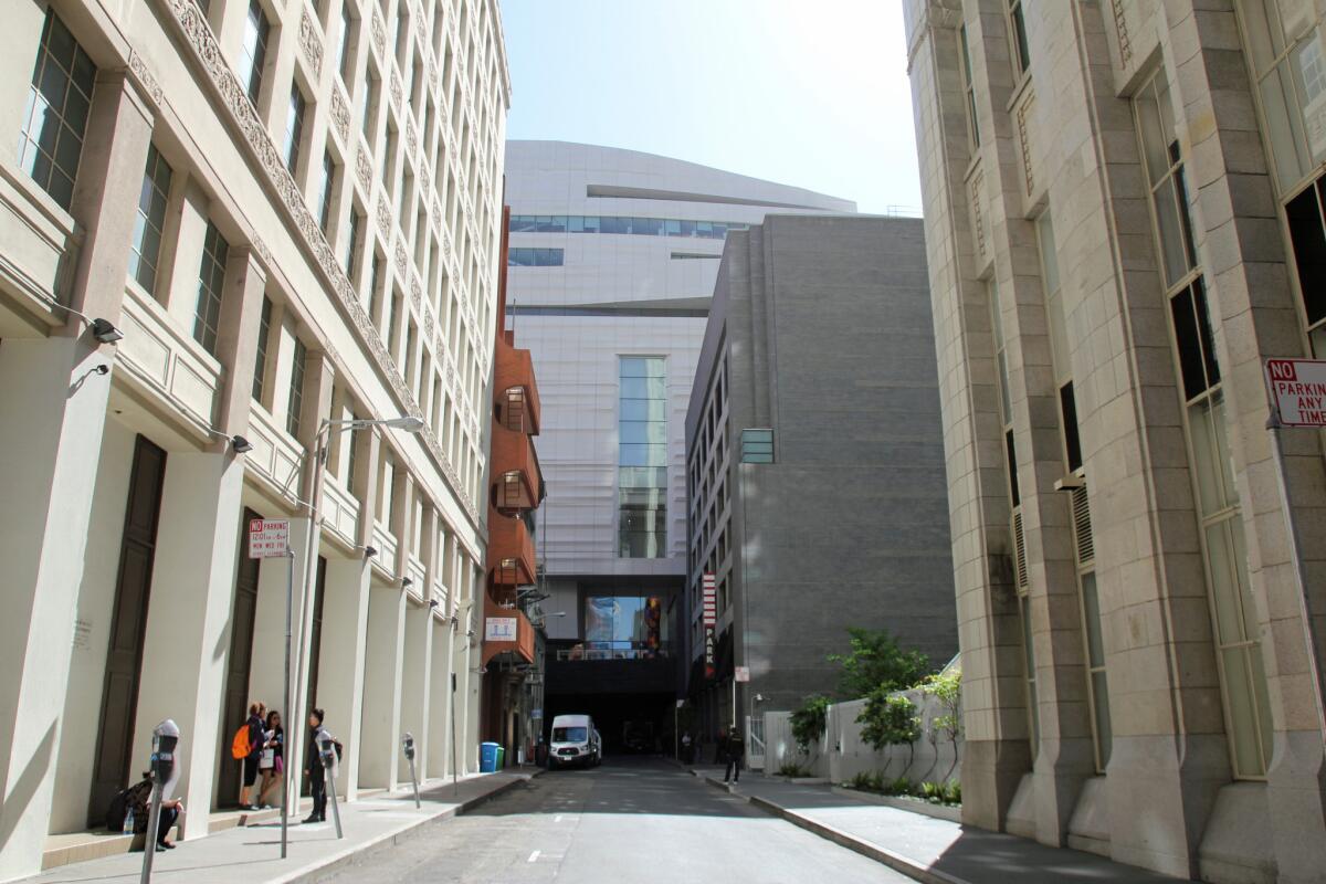
You can catch a glimpse of Snohetta’s marshmallow form from New Montgomery Street.
SFMOMA opens to the public on May 14. 151 Third St., San Francisco, sfmoma.org.
Find me on Twitter @cmonstah.
More to Read
The biggest entertainment stories
Get our big stories about Hollywood, film, television, music, arts, culture and more right in your inbox as soon as they publish.
You may occasionally receive promotional content from the Los Angeles Times.


