Architecture review: Perot Museum belongs to a preening old breed
DALLAS — It’s remarkable how slow — and disjointed — architecture can sometimes appear.
For nearly a decade, younger architects have pushed for a new agenda in the profession. They’ve been loudly (and rightly) critical of the expensive, highly mannered and sometimes self-indulgent trophy buildings turned out by some of the world’s most prominent architects. And they’ve helped bring different and more public-minded priorities to the fore.
And yet the trophy buildings keep coming.
PHOTOS: Arts and culture in pictures by The Times
One of the pricey, preening old breed opened recently in Dallas, stranded among surface parking lots across a wide freeway from the city’s mirrored-glass skyline. The $185-million Perot Museum of Nature and Science, designed by Thom Mayne and the Culver City firm Morphosis, is a largely windowless crypt, a cube lifted dramatically above the streets around it and wrapped in puckered and striated precast concrete panels.
It is a thoroughly cynical piece of work, a building that uses a frenzy of architectural forms to endorse the idea that architecture, in the end, is mere decoration. Mayne’s design appears to put innovative architecture on a literal pedestal — or a plinth, to be exact — while actually allowing it to become peripheral, noticeably separate from the heart of the museum and its galleries.
The building’s apparent radicalism is tacked on, its braggadocio paper-thin. Like many of Mayne’s recent buildings, it is a work of architecture without the courage of its convictions — convictions that are shouted, naturally, at top volume.
The museum, 170 feet tall, sits on a roughly 5-acre piece of land prominently visible from the highway that runs at its feet. The wide surface parking lot that serves it on the southwest is mostly for staff; members of the public park in a second lot, squeezed under the long concrete bar of a freeway onramp.
Once visitors cross a kind of frontage road parallel to the highway, they step onto a path, lined on one side by a stand of bamboo, that begins a rather drawn-out entry sequence. (The landscape architect on the project was Talley Associates.) As if pulled into a whirlpool, visitors follow the curving path upward onto a broad plaza.
The dynamism that marks this sequence is echoed in the sweeping forms of the plaza itself, an oval-shaped outdoor room at the foot of the building. It continues as you move into the museum, down a short ramp and into a wide, dramatic lobby space with an undulating roof.
Standing by the ticket desk, with a narrow escalator churning away and ready to take you up toward the exhibit spaces, it’s easy to hope that the whole building will be just as dramatically unsettled. That feeling is extended as you ride a series of escalators along the southeast edge of the museum, revealing views of the skyline in one direction and a slashing series of stairs and ramps in the other.
FULL COVERAGE: 2013 Spring arts preview
It doesn’t take long, though, to realize that this entry sequence represents a ghettoized architecture, fully sealed off from the exhibits.
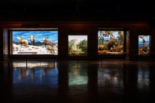
The displays fill dark, high-ceilinged galleries where Mayne’s sensibility — or any architectural sensibility — is absent. (The installations were designed by a team including Boston’s Amaze Design and Paul Bernard Exhibit Design from Austin, Texas.) On every floor you get a clear sense of leaving the architecture to enter the galleries, and leaving the galleries to return to the architecture.
The point is not that Morphosis wasn’t given the job of designing the exhibits; that division of labor is common enough, and this is the firm’s first museum project.
The point is that the complexity announced so loudly on the facade and in the entry sequence of the museum is never revisited elsewhere, to say nothing of being genuinely explored or extended.
The sensation will not be new to followers of Mayne’s recent work. A similar approach is evident, in fainter terms, in both his Cahill Center for Astronomy and Astrophysics at Caltech and at his best-known Southern California building, the 2004 Caltrans District 7 Headquarters in downtown Los Angeles.
In each project he’s put the architectural focus on the facade of the building and a single dramatic staircase. This skin-and-stair strategy then allows the client to make the rest of the building — every interior office or gallery — conventional at best and banal at worst.
A low point of the Dallas museum (funded in part by a $50-million gift from the adult children of H. Ross Perot and his wife, Margot) comes at one of the structure’s higher points. The glass skin sheathing the escalator continues past the edge of the building and juts out into the sky, a formal gesture that gives the museum a bit of extra energy from afar but adds nothing inside.
That detail sums up the museum’s relationship to the city. Thanks to its odd site, a little tricky to reach by foot from downtown but easy to spot from the highway, Mayne has an incentive to try out oversized architectural moves that look mannered and overdone up close.
PHOTOS: Arts and culture in pictures by The Times
It’s a kind of bullhorn urbanism. The building, marked by the civic aloofness that has become an unfortunate Mayne trademark, turns its back on the Dallas Arts District and the new park built atop a sunken nearby stretch of the Woodall Rodgers Freeway. The decision to lift the museum up on a plinth also sets it apart from (and in opposition to) the streets immediately surrounding it while giving it a stronger presence as seen from the freeway.
The Perot Museum suggests the kind of expedient — and, yes, cynical — exchange between architect and client that has become depressingly common over the last decade.
Mayne and Morphosis have delivered their architecture of cartoon menace, of exaggerated and slashing forms, and they’ve been given an unusually prominent site to put it on display. The museum, meanwhile, has banked its edgy-looking monument by a Pritzker Prize laureate without having to commit to a truly innovative or surprising piece of architecture.
In the memorable examples of museum architecture, a coherent design intelligence shapes the entire building. This is true of museums by architects as stylistically and constitutionally different as Ludwig Mies van der Rohe and Frank Gehry, or Edward Larrabee Barnes and the Tokyo firm SANAA. In each case the galleries, the skylights, the flooring and the facade — inside and outside, up and down — reflect a consistent, attentive sensibility.
In several recent projects, Morphosis has been all too willing to trade that architectural control for a chance to advertise its frenetic house style on building facades that, ultimately, are little more than billboards.
MORE
INTERACTIVE: Christopher Hawthorne’s On the Boulevards
Depictions of violence in theater and more
PHOTOS: Arts and culture in pictures
More to Read
The biggest entertainment stories
Get our big stories about Hollywood, film, television, music, arts, culture and more right in your inbox as soon as they publish.
You may occasionally receive promotional content from the Los Angeles Times.


