Here are the latest designs for LACMA’s $600-million makeover
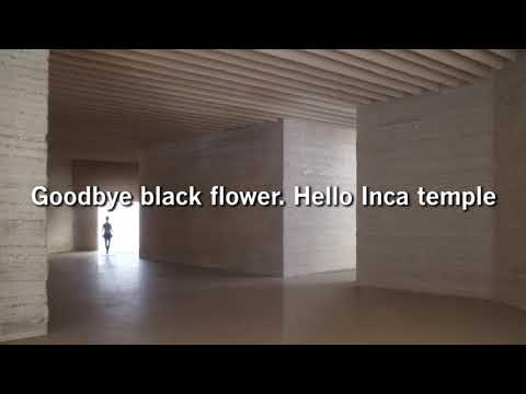
Since 2014 Swiss architect Peter Zumthor has been revising plans for a massive new wing at the Los Angeles County Museum of Art, altering the footprint, form and color of the forthcoming building.
Goodbye, black flower. Hello, Inca temple.
In promoting their ambitious, expensive and controversial plan for a remade Los Angeles County Museum of Art, LACMA Director Michael Govan and Swiss architect Peter Zumthor have never been short on evocative metaphor. As they’ve pitched several iterations of the $600-million design, they’ve resembled a sort of sales team by way of Rilke or even Magritte, trying to seal the deal not so much with hard numbers as with poetic allusion that is sometimes inspiring and sometimes so much vapor.
In a presentation to a packed house at LACMA’s 600-seat Bing Theater on Wednesday night — and in a lengthy conversation earlier that day — Govan and Zumthor revealed significant changes to the design. As always it was just the two of them onstage, with no space for curators or artists or time for questions from the audience.
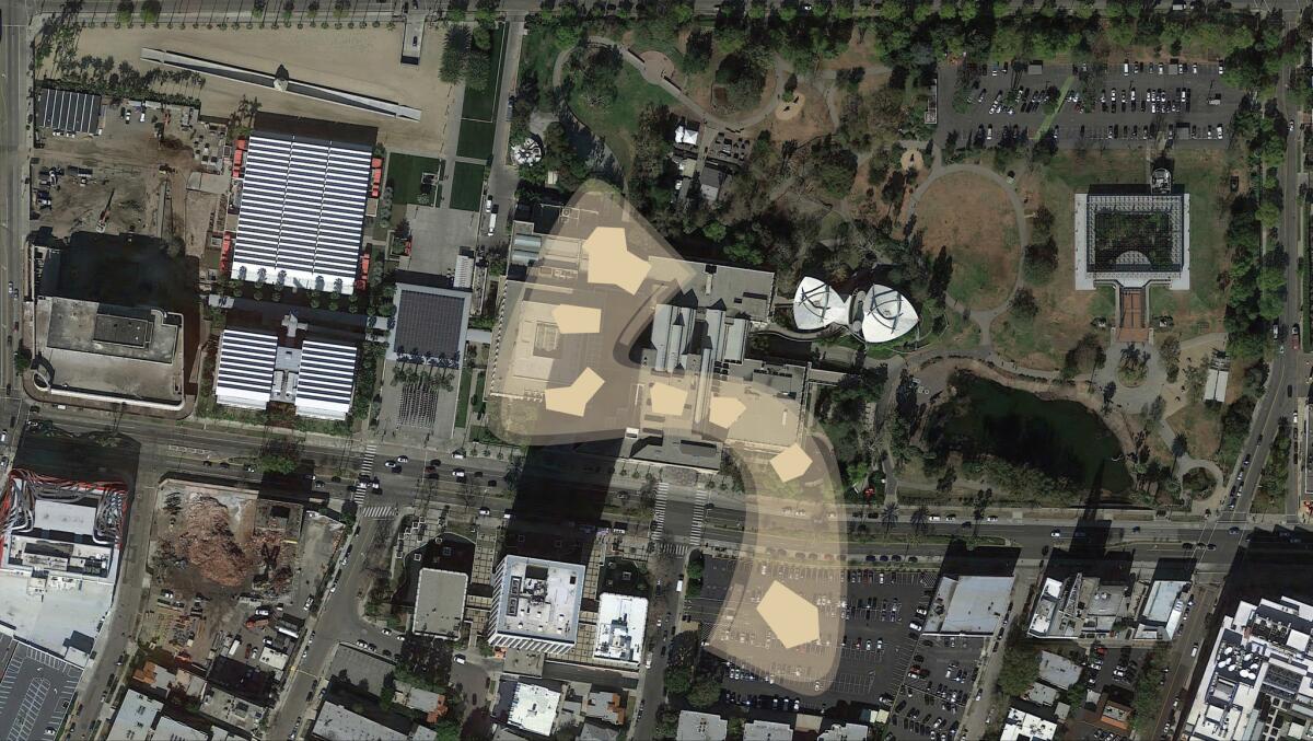
Though in urban terms the design has barely budged — the massive new wing will still bridge Wilshire Boulevard, touching down on a piece of land the museum owns at the corner of Wilshire and Spaulding Avenue — in other ways it departs markedly from earlier versions.
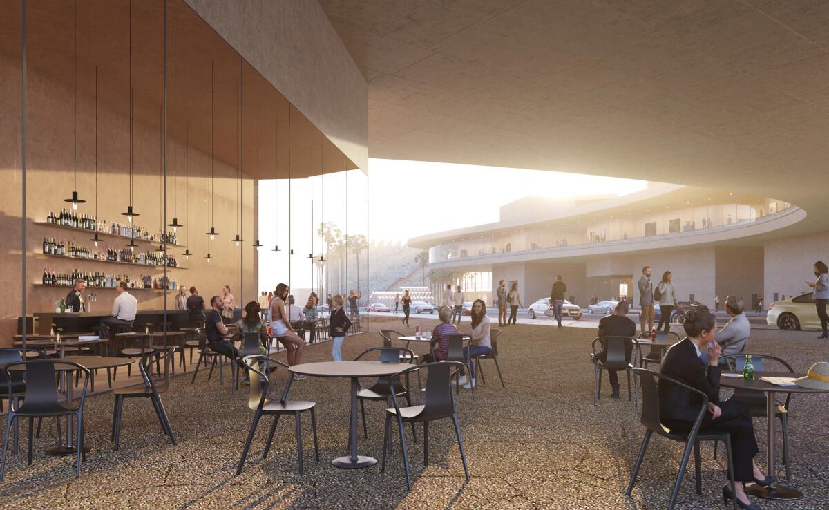
What began as an organic black form spreading across the landscape of the Miracle Mile, in homage to the color and texture of the La Brea Tar Pits adjacent to the museum, has become a less fluid, harder-edged and more muscular form in sand-colored concrete. It has moved away from an oozing oil-slick quality to resemble much more closely the architect’s sober and deeply effective 2007 Kolumba Museum in Cologne, Germany.
In typical fashion, Zumthor and Govan — especially Zumthor — describe these changes in almost mythical terms. Let the architects and engineers at Skidmore, Owings & Merrill, which is collaborating on the project, hammer out the cost estimates. Zumthor works on a higher rhetorical plane.
“The moment I had to cross Wilshire I had to develop a different kind of urban energy,” the architect told me and Govan inside an empty Bing, a few hours before the doors opened to the public. He was clicking through a slideshow that included an image of the building’s structural system hand-drawn in Chinese ink. “I couldn’t cross Wilshire Boulevard with that organic, peaceful form.”
He was suggesting that the older shape, an undulating one he’d called “the black flower” and that recalled the organic shapes in Jean Arp’s artworks, was too fragile to survive the trip.
“It took me a while to sort of let go of the baby,” he added, referring to the original design. “But I think I’ve figured it out. I’m happy. It’s less slick and more substantial. Elemental. If I’m lucky the building will be like some kind of an Inca temple that’s always been in the sand and now they’ve excavated it — a really old piece that’s always been there.”
SIGN UP for the free Essential Arts & Culture newsletter »
I told Zumthor that Frank Lloyd Wright’s work in Los Angeles — in particular the four so-called textile block houses he designed in the early 1920s — had a similar quality. Inspired by pre-Columbian architecture, Wright’s L.A. buildings were made of sand-colored concrete blocks.
Zumthor’s hope that the new LACMA might look like it had “always been there” was very much in line with Wright’s goals in L.A., where he sought a timeless, indigenous architecture as a counterpoint to the flashy, richly decorated Spanish Colonial Revival buildings that were going up all over the city in the 1920s.
Zumthor thought about this. The comparison must have appealed to him, because during the public lecture he referred to Wright’s L.A. designs in concrete as the kind of thing he hoped to achieve.
The importance of the shift in color is not simply that the exterior of the new LACMA will be tan concrete instead of black (or dark gray) concrete; it is that the outside walls will now match the ones inside the galleries, creating an enveloping and monolithic architectural experience, as is the case at Kolumba.
Zumthor is determined to create a museum where every gallery wall is unpainted concrete. There will be no drywall.
"Architecture is not sheetrock," Zumthor said.
Both Govan and Zumthor said they admire the color of the Texas limestone on the exterior of the May Co. building next door to LACMA, future home of the academy film museum. That building also inspired the material palette of Renzo Piano’s two buildings at LACMA, the Broad Contemporary Art Museum (BCAM) and the Resnick Pavilion. It also happens to be pretty close to the shade of the 1965 buildings by William Pereira that LACMA plans to raze to make room for the new wing.
As has been the case with earlier presentations, Zumthor’s latest images showed galleries where only a scattered (and oddly distributed) collection of artworks was visible. How the interior will look when it includes a denser display of art — and cases, wall text and other practical additions that Zumthor nearly always leaves out of these rather gauzy images — remains to be seen.
Wednesday’s talk, nonetheless, did give a much clearer and more developed idea of how the galleries will be laid out and how the new building will meet the ground on both sides of Wilshire.
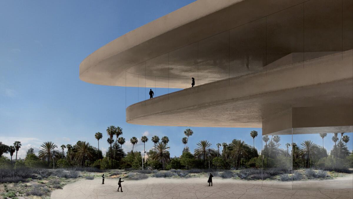
Seven thick legs, or cores, will hold up the main gallery level, lifted above ground and sandwiched between two horizontal concrete plates. The upper plate will be larger than the lower one, creating a deep overhang and helping shade the galleries inside.
Six of the cores will be located north of Wilshire Boulevard, on LACMA’s current campus. The seventh, holding the museum’s new theater, will be on the Spaulding site, allowing the building to span the boulevard. Two main staircases will lead up to the galleries, one on the northern edge of the building and one on the Spaulding side.
Two of the cores north of Wilshire will include ground-level galleries. Another, facing BCAM, will hold a restaurant.
Inside the main level will be four types of galleries. Along the perimeter of the S-shaped building will be so-called meander galleries, with floor-to-ceiling glass on the exterior side and artwork along the interior.
These spaces, some quite wide and others more intimate or pinched, will double as circulation space; in certain ways the success of the building as a whole will depend on how they turn out. They may feel like an exciting new hybrid of gallery, public space and viewing platform looking down on Wilshire Boulevard. Or they may suggest a crowded hallway where some art has been stashed for lack of proper space elsewhere.
The other three types of galleries will be contained inside the cores as they extend vertically through the building. Small “cluster” and even smaller “pocket” galleries will give way to larger and taller “tower” galleries that will bring natural light through high, hidden clerestory windows. (Seen from the sidewalk or plaza level the museum will resemble a long, horizontal form with the tower galleries poking through the roofline like chimneys.) In a change from earlier versions, the pocket galleries have a ceiling of folded, or pleated, concrete forms.
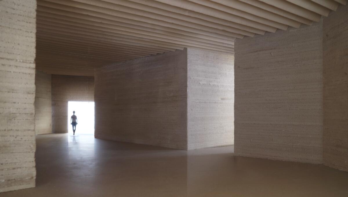

This combination of scale and light conditions — side light in the meander galleries, electric light in the pocket galleries and sunlight filtered through the clerestories in the towers — is for Govan and Zumthor a key to the design.
At plaza level, Zumthor is working with artist Robert Irwin, who has already contributed a palm garden to the LACMA campus, and the landscape architecture office Olin.
“The important thing is all the green grass has to go,” Zumthor said. In its place? “Shrubs, chaparral, desert grasses and colored mosaics on the plaza.”
Zumthor’s refinements to the plan, while encouraging in a range of ways, can’t change the fact that the design lost something fundamental when Govan made the decision to turn the building into a bridge spanning Wilshire Boulevard. The move came after the Page Museum complained that Zumthor’s building was too close to the tar pits and needed to pull back from their edges. To make up for that lost square footage without compromising Zumthor’s relentlessly horizontal proposal, Govan decided the building should cross over to the Spaulding site.
As a result, a piece of architecture that had a powerful relationship with the tar pits and existed entirely within a park setting, detached from the life of the street, was suddenly a kind of overpass looming over the boulevard.
Zumthor talks about the new design as having a timeless or even primordial quality, something “that’s always been there.” If you look at the latest version, though, you can spot a number of ways in which it is directly shaped by the fact that it crosses a boulevard full of traffic, that it’s not timeless at all but very much the product of contemporary urbanism.
Six of the cores are huddled together on the north side of the boulevard because you can’t put one smack in the middle of Wilshire.
Govan told the crowd at the Bing that the building is a daring one because it’s willing to break the city grid by leapfrogging the boulevard. But the newest version of Zumthor’s design suggests that the grid will have the last laugh. Or at least the final say.
Twitter: @HawthorneLAT
ALSO
2016: New details on the forthcoming LACMA building
The biggest entertainment stories
Get our big stories about Hollywood, film, television, music, arts, culture and more right in your inbox as soon as they publish.
You may occasionally receive promotional content from the Los Angeles Times.


