Review: Turning the humble quilt into a powerful symbol of choice
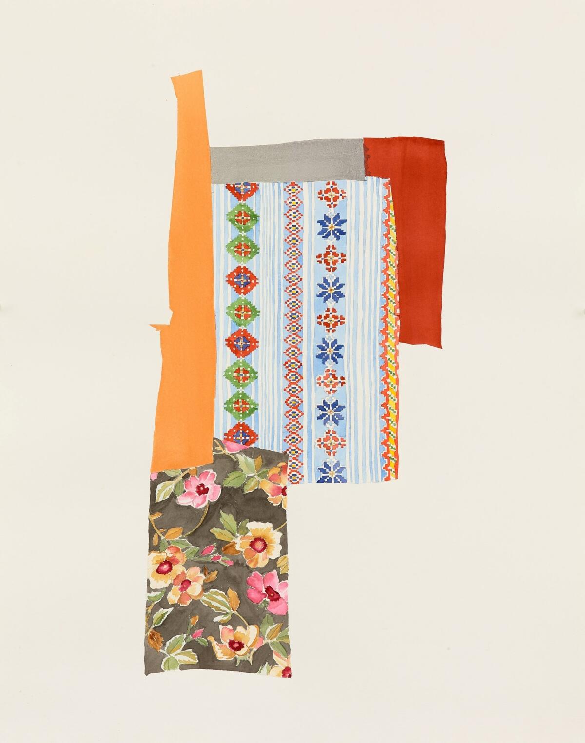
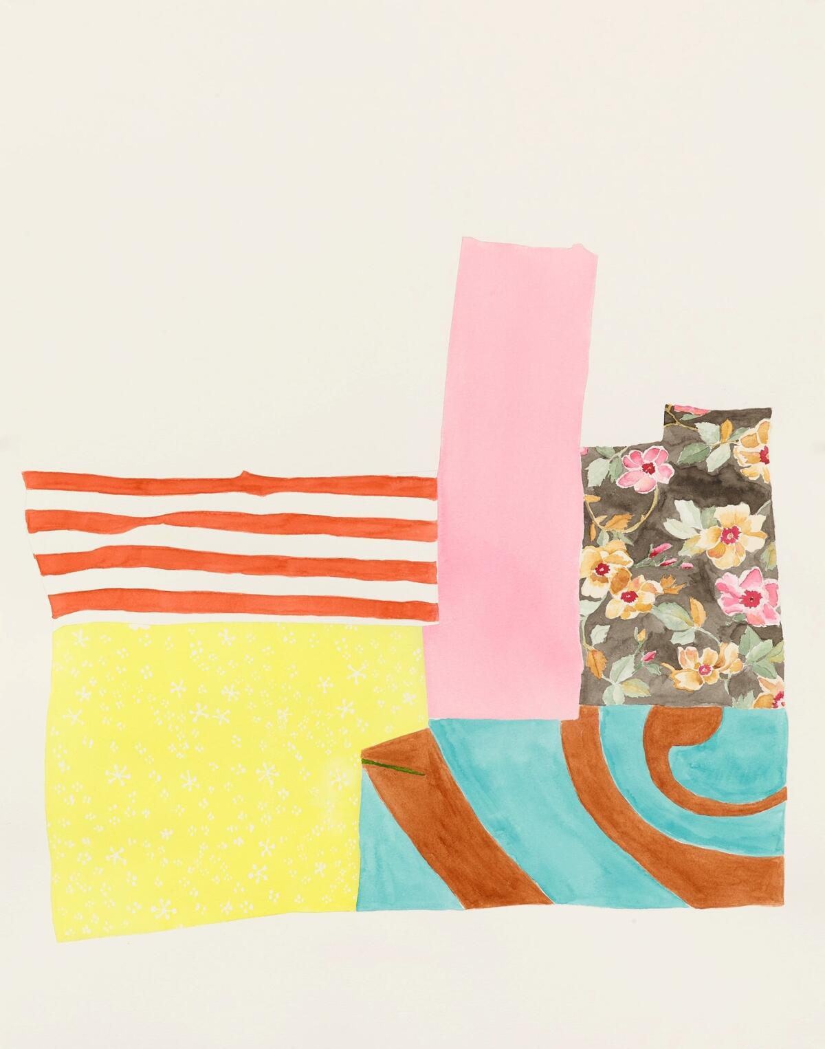
Cindy Bernard’s delicate watercolors at Richard Telles Fine Art document sections of a crazy quilt created by a distant relative, Gladys Osmond. Bernard became fascinated by the quilt as an object created out of necessity from castoff materials, and as a document of a particular moment and aesthetic sensibility.
Bernard’s drawings are something of a dissection: Each one features only a few panels of the quilt on a plain white ground. We never see the object in its entirety, but Bernard’s disciplined images allow us to focus on the myriad small decisions Osmond made in constructing the quilt.

In some ways, Bernard has reverse-engineered the quilt, making paper “patterns” for an endeavor that likely had none. In contrast to traditional quilts, which follow a regimented, geometric structure, crazy quilts are made of whatever materials present themselves, in whatever shapes and sizes. A traditional quilter may have balked at juxtaposing a turquoise and burnt orange swirl with a peach and pink floral, but “making do” sometimes makes for more interesting choices. Bernard highlights this by dividing the panels into discreet drawings. Osmond decided what pieces to put together; Bernard decides how to take them apart.
What emerges is a meditation on the power of choice, even in the most humble circumstances.
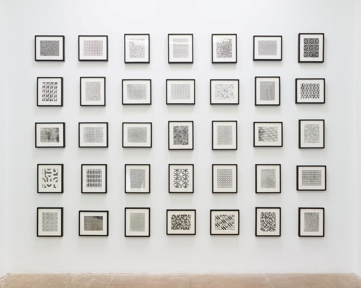
Humble materials are a familiar motif for Bernard. The show also includes the “Security Envelope Grid” work she created from 1987 to 1993. The piece, which appeared in the 1989 Whitney Biennial, consists of blown-up images of the patterns from the inside of security envelopes. The utilitarian designs, which are intended to obscure the contents of an unopened envelope, are pure visual static and typically merit little more than a glance.

SIGN UP for the free Essential Arts & Culture newsletter »
While they all operate according to the same logic — high contrast, repeating, monochromatic patterns — their variety is astonishing, ranging from geometric motifs to organic textures to corporate logos. Bernard’s act of collecting, enlarging and making these designs into art again brings our attention to an underappreciated act of choosing. It asks us to pause and marvel a bit at the myriad decisions that go into every little thing, every moment of the day. It says: “You have a choice. Don’t waste it.”
Richard Telles Fine Art, 7380 Beverly Blvd., L.A. Through June 24; closed Sundays and Mondays. (323) 965-5578, tellesfineart.com

Support coverage of the arts. Share this article.
MORE ART COVERAGE
At the future LACMA, plans call for radical change to how we see the permanent collection
Art review: New Marciano foundation proves the potential and the pitfalls of a vanity museum
The biggest entertainment stories
Get our big stories about Hollywood, film, television, music, arts, culture and more right in your inbox as soon as they publish.
You may occasionally receive promotional content from the Los Angeles Times.


