Can 11th-hour updates save Renzo Piano’s design for troubled Academy Museum?
“I cross a bit my fingers,”
We were standing inside the concrete shell of the main auditorium of the Academy Museum of Motion Pictures, an ambitious but troubled project that after a series of delays is expected to open in 2019. Piano was wearing a hardhat reading RPBW (for Renzo Piano Building Workshop, the firm he founded in 1981) and a light-blue linen shirt under a neon-yellow safety vest.
Construction workers hammered away all around us, producing a ring of noise that occasionally made it tough to hear Piano, who at 80 speaks more softly than he once did. Just off to the right we could see the architect’s only two Southern California buildings, both designed for the
It was precisely that easterly view that seemed to inspire Piano’s combination of optimism and hesitation in describing the Academy Museum’s prospects. Even as he was winning accolades and big new commissions in cities around the world over the last decade and a half, he found a consistently rocky path in Los Angeles. Though the Resnick is an improvement over BCAM, neither building would help anyone who’d never visited one of Piano’s truly masterful gallery designs — the Menil in Houston, say, or Switzerland’s Beyeler Foundation — understand why he became by 2005 or so the most sought-after museum architect in the world.
For a long while, it appeared that the film museum would be a third Southern California thorn in his side. The Academy of Motion Picture Arts and Sciences, so well-practiced in planning the complex Oscar ceremony every year, seemed lost when it came to overseeing a major construction project. Dissension within the design team eventually saw the local architect on the project, Zoltan Pali, pushed out in 2014, to be replaced by the firm Gensler.
The academy, though, seems to have righted the ship. Or at least — let’s not get carried away — to have plugged the biggest leaks. Which is, well, none too soon, with the museum’s construction already in full swing.
SIGN UP for the free Essential Arts & Culture newsletter »

Kerry Brougher was hired in 2014 to run the film museum, after stints at L.A.’s Museum of Contemporary Art and the Hirshhorn in Washington, D.C., and has brought a much-needed sense of direction. The academy has now raised more than $300 million, thanks in large part to a recent $50-million gift from Cheryl and Haim Saban, putting it more than three-quarters of the way toward its goal of $388 million.
There’s essentially no chance that the academy project will be a triumph at the level of the Menil, Beyeler or Piano’s 2012 London skyscraper, the Shard. (I like his 2-year-old Whitney Museum in New York less than most critics.) But the film museum no longer seems destined, as it did during its shakiest moments, to join BCAM on the list of Piano’s biggest flops.
So what’s changed? What’s gotten sharper? Not so much the large-scale architectural gestures as the details — and what you might think of as the design’s guiding metaphors.
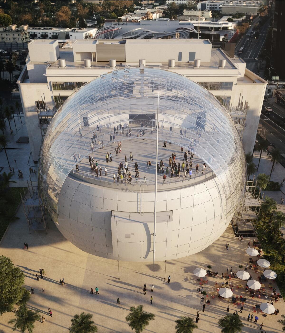
The museum will fill a renovated May Co. building at the corner of Fairfax Avenue and Wilshire Boulevard, with a spherical addition at the back holding a state-of-the-art theater. What Piano, with help from his colleagues at RPBW and Gensler, has managed to do is clarify the role that each of part of this architectural ensemble will play in the whole — and how they will be strung together both practically and conceptually.
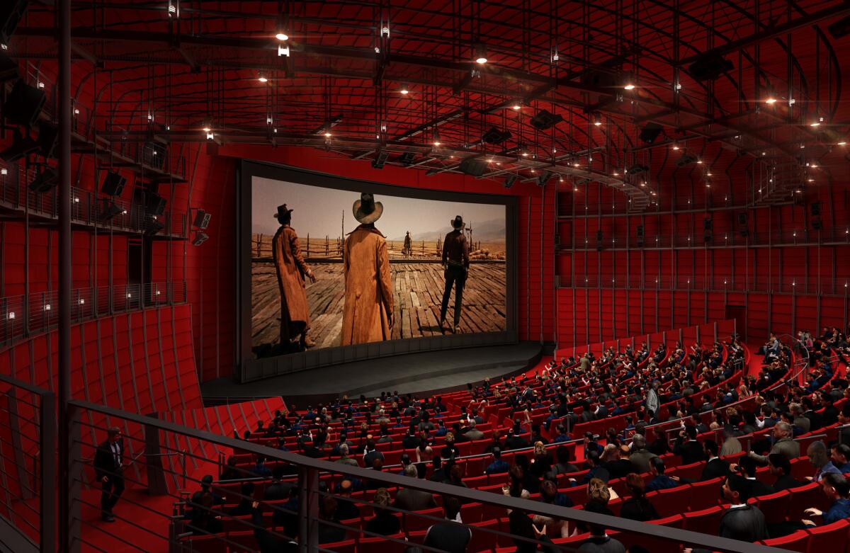
The relationship between old and new, between the 1939 May Co. and the sphere, has been streamlined. Inside the former department store, to be rechristened the Saban Building, will be exhibition galleries. Inside the sphere, in a blood-red theater with 1,000 seats, will be movie screenings. In between, along the rear elevation of the older building, will be a stacked staircase, lined in glass as it faces the sphere, that Piano calls the “spine.” Atop the theater will be a wide terrace with views of the Hollywood Hills.
The sphere itself is less uniform in the newest renderings than it looked before, with a clearer distinction on its exterior between the concrete panels wrapping its bottom half and the glass sheathing the top. This change gives the sphere more weight and architectural presence. It’s less of a soap bubble now. Less of a bauble.

The snub-nosed northern end of the sphere appears less pronounced. The columns holding up the cantilevered section of the theater, which covers a public plaza, are also less conspicuous. The suspended glass corridors leading from the May Co. building to the theater have been repositioned so that they all lead directly into the sphere. In earlier versions of the design, the highest of these passageways ran along the outer edge of the auditorium, over-complicating the museum’s profile.
What these updates and a handful of other changes add up to is a design that seems more grounded, rational and sure of itself — a noticeable if hardly radical improvement from earlier versions, which showed Piano grasping for a kind of futuristic, sci-fi populism.
I haven’t been especially impressed with the way the academy and Brougher have described their plans for the exhibits themselves. Red carpets where visitors can pose for iPhone photos holding fake Oscars? That sounds closer to a tourist trap than the serious museum of film history that L.A. has always lacked. I also wonder whether the concrete on the sphere, as built, will match the smooth quality and nearly white shade of the renderings. In person, it looks less even in color and finish, at least so far.
A coherent set of architectural ideas, however, has begun to emerge from the clamor of the construction site. The Saban Building will be the body of the museum and the sphere its mind — or mind’s eye. The old building will be dedicated to the artifacts of film history, the new one to the experience of watching film. One side will be about moving through space, looking at objects (and, yes, some screens). The other will be about about moving through the imagination, watching a movie in the dark.
Piano likes this sort of split: He often talks about making spaces in his museums for both the sacred and the profane. The guiding idea of his academy design is that as you walk along one of the passageways leading from the old department store into the theater, you will be leaving the tactile, measurable and knowable behind and entering the realm of the visual, the emotional and the ineffable.
It may work. We shall see.
Twitter: @HawthorneLAT
MORE ARCHITECTURE:
With Pacific Standard Time, Getty finally climbs down from hilltop oasis it built 20 years ago
With Lucas Museum on the way, Natural History Museum plans another makeover
Two decades after Gehry's Guggenheim Bilbao, where does architecture stand?
The biggest entertainment stories
Get our big stories about Hollywood, film, television, music, arts, culture and more right in your inbox as soon as they publish.
You may occasionally receive promotional content from the Los Angeles Times.


