Critic’s Notebook: Trump’s border wall through the eyes of an architecture critic

We were driving east out of Otay Mesa when my phone buzzed with a text message from T-Mobile. “Welcome to Mexico!” it read. I slid the phone back into my pocket. The wide street we were on, Via de la Amistad, soon turned into a dirt road. The SUV I was riding in, with a pair of officers from U.S. Customs and Border Protection, bumped along for another five minutes or so before we pulled into a long, open field.
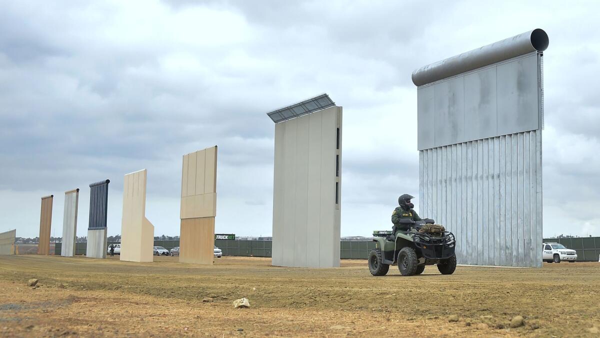
We hadn’t actually driven into Mexican territory, as I far I knew. Yet my phone’s confusion seemed to mirror my own. Lined up in the middle of the expanse of dirt where we’d stopped, now visible in a perfect row, were eight prototypes of the border wall that President Trump has promised to build between the United States and Mexico.
I’d been working for a few days to arrange a visit to the prototypes, which are being tested and evaluated by the federal government through early next year. They were designed and fabricated by six firms — not engineering giants like Bechtel or AE Com but for the most part homegrown companies including W.G. Yates & Sons of Mississippi and Fisher Sand & Gravel of Arizona. (One entry is by the North American arm of ELTA, an Israeli defense contractor.) To get permission to see them, I’d had to convince a CBP public-affairs officer that my interest in the subject was genuine — and my professional experience germane.
The opening line of his email reply to me had taken the form of a question: “What is an architecture critic?” I’d sent back a long and I’m sure insufferably earnest definition of my job, explaining that I see my beat as including nearly every part of the built environment. This corner, I added, is a whole lot more politically and symbolically potent than most.
Yet as I climbed out of the SUV and began walking toward the eight sections of wall, each about 30 feet wide and 30 feet high, I wondered if he’d been right to be surprised by my interest. All of a sudden my critical instincts seemed divided against themselves. The slabs in front of me seemed at once the most and least architectural objects I’d ever seen. They were banal and startling, full and empty of meaning. Here were the techniques of Land Art, medieval construction, marketing and promotion, architectural exhibition and the new nativism rolled uncomfortably if somehow inevitably into one.
From the start, Trump’s presidential campaign and his pledge to build the border wall were so intertwined as to be nearly synonymous. He made his first official version of the promise during the news conference announcing his White House bid, which took place in the windowless lowest level of Manhattan’s Trump Tower on June 16, 2015. (According to the Hollywood Reporter and other news outlets, at least some of the people cheering the announcement had been paid to be there, provided to the campaign by a casting company called Extra Mile.) After some opening boasting that will now strike most Americans as familiar — “Wow. Whoa. That is some group of people. Thousands. … This is beyond anybody’s expectations. There’s been no crowd like this.” — Trump vowed to “build a great, great wall on our southern border. And I will have Mexico pay for that wall. Mark my words.”
Fairly quickly, as Trump rose in the polls, that promise began to bump up against some real-world limitations. Mexico wasn’t going to pay for the wall, no matter how many times Trump announced it would. Nor, since he took office, has Congress seemed inclined to fund anything close to the whole project, which carries an estimated price tag of somewhere between $12 billion and $70 billion. (The House, but so far not the Senate, has passed a 2018 budget that includes $1.6 billion in border-wall funding.) There are long stretches of territory — along the Rio Grande and in areas where most borderland parcels are in private hands, to name two — where erecting a wall would be practically if not literally impossible.
In Trumpworld, that hardly mattered. What mattered was the brilliant battering-ram simplicity of the wall as political weapon — a blunt idea for a blunt candidate. After eight years of coolly detached rhetoric from Barack Obama, a politician whose perspective could seem Olympian to a fault, Trump’s advisors guessed that the electorate was ready for something more direct, even more tribal. Something far closer to the ground.
The slabs seemed at once the most and least architectural objects I’d ever seen. They were banal and they were startling, full and empty of meaning.
The wall became the marker of that shift in tone. The monosyllabic phrases Trump’s crowds chanted at various rallies — “Lock her up,” taunting Hillary Clinton, as well as “Build that wall” — made up a rhetorical foreshadowing of the prototypes themselves. The point in both cases was to suggest something drastic or even shocking in the plainest of terms. Not to gild the quotidian but the opposite: to make the outlandish, the improbable or the hostile sound like the most routine, achievable thing in the world.
It’s often said that the most basic form of architecture is shelter. There’s a famous illustration on the frontispiece of Marc-Antoine Laugier’s “Essay on Architecture,” a staple of Architecture 101 college syllabi, showing two tree branches lashed together to form a pitched roof: the so-called Primitive Hut. Yet it’s possible to pare the idea down further. In the simplest sense, human beings build two kinds of things in the world. We build connective things and we build protective things. We build tunnels and we build walls.
Tunnels suggest connection but also rule-breaking and escape. Walls suggest not just division but authority and control. Tunnels are about expanding the number of paths in the world. Walls are about limiting that number. Tunnels are stateless; walls give shape to statehood. Each is made in a fundamental sense out of a desire to outsmart the other.
It was hardly surprising, then, that the CBP’s guidelines for the prototypes included the requirement that they be strong enough to repel attempts to tunnel beneath them to a depth of 6 feet. Each also had to be able to withstand a half-hour of attack by “sledgehammer, car jack, pick ax, chisel, battery-operated impact tools, battery-operated cutting tools, oxy/acetylene torch or other similar hand-held tools.” CBP had divided the wall samples by material: There were walls made of concrete and walls made of something, as the guidelines put it, “other than concrete.”
As for their looks? This was the most surprising thing of all. When I first caught sight of them from the SUV, I worried about making even basic distinctions among them. They looked virtually identical. But as I spent more time in this odd open-air architecture gallery, it became clear that the aesthetic spectrum the prototypes covered was very wide.
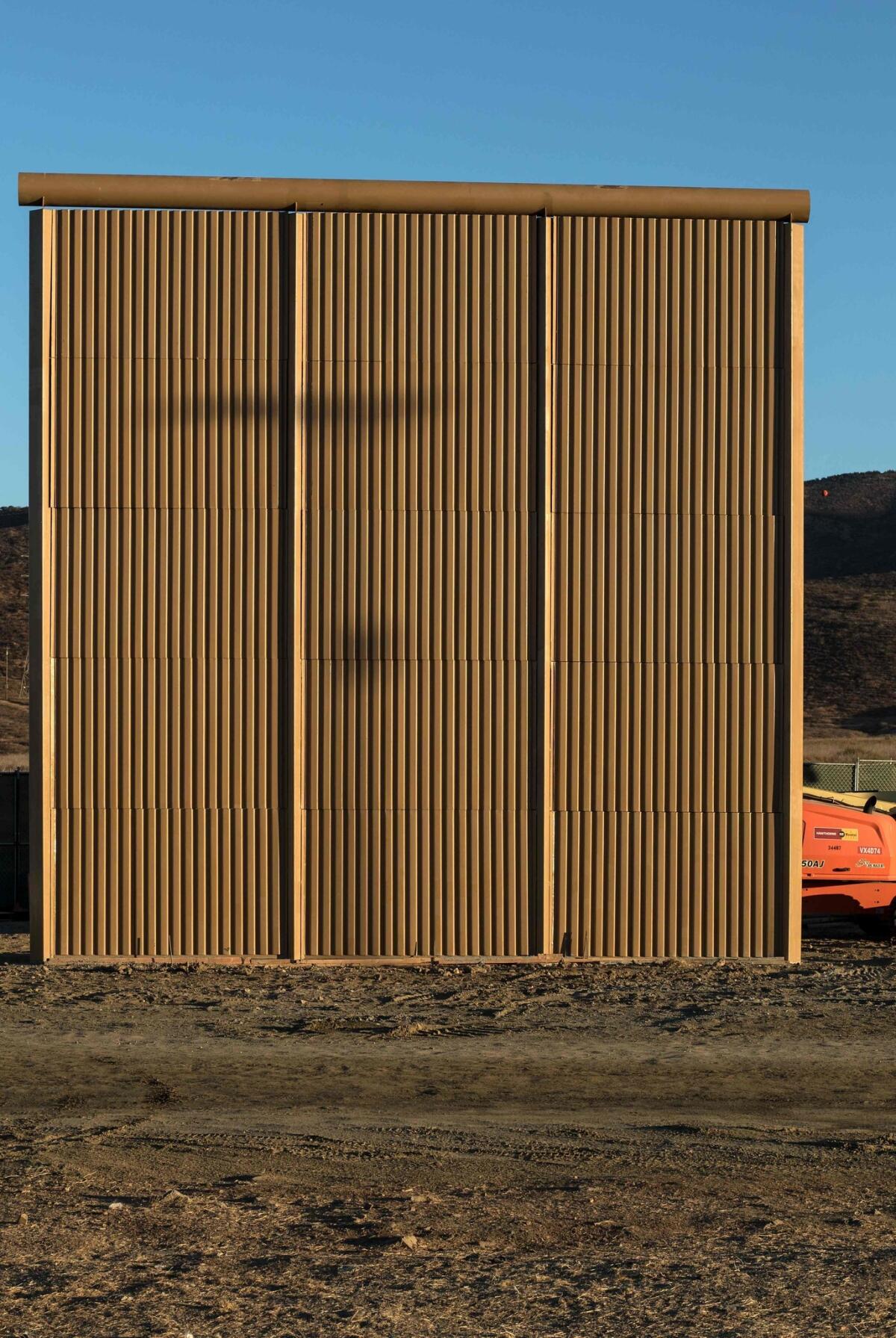
The one furthest east, by Fisher Sand & Gravel, was the idea of a wall stripped to its essence, suggesting a kind of accidental minimalism, a section of a Peter Zumthor facade after a trip through the federal bureaucracy. Made of three panels that matched almost perfectly the color of the dirt at its feet, it was the simplest of the group and also — at $365,000 — among the least expensive to produce.
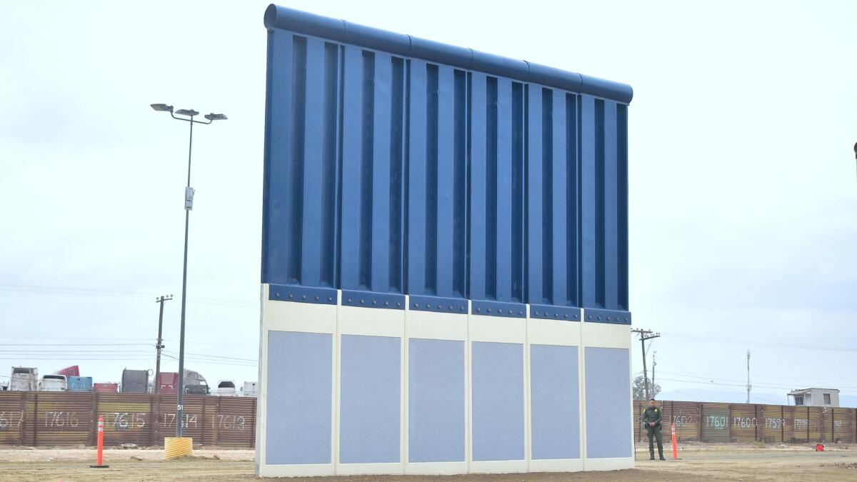
A very different sensibility was evident in the slab designed by ELTA. Its bottom half was concrete, its upper half metal. The concrete section (though only on the side facing the U.S., per the official guidelines) was painted white and blue, as if it were covering a split-level ranch house outside Phoenix.


Also in this decorative vein was the concrete wall by Texas Sterling Construction, which featured a white faux-brick pattern stamped into its American side. The argument these two walls made was pragmatism à la HGTV: that any piece of construction could be humanized, even made cheerful, with some measured, cost-effective ornament.
Adding to the strangeness of the setting was the fact that these prototypes for a new border wall overlooked the imperfect real thing. Running along the southern edge of the field where they were arranged was a genuine stretch of border fence, a sagging, pockmarked barrier made of rusting corrugated metal.
I’m sure that section of wall, built in the 1990s, looked shiny (and maybe even robust) when it was new. But time and nature had taken their toll. If the three-panel concrete prototype by Fisher Sand & Gravel looked as though it had risen straight from the earth, the existing fence seemed to be slowly returning to it.
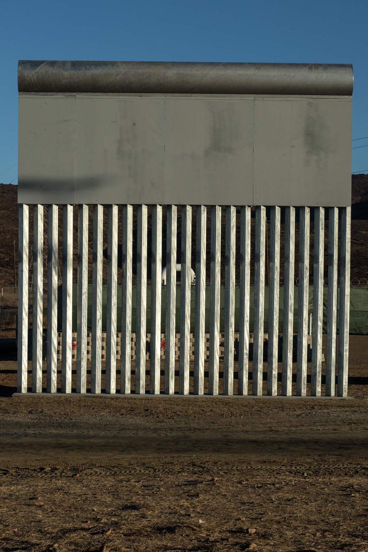
As I kept examining the prototypes, more variety emerged. There were perfectly straight walls and humpbacked ones. Some were solid. Others had vertical metal bars along the base, making it possible to see easily through them.
What the prototypes didn’t resemble, in any practical sense, was a wall. (A swatch of fabric is not a shirt; a lone panel from an umbrella won’t keep you dry when it rains.) It wasn’t just that they suggested Potemkin slices, architectural stand-ins to match the human ones Trump’s campaign invited to the news conference kicking off his White House bid.
Because they’d been put up with gaps between them — the better to appreciate the differences from one design to the next — they offered no sense of enclosure or completeness. This gave the whole display a surprising and ironic twist: the way the prototypes were arranged struck me as emblematic of the limits of Trump’s border-security aspirations. They were prototypes of a wall that will likely, for practical reasons as well as political ones, always be as notable for its gaps as for its consistent protection.
SIGN UP for the free Essential Arts & Culture newsletter »
What is an architecture critic? Maybe an architecture critic is somebody who goes to see slices of concrete and steel in a big field and comes back to report what’s so self-evident, even obvious, that it threatens to remain unsaid: that these sections of wall are better understood for their collective symbolism than as competing entries in a genuine design competition.
That as a group — eight slabs and seven spaces-between-slabs — they enact, with surprising precision, the southern border wall that we already have and probably always will, the one we’re eternally displeased with and yet condemned to keep building. That what we’re producing is a strange hybrid of wall and tunnel, just as I was in the United States while my phone told me I was in Mexico: something that both frustrates and enables connection, that makes plain that a border is at once the place where we’re separated from another country and where we’re joined to it.
A barrier made of alternating bands of substance and absence, aspiration and impossibility. Here wall, here no wall. Here something, here nothing. And on and on across the desert.
Twitter: @HawthorneLAT
MORE ARCHITECTURE
Best architecture in 2017: In a tough year, plenty of highlights
Flood, fire and volatility became the new normal for American cities
The Hogwarts Effect: College buildings look straight out of Harry Potter's world
The biggest entertainment stories
Get our big stories about Hollywood, film, television, music, arts, culture and more right in your inbox as soon as they publish.
You may occasionally receive promotional content from the Los Angeles Times.


