Review: In his rapturous MoMA retrospective, L.A. artist Ed Ruscha gives New York School art a witty blow
New York — Ed Ruscha, born in Omaha, Neb., in 1937, grew up in a devoutly Roman Catholic home. As a kid, he set the church aside, as kids often do. The moment he turned 18, and vaguely thinking of a life in art, he aimed his car west on Route 66 from Oklahoma City, where his family had moved when he was 4, and headed to Los Angeles.
During the 1950s, choosing to become an artist working in the cultural backwater of L.A. rather than in rising powerhouse New York was sort of like growing up Roman Catholic in the heavily Protestant Midwest. It was great that you had committed to a meaningful faith, even though it appeared to be the wrong one. Given firmly established social value systems for both religion and art, it would be best not to expect much success.
Eventually, fame and fortune did follow. Ruscha — pronounced rew-shay, as his oddball 1960 business card explained — is now the subject of a big, rapturously beautiful retrospective exhibition at Manhattan’s Museum of Modern Art. Today an artist virtually synonymous with the city where he landed in 1956, he has been instrumental in transforming Los Angeles from cultural backwater into powerhouse. Although it didn’t set out to do so, the marvelous show reveals how Ruscha’s alienation from organized religion proved to be useful for his larger, culturally striking project: deconstructing art myths and shibboleths.
Integral to his work’s profound effect is its sharp-eyed iconoclasm. Like other contemporaries raised amid the same religious structures full of visual pageantry, including Pittsburgh’s Andy Warhol and Baltimore’s John Waters, icon-busting was a useful strategy for rejecting entrenched values, cherished beliefs and established institutions. The conventional catechisms of art were dominated by the New York School, which Ruscha’s art held in an equivocal — and often very funny — embrace.
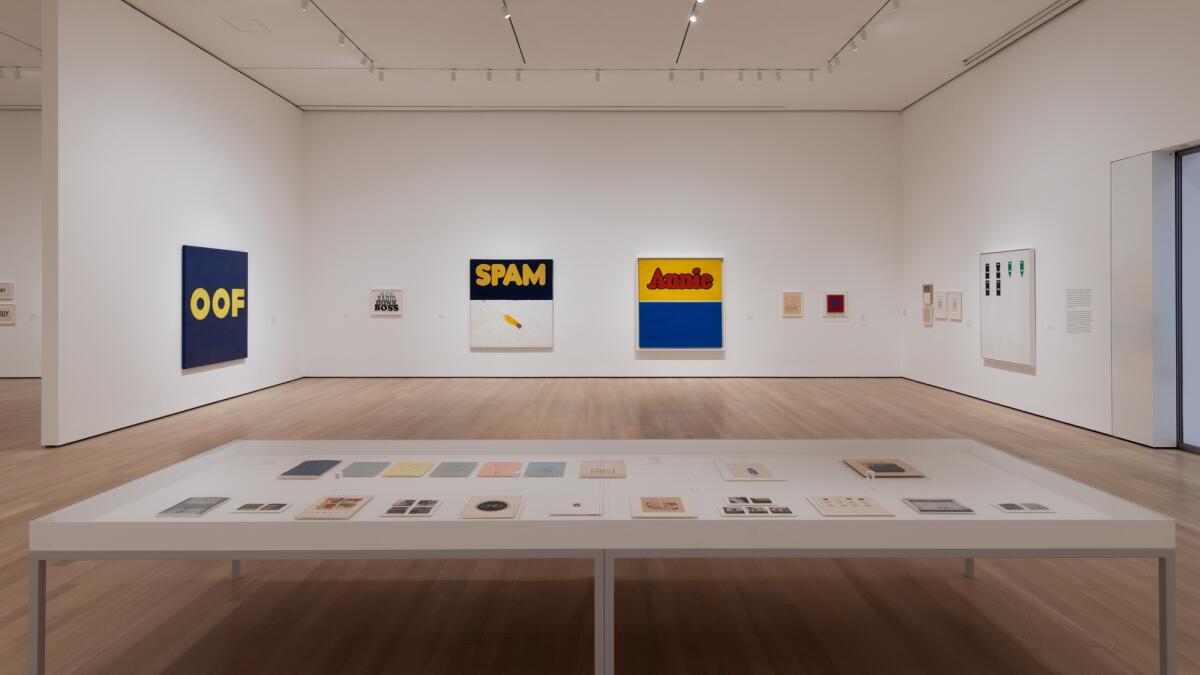
Gathered are nearly 200 works in painting, drawing, printmaking, photography and artists’ books, which are interspersed across galleries filling MoMA’s entire sixth floor. There’s also enlightening ancillary material, such as hundreds of photographs in contact sheets and drawings and souvenirs from Ruscha’s first European sojourn in 1960. Curator Christophe Cherix smartly emphasizes the multidisciplinary nature of Ruscha’s prolific output. Even from the get-go, he bucked a then-dominant demand for artistic purity.
Emblematic is the wild and wacky “Chocolate Room,” here in its New York debut, which has drawn a lot of ink in the show’s previews and early reviews. The installation is an anomaly in Ruscha’s long career. Invited to the 1970 Venice Biennale, he screen-printed hundreds of sheets of paper with warm, brown chocolate paste. Then, as Warhol did with cute images of a pink cow, his effete alter ego mocking Picasso’s identification with a randy bull, Ruscha used the sweet sheets to wallpaper a gallery’s interior, floor to ceiling.
The sheets met the then-critically approved demand for flat, two-dimensional abstraction as art’s highest achievement. But Ruscha’s wallpaper also collided head-on with the critically derided prohibition against decoration, claimed as art’s utter debasement. As art, the work’s roaring success was simultaneously its abject failure.
In Venice’s humid summer heat, the sinfully delicious room — literally, a box of chocolates — immediately drew a swarm of eager flies. The bugs tracked hungrily across the coated paper, creating a delirious scene of decay and dissolution. Vanitas, a Renaissance artistic genre meant to show pleasure’s transient futility in the face of death’s inevitability, was modernized and performed for visitors.
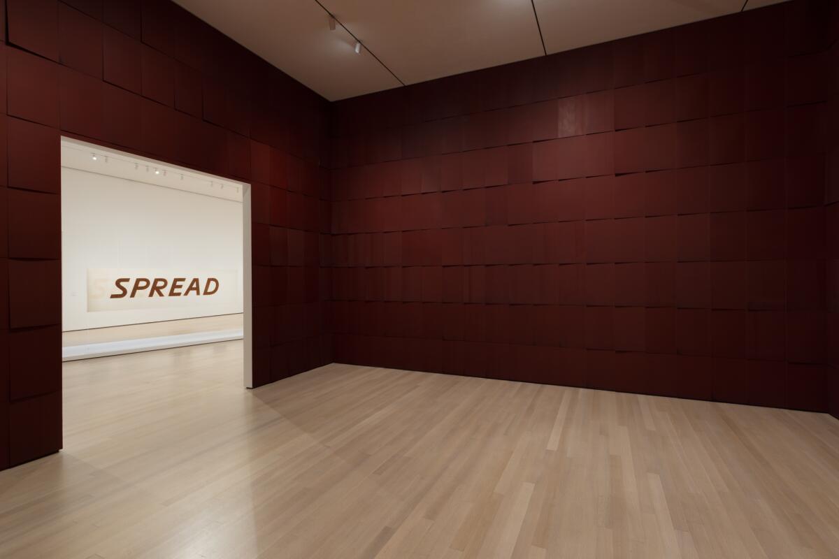
Unfortunately, the MoMA version isn’t very pungent. And of course, there’s no way the museum would be urging the arrival of vermin into its immaculate galleries. Cherix, in a savvy curatorial move, installed two Ruscha prints next to the room’s exit door, both made in the Biennale’s aftermath: The image in one teems with red ants; in the other, cockroaches swarm.
Across the way, “Evil” — a 1973 word-painting related to Ruscha’s series on palindromes, words that read the same backward and forward — is spelled out in dark, coagulated blood that was drawn from the artist’s veins. In a rear-view mirror, the kind where one looks to see where one has been, the word tweaks the palindrome genre to spell “live.” The bloodstained word is painted on scarlet satin, the material of a cardinal’s cassock.
Around the same time, Ruscha was making prints and drawings from other unusual liquids, including crushed rose petals, whiskey and tobacco juice. (Those go well with chocolate as romanticized leisure substances, as does the caviar and Pepto Bismol he used for a witty screen print showing the Hollywood sign.) The fundamental Catholic doctrine of the stain of original sin crashes headlong into the avant-garde controversy over the technique called “stain painting.” Supposedly, stain painting, where liquid acrylics are poured directly onto raw canvas, was art’s next logical step after Abstract Expressionism.
Whether “Evil” has anything to do with the media frenzy concocted around Catholic outrage being used to market “The Exorcist,” that year’s blockbuster Hollywood horror movie, is anybody’s guess. But stains of one kind or another are all over Ruscha’s work. Perhaps the earliest is the empty but oil-stained pavement in “Thirty Four Parking Lots,” aerial photographs shot around Los Angeles for a 1967 artist’s book.
Ruscha’s alienation from organized religion was more than incidental. The artist’s biography in the show’s wide-ranging catalog records how his father, the family’s most devout Catholic, had been excommunicated when he divorced to marry the woman who would become Ruscha’s mother. Still, he went to church every Sunday, enduring the weekly humiliation of being denied communion for a sacramental offense. Only on his deathbed did the local parish priest finally yield to familial pleas, administering the last rites to avert eternal damnation.
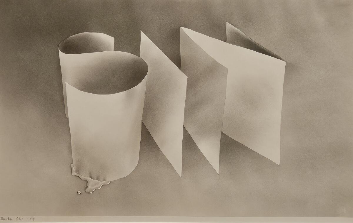
In the biblical beginning was the word, of course, and “Ed Ruscha / Now Then” opens with several of the radical word-paintings he began to make around 1960. When Ruscha arrived in L.A. he enrolled at Chouinard Art Institute (now CalArts) to study commercial art, and after graduation worked for brief periods doing jobs like paste-up at an advertising agency and hot-metal typesetting at Plantin Press, a small local print shop. Those practical experiences were surely instrumental in his subsequent shaping of language as a physical material, rather than merely a two-dimensional sign. His early paintings, drawings and prints stage words three-dimensionally.
“Ace,” a term of excellence, objectifies the vivid word in thick blue oil paint, which seems to have been clawed from beneath an inky black field. (Look closely, and from the overall blackness the faint contour of an envelope slowly emerges — perfect for sending a message.) Elsewhere, the bright yellow “o” in “radio” is being painfully squeezed by a C-clamp; the illusionistic word is set against a heavenly blue sky, where invisible radio waves travel.
The luxurious 1966 “Annie, Poured From Maple Syrup,” a tour de force of Conceptual painting, renders the name of the Dickensian American comics heroine Little Orphan Annie in a golden liquid script. The dribbly pancake treacle makes wicked fun of Jackson Pollock’s drip paintings, a love-hate requiem.
Ruscha has acknowledged the inspiration in a random magazine encounter with a photograph of “Target With Four Faces,” Jasper Johns’ 1955 mixed-media painting. The red-yellow-blue target, concentric rings in oil paint infused with wax and brushed over newsprint, was at once a flat picture and a material object — an image of a target and an actual one.
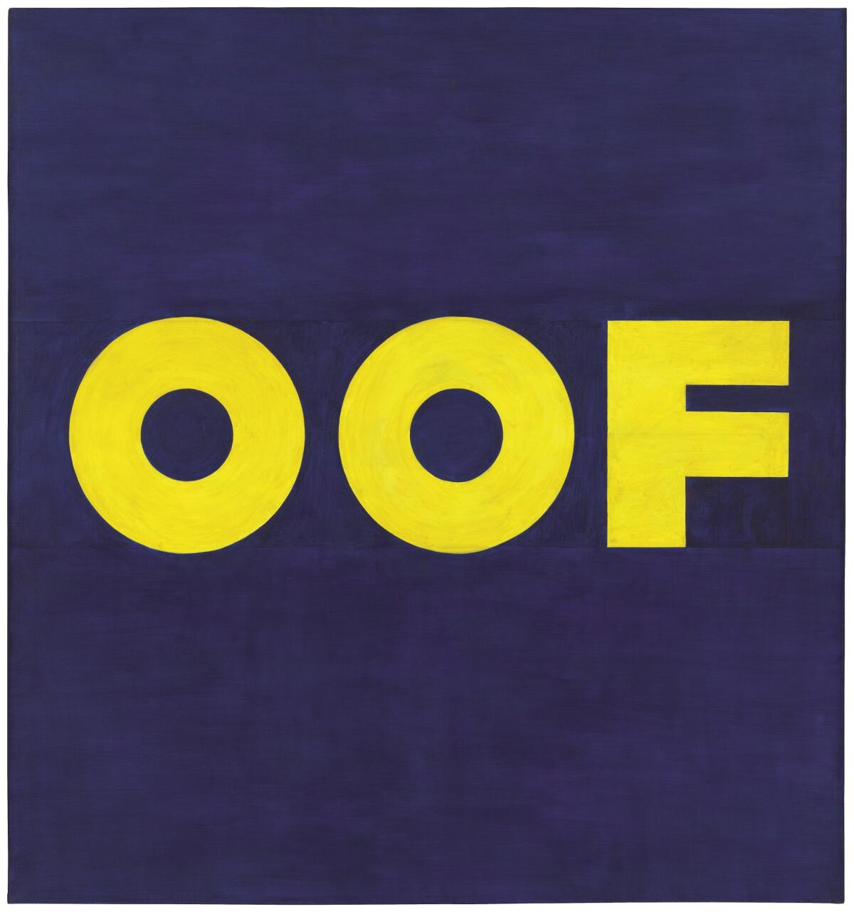
Christian theological concepts of “the word made flesh” are embodied in Ruscha’s painted words, albeit strictly in secular terms. Even the letters in a drawing that spells “sin,” rendered in explosive gunpowder, are themselves made to look like sheets of drawing paper. The plain intent was to give hidebound established art a body blow, as he spelled out precisely in a painting of the screaming yellow word “oof” against a midnight-blue field.
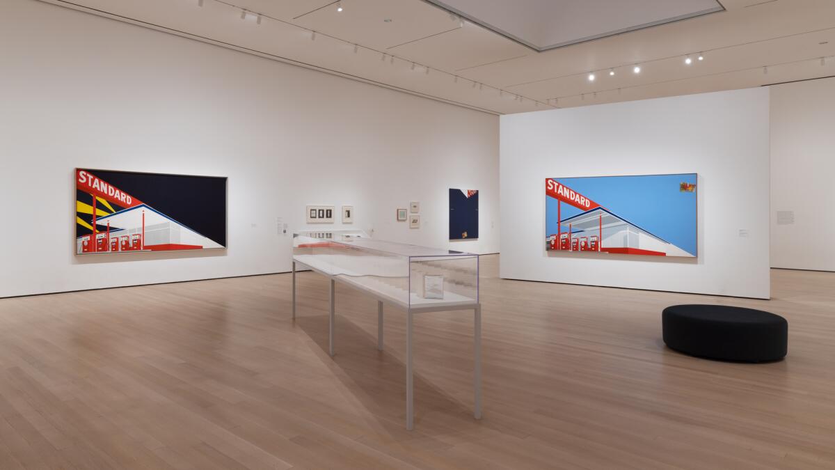
Color is critical. Perhaps his most famous paintings from the 1960s feature entire environments built around giant signs — Standard gas stations, Norm’s diners, 20th Century Fox movie studios — all done up in flag-waving red, white and blue.
In thrusting diagonal compositions, they trumpet the demand for an “American-type painting,” as distinct from European Modern art, voiced by New York School art critic Clement Greenberg. (The powerful critic organized the argumentative show, “Post Painterly Abstraction,” for the Los Angeles County Museum of Art in April 1964.) But the jingoistic ultimatum is cast as being stiflingly conventional — at least as conventional as any Main Street standards and norms. Eventually, Ruscha painted images of the gas station and diner on fire. They soon were joined by a post-painterly picture of flaming LACMA inspired by the format of Sir John Everett Millais’ famous painting of mad Ophelia, floating in a river just before she drowns.
Ruscha’s first “Annie” painting faithfully reproduces the comic strip’s curvy red typography on a big canvas divided into flatly painted rectangular fields of yellow and blue, one above the other. The primary colors of Johns’ target collide with the printing press of the Sunday funnies. Annie was a pioneering multimedia kid — a 19th century book that became a modern comic strip, two movies and a long-running radio show. (The Broadway hit musical came much later.) Her marketing promoters offered a handy mail-order decoder badge for fans, essential to unveiling secret messages hidden in her NBC radio program.
She also was famous for having two empty eyes —- blank white ovals with no iris or pupil. Ruscha’s sly painting invokes the rejection of “retinal art,” intended only to please the eye, by Marcel Duchamp, cultural iconoclasm’s reigning dignitary. Poor little Annie didn’t have the equipment, but her secret decoder would be helpful all over the MoMA show.
That includes “Every Building on the Sunset Strip,” an accordion-fold book 25 feet long that shows what the title says. The more than 2-mile street of offices and shops was photographed from the back of a moving pickup truck, then printed like stills from a movie. This motorized homage to the otherwise pedestrian-dominated history of century-old street photography is appropriately transformed for the radically suburban car culture of Los Angeles.
The book’s skewed view, which fits Ruscha’s L.A. angle, is wonderfully installed in a vitrine set on a long diagonal that cuts across the center of the gallery. Think of it as a forced perspective: The installation calls subtle attention to all the similarly eccentric diagonal compositions in the career-defining early landscape paintings.
Farther on, standing before “Pay Nothing Until April,” an exceptional 2003 painting that I hadn’t seen before, I let out an involuntary guffaw. The canvas, 5 feet square, imposes the sentiment in a stack of crisp white words over snow-covered mountain scenery, the sky a sallow yellow fading upward into bilious green. A diagonal black shadow at bottom right is creeping across the chilly rugged landscape, itself a routine artistic symbol for sacred heights. The shadow is like an old-fashioned editing wipe, shifting between movie scenes.
Not a soul is in sight amid the epic winter silence, as the dark advances. Surely the composition is a knock on art and commerce, a familiar tension in our cash-soaked contemporary culture, but it’s also more than that. “Pay Nothing Until April” casts its jaundiced glance onto the usual Easter month, the moment when mortality’s final bills come due.
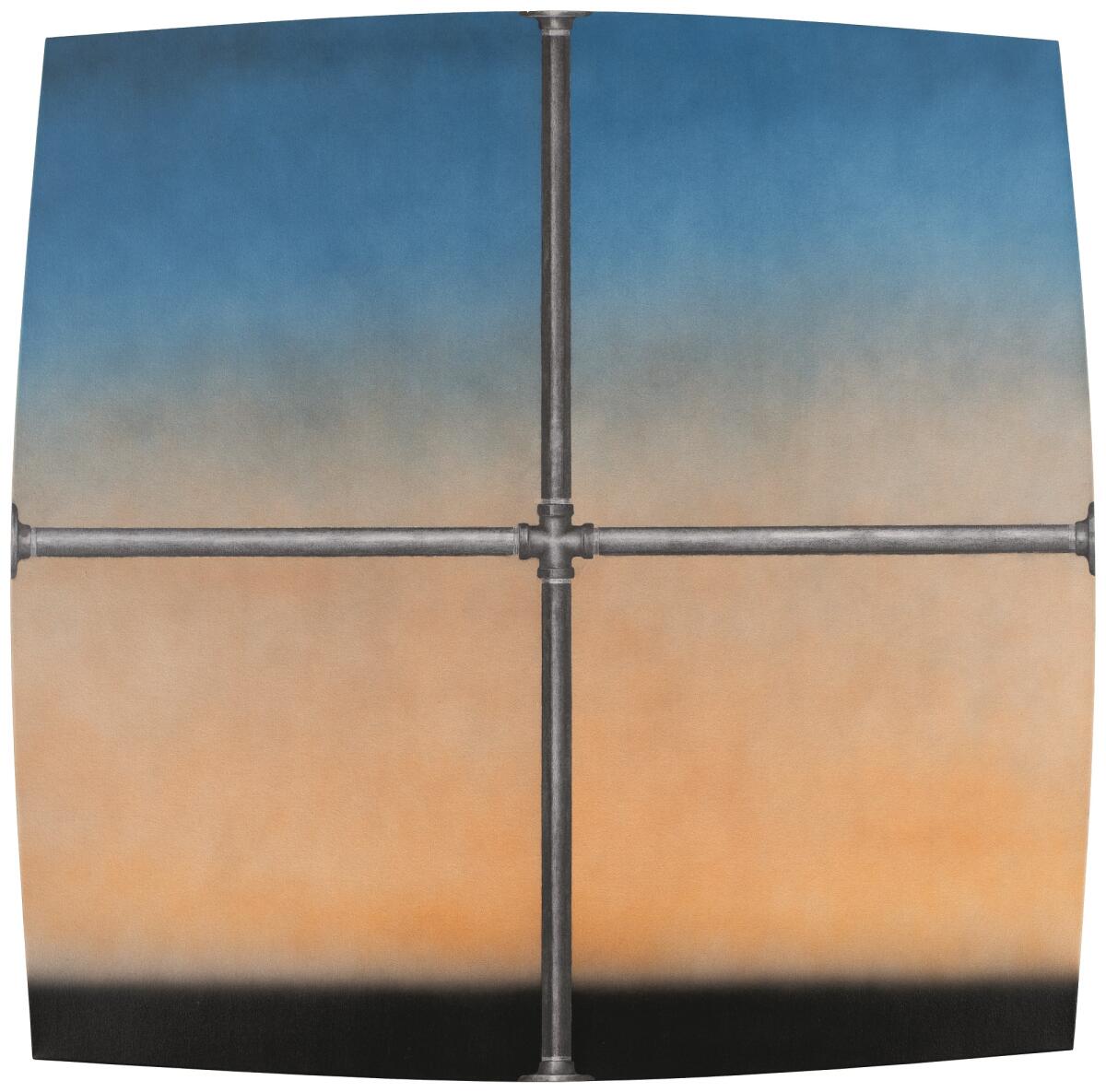
The excellent catalog to the exhibition, which travels to LACMA in April, features a revealing cover. “Charles Atlas Landscape,” citing the American bodybuilder named for the Greek Titan forced by Zeus to hold up the heavens, and who sold his fitness regimen in the back of comic books, shows a smoggy sky fronted by industrial construction conduits assembled to form a Greek cross.
The painting’s square frame appears to bow outward in every direction from the pressure, pushed out of normal alignment. I wonder. Could there be a more succinct introduction to Ruscha’s six decades of exceptional art?
"Ed Ruscha / Now Then"
Where: Museum of Modern Art, 11 W. 53rd St., New York
When: 10:30 a.m.–5:30 p.m. daily. Through Jan. 13.
Info: (212) 708-9400, moma.org
More to Read
The biggest entertainment stories
Get our big stories about Hollywood, film, television, music, arts, culture and more right in your inbox as soon as they publish.
You may occasionally receive promotional content from the Los Angeles Times.


