Atmosphere infuses the ‘particularly photographic’ black-and-white ‘Lighthouse’
From the first frame of director Robert Eggers’ “The Lighthouse,” you find yourself immersed in something different. Something you can’t quite put your finger on yet, but your eyes blossom as you slowly sink into your seat.
The allegory is set in 1890s New England and follows lighthouse keepers Thomas Wake (Willem Dafoe), a verbose grinch, and his subordinate, Efraim Winslow (Robert Pattinson), who’ve arrived on an isolated island off the coast of Maine to provide safe passage for nearby ships. The long, lonely days drive the two strangers to drink, and the line between what’s real and what’s not starts to blur.
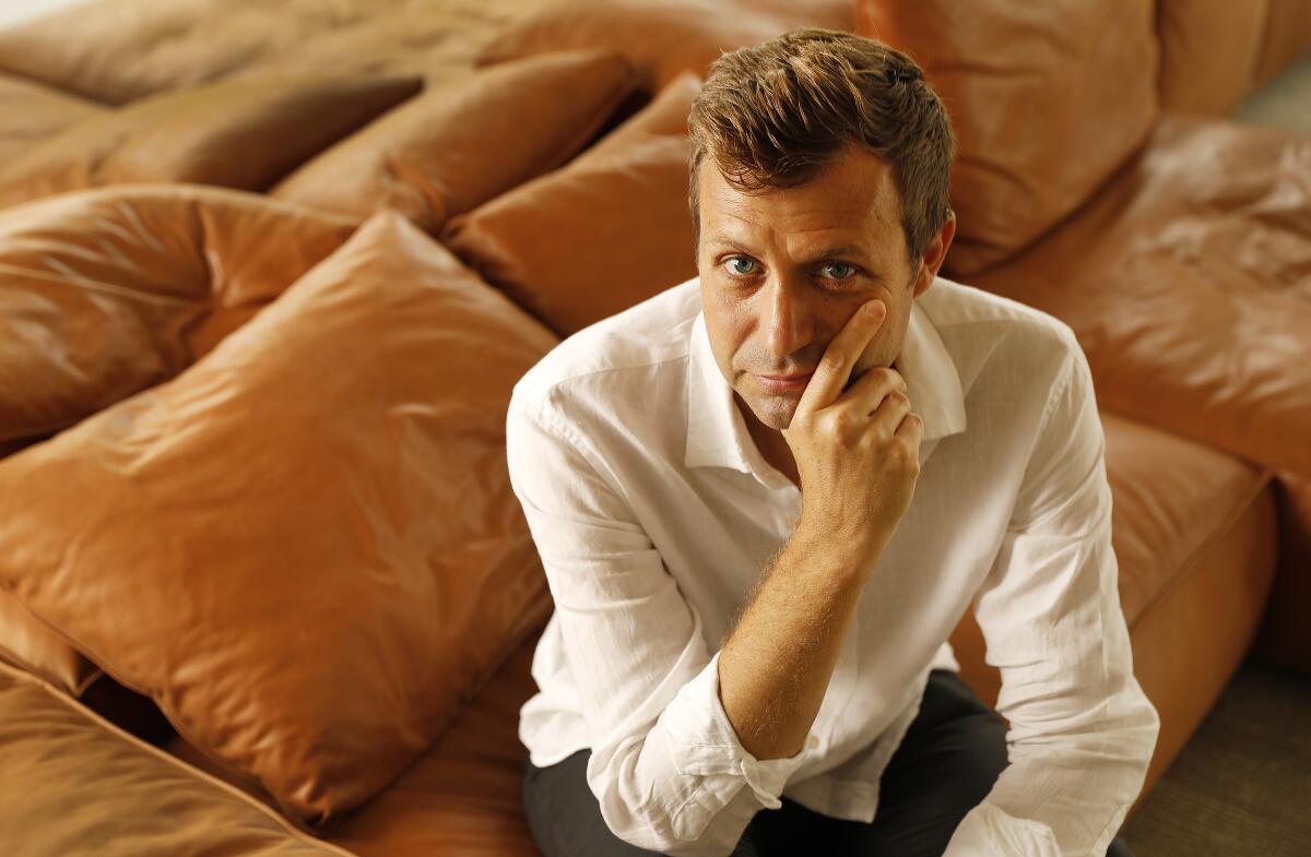
To conjure up its ominous visual style, cinematographer Jarin Blaschke, who’s collaborated with Eggers on several short films and the director’s first feature, 2015’s “The Witch,” layered black-and-white film with historically accurate motifs.
Robert [Eggers] said that atmosphere comes first and then the rest comes out of that. This project felt like I had a chance to make something particularly photographic.
— Jarin Blaschke
“Robert said that atmosphere comes first and then the rest comes out of that. This project felt like I had a chance to make something particularly photographic,” says Blaschke. “Black-and-white is already abstract but photographically we wanted a texture that looked like nothing else that’s been made in the last several decades.”
The aesthetic leaned on an orthochromatic signature, one that’s sensitive to blue light and familiar to the time period. Panchromatic film, which can see red light and is mainly used today, wasn’t widespread in motion pictures until the 1920s. “When you’re looking at 19th century photography, skies tend to be bright while skin tones are very dark, because blue is overly sensitive in orthochromatic stock. We wanted that same texture on this film,” says Blaschke.
Since motion picture orthochromatic film is no longer available, the cinematographer combined black-and-white Eastman Double-X 5222 panchromatic negative and a custom short pass filter designed by Schneider Optics to detail the visual style.
Furthering the palette, Panavision Millennium XL2 cameras were paired with vintage 1930s Baltar lenses for which Blaschke almost always sets his working stop at T2.8. “They’re gorgeous portrait lenses that are lower in contrast and pass blue light more freely,” he says. “They have a shimmer and glow that adds another layer to the image, giving balance to the hard orthochromatic look.”
Production filmed for just over 30 days and its exterior sets from production designer Craig Lathrop were built on Cape Forchu, a small fishing town in southwest Nova Scotia. The entire 70-foot-tall lighthouse, attached cottage and outer buildings were constructed from the ground up while interiors moved to soundstages and warehouses near Halifax or a Yarmouth aircraft hangar for the upstairs bunker where the two “wikies” (lighthouse keepers) sleep.
Blaschke chose an almost square 1.19:1 aspect ratio for its composition potential. “It wasn’t about trying to make it look like older films but rather choosing a frame that lends itself to the tall and narrow sets and helps you visually withhold information from the audience. It also had a secondary effect of evoking compositions of 20th century modernist photography,” he says.
To block scenes, Blaschke notes he and Eggers blended ideas and preferred to introduce the geography of the space early on. The opening sequence illustrates that notion, as Efraim watches the ship that dropped them off sail away in the distance and then the camera follows him into the cottage and up the stairs into the sleeping quarters. “Once you show the audience the space, you can do whatever you want. It really helps to make sense of it all visually,” adds Blaschke.
Lighting proved to be its own challenge, as the cinematographer was effectively shooting the film stock at 80ASA, which has a low sensitivity to light. “I’ve read in other articles saying this movie was shot in natural light but nothing could be further from the truth,” says Blaschke. “We used most of the large HMIs in eastern Canada.”
For daytime interiors, 18K and 9K HMIs were bounced through giant panoramas of muslin cloth outside each active window and shaped for mood. Night exteriors used the same HMIs while night interiors, like the heightened dinner scenes or drunken escapades, were lit based on the lantern’s glow, which was outfitted with a 500-watt halogen bulb. Closeups were further augmented with a China ball when needed.
“It’s a dark movie where the lighting is very motivated, which doesn’t take unrealistic liberties, countering some of the wild content. It’s all based on where light would be coming from in the real world,” notes Blaschke. “When it came to the table lantern, it was so blindingly bright we all had to imagine the mood and effect of the shadows because what we were creating, only the camera could see. It took a lot of previsualization for me to understand what the film was going to do.”
More to Read
Only good movies
Get the Indie Focus newsletter, Mark Olsen's weekly guide to the world of cinema.
You may occasionally receive promotional content from the Los Angeles Times.
