Disneyland’s Sleeping Beauty Castle reappears with vibrant colors and pixie dust
Sleeping Beauty Castle, the centerpiece of the Disneyland park in Anaheim, has been undergoing a makeover for the past four months, a job that blocked off the building from parkgoers.
But to avoid dashing fans’ expectations, painting crews enveloped the 77-foot-tall castle with a huge painting of the original structure, emblazoned on heavy fabric attached to scaffolding.
The idea was to let park visitors snap photos of a rendering of the original castle, even if they couldn’t see the actual fortress during the makeover.
This weekend, most of the fabric scrim and scaffolding are coming down and the castle is expected to open to the public Friday.
The project, which began in January, employed as many as 60 workers at a time.
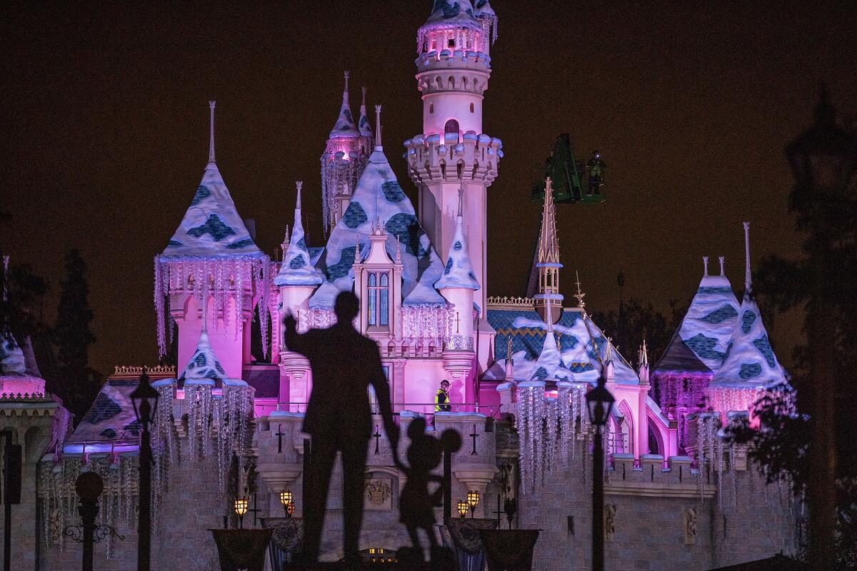
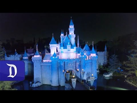
The most noticeable difference in the castle is that it has been repainted with brighter and bolder colors, with a strong infusion of blues and pinks. The cedar-shake roof shingles on the 18 turrets have been replaced and decorated with gold sparkles, representing magical pixie dust.
“It’s as though the entire castle has been enchanted,” said Kim Irvine, art director for Walt Disney Imagineering, adding that the bolder colors more closely reflect the original hues of the building when it opened in 1955.
The image on the scrim that has covered the castle during construction was originally created by Disney artist Herb Ryman, who painted the first depictions of the castle and other Disneyland buildings for Walt Disney Co. in the early 1950s.
“I personally think this is the best because it’s the first and it’s Walt’s castle and nobody can improve on it,” Irvine said, noting that other Disney parks also have castles.
The last time the castle underwent an extensive makeover was in 2005, before the 50th anniversary of the Anaheim park. The latest overhaul was timed to be completed before the May 31 opening of the park’s largest and most anticipated expansion, Star Wars: Galaxy’s Edge.
To make the castle look bigger, Disney designers have relied on a few optical illusions.
The colors on the walls are warmer near the bottom and lighter and bluer closer to the top, an artistic technique known as atmospheric perspective. Objects that are farther away are lighter and bluer because there is more atmosphere between them and the person viewing them. Enhancing those features heightens the effect.
In the castle, the cedar-shake shingles are also bigger near the bottom and smaller toward the top. Disney workers used progressively smaller shingles because objects that are smaller appear to be even farther away, another technique called forced perspective.
In addition to the castle’s new paint and roof, the area around the moat is being re-landscaped with new rosemary plants and pink roses.
Disneyland devotees began posting photos on social media last week as the castle started revealing itself, with many expressing excitement about the brighter colors and the chance to revisit the stubbornly analog attraction. There were a few voices of dissent who, for instance, described the stars and sparkles as “tacky” and the bold color scheme as “over the top … like a preschool toy.”
To read more about the travel and tourism industries, follow @hugomartin on Twitter.
More to Read
Inside the business of entertainment
The Wide Shot brings you news, analysis and insights on everything from streaming wars to production — and what it all means for the future.
You may occasionally receive promotional content from the Los Angeles Times.
