DOUBLE FEATURE : All of a Sudden, Los Angeles Has Two New Showplaces for Art
The opening of a major museum of art is a momentous event in the life of any city, a time to sound the trumpets. In the last decade, new and recast museums have opened in a flurry of civic pride in Washington, Dallas, Atlanta, New York, London, Paris, Frankfurt and Cologne. Indeed, art appreciation has taken on the form of a religion in this acquisitive, secular age, and museums have become a measure of municipal worth, as cathedrals were in centuries past.
Now it is Los Angeles’ turn for the international pursuit of cultural glory. But in this land of double features, of Rams and Raiders, Dodgers and Angels, USC and UCLA, Disneyland and Knott’s Berry Farm, the city is about to get not merely one but what amounts to two new museums. And true to the city’s reputation for dazzling premieres, they will be dedicated within three weeks of each other. Representatives of both museums insist that this is pure coincidence caused by the caprice of construction and exhibit schedules.
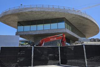
Opening first, on Nov. 23, will be the expanded Los Angeles County Museum of Art, featuring a substantial new building--the Robert O. Anderson--to serve special exhibitions and to house the museum’s permanent collection of 20th-Century art. The slick but subdued Post-Modern Anderson Building and a spacious central courtyard will unite the museum’s original trio of scattered, stylized buildings into a single streamlined complex. The $35-million project in the mid-Wilshire district is the work of Hardy Holzman Pfeiffer Associates, a New York-based firm known for its innovative museum designs.
Seventeen days later, on Dec. 10, the new Museum of Contemporary Art will open as the glistening centerpiece in the planned California Plaza, the massive redevelopment effort reshaping Bunker Hill and the downtown skyline. The $23-million museum, dedicated to displaying art produced within the last half-century, is a striking collection of cylindrical, cubic, vaulted and pyramidal forms in a variety of construction materials and lush finishes. The emphatically contemporary complex is the first major U.S. design by renowned Japanese architect Arata Isozaki and is expected to generate international attention. Isozaki was assisted by the Los Angeles firm of Gruen Associates.
The practical Post-Modernism of the county museum addition and the mannered minimalism of the Museum of Contemporary Art are inventive architectural responses to a host of demanding requirements and sharp physical constraints. Both the architects also had to contend with heavy doses of museum politics.
At the county museum, there were the curators, each seeking the maximum and best space for their collections. Also to be dealt with were the benefactors. And, of course, there were the administrators and trustees. None of these groups is known to be shy. As a result, the process of allocating space was, as museum director Earl (Rusty) Powell III puts it, “delicate.” Hardy Holzman Pfeiffer has a reputation for finessing just such balancing acts.
At the Museum of Contemporary Art, Isozaki did not have to contend with curators--there weren’t any at the time--but instead with a strong-willed trustee: philanthropist Max Palevsky, who was then one of the museum’s principal benefactors.
The Tokyo-based Isozaki won the museum commission in 1981 on the basis of his striking designs in Japan. But a year later, at a heavily publicized press conference, he unveiled a surprisingly bland scheme for MOCA. It quickly became apparent that even Isozaki was not pleased with the plan and instead preferred three more interesting designs he just happened to have with him. Under lively questioning, he acknowledged that the selected “final” scheme had been done only at the insistence of the trustees’ building committee, headed by Palevsky. Pressed further, Isozaki said he was considering resigning.
In the controversy that followed, the museum’s then-director, Pontus Hulten, and his deputy, Richard Koshalek (the present MOCA director), announced that they would also resign if Isozaki was not given a freer hand. In the end, Palevsky was elbowed out of the process and eventually sued the museum to recoup $500,000 he had donated to the project and to avoid paying another $500,000 that he had pledged. Isozaki was allowed to go back to the drafting board.
WHILE THE MUSEUM OFCONTEMPORARY Art was to be designed from scratch, the county museum was an aging, confused conglomeration. More and better space was needed to display the museum’s collection and traveling exhibits, and for services, staff and storage. The three original buildings--the Ahmanson, Hammer and Bing--were designed by the late William Pereira and constructed in 1964 in the then-popular neoclassical, cultural-campus style. They had not aged well.
Surrounded at first by reflective pools and fountains and later by an awkward sculpture garden, the complex had no identity and no sense of arrival. Pedestrian traffic in and between the buildings was a mess. The museum looked and functioned more like a suburban shopping mall than an urbane cultural institution. For that, the museum’s trustees turned in 1980 to Hardy Holzman Pfeiffer.
Among the firm’s many projects at that time were award-winning restorations and renovations of the St. Louis Art Museum and the Cooper-Hewitt Museum, the Smithsonian Institution’s National Museum of Design, in Manhattan. These projects and subsequent others have not been marked by any one particular aesthetic but by a determined pragmatism that, a few years ago, earned the firm the label in architectural circles of “functionalists in drag.”
Hardy Holzman Pfeiffer’s response to the Rubik’s Cube puzzle presented by the county museum was an ambitious master plan that called for a sweeping reorganization of the museum collection and service facilities, as well as for doubling the size of the institution to more than 400,000 square feet. Besides the Anderson Building and the central court, the inventive plan included still-to-be-completed sculpture gardens, and education and study centers. Added to it later was a pavilion for Japanese art--a gift, along with their Far Eastern art collection, from Joe and Etsuko Price. The pavilion, designed by the late Bruce Goff, is scheduled for completion in early 1988.
But the keystones of the plan are the 115,200-square-foot Anderson Building, mainly financed by Arco and named after its former chairman, and the 40,000-square-foot central court, a gift of Times Mirror Co.
The four-level Anderson has a detailed, textured facade of horizontal bands of glass block, buff-color limestone and green terra cotta. The building steps up along Wilshire Boulevard to lend a strong, urban image to the museum and a focused entry in the form of a 52-foot-high, 50-foot-wide “front door.”
The entry leads to a 20-foot-wide, skylighted stairway bordered by a cascading waterfall, pierced by towering green terra-cotta-veneered columns and flanked to the west by the undulating porcelain panels of the Anderson. To the east are the existing Bing Center and a granite wall inscribed with the names of donors. Together, the entry and stairway create the sense of arrival that the trustees sought.
The stairway empties onto a one-acre, partially roofed space, the Times Mirror Central Court. The three-story area serves as the axis of the complex and will contain a new admissions and information kiosk as well as an expanded museum shop.
The Anderson will provide more than 50,000 square feet of new galleries, including 18,500 square feet of much-needed space for special exhibitions. Until now, most of these exhibitions--such as the recent display of Impressionist and Early Modern paintings from the Soviet Union--have been squeezed into awkward spaces. The galleries will range in height to 18 feet, with many lit naturally by skylights, louvers and filtered glass block.
To illustrate for trustees and administrators the problem of designing a new image for the county museum, Hardy Holz man Pfeiffer built a model of the complex and gave it a series of facades that mimicked the neoclassical Metropolitan Museum of New York, the proposed Post-Modern addition to New York’s Whitney Museum and the Modern, hatbox-style Hirshhorn Museum in Washington.
“It is not that we didn’t have choices,” says Norman Pfeiffer, the partner in charge of the project. The facades effectively purged the museum’s trustees and administrators of any preconceived visions, opening the way for the distinctive design Hardy Holzman Pfeiffer produced.
“Our major concern was, of course, to display the art well and accommodate the viewer and the staff and services,” Pfeiffer explains. “But we also had to address the existing buildings and change the perception of the entire complex, its image. And there was also a changing Wilshire Boulevard and the need for the museum to make an urban statement.
“All the pieces are not done yet, but I think we are well on the way to accomplishing what the trustees wanted, and what I think Los Angeles needs.”
ALTHOUGH THERE WERE MANY GHOSTS at the county museum, the Museum of Contemporary Art was essentially a blank page. Even so, MOCA had its physical constraints. It had to be built on a multilevel site above a parking garage in a cluster of downtown towers. For economic reasons, its column grid had to be consistent with that of the superstructure of California Plaza. A courtyard would have to divide the grounds to provide a view from the street of a hotel planned to the east.
The height of the museum was limited so as not to compete with adjoining commercial structures, whose developers, under the name California Plaza Partnership, underwrote the cost of the 98,000-square-foot building under an agreement with the city Community Redevelopment Agency.
Isozaki’s response was an intricate plan calling for seven interconnecting galleries totaling 24,500 square feet on one floor, and an auditorium, library, bookstore, cafe, staff offices and other services spread over seven levels and within a variety of bold, geometric structures topped by 11 pyramidal skylights and one sawtooth-shaped skylight.
Because it will eventually be dwarfed by buildings, Isozaki says, the structure had to attract attention “not with its volume but with its materials and forms.” The complex has been broken down into striking geometric fragments that, Isozaki explains, “in a way, look like a small village inside the valley created by the skyscrapers.”
Dominating the complex are blocks of warm red sandstone, quarried by hand in India and laser-polished in Japan. There also are panels of dark-green aluminum, with cross-hatched joints painted a bright pink. Copper that in time should take on a greenish patina is used for the barrel-vault roof of the library; glass brick frames a doorway, and the main stairway and lobby and the cafe are of synthetic marble.
The soul of the museum, of course, is the galleries, which the architect says he made as neutral as possible to serve simply as a background for the art. Wherever possible, natural light is used. Gallery A is particularly dramatic. It rises 58 feet to the peak of a pyramidal skylight, creating the feeling of an august church.
As the finishing touches are applied to both complexes, however, the mood in the galleries is not one of reverence. It is of anxiety. No matter how imaginative the designs look on paper, or how attractive they appear in tours before opening, their true test will come in the display of art and the crush of crowds. And that will happen soon enough.
More to Read
The biggest entertainment stories
Get our big stories about Hollywood, film, television, music, arts, culture and more right in your inbox as soon as they publish.
You may occasionally receive promotional content from the Los Angeles Times.


